Making of Frodo by Vishal Pawar
Hello I am Vishal Pawar and i am a Digital Artist from India, artists like Craig Mullins and Dusso (Yanick Dusseault) always inspire me.Peter Jackson’s Lord of The Ring trilogy has been a very big inspiration for me throughout my carrier,every frame of the movie is a visual masterpiece. Well that was all about me, so now lets kick start with the tutorial.
“Making of Frodo” I assume you guys might be familiar with Adobe Photoshop.
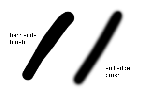
Starting off: Adobe Photoshop is a big software with different options and tools, but for creating a good illustration a brush is very important tool, well lets start off with brushes in Photoshop. there are many types of brush in Photoshop like hard edge brushes, soft edge brushes, texture brushes, dry brushes, drop shadow brushes and many more, even you can create your own custom brush in Photoshop, so lets get through the brush we are going to use for painting Frodo, I have used soft edge brush and a custom texture brush for the Background texture. Hot key for brush in Photoshop is keyboard button b, by default brush type is set to hard edge brush.
Few helpful tips about Photoshop: As you start painting in Photoshop you need to set a palette for colors and for palette you need to pick different colors with the help of eye dropper tool hot key is i, so its pretty confusing sometimes to switch between brush tool, eye dropper tool and many others, you don’t need to worry its pretty simple. Pressing b takes you to the brush tool and while you are in brush tool you want just press alt key and hold it the tool changes to eyedropper tool so that you can pick your color, pretty cool huh! well this way you can toggle between brush tool and eye dropper tool. [ button decreases the size of brush and ] increases the size of brush and if you hold shift+ [ it makes the brush a soft edge brush and holding shift+ ] makes brush a hard edge brush, press and hold spacebar it will take you to hand tool which is very helpful while you are working at 500% zoom to access different areas of a image, press and hold spacebar+ alt to zoom out and spacebar+ ctrl to zoom in, and you can make your brush pressure sensitive if you are using Wacom Tablet, for that you have to explore bush option box, there are few more things I would like to cover sometime latter.
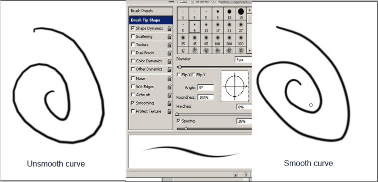
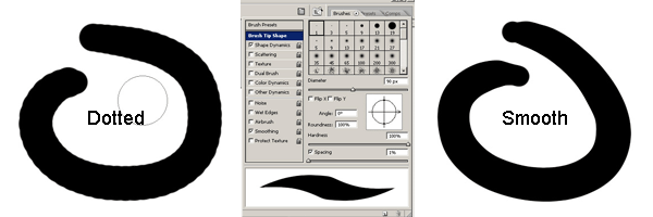
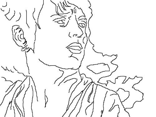
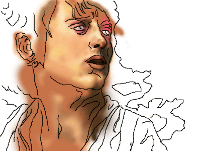
Well lets first open up Photoshop, then say create new file and fix up the resolution you want like 800 pixels X 600 pixels and then set the dpi, 72 is lowest, ok so we start off with a new file then open up the reference image in Photoshop, the very important thing before we start painting a image is look at the reference with half closed eyes, why? Because it gives you the good idea about highlights shadows and mid tones and so it will be easier for you to judge and paint it. now take a brush of size 2 or 3 pixels and then add a new layer now lets start painting the outline , this drawing has to be very similar to the reference and detailed so that it gives u idea bout highlights mid tones and shades, well while drawing many of you might face this problem about unsmooth curves in Photoshop, so you don’t need to worry open up the brushes option box and just check that smoothing option is ticked one more problem related to brush when you take a big brush and try to paint you will find your lines kind of dotted , so go to brush options and then tip shapes and turn that spacing from 25 to 1, now try drawing hey!!! it works right. So few more helpful tips for brush b is the hot key for brushes in Photoshop and if u want a hard brush to have smooth edges just press n hold shift and [ this will make the brush smooth and exact opposite for hard edges like i have explained earlier.
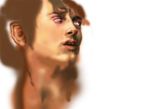
Then after getting all the settings right complete the outline drawing by looking at the reference.
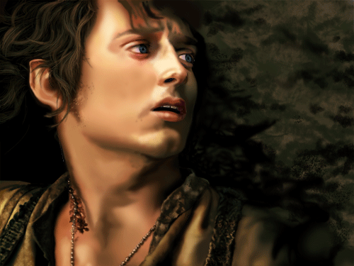
So after finishing drawing lets start painting ,I prefer starting to paint from highlights to the shades as it helps in maintaining good contrast between light and dark, so pick the color of highlights using a eye dropper tool from the reference and now we start painting the face. Well an important point…. always keep the outline drawing layer at the top of all others.
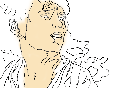
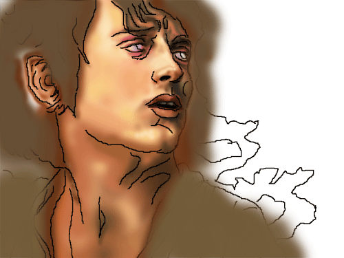
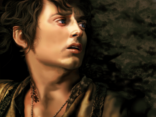
After we finish painting highlights lets start painting mid tones,
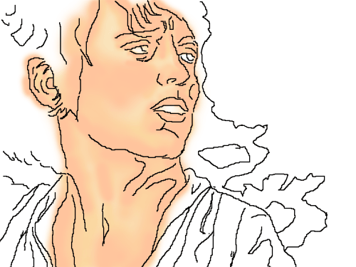
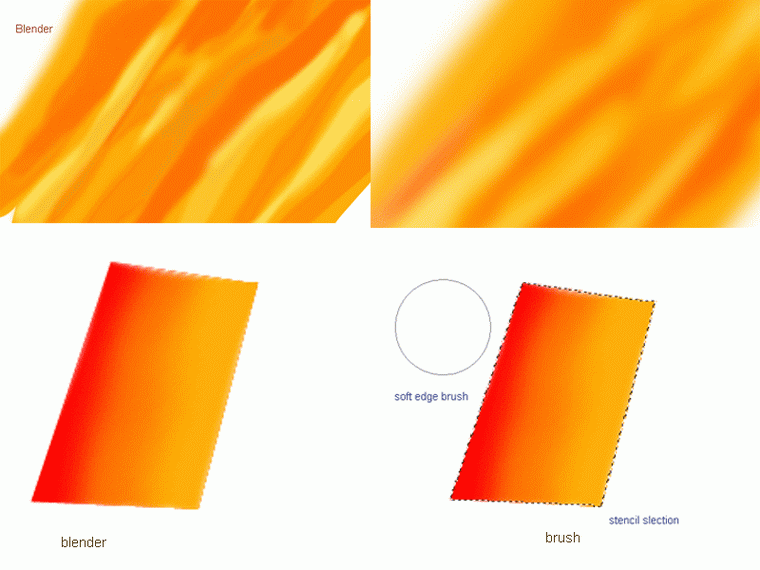
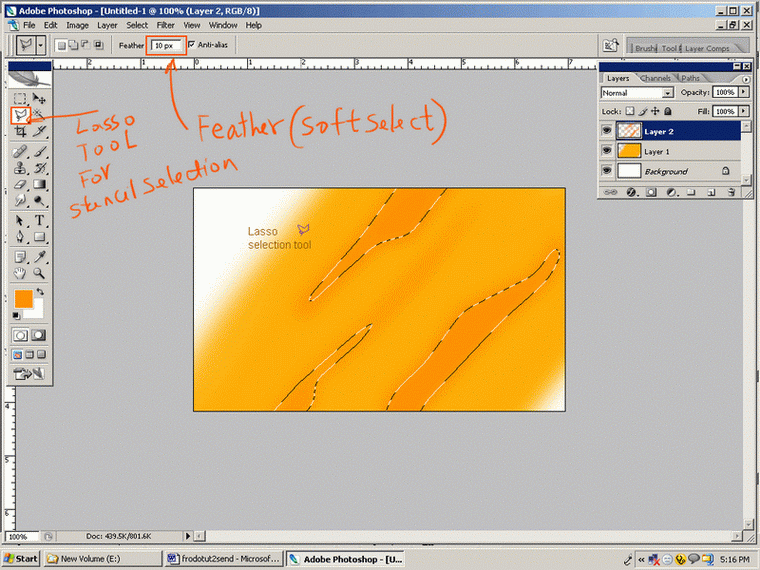
At this stage no details have to be added because here it is important to maintain the tint, tones n shades, details are to be added latter on, so start painting mid tones and start blending colors, well blending are a big issue in digital painting industry. Many artists use blender that is smudge tool or finger tool in Photoshop, but I don’t prefer using it because sometimes it hangs up the system, so I use big soft edged brush or can say a airbrush and often make stencils out of selection tool and give it a feather and paint over, the result is really good.
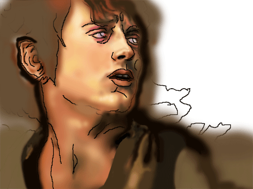
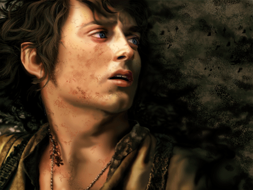
Now slowly we are getting near to what we want, to get the exact feel its very important to understand when light falls on a object how do the surface reacts, every shade of color need different layer and please do not forget to rename your layers because at the end of the painting one ends up adding hundreds of layers and its very difficult to find right layer u want to manipulate.
Now start working on the drapes and the background in the similar way, which is not very detailed in the start, add some basic color tones, use selection tool, smooth edge brush and blender if required and then blend them, I have used dry brush for the background.
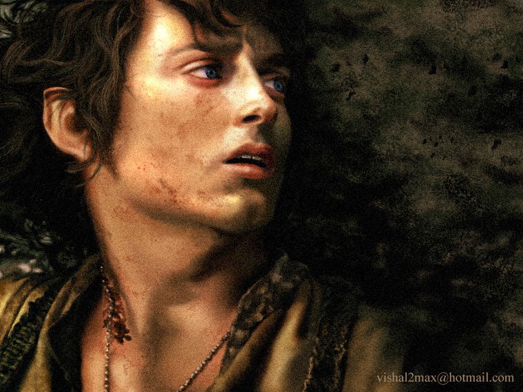
Adding more and more details now with a very fine brush that is 4 to 5 pixel brush , and one thing to remember is to zoom in too 400% – 500% while working on details.
Paint the base color first for hair so that it blends well with the skin tone, if we use directly the dark hair color it would look very hard in contrast to the skin tone that is it won’t blend properly and the hairs would look more like a wig instead of real hairs or may be like a cutout.
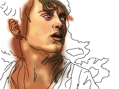
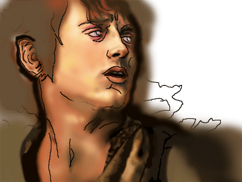
All the face and drape details have been worked out finally and we are nearing to finish the painting.
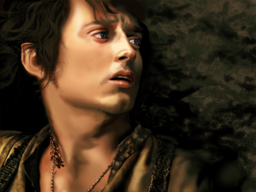
Blend the brown color I used for hairs with the skin color then painted over very dark brown and blend dark brown to the brown base color I used, so that hairs don’t look like a cutout. After that adding some details on hairs, I started painting a every singer hair with 1 pixel brush here and then used several different tones(dark to light) so that hairs look real.
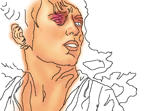
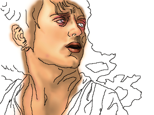
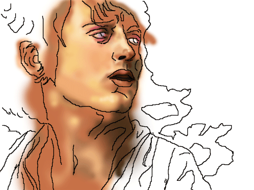
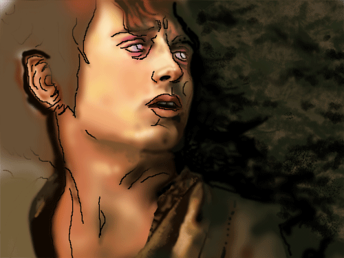
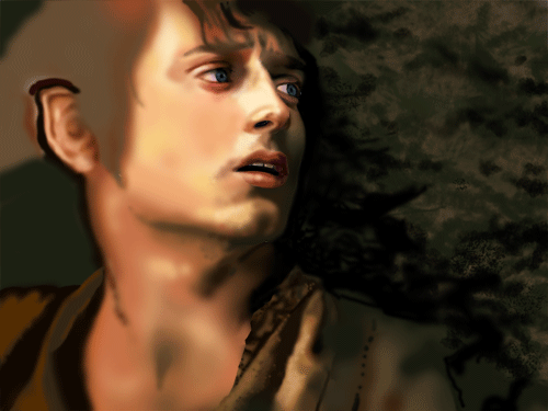
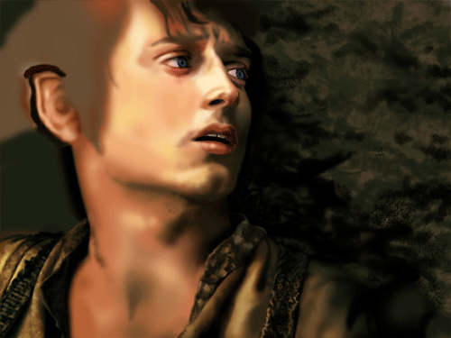
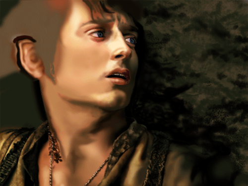
Work in Progress Images in animation
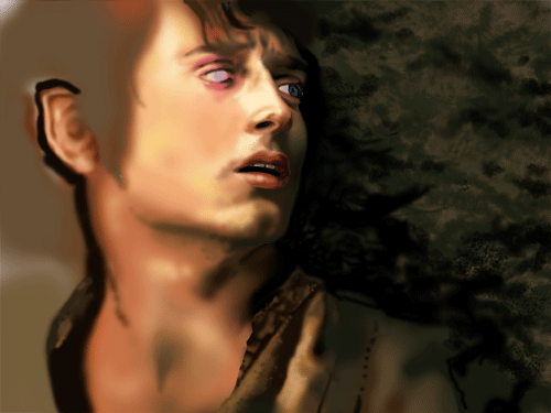
Now we are finished with the final painting, but there is something that is missing…Can you guess what it is???…….. Well the painting looks very smooth it has to look a bit noisyor grainy, So for that we have to save our image as a jpeg first, once you are done with saving go to filters/Noise and add noise that’s it….. You are finished, save your work and post it:) Thank you for reading. Any questions? Mail me vishalpawar@yahoo.com