“Dr Julian’s Texturing Tutorial” by Julian Jeremy Johnson-Mortimer

Hello there, Welcome to my Third tutorial. In This one I will be texturing the head of the character I made in my modeling tutorial.

Now I will be working in Photoshop, I should first say that for a good texture, you need a good UV map with a minimum amount of stretching.

In my last tutorial I went though how I set up my uv’s. Now it’s not very in depth, so i’ll provide a few links to some other uv tutorials.

Chris Kniffen has written a good one for maya users Link.

And here’s a link to a good uv mapping thread on cg talk.

Leigh van der Byl has written a lot of good information on texturing and what different maps are used for. It’s very well written:
Texturing Workshop Part 1
Texturing Workshop Part 2 & 3
Texturing Workshop Part 4
Texturing Workshop Part 5

Ok that’s some useful links for you, now I can make a start.

Here is a picture of the UV Map for my head. which I shall be using as a guide for painting.

I will be working in a texture size of 3000 by 3000.

If your just learning and practicing you do not really need to go this big, a texture size of 1000 by 1000 or 1500 by 1500 will be just fine there’s just no need putting in extra detail when its not needed.

I’m using texture size of 3000 because of one that’s probably the limit of the memory I have for my PC also I plan to do some large renders of the head and 3000 by 3000 should be fine.
Now I’m not really, going to go into great detail of what each map does, please read the above texturing links by Leigh she can explain them far better then i can.

The maps I will be making for my head will be:
Color Map
Bump Map
Spec Map
Reflectivity Map
Transparency Map
Translucence Map
Diffuse Map

Some of these maps I just use as part of my shader, please remember you don’t actually need to make all these maps, this is just what I use.

I will be starting with the bump map because its usually the base for the other maps, now if your have Graphics tablet your probably find adding nice bump details far easier, then using a mouse. I only have a mouse so it’s not so easy painting nice bump details and can take a lot of time, but we’ll make it;-).

Now lets load up photoshop and make a start.

This tutorial is aimed at beginners so the bump map won’t actually involve to much painting.

I’ve thought up a few ways to make it easier to make a bump map, it won’t be the best, but it should be quite easy to make and follow if you have Maya that is.

Lets first load the UV map into photoshop.

I’ve made a gray 50% gray layer, below the uv map layer.


Now i’ve screened the uv map over the gray layer and turned down the opacity.

I should just say you always need good reference for making textures, here is the picture i’m using for reference, i’m not going for a nice clean skin texture, quite the opposit.

Now usually I would start painting the bump details and it can be hard some times to make a start. But for this tutorial I’ll be using some of Maya’s Procedural textures as a base for our bump layer.


So let’s load up maya and experiment with some of maya’s Procedural textures, it’s always good to experiment and try different things.


Now using the IPR Interactive renderer, i’ve played about with different textures and settings looking for different parts of the skin.

I’ve pluged a fractal texture and started playing about with the settings.

I’ve tweaked the settings till I found something that I liked, once I’m happy I converted it to a file texture that I can use in photoshop.

From the menu shown above I first selected the head mesh then shift selected the shader, then select convert to file texture from the menu.


Here’s the options i’ve selected texture size 3000 by 3000 because that’s what i’m using of course and I selected TIFF format to keep all the details.

Once Maya has written the texture image i open it in photoshop and paste into my photoshop file .

Now let’s see what else we can use…

Using a noise texture this time I made loads of spots, once I was happy i’ve converted to file again and put with other layers in photoshop.

Here’s my crazy spot texture opened in photoshop and put with my other layers.

Next i’ve used a brownian texture to make the very fine wrinkles that you might see on the forehead or around the neck. Converted to file texture again.

Now for some pot marks.

The pot mark texture opened in photoshop; we are only actually going to use it in a few places like the nose and around his cheeks, we will erase the rest.
Now I have started to blend the textures together, starting with the first texture, and doing some test renders at the same time to see how its looking. erasing areas of the textures and blending it with my 50% gray layer right at the bottom using soft light, or multiply or overlay.

Now looking at the spot texture, we of course only want some random spots and bumps here and there so I will be erasing most of them.

Now we need to be making lots of test renders while we work on the bump map, there’s only really a few areas of this spot map that I want to keep. I like the big lump that’s above his left eye, i’ll probably try and keep that in.

I’ve started fading out areas of the spot map. You see i’ve tried to keep the lump over his eyebrow.

To blend different bump layers together try using soft light or overlay with opacity just experiment and see what works best.

My spot map with areas faded, poor old guy he’s got loads of spots, but your hardly see them in the final texture.
Now playing around with the fine wrinkle layer its only really useful in a few places.
Now the pot mark layer i’ve used levels adjustment to make the spots darker. then blended them with the other layers.

Now on a new layer i’ve started painting in some wrinkles using a small brush and low opacity.

Now here’s a little tip that can help painting maps a little easier. I render out a simple baked texture, the lighting I used was Dr Emmanuel Campin’s GI Joe lighting dome (Link). if your going to try baking a texture with a lot of lights, it can take a while so do it at night or something when your not using your pc.

I’ve setup the lights selected the object and in the convert texture options selected bake shadows this time.

Here’s the baked texture image, using this in your photoshop file can make Painting easier instead of using the Uv map to paint different layers.

You can actually use some baked textures like this in your maps, its not really any use in a bump map , but can be useful for spec or diffuse map for example.

Here’s my bump map so far, you can see how i’ve blended in the baked texture for now, its makes it easier to paint.
A test render.

I’ve added more layers and more wrinkles the photoshop file can start getting quite big, you could start merging some of the layers to together to reduce size. But its best to keep as many open as possible because there’s always some tweaking to be done later on.

Also in the above picture notice after painting the wrinkles on one side i’ve copied and flipped them over to the other side, saving time.

Here’s the bump map almost finished, its not actually very good, but it will do, it was rather rushed.

You can probably see parts of the different maya texture maps I used, its a quick way of making half decent textures.

It would have been nice to of been able to of used some displacement, it would really suited a head like this.

That’s the bump map kind of finished, I might go back and tweak it some more later. Now its on to the colour map.

Like the bump map it can be hard making a start on the colour map.

Well lets start with just a skin tone its R227 G183 B156 if you can’t see the number.

Then on another layer a slightly darker tone R217 G157 B137.
Next I have diffused the darker skin tone layer then added blur to it, to get a nice variation in the skin texture.
That’s probably the key with skin the variation in the skin tones.
I’ve hidden the first skin tone layer for now and started another and i’m going to start painting some marks and spots. Now a lot of the detail you paint you probably would even see in the final texture but its about building up layers and variation in the skin tones.
In the picture above you can see I have faintly outlined the details of the face, also in instead of spending ages painting every single spot (that would would take forever). Experiment with making your own brushes, just create a new photoshop file maybe 200 by 200 in size and Paint various spots in it, then like in the picture above make it a brush. you should be able to see the menu and what i’ve selected.

Now using different skins tones i’ve darkened and added spots and blemishes here and there, it don’t have to be very neat just building up lot of different tones.

A good thing about painting an old persons texture you don’t have to be so neat and precise, I find the hardest texture to paint is a attractive female face.

Now we have a base of a texture here but I need to deepen the colour a lot more. To do that i use a map like the one below, this is just a simple layer painted in nice dark tones lighter and darker in different areas, if you want to use the picture below I included the high res version just click on the picture for it.

Now using the picture above as the bottom layer I blend the other skin layers on top of it using soft light or multiply this enables me the easy control the darkness of the texture. Because the skin shader I use does tend to fade out my texture some what so I have to make sure their quite dark.

Now here’s the texture blended with the two light skin layers I made.

Marked in red above your see their overlaying the dark texture using soft light and multiply.

Also notice theirs a light skin tone below the dark layer this is if i want the skin lighter I can just tweak the opacity if the dark skin layer.

Your see we still keep lots of the details and marks from the lighter skin layers.

In the picture above I have just darkened the outer areas of the texture using a copy of my dark skin layer and erasing the middle area as you can see marked in red.

Now i’m going to go though all the layers i’ve used, some have hardly no effect but they all add up to a nice varied skin texture I guess.

Right marked in red is layer 28. (if your a organized person by the way you might want to consider about naming and colour coding all your layers ;-) ) but I cant the bothered.

For layer 28 i’ve painted light colour spots using a simple custom brush I made, then i’ve used lighten with opacity at 20% so you can just barely see them. On the right i’ve pasted in a picture of the opacity turned right up so you can see them.

Now a layer of dark spots made again just by using a custom brush. then multiplied.
Next layer lots of random light skin tones then, layer set to lighten at 20% opacity, i’ve lightened the area on the left of course so you can see then.
Next up a reddish tone adding a bit more variation and colour.
Next up, loads more tiny spots, a custom brush again and layer lightened with a very low opacity so you can just barely see them.
Now a layer of small darker spots layer set to multiply.
Sorry, but its another spot layer.
Next up there’s some stubble layers this was made just with a black layer then diffused to make the dots then erased in the areas I did not want them.
I know, lets add some more spots. :-)
More spots. These where painted on top of the spots on my spot bump map layer if you can remember it
On this layer I painted some soft blue tones then multiplied you should be able to see the effect they achieve.

Now a vein layer , your hardly even see these if at all, but it gives the impression of something under the skin. you could pick out one or two that looked the best and copy then on to another layer and make them stronger.

Then use the same vein layer on the bump map using colour dodge to make a slight bump where the vein is.

Now for a few small random veins here and there.
I’ve added some scaring, the characters face is actually meant to be covered in scars but i’ll see how it looks before I add more.
Now you can use some of the bump details on the colour to darken where the wrinkles are, sometimes it can look better if you paint over them with a more reddish colour where the wrinkles are (like the scars) but that takes time, but can look a little better.

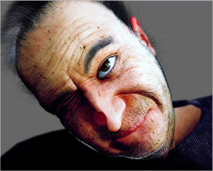
Here’s the sort of finished colour map but you can’t really say finished, things always need tweaking.

Now I can’t provide this full photoshop file because its 400mb big. So i’ve had to reduce it in size and cut it down its now 684 by 1031 18mb in size.

The picture below is what’s left, i’ve also had to compress it with the program winrar, because it’s the best compression program, and I had to get it as small as possible, I have a slow connection and uploading takes for ever. If you can’t use winrar sorry their’s nothing else i can do.

Photoshop File, 18mb

Now before showing some of the other textures I use, I will show you one of my skin shaders and try and explain the connections, below is a map of the connection for my maya 4.0 shader. I have colour coded various parts, it’s basically made up of five different layers.

I’ll start with the Bottom layer which is circled in RED, this layer does not really have that much effect.

But i’ll explain what textures are assigned here.

Marked A is a translucence map click here to see it in more detail. This layer it just to trying to achieve some sub surface scattering effect underneath the main skin layer.

Marked B is a Diffuse map, I find the maya default renderer tends to fade the textures no matter how deep you make them this map is just trying to keep all the areas like the spots and marks as deep and possible trying to keep as much variation in the skin contrasting light areas with nice dark spots.

Right Marked C is a ramp colour node based on the ideas of Dr Steven Stahlberg’s skin shader Link, this is plugged in the the ambient map trying to give a reddish glow coming thought the skin, but you’ll hardly notice it.

Marked D take no real notice of this one it’s just a few different skin tones taken originally from a good shader by Dr Matt Wood link.

The layer that goes above the bottom layer is circled in YELLOW sorry the hyper shade map is laid out a bit awkward i should of arranged them in the right order but did not really have enough time.

Marked A This is the maya skin shader which you can get of the maya web site Link its very good for bringing out the rice skin tones, but does take some tweaking to get the right look.
Marked B is the colour map of course.
Marked C it’s the bump map.
Marked D this is a reflectivity map this brings out some of the nine shiny tones you might want here and there.

Now it may be a bit hard to find but circled in PINK is a transparency map this is used to blend with the bottom layer some areas i want to keep dark as possible other areas i’m happy for the reddish underneath to blend though.

Next up circled in GREEN is a ramp based shade trying to fake some translucence in to skin once, again taken from Dr Stahlberg’s skin shader Link reading his great tut will tell you about it.

Circled in BLUE is a blinn spec layer using a part of Dr Emmanuel Campins back light shader Link giving nice side glancing highlights

Marked A is just the spec map.

Circled in WHITE is the top layer this is just a another spec layer, a phong this time I try to get some nice wet highlights on this layer the skin looks little to dry other wise.

Marked A is a spec map.

Marked B is another translucence map bringing out some more reddish tones around the ears.

And that’s it for the shader description.
For the final part of this tut I will just go though the other maps and how I made them.
Sorry but this tutorial does not include any lighting or rendering tips, that will come in a future tut.
First i’ll have a look at the spec map.

This map just controls the shininess of a shader, I used part if my GI light baked texture Map to help darken a few areas.

Areas like the nose and lips usually have more shine or glossiness to them, areas like the bottom eye lid aswell. Have look at someone and see how shiny and reflective the bottom eyelid can be.

If I want to tweak this map or add colour to it, I usually do that in maya, to achieve a really wet highlight, I might alter the level making darks dark and light areas really bright.
For the spec map I just used what i’ve already painted i’ve just by adding a Hue/Saturation layer to fade out all the colours.
Notice i’ve use most of the layers but left out some of the colour ones.
Next is the reflection map, this is kind of like a spec map is it brings nice colorful highlights in the more reflective parts of the skin. notice the eyelid and lips are the brightest parts to give them a nice reflective shine. this map does not really have that much effect in this shader.
This map is very similar to the spec i’ve just added a few more layers, I used a Colour Balance Layer for the purple tone and painted a few more colour layers on top.
This is my diffuse map, not really to much to say on this, just trying to keep certain spots and marks nice and dark.

Well here’s the translucence map trying trying fake a little sub surface scattering and get some redness around the ears and a little around the nose.

This map is turned down and made darker in maya, noticed i’ve over laid all the spot and bump detail keep them nice and dark.

Well i guess that’s it, I hope you found my little texturing tut usefull.

One final tip (see below) images can always be tweaked and improved if your not happy with them.

That’s it, byeeeeeeeeee!

3DM3.com
Copyright © Julian J & Stryker
Source: http://www.cg-art.i12.com

3D Tutorials & Courses Online at 3DExport

About The Author

You might be interested in

3DExport Buy & Sell 3D Models