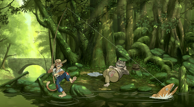
Making of “Cats in the shade”
I started working on this picture, because I missed painting a background, and I felt like doing a nature scene again. .
Introduction
I started working on this picture, because I missed painting a background, and I felt like doing a nature scene again. So I had a very vague idea of drawing 2 runaway characters in a forest, on a happy day, like something that would happen in the first, easy-going part of a movie.
I chose to paint it to look like a still frame of an animation film, not because I think it works especially better as an illustrative style, but because I find the difference of styles (from the background to characters) interesting conceptually and aesthetically. It’s like the painted nature is being inhabited by characters that are alive and moving, and not just integrated and rendered the same way in a still picture. Or at least, that’s my intention in evoking the look of animation cinema.
The whole picture was done in Photoshop, so I’ll be using some terms that refer to functions of that software.
STEP 1: Sketch
I started by collecting references of mossy and sunny forests, from where I could get elements and lighting inspiration for the background. I found all the pictures I needed online. (fig.1)

Then, based on those, I did an overall line sketch of the background.
For the sketch, I started with a white background layer. I created a new layer on top of that, where I did a very loose ugly composition layout of the main elements in the scene (fig.2).

Then I did a hue/saturation adjustment to turn those scribbles into a soft colour (doesn’t really matter which hue you choose, here it’s purple – fig.3), and have more contrast sketching the more refined lines in a new layer on top. (fig.4 and 5 – final line drawing)


STEP 2: Colouring
2.1. Brushes used
This is a list of the brushes I mostly used on this painting, some are picked from a set I downloaded, made by the artist Jaime Jones, and others are default or done by me. However, you can use other brushes and achieve the same results. (fig.6)

1 – A thin round brush, set to black, pressure switched on to opacity and also size, but with a limited minimum size, and a little bit of scattering to make it more organic. I used it for sketching.
2 – A wide, organic-looking brush with an irregular texture of bristles. I used it to block in the initial colours.
3 – A brush with a slight grain texture, I used it for medium-sized blocking and detailing.
4 – The default Photoshop round brush, used a bit everywhere (especially detailing), in all range of opacity.
5 – A very roughly textured brush used for rough surfaces. I used it mostly on painting the moss.
6 – A round brush, with the tip stretched horizontally into a thin ellipse. I used it to shape the water ripples.
7 – A scatter brush with the pre-made shape of a bunch of leaves, very useful to block in foliage.
2.2. Base colouring
When I was satisfied with the sketch, I discarded the scribbles. I like to paint with as few layers as possible, and this one wasn’t going to be of much use from that point on.
I made a new layer under the lines, where I started to apply colour.
The logic I’m using here is a bit the same as if I were using watercolours, from light to dark. I started by blocking in the lighter areas, in the left part of the picture, with the bright yellows and greens. Then I moved on to the deeper greens and darker values on the right side.
I used a brush that simulates bristles, to get an organic-looking underlying texture which will probably be slightly visible in some spots of the final picture (fig.7).

Then I went in and applied an almost black colour on the areas I knew were the darkest in the picture (fig.8).

You have to be careful to keep a good balance between very dark areas and the rest. They make the picture pop, but it’s important not to let them become too heavy.
At this stage, I have a pretty good range for the dominating colours (green) set up, from light to dark. So next, I went on to complete the colour scheme and also started to flesh things out a bit.
I applied the brown on the tree trunks and blended it with the black and the green. I wanted to keep a lot of the green on the trunks, as they’re supposed to be mossy.
For the mossy big roots, I used a lighter green, as I’d seen on a reference photo. However, it’s only a relatively light green, as this whole area is in the shadow, and the lighting effects will come later.
In the far background, I used some very light blue on the part of the sky that we can see. It’s a way of breaking with the yellow/green colour scheme which is a bit overpowering.
(fig.9)

2.3. Detailing
On the next stage, I started working on the water and rocks, as well as the sunlight creeping through the leaves.
For the water the process is simple, I just painted the bottom of the river, with no surface or water effects, except for the fact that it’s dark. Underwater there’s no moss, only bare rocks, dead branches and leaves, and maybe mud. So I only used brown. I painted some very sketchy rocks with brush 3, as you don’t need to see much more, and because later there will be stuff at the surface which will cancel the need for more detail. (fig.10)

For the rocks, I started by painting their darkest parts and shadow. Then I used brush 5 to make the moss. For the moss, and also for the small vegetation that you can see all around, I used a green that is closer to blue, as opposed to the green- yellow of the rest of the picture. This gives the scene a wider tonal range, and a cooler feeling, since we’re portraying the shade. I did the finishing on the rocks using the round brush, so that I could tone down the roughness of the texture. (fig.11)

Then, for the bits of sunlight, I picked colours close to the hues you have in the shadow, but with much higher brightness and saturation.
For example a brown in a shaded tree trunk (which in reality is close to greens range):
(fig.12)

Turns into this in the sunlight(fig.13):

And a shaded green(fig.14):

Becomes:
(fig.15)

I painted some quick strokes on a new layer on top, where I wanted the sun to shine, and then I refined their shape and texture by erasing as needed, to correct their shape and follow the volumes (of the texture on the tree trunks, for example).(fig.16)

Painting the foliage
From looking at the picture steps, it may not be very obvious how to paint the foreground leaves. So here’s a small guide for the process.(fig.17)

First, I draw a branch.
On a layer on top, I use a few strokes from the brush shaped like a bunch of leaves (brush 7), to get the basic shape for the leaves, with a very dark green colour.
Then I lock the opacity for this layer and with a lighter shade of green, I use the same brush on the leaves, to create some variation and volume.
However, as you can see, the shape isn’t perfect, from all the scattering, so I have to fix it by hand. I unlock the transparency, and I use the round brush with high opacity to draw some extra leaves and make give the foliage a more pleasant shape. I also erased the extra bits that are scattered too off the branch.
Although this technique saves lots of work, in the picture in many places leaves are individually drawn.
STEP 3: Top layers – characters and effects
3.1. Water
The background is practically wrapped up by now, so it’s time to move on to the characters and water.
I wanted the water to look like it could be animated, so instead of painting any water effects onto the background, I did it like it had been painted on an animation cell, with a flat transparent colour.
I created a new layer, picked a bright yellow from the far background and with it I painted a flat area where the water would reflect the light from the left part of the image. I shaped it like it had ripples and erased the parts where it would be reflecting objects, like the rocks. Brush 6 (very wide elliptical) is very useful for achieving this rippled shape.Then I turned down the opacity to 25%. (fig.18)

3.2. Characters
In order to draw the characters, I created a temporary white layer over the background, which I made semi-transparent, so I could see what I’m drawing, and I sketched the characters very loosely where they would stand. Then, on yet another layer, I drew the refined character lines.
On a new layer underneath the lines, I started colouring. I used flat 100% opacity colours. I chose relatively dark and de-saturated tones, with a slight tendency towards green (since the light in the scene would be so filtered from all the foliage).
I gave a subtle suggestion of volume by lighting them with slightly brighter tones, also flat.
Then, like on the background I added some spots of light, by using much brighter tones of a hue close to the shaded one, in flat shapes, also.
To unify the characters with the background, I drew a shadow, on a layer underneath the colours. I used 100% black, and then set the opacity to 25%
Finally, I added the water ripples, a flat bright grey/blue on a layer that came on top of the lines, which I cut down the opacity to 45%, and on a layer on top, the fishing line and the splashing water on the fish.(fig.19)

3.3. Finalization
For the final touch, on a layer on top of everything, I used a soft brush with a very bright yellow, to suggest some sun rays coming through the leaves from the top right. I adjusted the opacity to make it subtle, as too much could make it look cheap.
I’ll finish by showing a scheme of the main layers used, so you can refer to it to understand the structure of the painting. Normally, I collapse the layers much more, but here I wanted to keep them separate and clear for the understanding of the process.(fig.20)

I hope the tutorial was helpful. It’s just an insight on the technique I currently for this type of illustration. I hope to improve on it a lot myself!
Happy drawing!


About The Author
You might be interested in