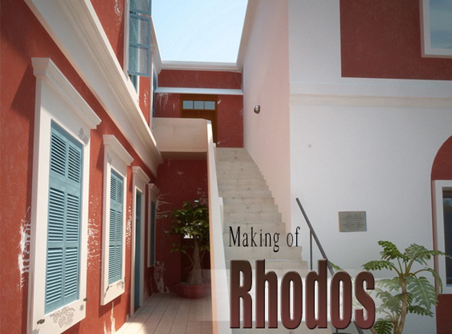
Making of Rhodos
In this making of I will show you my way of working and I will tell you something about the progress and some techniques that I used for the image.
|
Hello to all of you and welcome to my making of Rhodos. In this making of I will show you my way of working and I will tell you something about the progress and some techniques that I used for the image. I created the image with 3dsmax, Vray and photoshop. I hope that it will be useful to you. IntroductionLast summer I was with a friend of mine on a holiday on the island Rhodos, Greece. I was never been there before and I must say, its a beautiful island. Great nature and of course typical Greece architecture. No matter where I am, I am always looking around me to absurd everything I see. Its a non stop progress. Do I see something what I can use for any project at home? |
 |
Modeling
|
 |
| For walls I am always trying to use splines for the modeling techniques. In any case at the beginning. The advantage of this technique in my opinion is the flexibility. You can easily create clean door and window holes. At the end when everything is done you can always convert it to a mesh or poly and at some detail. So I was moving on with the modeling and I started making the window holes |
 |
| Now it was time to setup my camera view. The reason I did this in a early stage had two reasons. The first reason was the fact that I already new where to put my camera. I had taken a photo with the position so it was fine to switch to my camera view during the process to see how it looks. The second reason was the simple fact that I could see what I had to model and what not. Its a pity if you model some cool stuff but you cant see it on the render. |
 |
[pagebreak]

| The most important thing in the scene was the stair. It is an object that is almost centered in the middle of the image. And if you analyze the photo, you will notice that its the most complex object of the image. Every step is unique and has its own texture and unevenness. So I put the most time in the stair. To give it a natural look. One of the most reasons why a picture looks fake is because the render looks too clean. |
 |
| For every step I made a unique modifier stack. I used the noise and wave modifier to create the look I wanted. Its a time killer to do this for every step but it was worth it. After the stair I moved further to the other side. I modeled the windows and door. For these objects I didnt use any special techniques. The top was done with basic poly modeling and the frame was done with the spline technique. The little green laths you see were simple boxes that I rotated. The reason why I use different extreme colors is a personal matter. This way I can see everything clean and for me its organized as well. But what works for me doesnt have to work for you. By the way, if you have a scene with a lot of objects use the layer manager. That way you never lose something and your scene will be organized. |
 |
Lighting
|
 |
Texturing
|
[pagebreak]
| I made the walls with three separate layers. First you have the basic diffuse color. Second there is a reflect color, and last but not least I used a bump map. Now maybe you are wondering why I used a bump map instead of a displace map. Well, of course I was trying to make a realistic scene but there is always a render time issue. So I was looking and trying to find a way that the scene still looks nice but the render time isnt killing me. |
 |
| For the steps of the stair I made again a texture within 3dsmax. I started with a basic diffuse color. Because the light was infected the scene I had to tried different colors until I was satisfied. After that I used the tiles texture from max to accomplish the structure as in the photo. With a basic box UVW mapping I could get close enough to the picture. I decided to paint all of the dirt of the stairs later on in photoshop. |
 |
Rendering
|
 |
Photoshop
|
 |
Closure
|
 |

Related linksEmail: info@emmerdesign.nl Web-site: http://emmerdesign.nl Profile: emmerdesign.3dm3.com/ |


