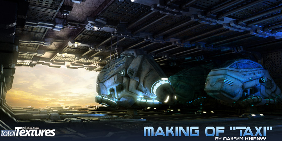
Making Of “Taxi”

First, I started with a sketch of the vehicles. I used paper and pen rather than the computer, as this is what Im used to, but you could ask create something with a tablet in digital format.


I was always fascinated with flying cars, and it was a dream that maybe one day I could pilot a flying car. Since that is far off, I thought I would make a piece of art related to the idea instead.

I wanted to have the piece be inspired by the film “The Fifth Element” but keeping my own style. I wanted the vehicles in the shot to be something that could be used for both Earth and other planets.


First, I started with a sketch of the vehicles. I used paper and pen rather than the computer, as this is what Im used to, but you could ask create something with a tablet in digital format. Luckily, I had a clear mental picture of what I wanted, and only had to refine the environment.


I created a camera with a background of my scanned sketch, and began placing box objects in line. After this, I went into independent cameras, and used simple box modeling for the ships. The ships are actually not that high in poly count, as I wanted detail in the texture and post effects (which also worked well with my not-so-fast computer).

You can see a bit of this low detail in the main model. Usually when modeling, I always start basic, and make details by cutting faces, extruding, and champfering. A little rule I sometimes go by is “Champfer it!” The detail grows and grows as you cut more details into the model, and get more extrusions and champfered edges.


First, was the research phase. I gathered many images from the film “Fifth Element” as well as other inspirational Sci-Fi/Steampunk works. I noticed that all of these works had one thing in common, dirt and grunge! There was much opportunity for this piece, because with the 3D total textures I had many different possibilities, and so I got organized. I seperated the textures by those that were clean and dirty, because I wanted clean bases, with “grungy” layers on top (the vehicles are used heavily, and I wanted to show the life these cars had lived by all of the dirt and grime from their extended use in the texture).

A good starting point is to take a clean texture from the 3D total textures DVD into Photoshop as a base layer, and then place other grunge (dirt maps) on top. Next, I experiment with blending modes set to either “multiply” or “overlay”. Use your best judgement, sometimes adjusting the opacity, or using the “nomral” overlay mode can also work. Remember that “multiply” will exlude white, and “screen” will exlude black, and “overlay” is a bit in between. Because the scene would only be used for a still image, and not for an animation, I really only unwrapped the vehicles.

For everything else I used simple mapping methods like “planar” and “box” in 3D Max, especially on the environment. I also used Vray light material for elektrical engines on the main model, this is one of the tool i ever used, but if you used this material wiht amount more than 20, you must give other material whitch may be will reflect your light material, more subdivision in reflection settings like 16 or 32, so you will have a very good quality of reflection.


I placed one large Vraylight outside for daylight imitation with Intensity at 14.0. Then I placed 10 omni lights to illumiate the vehicles, the intensities and colors ranged from white/gold to blue with intensities of 1-2.

Finally, one blue light for contrast on the right side of the picture with intensity of 4.5. All of the Lights have Subdivision of 8 for testing and 16 for the final image.


For rendering I used Vray. I turned on indirect illumination and set Primary bounces to Irradiance map (with medium settings for test, and high for final image) and then Light Cache for secondary bounces (with subdivision of 200 for test and 500 for final image). With the final settings, it took about 5 hours to render the final resolution of 4000x2000px.


I always work out all of my pictures after rendering, in Photoshop. This is so I can paint out mistakes and play with contrast and color correction. I took a few hours painting in some small details with a 1-3 pixel crisp brush, and adding some blur and shadow adjustments. With your picture, it depends on personal taste, but always have your pre-painted and current image loaded in, so that you can compare, and see what is working best. Oh, and dont forget the background for the image! This can be done easily by saving your rendered image with an alpha (tif or targa file format), and then using that as a selection in Photoshop. Now, place your desired (or painted) image in the lowest layer, and it will only appear through the "hole" in your image (like a window in a room, for example).


I hope this has helped you out, remember to research extensively, and dont be afraid to experiment, and spend extra time in post-production. Many great images do not come just from the 3d package, they are a combination of work from many different mediums, including your concept drawing.

Maksym Khirnyy’s Profile
All artworks by Maksym Khirnyy >>
Talk about this Making of on our Forum >>

This image was created using a few of the hundreds of textures from the Total Texture CDs – very comprehensive texture collections priced with the hobbyist in mind. To see more examples, download free samples and read full details follow this link

3D Tutorials & Courses Online at 3DExport

About The Author

You might be interested in

3DExport Buy & Sell 3D Models