Making of The Sunflower Fountain
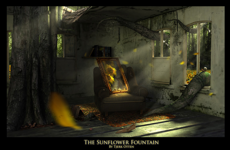
This project started with a simple idea. I wanted to model a water fountain with sunflowers growing on the inside instead of water.
|
The Day It All Started This project started with a simple idea. I wanted to model a water fountain with sunflowers growing on the inside instead of water. I searched the internet for reference pictures of water fountains. Than my eye got caught by some screens of the Unreal 3 Engine. Crazy amazed i was, bud this gave me the inspiration to model my own fountain. Modeling the fountain itself wasn’t the thoughest part on this project. More about that later. The Feeling Of The Fountain When i Made the fountain i felt that the floor that was laying under the fountain should be very real and tough. In Holland we call these stones “Kinderkopjes” which means childrens heads, cause the stones are rounded on the top, just as an human head. A Displacement map that i made in photoshop should create this realistic effect. |
 |
 |
 Click to enlarge |
Modeling The Different Elements Modeling the inside of the room where the painting of the sunflower fountain is wasn’t the hard part of the project. The real challenge was making simple object meshes complex. Making realistic textures and displacement mappings for the individual objects. Creating almost all of my textures by myself nowadays results in having a great library of textures to choose from. You get all the worlds textures to use. And so i did. I’ll talk more technical about the project now. Modeling and texturing the trees. The trees are actualy created with simple cylinders and mesh modifiers. The Basic mesh are cylinders that are bend and welded together. Doing this as long as needed to get the right result. |
 |
|
When the model was finished it was ok, bud untexturized. Using photography for the textures is very important. So i waited till there was enough light outside to take good textures. |
|
|
The Texture Reference i shot was taken from 2 Trees in the forest. The Texture of them was amazing. Really promosing. So i took my fujifilm s5500 5
Modeling The Interior The Texture of the interior was made in a neighbourhood with alot of coffeshops |
 |
 |
Placing the roots and other elements One of the coolest things to make in this project were the tenicles. I wanted them to look more like an octopus tenticle than a real life root growing inside. Some people said the roots were too clean and they went from too big to too small in such a short distance. But hey, thats what i wanted. Its gives more strength to the root. Placing the tree inside the house was just a matter of smart placement. A problem came when i couldn’t place the sunflower fountain in the scene as i wanted. It was too big and didn’t had the strenght that i want to give it. Placing the fountain outside was also not a good thing. I had to think of something else.When i grew up i always making paintings and i still do. Keeping this in my mind i thought. How about i put a painting in a chair, like someone is sitting in a chair. But instead of putting a human in the chair. Put a painting inside the chair as if it was a human by itself. Modeling The window this one had to be realistic too and really fit in the texture of the wall The picture on the left was a satisfying result.
|
|
Modeling The Carpet Next thing was to model the carpet where the chair was going to stand on. This texture i did not made myself, cause i didn’t found the right rug in this area. My Best friends wife is a persian woman , so i had already seen persian carpets and knew what i had to create. So this one i got from the internet and made my own displacement mapping for it. The result again was very strong. |
 |
|
Modeling The Chair and painting The chair you see on your left was actualy a couch. Its the couch that stands in my living room. I bought it for 25 euro 6 years ago. I love this couch and that is why i wanted to make a model of it. The Baroc kind of painting was made with displacement mapping applied to a simple 3D mesh. The picture on the painting is The Sunflower Fountain. The Center piece of this work of art. |
 |
 |
|
Spiderwebs and snail The Spiderwebs were pretty easy cause the alpha of an spiderweb is just white and a little bit grey. So you don’t have to paint out a lot of by yourself. If you copy the layer were the black and white contrast is the greatest you can use that as your alpha and there is your spiderweb. The creation of the snail was pretty hard. I already took a photoshoot of a snail a few months before I started the sunflower fountain, so i could pick textures of the macro photo’s i took and they where great for painting the snail. The displacement map was pretty hard, it was almost always too bumpy, a snail has a very soft bump mapping, bud in the end it was good enough for the scene to use it. I wanted to make the snail very realistic so i could make a angle of him so i could use him in his own individual scene. |
 |
 |
 |
Modeling The Easter Egg This Easter Egg is a Small thing i wanted to put in the back of the scene. Its actualy an ode to all the famous directors. Steven Spielberg, Peter Jackson, James Cameron, Ridley Scott , Francis Ford Coppola and more. They all inspired me and many other artist i think. The textures are taking from my own dvd collection. Also there is a greek scriptures of the bible and a book about achitecture and anatomy that also helped me with many other projects. You don’t know this if you just watch the final plate, but this is good for the depth in the scene. |
 |
|
Making the leafs The leafs are actualy a small thing in the scene, its more of a solution to get rid the flat texture that is laying under the tree under control. Cause there are some leafs that aren’t just flat textured you create realism and depth with this and this is important cause it have to look real for the most part. |
 |
|
Making the Rooftiles A fun thing is that i made this texture twice. I took some texture of a surface i thought that would certainly work. Bud i had to take the texture of the surface of which i was thinking that wasn’t going to work at all and it did the trick. So your instinct isn’t always the best way. Sometimes you just have to try stuff and see what happens, cause new view is always a good thing. Thats why its always good to put things on forums and try to feel and see what other people think without loosing your own art ways. |
 |
|
Finishing the project. So i was working about this for 1,5 months now and i had the feeling if i was going to put even more in this seen that it was going to be to crowded and it wouldn’t work. Bud i thing was missing. There was no movement in the scene, so i thought about my Anchor project and for those of you who know that project too , i used some falling leafes in that project too to break the silence. |
 |
|
FINAL So that was the finishing touch for this one too. Creating some sunflower leafes that flew around in the scene and 1 in front of the camera made it better. There was more depth in the scene. The background plate is actualy a matte of many layers of swamp pictures and a foot layer of a sunflower fountain field. This gace a little bit a flat feeling, but it was ok cause i wanted it to be more focused on the sunflower fountain. And this is what became the sunflower fountain. |
Related links: |
 |


