Making of a Victorian Building
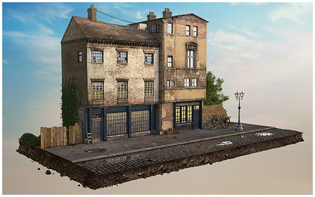
This scene was created in 3ds max, rendered using Vray and then composited in Photoshop and was inspired by my love of victorian architecture.
Introduction
This scene was created in 3ds max, rendered using Vray and then composited in Photoshop and was inspired by my love of victorian architecture. Texturing was key in getting the desired result and if there’s one thing I’ve learned it’s that you must be prepared to hunt down and maybe even pay for good textures! While this was made in 3ds max and rendered with Vray, there’s nothing unusual about how I used either, so this tutorial will work in any similar software.
This piece had 3 main components that made it possible to create:
The modelling techniques
Decent high res building textures from here: cgtextures.com and here: isourcetextures.com.
Research. I spent a long time trying to find as many photos of Victorian England/London as I could. The Roman Polanski version of Oliver Twist was a good source of architecture reference.
It’s very important to source building textures that are nice and straight (not taken at an angle), without noticable directional lighting (they should have a kind of overcast, diffuse lighting) and of a very high resolution so you can see all the pixel detail in your 3d program.
Step 1
I Began by making a flat plane in the top viewport, rotating it 90 degrees so it could be seen in the front viewport. I Then took that plane through the following steps:
Turned it into an editable poly.
Added an edit mesh modifier.* (see explanation below)
I then added a UVW modifier. Make sure the bitmap is correctly proportioned and not stretched.
Next I used the ‘swiftloop’ (within the edit poly modifier) tool with the ‘show end result’ clicked/checked, to slice into the mesh.
* You put an edit mesh modifier between the poly and the UVW modifiers because otherwise, as you push and pull edges around, you’ll see your texture stretch and mess up in your 3d display. Just a random 3dsmax glitch/nuance.
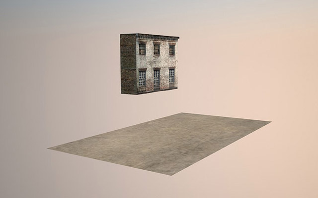
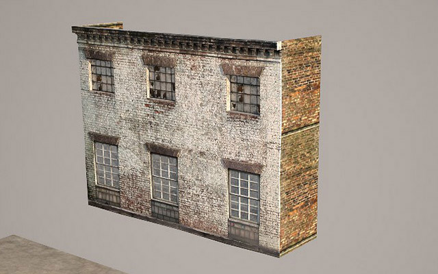
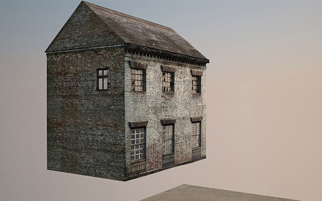
The swiftloop tool is found under the graphite modelling tools in 3ds max (when edge sub-object is selected) and creates horizontal and vertical cuts right around your geometry. Click above, below and either side of a window and you can then push the window back via extrude. You’ll then see something like the above image.
You can then take the far edge of the wall and shift+drag it back to create the side walls. You can either keep it as one object or detach those walls to gain greater control over the UVW maps. Otherwise when you change one face, it will affect the other.
Finally, I also created blocks of geometry and converted them to editable mesh, placing them carefully onto the face of the building before ‘attaching’ them via the edit poly rollout. They then inherit the material of your building face and are selectable as an ‘element’ if you need to grab them and move them later. I did this with the geometry above the windows and the detailing near where the roof will be.
Step 2
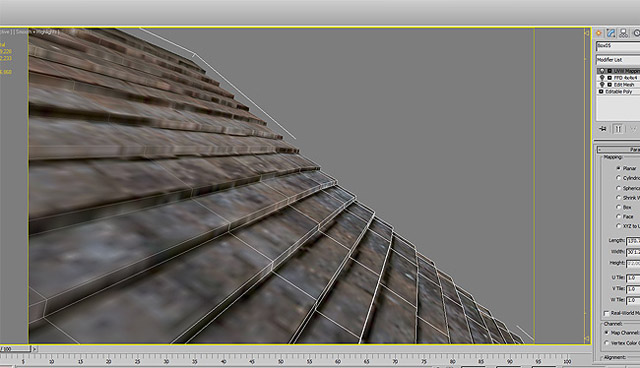
Next up is the roof which is made in pretty much the same way as the building faces. You take a decent high res texture, place it on a plane and cut horizontal lines in it via the swiftloop. If you make two cuts very close together along the lines of the roofing tiles, you can pick one like and drag it up, creating a zig-zag. You can see here in this close-up:
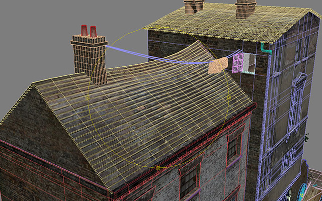
You can then add free form deformation to the roof to create slumps and sags.
Step 3
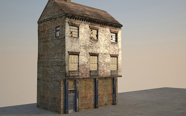
Time to do the ground floor. I didn’t quite use the principle of getting a whole building facia done in one large texture. Instead I built individual components, although the door was from a door texture which did make use of the swiftloop technique. Again, reference is key, without which you just won’t know what to build.
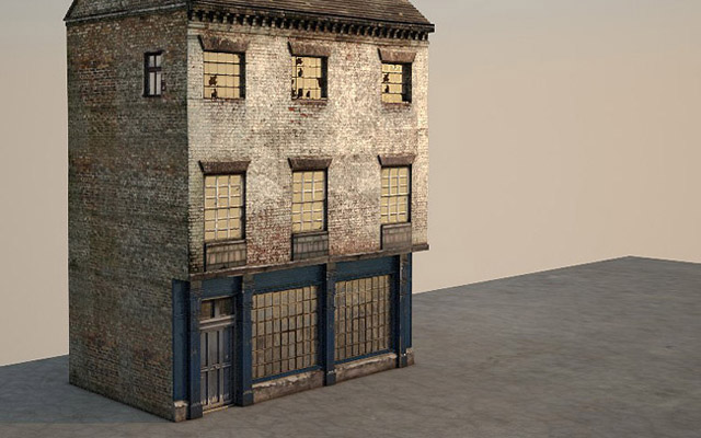
Step 4
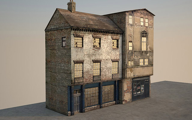
Here’s how to make a whole building using one texture as opposed to splitting it up as per the first building.
It’s basically all down to how good your textures are. Chances are you won’t be able to get a full building, so photoshop must come to the rescue. Below is the basic result once applied:
…and here are the raw textures:
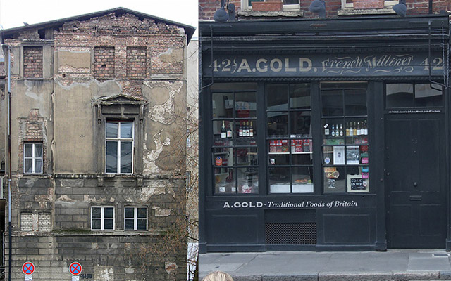
There was a lot of work done here to clean up. I had to remove the tree and attach the shop (from a totally different photograph) in such a way as to make them seem proportional to each other. Here are the finished texture maps:
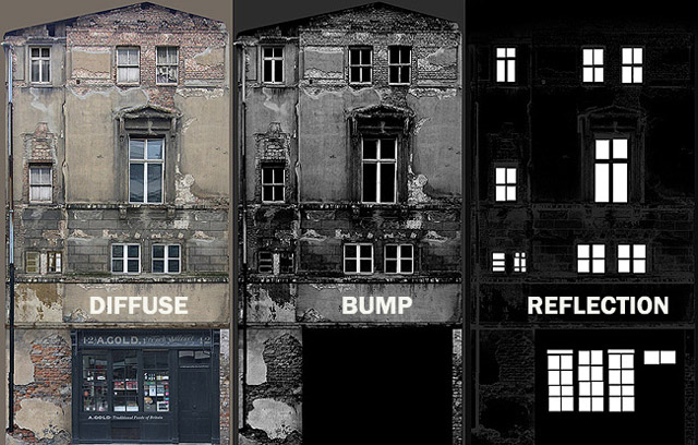
So using the reflection map was key here. White is reflective and black is non-reflective. I was careful to mask out the precise areas I needed the window glass to be and as you can see below, we get shiny reflective windows in all the right places.
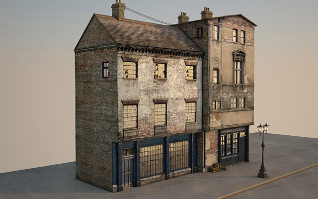
This is how the building looked once the modelling and texturing was pretty much done:
Step 5
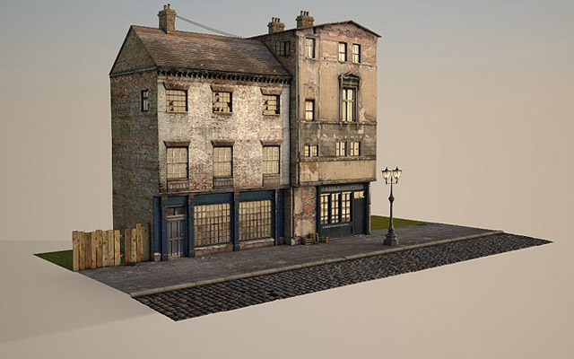
Time to start work on the ground plane. Again, I had to do a lot of hunting to get the texture right. It was a large pavement texture plus a large cobbled street texture (all taken from cgtextures). The corner paving slabs were hand made. Displacemet was key here.
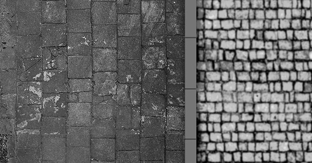
Here is a section of the displacement material I used for the ground plane. There is quite a specific method for creating good displacements – if you need smooth bumps, you need to have smooth displacement. A good method I’ve found is to simplify your bitmap in photoshop using something like posterize or threshold and then add a blur. Remember for straightforward raising/lowering, make very simple, blocky maps (see the long corner slabs below where the pavement meets the cobbled road, I just needed the mid grey to raise and the darker grey mortar to lower). If you use the original texture and just greyscale it, you’ll just get random spikes rather than single, round bricks.
Step 6
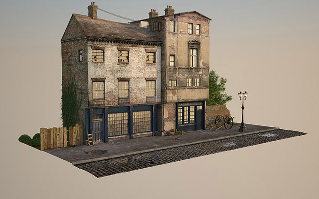
Next came the finishing touches in terms of the geometry and props. I added some peripheral elements so I modelled some victorian bits and pieces which were all pretty straight forward. The victorian lamp, cart wheels and crates were taken from a previous scene I’d made so that saved some modelling. Any time you can grab elements from previous scenes it will save a ton of time.
The foliage was made using Itoo Software’s Forest Pack Lite (which is the free version) as well as Ivy Generator, which is also free. I recommend looking into both of those if your budget is tight to non-existent!
The hanging washing was actually made using 3ds max’s cloth feature. It’s a very useful feature and there are many simple, easy-to-follow video tutorials on youtube etc. on how to make basic geometry fall and fold onto target geometry – in this case, the spline washing lines.
Finally the water plane was placed to give the impression of puddles. This was a flat plane and was slid under the cobbled street/pavement and then I pushed and pulled some vertices around to create dips in the ground plane so the water plane would show through. You have to factor in the displace height on top of the geometric height of the plane and the only way to see that is to render it and tweak as you go.
Step 7
Here is the light set-up. It’s very basic, just a Vray Sun and nothing more. I knew I would create a backdrop in Photoshop, so didn’t bother whith a HDRI background or similar environment map.
The only thing I added was a HDRI reflection map in the Vray Environement > Reflection/refraction environment override so the windows had something to reflect.
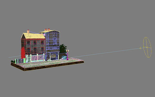
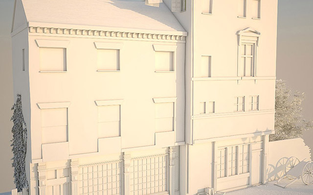
Here’s the basic lighting to give you an idea of how that looks minus the texturing. There’s also some Vray ambient occlusion turned on to bring out the smaller details.
Step 8
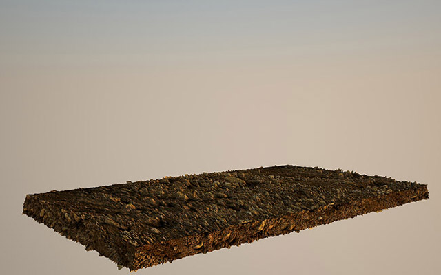
For the base I just made a large block with a soil/earth texture and a thick displacement added. I knew this wouldn’t look 100% in the render and I’d need to let photoshop handle this, so I rendered the two separately.
Final Result
The two elements were brought into photoshop and stacked on top of eachother. I then tweaked here and there to make the block of earth look that bit more realistic as well as adding a sky backdrop. Apart from that there was no other major photoshop work needed.
Next I need to think about making a whole street!
