Tutorial “Using Zbrush, 3DS Max and digital painting techniques”
In this tutorial I show you how I used a combination of Zbrush, 3ds max and Photoshop to create Grayskull Islands….
So, in my last making-of I mention my big concepts taking too long. And this is one of those! To be fair that’s because the completion time did involve learning Zbrush – possibly the most hard-to-learn bit of software I’ve had-to-learn.
It started out with the beginnings of a totally different piece. I realised I need to make an island or cliffs in 3d. Hmm, I thought, I bet Zbrush can do that. At the same time, having just moved house, I did not have internet at all. So I took off in the car and stayed with my folks where I literally DRANK the internet for almost a week, doing nothing but learning Zbrush. And I’m talking, not leaving the house, and sitting at the dinner table with a laptop in front of me, watching video tutorials. Hardcore.
Basics of Zbrush:
So, Zbrush. Sigh. You won’t learn it unless you desire nothing but learning it. At first I fired it up thinking that I could just wing it, nooo-hooo way. This program makes no sense on an intuitive level.
Also, after a week of learning it and making one or two kick ass sculptures, I then was left with the problem of… how do I get this sculpt to look this cool in 3dsmax/Vray? A further week of study revealed… I couldn’t. It couldn’t. The sculpt inside Zbrush will never look as good as in the 3ds max render, and it’s not really supposed to.
You see, Zbrush is designed to have the illusion of a 3d mesh which has millions and millions of polygons… without crashing. But it’s kind of not really full 3d, it’s like 2.5d or something. Using things called ‘pixols’. What I learned is that you have to export a low-poly version of the model and, using displacement maps and normal maps, fake the detail using the material editor in your 3d package.
Example:
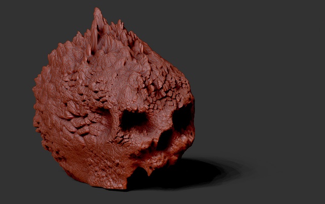
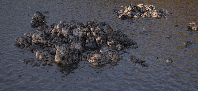
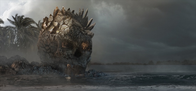
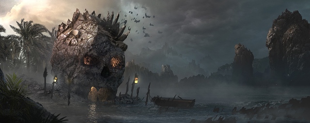
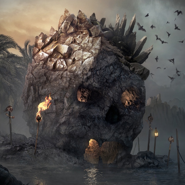
So this is a Zbrush render. Took a few hours to sculpt and I’ve never scultped before or studied skulls that much. Very cool and looks so detailed.
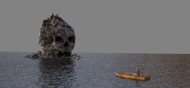
Now… here is what it looks like inside 3ds max using Vray to render. On the left is the raw mesh, on the right is the displaced/normal mapped render :
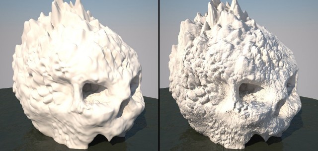
Not nearly as good. Here’s a full 3ds max render with texture maps etc…
So, I realised I was exporting my maps at a size of 2048 and changed that to double and tried again. Maybe then I could get more detail in.
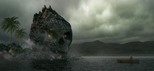
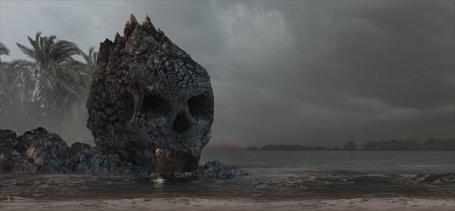
I did this and still wasn’t happy with the result, so figured, hell, I’ll just photoshop the bugger. This is what I got:
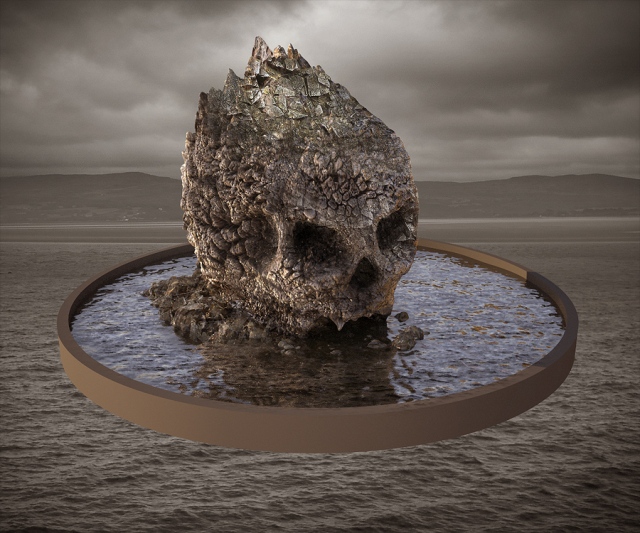
Much much better, right? Photoshop is the lord. And if we’re going to be doing environment stills… eff it, just treat Zbrush, like all other software, as the prelude to the final paint. In this I found great peace, as prior to this understanding I felt like I had wasted a week or two of study and perhaps more importantly, felt that Zbrush just might never live up to the awe I held for it.
Just note that it’s fine for smooth things but not for hyper detailed rock. Maybe in ten years we’ll have that when 3ds max can handle 100m polys easily.
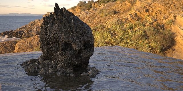
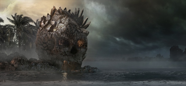
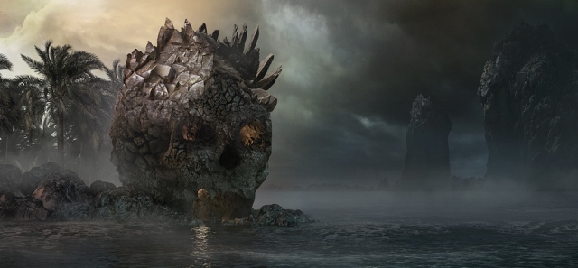
Here’s a test render of the rocks by the way. They too look a little funny but again, they’d be heavily over-painted in Photoshop…
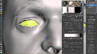
I actually didn’t even bother with displacing my Zbrush sculpts. All it does is bloat them a little. The normal maps are the most important part – as well as the diffuse actually because you can force the eye to see details by painting it in. Finally, ambient occlude and vray dirt map the hell out of all your detailed stuff.
Quick tip – if your vray dirt map isn’t showing up dark enough, play with its scale for a start as this can mean the difference between it being visible and invisible, and also, under the unoccluded slot (usually white) – stick ANOTHER vray dirt map. So it’s like doubling it up!
The 3ds Max part:
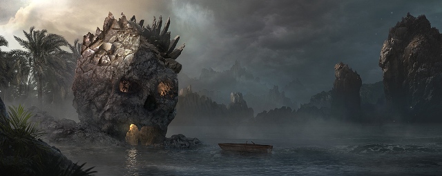
This is a basic render, trying to get good ol’ composition right. I’m not falling at this hurdle, so a no-nonsense approach is taken to ensure the final comp sings somewhat.
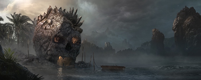
I then start to export to Photoshop for paint-over testing…
I settle on the above as the basic composition. Bit of warm hitting the top of his head as the sun sets, cool blue contrasting in the shadows. Lots of mist.
The 3ds max part was the easiest apart from trying to figure out how to get Zbrush to render nicely inside of it. By the way, much of the forums were useless, they just don’t answer questions from newbies it seems. There were one or two helpful guys though and they helped just point me in the right direction. I was actually posting which ever question I had four times in four different forums, just to maybe get one response – dire.
The Photoshop part:
Ok, so now I knew what I needed from 3ds Max, I did a render that was about 4000px wide. Tip! Don’t render this size when using displacement maps. It was the water that got me (note that I didn’t even use the 3d water anyway, just wanted it for the light reflections). After rendering for about 36 hours I just stopped it, turned off displacement, and rendered the remaining water with just regular noise – took 50 seconds.
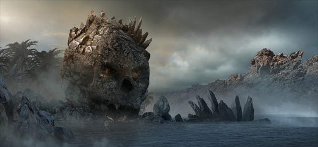
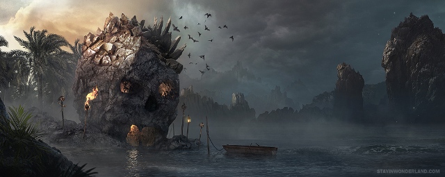
Here are my steps inside Photoshop. Just lots of matte painting here. Oh and the first thing I noticed was that my composition was suffering and I had to make it wider. The skull just felt squashed. Never be afraid to do this.
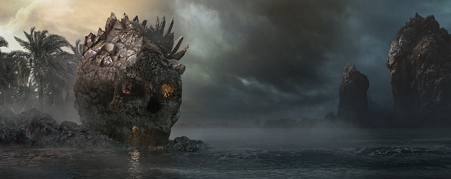
You can see how the new composition really helps the skull – which is our focus, obviously. Also, widescreen shots tend to look nice and cinematic. It’s easy to really show off left to right styles of composition this way.
To make something look like it has a spot of light on it, just duplicate the source image and work separately on each – the dark one make darker, the light one (on top) make lighter (through levels/curves etc.) then just create a mask for the light layer, invert it, and use the contrasting paint shade (black or white, I forget) to let the light version come through in the spots you desire. Standard form of practice that one.
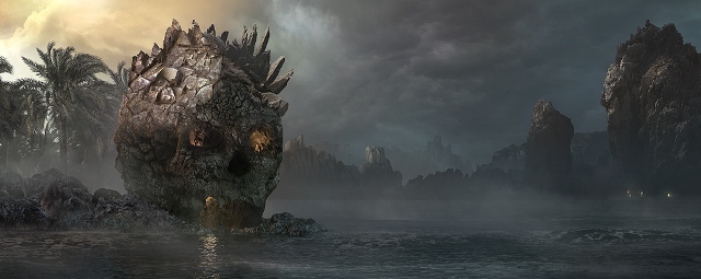
Finishing touches: At this stage I knew that if I just went the extra mile, I could really finish off the painting nice. So I went back into rough/composition mode and scribbled in some objects…
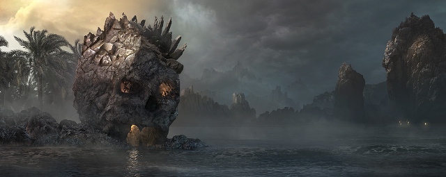
And here are the final steps in re-creating the above…

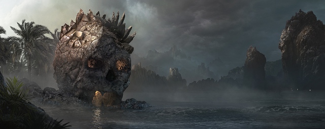
And a close-up treat…
So, hope you enjoyed that. Sorry it was somewhat brief but I’m quite busy at the moment (trying to become a successful artist!).
Overall I was really pleased with the result. I’d carried over the learning from my mistake with the night-time apocalypse scene and made sure that, even though I hadn’t speed-painted this initially, I did spend some time mocking it up in photoshop to ensure the composition worked first.
That said, it’s worth sharing that the piece did not get any special attention when submitted to the various online forums and galleries and that was quite a blow if you consider all that I put into it. This has left me wondering what I could do to improve further as, for me, getting accepted into the heavyweight galleries is a sign that you are worthy of the industry’s standards. I achieved this once with my Victorian painting, but have yet to replicate that success.
Well, as they say, back to the drawing board. Gonna have to be twice as epic next time!

About The Author
You might be interested in