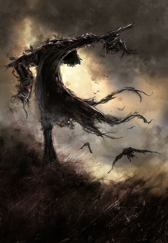
Making of “Dead Wringer”
This tutorial is made for those who have at least a basic knowledge of Photoshop.

Step 1
Pencil sketch scanned in at 300 dpi.

Step 2
I bring in the sketch as a “Multiply“ layer on top of a warm, 50% mid-tone background. On a new layer, I then begin to block-in the basic shapes/values using one of the default large chalk brushes set to a low Opacity (10-15%) and lower Flow (20-25%). I’m trying to just get an overall pleasing silhouette/composition.

Step 3
I duplicate the layer and set it to “Overlay” in order to deepen the silhouette and darken the main shape. Further blocking in, erasing and darkening areas while checking the overall composition. I start working on defining some parts with detail using a smaller version of the same brush but adding a bit of “angle jitter” in the brush settings.

Step 4
On a new layer beneath the scarecrow I use a large, textured brush to add a sky and rough indications of clouds. I don’t get too precise as I know the sky will just be a background to help frame the silhouette of the scarecrow. I keep the top darker in order to keep the eye drawn back down into the frame. I also
add long, thin brush strokes to indicate grass as a foreground element. Again not being too precise with detail as I don’t want the eye to spend too much time there.

Step 5
Duplicating the sky and ground layers and setting those to “Overlay”, I erase and add in dark/light spots to help try and enhance the composition. I also keep adding smaller brush strokes/details into
the scarecrow to help define the raw shapes and keep the eye more interested in it.

Step 6
I use a couple stock photos of some grass textures and place them into the foreground on a “Multiply” layer at low opacity, erasing and adding bits just enough to sell the idea of it being grass. I then use the lasso tool to select and scale parts of the grass up to help add some perspective.

Step 7
I add some contrast to the overall image using a Curves adjustment layer. Using a small round brush with angle jitter, I draw in the crows on a new layer to add some more scale and perspective, keeping them kind of loose and rough to fit with the overall style of the rest of the image.

Step 8
Using a Levels adjustment layer, I darken the image using only the mid-tones slider to give a more
stormier, poor weather feel. I finish a few highlights and detail bits toward the top of the scarecrow so
that it pops a bit more against the now darker sky. Now that I’m okay with the overall values, it’s time to add some color.

Step 9
I fill a new layer with a warm sepia-like tone and set its blending mode to either Color or Hue and move it to the top of the layer stack, lowering the opacity (60-70%). This I use as a sort of base underpainting . Using a rough chalk brush I select subtle color compliments and lightly brush swatches of color around the image, being careful to keep the saturation levels low, as too much color can tend
to be distracting.

Step 10
I combine all the layers and then make some final contrast adjustments using Curves. I then duplicate the image and sharpen it a fair amount using the Unsharp Mask filter. Then using a layer mask,
I brush out the sharpness around the image, leaving mostly the scarecrow and foreground elements in focus. This leaves the background looking a bit more blurred and subdued, which further helps to keep
the eye focused on the scarecrow.


About The Author
You might be interested in