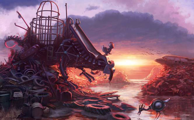
Making of “Junkasaurus at Sunset”
In this tutorial Jim Moore describes the process of “Junkasaurus at Sunset” creation.
Concept
I created this piece a few years ago as part of a competition on an art community site. The theme was simply to create a creature from from everyday objects. I immediately became intrigued with the idea of using playground equipment as my material, but I knew I wanted to give it some context as well-I wanted to create a world for this creature to live in as well. At this point I begin doing rough sketches to figure out the kind of mood I’m looking for.

Along with mood, at this point I’m also trying to figure out the staging of the scene: where should each element go in order to convey the idea I’m trying to achieve? If the camera is on his face, we’ll see his expression, but is his expression more important than his pose? Or his environment? Or even what he might be looking at?
The Reference

Something I’ve picked up from working on projects with tight deadlines is to create reference master sheets with all my photo material on a single document. This way I can easily sample from, refer to, and choose elements from my reference in a single glance. One important thing with these sheets is to try to equalize the sizes for all the material as much as possible, because the natural tendency is to overuse the larger images and ignore the smaller ones. Here you see the sheet for just the playground equipment…this will become my visual language as I construct my beast.
Putting the Scene Together
When creating a scene with a good deal of depth, it’s almost always best to work from farthest from the camera to closest. Here I start in on the clouds using a variety of custom brushes that give me irregular edges that emulate cloud shapes.

For the piles of junk that make up the landscape, A high level of detail is necessary to create a convincing shape. The general forms are defined in the sketching stage, but for detailing, photomaterial can easily be dropped in and integrated. I see a lot of industry work that leans very heavily on photo material and it’s obvious when there’s no foundation of art knowledge to back up all the copy/pasting. For that reason I try not to rely on it too much, but with the realities of deadlines and all, sometimes it’s simply the only way to go. Here I assemble a mish-mash of junky bits, then go over it a bit with a brush to to get it to sit in the scene a little better.

To sum it up, photo material is like underwear: It’s very handy when used properly, but don’t leave it hanging out for people to see.
Details
Bringing the scene to a finished state is a process of refining shapes values and colors that begins all the way back in the sketch stage. It’s often helpful to get away from your work for a bit and come back with fresh eyes…I often find fairly obvious things to fix after taking a break. Here, I’ve caught something I missed earlier: this hill of junk feels a bit too close to the one in the foreground. Using the transform tool, I squish the base of the pile which both causes it to sit further back in space and also conform to the vanishing point.

Here’s an interesting color problem that comes up from time to time. This area falls in what should be a high contrast ( stronger lights and darks) and high saturation ( brighter colors) area due to it’s vicinity to the camera. However, since it’s in a shadow area, it’s not receiving direct light from the primary source ( the setting sun ), but only indirect ambient lighting from the cool dark area of the overhead sky.

Now, as this area recedes from the camera, the objects there lose their local color ( the color of the object ) and pick up more atmospheric color, which is good because you don’t want this block of monochromatic shapes this close to the camera. At the same time, it should also be transisting from dark to light as you go towards the camera due to the bounce light having a greater effect as you get closer.
So this sounds like a lot of things to think about at one time but the answer is actually simple, though counter intuitive: using either your sponge tool or a gradient mask, desaturate the area carefully as it nears the camera. As this area loses the strong blue/purple tones and becomes greyer, it will also gradually pick up the complimentary color-reddish/orangish- due to optical color mixing. With this as a baseline, all you need is a touch of local color in to the object to give it a better sense of light and depth.

Parting Thoughts
I don’t see a lot in tutorials about narrative and I find it’s a thing that’s lacking in the concepting industry. Much of the time it’s enough to just draw a spaceship or a guy in costume, and as a result I think some of us artists in the industry today don’t get to develop our sense of storytelling. I do my best to think story-first when beginning a new concept, because that tends to lead to more interesting results visually as well. In this case I didn’t want to simply concept a crazy monster made of junk, and then some background around him. I wanted to create a specific time and place, and that thought effected every decision from the time of day to the pose of the main character. Hopefully these details help to create a more immersive scene.

I hope this tutorial was helpful. If you liked it let me know and I can try to make time for more in the future. Let me know if you have any questions and I’ll try to give you an answer. Feel free to visit my blog at:
http://jimsdrawingboard.blogspot.com/

About The Author
You might be interested in