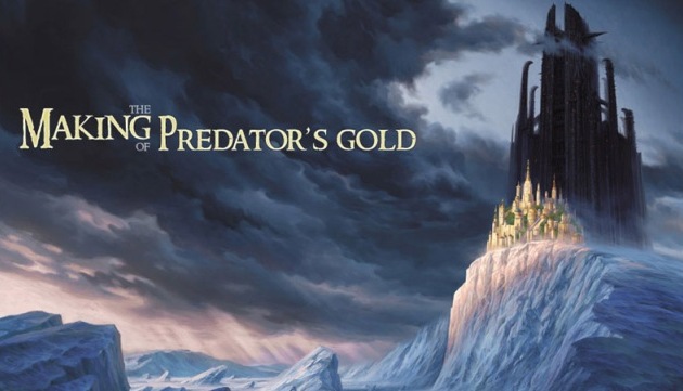
Making of “Predator’s Gold”
This painting was made for the cover of the young adult novel ‘Predator’s Gold.
Introduction
This painting was made for the cover of the young adult novel ‘Predator’s Gold. It Is the second volume in a series of books by Philip Reeve called The Hungry City Chronicles”. It includes both the front and the back of the book, which explains the long format and the composition. I had already painted the cover in oil for the first volume of the series, so I was familiar with the setting: moving giant predator cities evolving in a post-apocalyptic environment. But this time. I wanted to do it in Photoshop. I had used it on and off since 1996 but only a few times for book covers.
This second book was supposed to take place in a desolated, unwelcoming arctic world, with classical archetypes – the predator city symbolizing Darkness and Evil the smaller city symbolizing Hope and Light.With these elements in hand, I had to let it ‘sink in’ for a few days before I came up with the visual concepts.
Concept Sketches
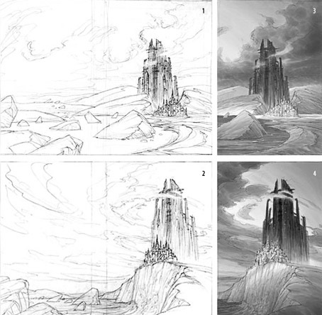
First, I did two rough line sketches (1 & 2) and two value sketches (3 & 4). I always give the art director value sketches, as it indicates the dramatic tone of a scene, wtiile the line work sets the composition and structure. Note how the curves in the sketches all work around each other (both in the sky and the icy landscape to shape the general dynamics of the scene and build a harmonious composition. Originally, I had imagined the bottom of the cliff and the flat part of the landscape to be water, which could have allowed me also to go darker in the color tones, and push the drama of the scene even further. But the art director didnt go for it.
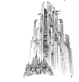
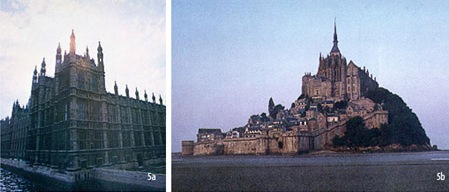
Once one of the sketches was approved, I had to start designing a more precise architecture for the big predator city, and the small one, as well as refining the arctic landscape. Using my knowledge of medieval architecture and numerous reference pictures (5a & 5b), I drew a line sketch of the two structures (5). Later on. I placed this layer on top of the color sketch and set it to Multiply, to use it guide while painting the architectural structure.
Color Sketch
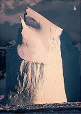
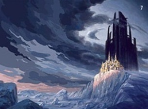
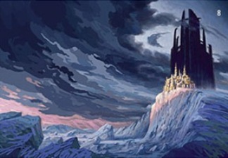
Next, I started to work on the color. I used some reference pictures for the texture and color of ice (6). Then did a first color key (7). After a first pass, I thought something was missing. So, I reworked it (8). I modified the design of the icebergs on the left, added some darker shapes in the sky and light rays in the distance. I also added more subtle ranges of color on the cliff and on the far right, as well as slightly deepened sky areas around the dark tower. The color key of a cover is probably the most important part as it sets the emotional mood of the image and solidifies the basis established by the line and value sketches
Detailing
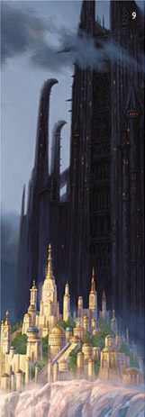
Now the color sketch was ready (or detailing The first detail picture (9 * top half) shows how I tried to bring up warmer tones on the edge of the clouds around the Predator City, to give them a slight translucence. On the Predator itself. I pushed lighter values on the further structures, to increase depth. Detail picture 9 (bottom half) shows a closer look at the
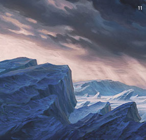
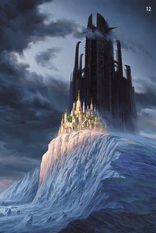
small city. I wanted softer, golden colors on this. I know the greens in the city are a cheat, but it emphasizes the surreal, out of place yet hopeful feeling Picture 11 is a close up of the far left of the painting. where I could go a little looser as it is going to be on the back of book, but still keeping very specific shapes on the clouds and the icebergs Image 12 is actually how the front cover of the book is framed. In conclusion I would say that even though my background was originally classical. I’ve been using Photoshop (and similar programs) for eight years now, and I’m amazed to see that one can still be discovering new tricks about it after all that time. I think that is definitely the beauty of the digital world: you never stop
learning
