Making of “TheMeeting”
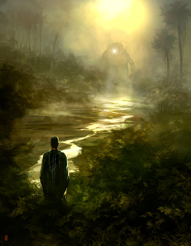
A young man who meets his bot friend…
INTRODUCTION
“THE_MEETING” is a personal work and mostly made for improving my skills and to get a more “illustrational”feeling, compared to my other work. I started this image with no idea what it should be – the only thing I had in mind was that it should have way more details than my other paintings. Well – the goal was set and I made a couple of thumbnail sketches to fnd a interesting idea and composition. Those thumbs are only readable by me – a stroke here and there and that’s all you’ll see. After some sheets of paper later I had the idea of a young man who meets his bot friend. Well time to open up Photoshop.
BRUSHES
I’m still a big fan of customized brushes and shapes. Those brushes give me the option to concentrate – in my opinion – on more important things, such as composition, color balance and values. The use of it also speeds up the entire process. All brushes I used for THE MEETING are shown in FIG. A.
Step 1: BLOCKING IN
Based on my sloppy sketches I started to block in the main colors and shapes by using the “palm” brush and a normal round brush. For the ground I used a huge hard round brush to set the colors and the first “details”! Are made with customized shapes. When you work with customized shapes, Photoshop automatically creates a new layer. With the shapes on the new layer I picked the eraser tool and started to get rid of not necessary areas or parts which have to much details. (Fig. 01)
Step 2: FIRST DETAILS
Kind of happy with the initial blocking and look, I merged all layers together. I created a new layer and started to paint in my foreground elements by using the palm brush in a huge size. The brush modifications are set to scatter, size and opacity, which gives a more random look. The same brush is also used for the palm tree tips. Later on I created a new layer and drew in the shape of a river by using the lasso tool. A pretty simple and effective way to draw different shapes and to get some pretty crisp edges as well. When working with the lasso tool I use a lot my P’n’E technique (paint and erase), which means that I block my base color and erase not relevant areas. This will go forth and back until I’m happy with the look. Later on I used a color balance effect to get a more greenish jungle look. (Fig. 02)
Step 3: MORE DETAILS AND COLOUR VARIATIONS
More details are added to the palm trees and I painted in some single leaves on the bushes by using again a customized brush (shown in Fig. A). I realized that the green was to “green” and I used again the color balance effect to add more yellow to the midtone and highlights as well. (Fig. 03)
Step 4: DETAILS, DETAILS AND A SUN
The colors after the modifications felt way better and so I kept working on the details. By using my customized cloud brush I painted some fog into the background and the lower areas as well. With a yellowish soft round gradient on a new layer I simulated the foggy sun and de?ned my main light source as well. Later on I painted in some huge technical structure with a special made brush. For the little glow effect on the river I used just the burn tool with a soft round brush – set to roundabout 10% (lights). (Fig. 04)
Step 5: THE YOUNG MAN
Pretty happy with the actual look, I started to paint in some basic shapes for the young man. When I start to paint a figure I keep my strokes pretty loose and rough. I basically use a hard round brush for the blocking and erase certain areas to get the shape of a head, the upper body, etc. A bright yellowish tone, which was picked from the river (pipette tool), was used to define the frontal lighting for the guy. The highlights are painted with a small hard round brush, set to opacity and the value blending was done by using the smudge tool. (Fig. 05)
Step 6: REWORKING THE BACKGROUND
After a break I put my hands again on the background. The huge structure in the background, isn’t ? t anymore and so I decided to get rid of it. By picking color form the closest range and a hard round brush I did a quick paint over. I kept some of the “columns” from the structure as palm trees. (Fig. 06)
Step 7: THE BOT
For the bot I used the same technique as described for the young man. Its a simple technique and at the same time a good way to explore things. I’m a big fan of happy accidents. The only thing I had in mind about the bot was the he should have a more bulky shape and feeling. Which will give a nice shape contrast to the more spiky environment and to make him more connected to the roundish shape of the young fellow.(Fig. 07)
Step 8: FINAL TOUCHES
To get a bit more color variety into that image, I created two new layers – both set to soft light. On those two new layers I added a soft round gradient with some pal blue tone. The blueish tone – combined with the overall greenish looks – are responsible for the sort of grey values on the upper right and left corners. In my opinion is really important to have a good understanding for light and especially for color theory. Happy with the actual mood and color variety I got back to the robot. Using a new layer and a hard round brush, I started to define the shape of the robot and added some “technical” details to the bot as well. To connect those two important elements more closely, I painted in a floodlight to the head of the robot. With the rim light on the young dude and the floodlight from the bot you’ll start to connect both elements together. Finally I painted in some bright leaves for a better contrast on the dark areas – just by using my Leaf-brush.(Fig. 08)
CONCLUSION
I hope this making of will give a small insight or at least a glance. I still believe a good understanding of light and colors, values and composition is the key for a successful image. And if you have a good understanding for it – I think the technique will be just the fun you pick to paint.
Thanks for watching this Making Of and I really hope that it will be a bit of help.
Take care


