Making Of ‘Tin Man’
Making Of ‘Tin Man’ by Francois Conradie
Introduction
I have always wanted to do a steampunk project, and the idea of an antique steampunk themed Iron Man type suit seemed very appealing to me. Trying to not make the model too modern and high tech was the challenge, but it was fun to exchange modern technology for a more tin and leather approach.
Since I had the composition of the overall image in my head from the start, I decided to model and texture only what would be seen, so I could focus most of my time on the lighting, composition and overall look of the image.
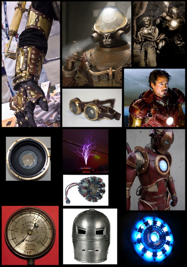
I also knew I wanted to create this image with low-key lighting as it gave the image great depth and made it dramatically interesting. A couple of references I gathered when I started this project can be seen here. (fig01)

Modeling:
I started by using the generic male model of XSI to place the character in the desired pose that I wanted. After the pose was achieved, I tested with some quick spotlights to see what the character’s sillouette would look like. After I found a pose and camera angle I was happy with, I deleted the legs, back, head and all other areas of the body that would not be visible in the render and started modeling on top of this posed stand in body. I put alot of effort into the arm first to get a general look that was detailed enough but that wasn’t too heavy and cluttered with objects. I then moved on to the torso and head of the model and started adding more and more detail to the model as I moved along. I found rendering out a frame now and then to see what modeling was still needed, to be quite useful.
I don’t find it necessary to model a character like this perfectly if the aim of the project is to only be a still image. In the end it was about making a pretty image after all, not an animation. (fig02) I also generated some hair for his arm in XSI.

Lighting:
I have always had an appreciation of low key photography, it is a brilliant way of showing off details in the model that might sometimes get lost, and a low key image always has such a nice ambience to it. So I wanted to create this image in the low-key form. Because of this, lighting was straightforward, but a challenge to get exactly the right amount of lighting and the correct placement of lights.
I used a couple of spotlights, one spotlight was used as a key light and the rest were placed to get the right amount of rim lighting on the edges of this character. (fig03) It was important that he had a nice rim on the edges of his body as this lifted him off of the black background.
In the end I came up with a lighting setup that made my greyscale model look pretty interesting, so I moved on to work on the textures and materials of the model.

Texturing:
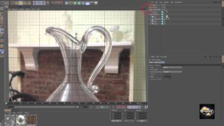
Texturing didn’t take too long, as I had my camera set up already, so I could make it work for that angle and didn’t have to worry too much about perfect uv unwrapping. I used a simple skin shader for the arm and used architectural materials for all my other objects, getting them to look like my references using the lights setup I made, before plugging my damage and scratches textures into the materials’ specular, bump and reflection properties. This helped a great deal as it gave the materials a much more realistic feel. It gave the impression that these objects were not new but that they were worn out. After getting the look of the textures right in Softimage XSI (fig04) , I did a lot more textural detailing and painting over the render passes in Photoshop.

Rendering:
I set up my render passes in XSI, including diffuse, ao, glow mattes, specular mattes and seperates for the gold, the red metal and the reflections so I could adjust these more in Photoshop. (fig05)
I also rendered out my rim lights as seperate passes so I could control how much the character popped out of the dark in Photoshop. (fig06)


Compositing:
After putting all the render passes together in Photoshop (fig07) , I started painting in more detailed glows for the chest and hand of the character. Adding in electrical tesla bolts shooting out of his hand and his chest. I worked on getting his chest piece to glow hot. I painted in smoke trails coming from the pipes on his back as well as smoke coming out of his chest and hand sockets.
I painted reflections of the electrical bolt in his glasses and light spill of the blue glow on the smoke behind him. (fig08)


For the final tweak I added some more blue glows on his body, painted areas around him black to fade him into the darkness and added hue/saturation and curves adjustments. I also adjusted the levels to crunch down the black areas a bit more and added a final photo filter. (fig09)

For detail, I have included a couple of close up renders as well. (fig10) and (fig11)


Thank you for giving me the opportunity to write about the process for making this image and thank you for reading.


