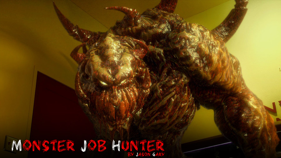
Making of Monster Job Hunter
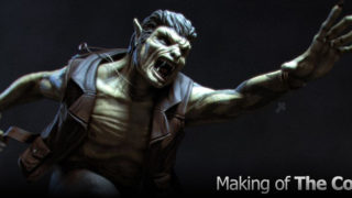
My goal for this ‘making of’ is to give an account of the work I did on ‘Monster Job Hunter’, a short film by Horseback Salad Entertainment. In this comedy/horror film, the main chraracter, Morgan Aquinaldo goes to a job interview that takes a turn for the worse.
|
Copyright 2007 Digital Jackson LLC | jgary@austin.rr.com
For this project, I was hired as a freelance artist to create, animate, render and composite the cg monster into the live action shots. I also ended doing some work modifying background plates when there was not enough practical gore effects or when the set needed to be extended. I did all of the work at my house over a 4 month period and communicated with the director either through phone or email as needed. About once every 2-3 weeks we would meet in person for project meeting. While not getting into specific details about every step, I will instead focus on general workflow decisions and what led me to make them. Having worked almost exclusively in games, I have no film industry experience, but hope to show that it’s possible to do some respectable effects work on your own computer for a short film like this.
|
|
Based on this conversation and using sketches in the animatic for reference, I created some quick, thumbnail sketches to get ideas going and emailed them to him.
After a couple of rounds of quick sketches, followed by feedback, we ended up with a rough creature design that was very animalistic and had a primitive looking face mask.
I made a quick 3d model of the creature’s mask, and sent a rendering to the director.
He liked it, but had changed his mind about the creature’s design and suggested a more human, jock-like monster and sent a sketch showing what he was wanting . We both agreed to go ahead and start production based on his sketch, designing the rest of the body as modeling progressed. |
|
Moving on to the arm, I used a hand from another model to save some time. |
Extruding geometry from the existing hands wrist, I modeled the arm, connected it to the shoulders, and then worked on the torso, also making proportion changes throughout the model as I went.
Next, I modeled the legs, back spikes, and added lower teeth, connecting them and the upper teeth to the body, instead of having them as separate meshes. At this point I had a good clean base mesh that was relatively low poly (5540 triangles without eyes and mask) and was ready to bring it over to Maya for rigging.
|
|
Since there were a limited number of anims for the monster and I would be the one animating, I kept the skeleton and rig very simple. There were some specific animations (i.e. hatching, exploding, etc.) that required the rig to be modified on a per shot basis, but since I was the rigger and animator, it was easy enough to make those rig changes/additions when I got to the animation requiring them.
I used a simplified version of the mesh, segmented into pieces representing each skeleton joint, as my animation selection controls. The spike joints, a later addition to the rig, had only selection handles to use, which, while confusing to look at, were fortunately not needed often, and therefore hidden for most of the anims.
|
|
After getting the weighting and rig set up, I went back to Lightwave and made a pass at modeling armor for the monster. As the character design progressed further in Zbrush, the armor and face mask no longer fit with the creature and were eventually dropped. This turned out to be a big time saver, as having the armor would have caused technical problems on some anims, such as when he expands and explodes. The mask would have also covered his face and restricted facial expression on an already limited performance.
Before exporting the model to Zbrush, I organized the mesh into different parts that would allow me to selectively show/hide these different geometry regions in Zbrush. This helped performance when mesh complexity increased and also made it easier to access hard to reach areas such as the mouth interior.
In Zbrush, I first defined broad muscle regions, working on only one leg and arm, with the intention of using the displacement on both sides. (image below) Next, with the mesh topping out at a maximum subdivision level of 6 (2.8 million polys) I sculpted in the detail, perhaps over doing it and making the creature too busy (easy to do in Zbrush). With the mask/armor gone and the Zbrush detail sculpted, the creature’s design had now deviated from the original sketch, but the director was still happy with progress.
|
 |
|
Now that I had the UV’s, I proceeded to export displacement maps from Zbrush, as well a several cavity maps using different materials. Back in Lightwave, I set up a render scene in Layout, applied the test pose animation data from Maya to my monster mesh, along with the displacement maps from Zbrush. Instead of painting a texture map, I used the various cavity maps I had made in Zbrush, modifying and mixing them using various blend modes, and gradients in Lightwave’s surface editor. On top of this, I added procedural shaders, controlled by weight maps, for a layer of bloody gore. I used the same process to texture the specular, reflection, and bump channels. An indispensable tool during all this texture work was Fprime, a interactive renderer that allowed me to see the surface and lighting changes I made as I worked.
With the first round of texturing complete, I finished setting up the lighting in the scene, and rendered out the test poses with Fprime, followed by some post process work in Photoshop. The director was happy with the results, and until I had live action footage to insert the monster into, there was no reason to continue any further. |
|
In a last minute decision, we decided to try and shoot a HDR lighting dome to use for lighting reference, but did not have a reflective sphere. It was December and stores were stocked with Christmas decorations, so I drove to the nearest store and found a 5 1/2 inch reflective ornament that was only $5 and worked well considering the how little it cost. We mounted it on a lighting stand and I shot several exposures with the dome in the center of the set. Unfortunately, my digital camera was new and I did not have my camera set to full manual, so some of the exposures were incorrect since the camera tried to ‘correct’ them. I still ended up being able to construct a decent angular HDR image dome that was good reference.
After the shoot was finished, I had to wait a few days to get background plates from the director. While waiting, I started working on re-constructing the set room and lighting from the reference pictures I had taken. Even though I did not plan on using the 3d room in any of the final renders, having it helped place the monster, position the lights, and adjust the shadows so they matched the live action reference. It was also used to receive shadows for the shadow pass and as the main reflection source.
Once I received the background plates, I immediately noticed my camera had ‘corrected’ the images I had taken to a cool color scheme and did not match the much warmer background plates. I made the necessary adjustments to the 3d lighting, noticing that the monster’s skin did not look as good with the warmer lighting.
|
|
To make sure I had my shadow’s casting correctly, I matched my camera to a shot that had practical feet, used for some of the live action shoot, and a good reference of shadows casting on the wall. I constructed a simple desk, and moved my monster into place, matching the practical feet, then made adjustments to the lights until my shadows matched the live action image.
Happy with the lighting, I rendered a test animation of the camera rotating around the monster and brought the frames into After Effects to work on post processing blooming effects.
|
|
|
Before starting animation, I modeled some drool, and in Maya, set it up using soft body dynamics. Even though the drool sometimes looked rubbery using soft bodies, it was easy to set up and worked for most of the anims without having to make many adjustments.
The director wanted to enter a five-minute version of the short in a competition, so there were three shots I needed to finish first. The first one I started on was the rising anim, where the monster raises up after hatching from a dead body to reveal what he looks like. I started on the anim, trying to use his arms to cover his face until reaching full height and revealing himself. Covering his face with his arms worked, but seemed a little boring, so came up with having him having some afterbirth membranes attached to his face and arms that would help hide him and make some tension as he tore them off. The membranes would have to be added as a dynamic effect afterwards, so I had to imagine what they might look like, while animating the monster ripping them off. When I had the anim to a good state, I sent a test render done with Fprime to the director, along with a quick sketch, done on one of the frames, to help visualize how the membranes would cover the monster. I had to experiment with different methods before coming up with a solution for the membrane simulation. First, I tried Maya’s soft bodies, but calculation times on the test objects were very slow. Next, I looked at a free physics plug-in for Maya, called Nima. Nima has the ability to dynamically tear a mesh as it’s stretched, and while very cool, I was unable to use it since the tearing changed the meshes point order and then the resulting anim would not export correctly to Lightwave. To my surprise, I ended up using Lightwave’s built in cloth dynamics for the simulation. After modeling a membrane mesh, I then used the ‘sew’ command in the cloth dynamics panel to attach points on the membrane geo to points on the monster’s base mesh. After setting up the cloth dynamic properties for the first membrane, I made the additional membranes for the arm and face, and repeated the steps used to attach the first one. |
 |
 |
|
|
The tearing was accomplished by having the membrane geometry in two halves that were attached together using the ‘sew’ command with ‘cut by event’ set for those points. Using a event collision object, I then animated the event object touching the appropriate points whenever I needed them to separate.
Once the membrane simulation was done, I finished the sequence by animating the back spikes growing and unfolding as the creature rises up into frame. A jiggle deformer was also added to the monster’s geo (courtesy of Hoyt Hindley) to give his skin some dynamic secondary motion. Finally, before rendering, I tweaked the lighting for the shot. Even though I tried using radiosity and my hdr dome in some of the test renders, I ended up lighting the scene with area lights and spotlights to keep render times manageable. The main lighting stayed similar for the remaining shots, with only localized fill lights and specular lights moving around. I used Worley’s G2 Subsurface scattering on the monster, which allowed me to also have specific lights that would only affect the subsurface shading and were moved around on each shot.
The shot was rendered out and composited in After Effects. When completed, I wasn’t happy with the results. The live action lighting for this shot was much brighter than I had expected and shining directly on the monster. The monster’s textures, which had worked much better in the darker test scenes, were not working well in this shot.
I went back and re-worked the monster’s texturing, cleaning up some of the noisiness, giving it more of a wet look, and creating more contrast, especially in the face. I also worked on improving the membranes texturing.
The only passes I rendered for compositing were a wall shadow pass, reflection pass, and a pass that contained the rest. At first, I rendered the background plate into the render and used a alpha channel during compositing to remove it, but for later shots, I stared rendering on black to keep my edges clean. Compositing the first shot took some time, and I used various filters and color correction to get the render to match up, but was worth it, since this last step is what really made the 3d rendering work with the live action footage. The finishing touch for the shot was using some blood burst clips we had purchased, to add some blood splatter when the membrane is ripped off his face and arm.
|
|
The next shot was a roar that happened after the rising shot, with a live action cut separating the two. Same camera angle and lighting, so this one went fast. I added some drool stretching from upper to lower mouth using the same soft body ‘sewing’ method I had used on the arm and face membranes. Some camera shake, when he roared, was added in post.
The hatching, which sequentially appears first in the short, was the final shot I worked on for the 5-minute version. It was originally attempted during the live shoot using practical props, but turned out with less than desirable results, and was added to my list. Thankfully, an alternate version was shot without the practical elements in case it needed to be done in 3d. However, even in the alternate version, the suited body was left in the shot and I had to make sure my 3d model covered this area at all times. This shot required animating the back spikes growing out of the body, reaching down to touch the floor, and then raising the body up off of the ground. The growing spikes were accomplished by a crude but effective method of translating and scaling the spike joints.
The body had a suit that the spikes emerged form, and then slid off as the creature raised up into frame. For this dynamic simulation, I used the Nima plug-in in Maya. As I stated earlier, I was unable to use Nima’s tearing ability, so I built the cloth geometry with tears built in and had the spikes come through the pre-defined holes. Not as interesting or dynamic as I would have liked, but under the time constraints, it was a acceptable solution. To simplify the simulation, I parented spheres to the appropriate joints and used them for collision with the cloth instead of the creature’s mesh. To hold specific areas of the cloth in place, I created some geometry at the desired locations and point constrained certain vertices to these objects.
After exporting the cloth object and animation into Lightwave, I textured it, and then made some lighting tweaks specific for the shot. The finished scene was then rendered and composited in After Effects. Once again, I used some blood splatter clips, in this case, to enhance when the spikes puncture the skin membrane.
|
|
Another enhancement this shot needed was blood added to the walls and a pile of guts to represent the body afterbirth. In Zbrush, I modeled and textured a quick pile of guts, then made a couple of renders using different materials. In Photoshop I composited the guts into the background, followed by painting in the blood on the walls and floor.
When the feet contacted the floor during the walk, I needed to make sure they squished flat. To accomplish this, two lattices were added to each foot that remained at floor level and would deform the geometry once it was inside them. The resulting effect was subtle, but effective, especially when combined with the jiggle deformer on the skin. Completing the anim for both shots, I once again made some tweaks to the lighting to make them work better with the scene. Moving on to rendering, the shadow pass for this scene required a little extra work because the monster’s shadow cast across the guts as he walked into the background. I had to position the 3d guts model into the scene and include it in the shadow pass. During compositing, making the feet feel like they were connecting with the floor made this scene a little extra challenging. For the second shot, I also had to rotoscope the clock out of the original footage and composite it into my scene with the digital feet.
Moving on, I next worked on a sequence of shots where the monster is repeatedly knocked back as he’s shot by a laser gun. There were four shots, but only two camera setups, one from the front and another that was more to the side of the monster. These shot’s were fairly easy to animate, but there were complications because of additional lights. I had to simulate a rotating light from the live action footage that represented a train passing by the window. I also had to set up and animate green lights that would flash on/off when a bullet was supposed to be hitting his skin. I rendered these extra lights as separate passes to give me more control tweaking them in After Effects. I also rendered two separate main passes for these sequences, one without bullet wounds, and one with a texture that had all the bullet wounds visible. In After Effects, I layered the two passes, with the bullets visible pass on bottom, and used animated masks to reveal the bullet wounds at the appropriate time. I did not create any laser bolts for this scene, as they were tasked to be completed by another artist. The monster explosion, which consisted of three separate shots, was the sequence I worked on next. The first two shots in the sequence, where he realizes he’s been shot and reacts, were straightforward to complete. The last shot, when the monster expands, as a result of his wounds, and then explodes, was the shot I had no idea how to accomplish, and was dreading. Before working on the animation, I needed to extend the background plate because it was shot at too low of an angle, and cropped off a good portion of the monster when he was placed in the scene.
After some experimentation trying to figure out how to make the monster’s body swell, I ended up using sculpt deformers in Maya for the majority of the effect. I placed several deformers on his body, then parented them to the appropriate joints so they would move with him. Next, I animated them swelling over the length of the sequence, also applying a free plug-in, called shaker, to make them vibrate as they increased in size.
Over time, as the monster expands, the laser wounds needed to glow and intensify in brightness. I tried to track vertices on the monster’s skin and then use this data on the lights to match the swelling and vibrating surface, but this only partially worked, and I ended up having to do a good bit of manual tracking. I also added some green lights inside his body that affected the subsurface scattering shader. The actual explosion, done in a separate scene, was achieved through a combination of Lightwave’s hard body dynamics for the monster chunks and Realflow for the blood goo. |
[pagebreak]
|
For the hard body simulation, I saved a version of the monster mesh that was frozen in the last frame pose, cut it up into pieces, and enclosed each one. I ran the simulation using wind emitters, set to explosion mode, to get the pieces flying outward. Once I had the hard body work done, I created a liquid mesh in the shape of the monster that would be used for the Realflow simulation. I then handed the scene over to Hoyt Lindley at Horseback Salad so he could do the Realflow work. After Hoyt completed the Realflow simulation, I textured the goo geometry that Realflow had created. A camera shake was added, requiring the background plate to be camera mapped to the 3d room geometry, and the green lights on his body were animated intensifying during the explosion. This shot was a real pain to composite since there were many elements, and two separate renders, one of him swelling, and one of him exploding, that had to be hooked together and made to appear continuous.
The last shot I animated, the monster approaching the desk, was easy compared to some of the others, but was also the longest (about 500 frames) and took some time to render. The biggest hurdle for this scene was getting the monster in frame and close enough to the desk, without getting behind the part of the picture frame where the window light was blooming over it. When compositing this shot, I made a simple mask to allow the monster to appear behind the desk. While the desk does shake as a result of the actor bumping it, it’s not enough that I had to animate the mask. My final task for the project was another practical effects fix, this time for the explosion aftermath plate. Blue goo and slime were thrown on the walls prior to shooting the plate, but it was not enough to convey what the director wanted. In Photoshop, I painted additional guts on the floor and walls, then composited the new background into the footage of the character eating the goo. The director decided to leave the practical feet in this shot instead of replacing them with the digital ones.
|
|
I could start rendering a sequence of frames, watching progress as Fprime saved each pass, and then decide to stop the render when I felt it looked good enough, without having to wait for Fprime to finish. This worked especially well for anims where there was a mix of frames, some with no fast movement and little motion blur, requiring less passes to render, and others with lots of motion blur that required more passes to smooth out. I could start the render, stop it when most of the frames looked good, and then continue rendering the frame range that had more motion blur and needed the extra passes. One more thing I would like to mention is that, if I were to do this project over, I would now start the model in Zbrush instead of Lightwave, especially considering all the great new tools available in Zbrush 3 that make it easier to conceptualize a model from scratch. Overall, this project was a big challenge, and one of those rare creative opportunities that seem few and far between. I spent plenty of late nights completing my work on it, but also had a blast, and hope you enjoyed this ‘making of’ article. On my website, www.digitaljackson3d.com, I have quicktime movies posted for a few of the completed effects shots.
|


 Once I had a rough head and mask done , I made a test render and sent it to the director.


 As a result of keeping the poly count low and vertices well placed, weighting the mesh was easy and fast. Putting the mesh through some test poses, I was able to get reasonably good skin deformations without the use of extra deformers or corrective joint morphs. The only facial blendshapes needed were a roar, angry eyes, and raised lip (for lip twitch).


 The live action was shot with a digital camera, at resolution of 720p, with a black pro mist filter on the lens to give the HD footage a softer, more film-like look. The set was constructed in a old airport hanger at Austin Film Studios. On the days they were shooting scenes involving the monster, I was there to observe, and also take photos of the set and lighting setup for reference.


 I was able to modify the blood and guts elements I had made for the earlier feet plate and use them in this new one. The set did not have a ceiling built, so I had to make something up when extending the shot, as well as build a lighting fixture for the light shining on the back wall. I also added some bullet holes on the walls.
 To give the swelling a more detailed, bubbly look, I imported a swollen version of the monster mesh from Maya into Zbrush, and created a displacement and texture map to use along with the sculpt deformers. These maps were then applied in Lightwave using blend modes, and animated over time, to correspond with the sculpt deformer anim.


