Making of “Scène Française”
Today I’m bringing you the making of “Scene Francaise” that was made with 3DsMax, VRay, ZBrush and Photoshop.
The idea of this scene came to me when I bumped in to some random image on the internet and from that very first moment was charmed by the simplicity and atmosphere that this scene was projecting. The tricky thing in this this scene was the soft lighting that was not created by the SUN. I knew it from the beginning that it might be challenging to recap the same look and feel.
Eventually, the scene was created and the goal was achieved thanks to my friend Karim Cheikh Djavadi, who helped me by supplying the background building and HDRI image for the scene lighting.
Anyways sit back, relax and enjoy the making of “Scene Francaise”.
Modeling
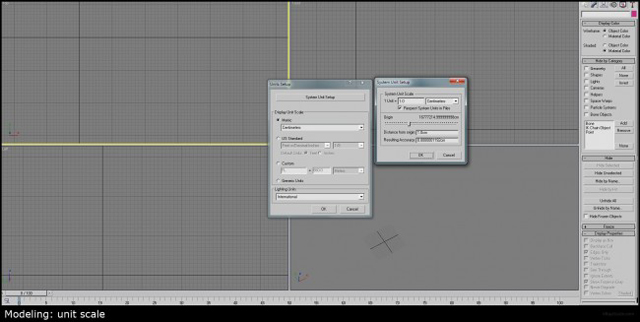
One of the important keys to a proper render is the unit scale and the position of the model in the scene. I’ve seen several times when newbies import architecture plans (DXF/DWG) and without checking its unit scale start to extrude the walls and build objects. Well in my case that was not the issue cos’ I didn’t had any plans to rely on, but I just wanted to make this point clear enough. Just to make sure that your unit scale and your plans dwg/dxf dimensions are coordinated to cm, mm or inches.
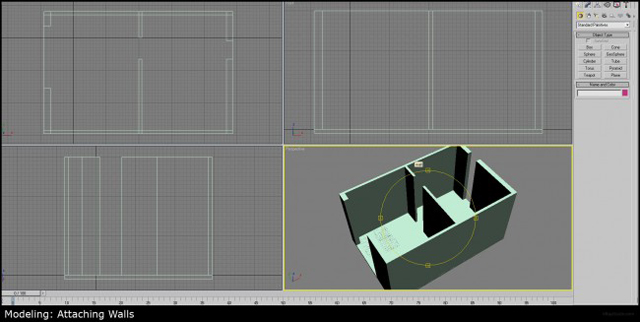
I’ve made wals by using simple box modeling, cymentrical boundaries just to get genral idea for room space.
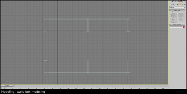
The next step was to attach the floor and create one solid piece that could be easely modified. (You can also make a group and use edit mesh modifier to make this task).
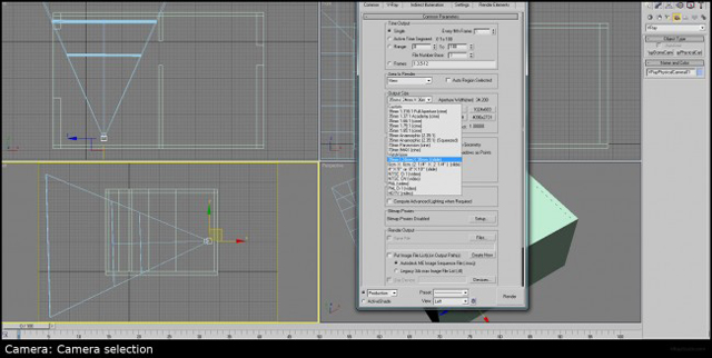
When I’ve completed my basic room space now was the perfect time to select camera ratio to fit my reference image. I used 35mm camera.
Simply by drag and drop in to perspective view, I’ve added my reference image and started to move / modify my room space to better fit the reference. This, however, one of the most hardest tasks, because not only do you need to find the perfect height for your camera and camera target you need also to adjust it’s focal length (lens) to fit the walls, floor and ceiling height. Anyways, don’t be frastrated about this, it can never be perfect, because all photographs have lens distortion, that will curve either the corners of the image or the center, this we simply do not have in 3Dsmax max.
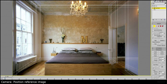
The best way to do this match is to put your geometry in transparent mode. You can do it by clicking Alt+X and making model to be translucent (you’ll be able to see through) or you can adjust object visibility by using right click and modifying this parameter under object properties.
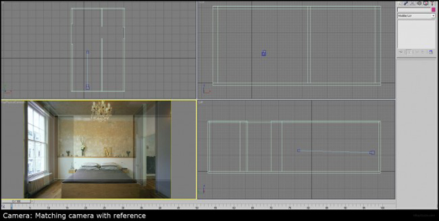
This or the other way; after positioning the camera at a relatively reasonable height according to the reference, I tried to manage it to fit the doors and the openings as close as possible. Then playing with the camera target I finally found the most accurate match.
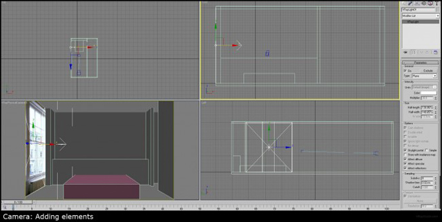
Now, just before I moved to my favorite task, which is adding the lights, I’ve added some basic objects. This actually helped me improve my scene alignment.
Lighting
This lighting rig is always my default setup; VRaySun+VRaySky+VRayPhysCam
Off course every opening gets a rectangular VRayLight with Sky Portal option. (Just so you know, sky portals are not meant to lighten the scene, they are meant to navigate light particles from exterior into interior).
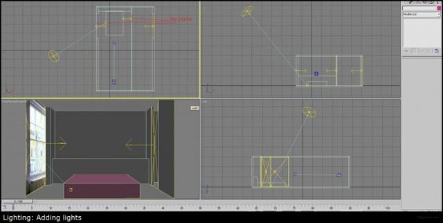
I always use sky portals at the openings, doors and windows. If this is an interior space, I need to define it, in other words, I need to tell particles how to behave. If the opening doesn’t have VRayLight as sky portal, you might get artifacts, simply because particles that will enter the room from the outside will caustically behave and start to bounce without any motivation /direction. Sky portals are meant to direct and define closed spaces, therefore position VRayLights as close as possible to match the opening dimentions.
Camera
Camera configuration and color mapping are two things that always go together. Both of them can control the exposure and overall gamma of the scene. Just because I work with gamma 2.2, and my color mapping is also set to gamma 2.2 (in order to avoid over exposure) I like to set my camera to f/number 4, shutter speed and ISO to 100, white balance to neutral. This is my default state.
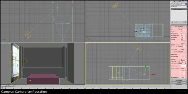
In these days, I mostly use Reinhard as color mapping, but I always like to start from Exponential, it gives me very calm colors in comparison to Reinhard that might supply very saturated results.
Rendering
Ok, so with this default setup, I’ve executed the test render, just to see the direction that I’m going. I know that it’s not exactly what the working pipe-line is suggesting; you are supposed to finish the modeling first and then add all the objects AND only then work your lighting. Simply because lighting will be influenced by the objects and it will different at the end. However, I could not resist the temptation this time, it’s my personal project and I can do whatever I want
Anyways here’s test render.
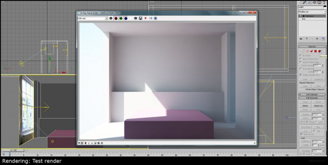
Even though I used really low rending settings and the room had no objects in it, the render came out really smooth and fast.
Let me share with you my “Low_Preset” rendering settings. After setting this up you can save this preset and load it each time you want to do test renders.
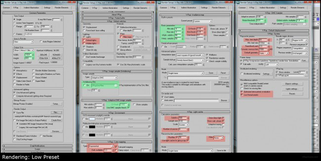
I’m using this “Low_Preset” on the preview mode, when I need to get fast feedbacks/fast results. There is no need to render with high quality during the WIP (Work in Progress).
Modeling Details
Each time while creating 3D images, my task is to get as fast as possible to this stage. Then I can spend more time and give enough attention to details, which in my opinion makes the REAL difference between PRO’s and amateur architecture visualizations.
Edit poly – “M” object: I really like edit poly modifier, you can extrude and bavel by exact numbers and when you done simply press apply. It’s fast and easy way to create basic objects with round corners.
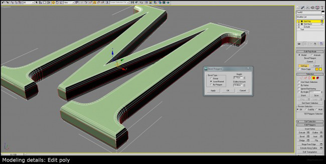
After extruding text (M) I’ve added edit poly modifier and started to round corners with bavel and chamfer.
Auto smooth- Is an excellent way to smooth the faces and polygons with using smooth modifier.
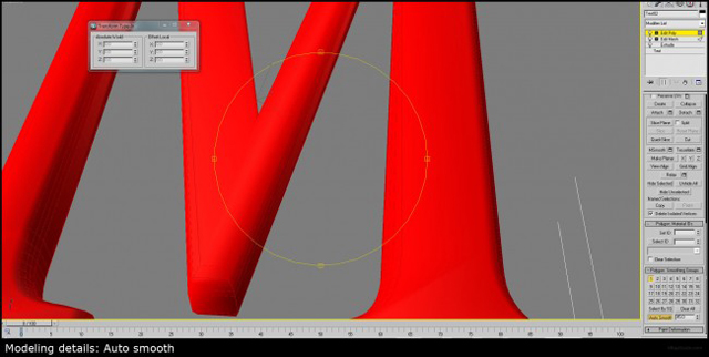
I’ve kept modeling and created the rest of the room by using same modeling methods.
As you can see I didn’t have too many complicated stuff to model in my room, except the pillows and the sheet. For that purpose I used ZBrush. As this is a whole different topic it will be hard to explain everything in this making of.
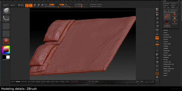
I’m pretty sure I’ll do a separate tutorial about ZBrush modeling tools.
As for now, let’s concentrate on something really interesting and that is textures!
Textures
For the walls and the ceiling I’ve used “bake to texture” option.
It’s pretty easy to use and I’m able to paint exactly the texture in Photoshop. In order to get good looking wall texture I went to www.cgtextures.com and downloaded some hi-res textures that in my opinion would make a perfect wall for my scene.
After playing with different blending modes and combining 6 different textures I finally came to one I really like.
Small touches of Photoshop brushes added realistic looking paint splashes.
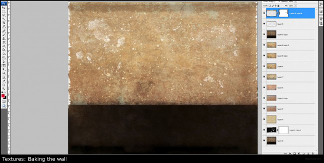
I know that this is only a tip of the iceberg, I have recorded the whole process of baking, painting and creating these textures, you can find the complete series in recorded webinars here.
While finishing that stage I was pretty much done with the textures and the modeling, now what left from me to do is, to pull everything together and do the final tweaking of lights.
After doing several rendering test I’ve decided to remove the VRaySun and I left only with the VRaySky. The result was in the right direction but still VRySky was not strong enough to create soft shadows, the only solution was to use HDRI image to create the same effect that the reference image had.
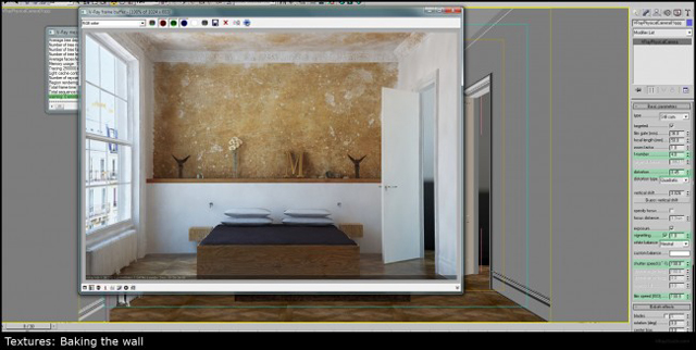
HDRI Lighting
Here I would like to thank Karim, without his help this image could have not been made. He actually tweaked the lighting by switching from Exponential to Reinhard, and added HDRI image with actual model at the background.
Using HDRi images in interiors is not really acceptable way of working. However in our case this was an essential move:
We needed to have soft/indirect lighting.
We needed to avoid having VRaySun exposures.
The lighting had to be strong enough to create soft shadows.
Basically in such cases using HDRi images is the only way to get satisfying results. So it was good enough and I was able to perform final camera and rendering tweaking. Stuff like white balance, changed from white (neutral) to orange and as the result of that ISO jumped to 1450.
Here is the raw render result, it was pretty much satisfying.
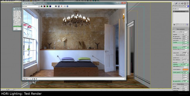
Final Rendser
After adding all the small details and making the final refining, I was able to set the high production rendering preset. Here it is “High_Preset”. Same here, you can save this as preset and load it every time you want to render your high resolution images.
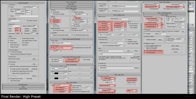
It’s pretty easy to switch from LOW to HIGH, I’ve marked in red parameters that was changed in compare to previous (green) settings.
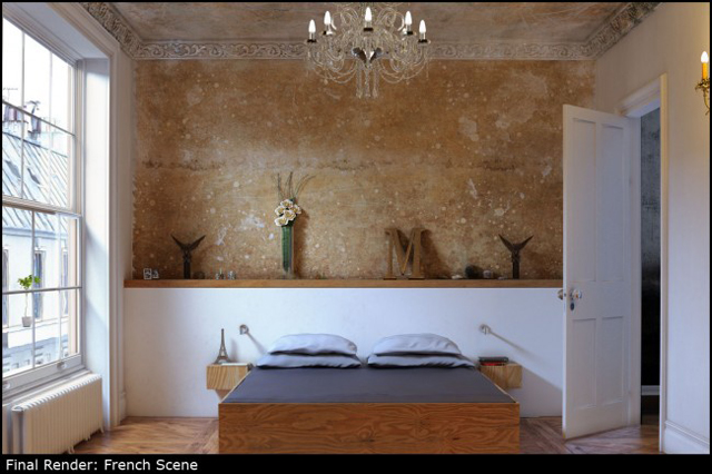
Off course after using my unique technique for combining passes and making color correction the image got a really neat look.
Post production
As you all know I have developed some nice tips and tricks of getting photorealistic results from even really simple images, and it works like charm every time I use them.
As for general color correction I use color procceing method. You can find it in my free tutorials that I’m sharing in these days.
As for natural lighting, I used photoshop Filter->Distort->Diffuse glow, it’s a really nice effect to get natural feeling of light coming from the window. While using this try to keep it under 40% of opacity, otherwise you’re going to get an unrealistic glow.
As for artificial lighting around the shandlier, I just created a new layer and painted the area with orange color, then I swithed layer mode to Overlay and reduced its opacity to get nice warm lighting effect.
This was basicaly it, PTLens plugin was used to get the realistic lens distortion.
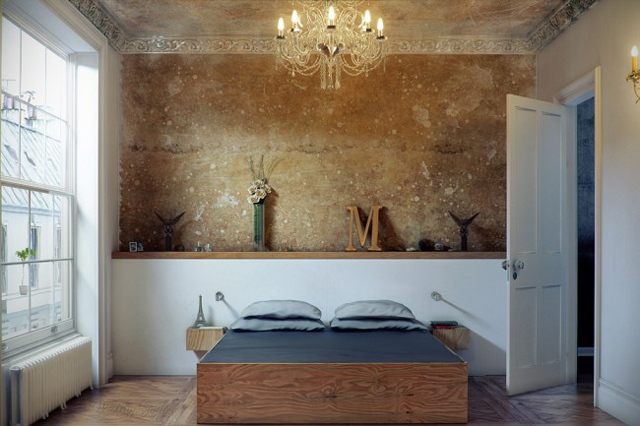
This is what I came up with after doing all what was described above.
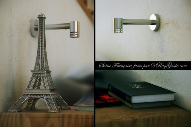
I also did some close ups and used DOF option of the VRayPhysCam, Like a PRO!
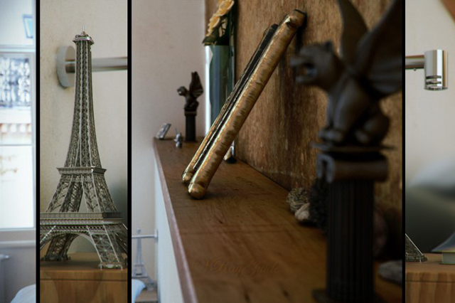
Hope you’ve enjoyed reading this making of “Scene Francaise”, as much as I’m writing it.


