Photoshop Tutorial: How to color a sketch
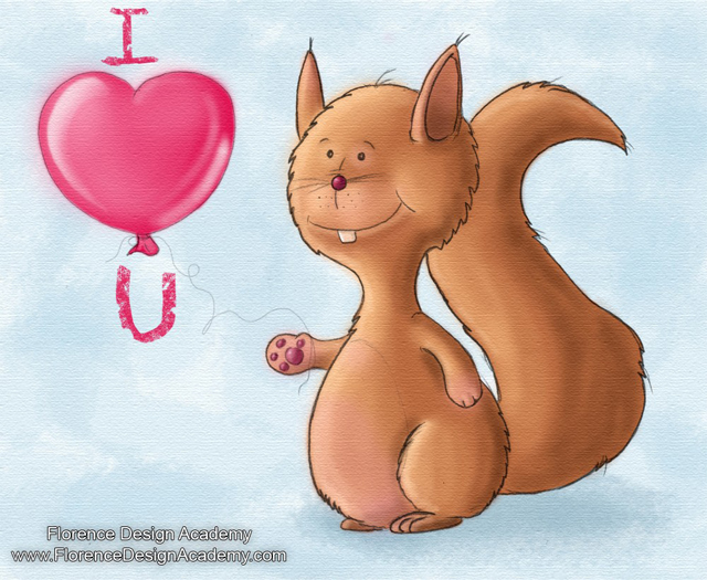
This tutorial of the Florence Design Academy, the leading design school in Europe, will teach you how to color a scanned sketch. In this case it’s the cover of a Valentine card.
For a better quality you should scan with 300 dpi and save the image as BMP. After this step you must open the image in Photoshop and rotate the image like on the image below

Normally scanned images are not perfectly clean, or like in our case the pencil outlines are not dark enough. To change this situation there are several techniques.
Technique 1
Select on the main tool-bar Adjustment and then LEVELS.

Now move the three little sliders until you get the ideal contrast between the outlines and the background
which should be white. Many times you have to use the ERASER tool to clean the image.

Technique 2
Select on the main tool bar Adjustment and then CURVES. It will give a similar effect like the levels.

Try to create in the CURVES window a shape like the letter “S” creating 2 new points like on the image
below. Also in this case probably you have to use the ERASER tool to clean the image.

Technique 3
If you are still not satisfied with the result save your image and open it in ILLUSTRATOR and select it. After the selection click on the main tool bar on LIVE TRACE and use the sliders THRESHOLD and MIN AREA. You will get a cleaner shape. Now you must save the image as BMP and open it again in Photoshop. I prefer ONLY the Photoshop option since it looks more natural, but this is a personal choice.

After you have cleaned the image we have to use the LAYERS ( press F7 ). Make a right mouse button click on the “background” layer and choose LAYER FROM BACKGROUND. After this step select MULTIPLY. Why did we do this step? In this way the white part of the image will become transparent . If you create a new layer below and you color it, the color will be visible also on the Squirrel image since everything what was white before now is transparent. You will understand better this concept if you follow the next steps.
TIP:
If your outlines are still too bright or not very visible you can copy the layer and multiply also the copy.
If the outlines are too rough ( this happens often if you use a soft pencil ) you can blur them with the MEDIAN tool. You can find it under on the main tool bar in FILTER , Noise ! Try it, it gives interesting results.

Create a new layer. IMPORTANT : EVERY NEW LAYER must be UNDER the original MULTIPLIED layer ! THIS is very important ! Otherwise you will cover the outline of your scanned image. Just press on the small con like on the image below to create a new layer.

But now let’s talk a bit about the brushes:
To simulate natural brush strokes you can use an irregular brush (not perfectly round and rough) and lower the opacity amount of the brush. This will allow you to go over a stroke more times and darken it more and more. In the image below you can see that on “a” I made 2 brush strokes, and on “b” 3 brush strokes. Additionally I am using a “DUAL Brush” which combines the properties of 2 different brushes. This gives you a more natural feeling of a brush stroke. In “c” you can notice that the stroke fades out with a smaller stroke size. This effect is given by the option “shape dynamics” Size Jitter “pen pressure” like on the image below. The brush size will change if you press more with the pen on your tablet. This will work if you are using a WACOM graphic tablet ( I have a Wacom Baboo Fun which is really great ).
In “d” you have the watercolor effect if you enable “wet edges” ( I did NOT use it on the squirrel, but in many cases it is giving interesting effects). There are many many more options for the brush setup, but for this basic tutorial the information above should be enough.

Now go to select the new layer UNDER the original and color the squirrel and heart with the main color. Don’t use too dark or bright colors,it should be a medium value since later we have to create new layers for shadows, highlights and one for reflections or other effects. Don’t color them all on only one layer. To have more layers for each effect will give you more freedom in adjusting later each effect individually. The mask tools ( marked in blue below ) can be helpful to isolate the areas to color. But I prefer NOT to use them to have again a more natural look like watercolors which are never perfect.

Create a new layer on the top of the previous one, but remember to leave it always UNDER the original as I told you at the beginning of the tutorial. Choose a brighter color and begin to paint the highlights. Try to use a low opacity value ( like 20 for example ). It’s easier if you imagine that the light is coming from one of the corners of your canvas (for example the top left corner, like sunlight ).

Now create again a new layer on the top of the highlights-layer and add the shadows to the squirrel. On the heart I did not add shadows but reflections to create a glossy effect. If you like reflections which are sharp on one side and out fading on the other side (like a gradient) crate a mask with the shape of the reflection and color it with a soft brush only on the edge of one side.

Create again a new layer and with a low opacity color the blue marked areas with a pink color. Of course you can add any other effect … these are just samples.

Now create another layer. It will be the one of the blue background. Move it down , it must be the LAST layer. I have used a much more bigger brush, again irregular and with a low opacity. This will give a “water color” style to your artwork. Don’t forget to add a darker shadow where the squirrel is standing.

If you like to add an effect to all layers I recommend to flatten the image. This will “fuse” all layers to only
ONE layer !

To give the impression that you are painting on a canvas you can go to add this effect choosing FILTER and then Texture and TEXTURIZER.

If you choose CAVAS you will get a nice canvas effect. There you can change the size and depth effect.


I hope you have enjoyed this tutorial.
Best Regards


