Digital Painting: Catch of the Day
This tutorial is partly a development of my knowledge with Painter IX program, hence this is still amatuer level. Hopefully, you can get some pointers here. Anyway read on to see how this piece is done using Painter IX with Wacom tablet.
I scanned this drawing in Photoshop in original blue pencil sketch then I clean it up to prepare for painting. Still under Photoshop, I double clicked the background layer to convert it to a new editable layer and set the mode to multiply. I then added a new layer and bring it down below the sketch layer. I do this to preserve the sketch and paint on the next layer below it. I press ctrl + shift + U to desaturate the sketch and giving me black and white drawing.
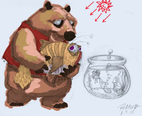
Below image are then imported to Painter. Things to remember before doing any thing (refer to red numbers on the sketch)
- 1. Always check the layer, must paint on the layer below the top layer where the sketch is to preserve it.
- 2. Pick brush style to use for painting, it can vary whenever you please, for this painting I used Oil – Bristle Oil 30.
- 3. Specify the features you may need, in this painting my brush size, opacity and feature always varies depending on the effects I want to achieve.
- 4. I constantly check my outline just to guide me along the way while I paint the drawing and hide it while working.
- 5. For this piece I picked some earth tone colors for my palette.


I start by filling the sketch with colors I want to use. I don’t bother even if I stray out of the drawings; this is not fill in the coloring book after all. (refer to red numbers on the sketch below).
- 1. Preserved layer where my sketch is in Multiply mode so I can still view the painting on the next layer below. Typically I locked this layer so I don’t accidentally paint on it.
- 2. This layer is where I really paint.
- 3. Bottom layer — where I fill it temporarily with dirty white and later on I will paint over this with background.
- 4. My color palette is always on so I can pick colors quickly.

After filling it with solid colors I decided to place imaginary light on the upper right (see the red sun sketch below). Knowing where the light is I then painted some highlights on places where I assume light will hit and shadows where I assume it will lie.
Knowing the direction of my painting, here is where the real fun begins. As I previously mention the specification of the brushes is always important, it will give nice desired effects. In this painting I used normal brush size or you can press open bracket ([] to decrease brush size and close bracket ()) to increase the size (refer to number 3 on the sketch) to change the brush size. I always vary the opacity depending on what kind of surface or materials I wanted to achieve, here I normally use from 10% – 20 % opacity (refer to number 2 on the sketch). You can hit any number too and it will change the opacity by decimals. For this painting I wanted a hairy bear-like animal so I increased the feature to 2.7 or higher (refer to number 1 on the sketch). What it does is it gives you a dry or hard bristle brush, the lower the value the softer and finer the brush is.
In every drawing or painting I do I always start with the eyes. If I get the right feel it will set me in the right mood to continue, here is no exeption.

Below is the succession of head painting. The shadows and highlights have to fall on surface but still keeping the hair like texture. I apply brush strokes with varying low opacity to give me much more desirable effect. I started from highlights to dark shades but can also work backward from dark shades to highlights. (Click each image to enlarge)


In order for me to get consistency in painting the characters I have to render each by the surface. First I paint all the hairy parts — the head, arms and lower body then followed by the dress and so on.

I often unhide the layer where the sketch is to see if I am not straying too much from the basic concept.

See below image on how I progressed and constantly reshape the belly to give him more weight in the front. Shape and volume are always defined by where we place the highlight and shade so always bear in mind where light comes from and where the shadows will fall.


Common fish has darker top and lighter bottom. With that in mind I started painting brown on top with yellow ochre in the mid-section and dirty white in the bottom. And painted the large bulging eyes yellow and eye bugs dark brown.


One of the satisfying things while painting is detailing. Adding small detail completes the entire painting. As per my sketch I did a tiger stripes on the fish. I dabbed the brush gently on the canvas with low opacity of 10% until I get on the tip of the stripes with low pressure. I added some scales on the fish and specular highlight so it look as if wet. Finally, I added the razor teeth to give it a little ferocious look but the contrasting eyes still retains a touch of gentleness.

With the fins added it’s almost done.


I finished off the first part of the painting with details on the tail and antenae. Soft shadow enhances the depth of the image and knowing where to put it will increase the paintings believability.

Second phase of the painting is the fish bowl. Originally I had a small bowl placed on the floor with small gold fish but I think it’s just more humorous to have a large bowl with the small frightened gold fish inside and it’ll just fit the title– catch of the day. Hence below is a modification from the concept. I used light blue for the bowl and dark marine blue for the glass. The image below is quick color dabbing so I know just where to place the refraction of the glass, gloss, gold fish and other accents.

Once every color is in place I made detailing. To capture the sketch, I paint \ the little gold fish really looking worried and frightened.

Below is the close-up view of the gold fish. I did a very light coloring on the tail and fins to make it a little translucent.

After finishing the gold fish I followed by placing some gloss highlights and some hint of refraction on the glass bowl. I added some solid brown in the bottom to make several pebbles and some aqua to give feeling of murky water below.

I detailed the pebbles and added some green aquatic plant to finish rendering of the glass bowl. I added a final touch of specular gloss on top of the plant, gold fish and pebbles to make the impression that it’s inside the glass.

What is an aquarium without bubbles?


To finish the painting, the last thing I did was to create another layer and placed it on the extreme bottom of the stacked layers. Then I played around painting the wall and ground. I need to make the wall color almost the same color as the water on the fish bowl in order to have seamless image. Finally the shadows are added to characters and bowl. Since bowl and water is a transparent object it cast the same color as the liquid or transparent container and gives off caustics when lit by light. Click image to view final painting.
If in anyways you learn from this tutorial please visit my sponsors so I can still continue this site and all it’s contents! Thank you!
Cheers!


About The Author
You might be interested in