King Dodongo Tutorial
Here’s the process I went through during the creation of ‘King Dodongo’, from the Legend of Zelda: Ocarina of Time. If you have any questions after reading through everything, don’t hesitate to ask!
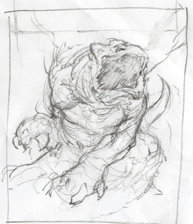
I usually like to start off an illustration in my sketchbook, sketching out thumbnails, compositions, design details, even writing a bunch of words down. Just trying to come up with an idea that looks cool. To the left is the composition I chose. It’s super rough, but you can see it’s influence throughout the final image.
I don’t bother bringing the sketch into photoshop. Instead I just restart it, using the pencil sketch as reference. I block in the big shapes with a hard brush and eraser, no opacity or flow control. There’s no need for that at this point.

Then, beginning directly in color, I start to block in the basic color scheme and shapes with a soft round brush. I find when I start in black and white, contrary to what I thought, it’s often much harder to get my values right in the end.
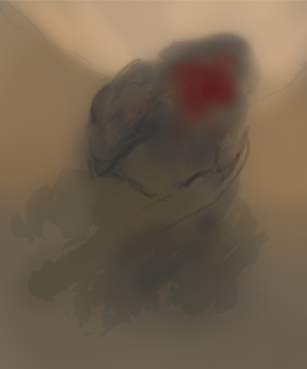
Going over top of the soft shapes with a harder brush now. Opacity and flow jitter set to pen pressure, and there’s a bit of dual brush texture in there. Sketching in the basic anatomy and structure, and tryin to determine the pose a little more.
I decided I didn’t have nearly the value range that I wanted, so I went over the sketch with a color dodge and a color burn layer. Even with all the disdain these layer modes might get from other ‘pros’, I find them very useful at times. Just don’t go crazy with them, it’s easy to get carried away.
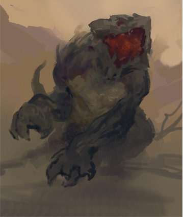
I continue to refine the sketch further, switching between brushes with a square shape and a round shape, just for some variation. I’ve also figured out the rest of the pose for his legs, after like two hours of turning layers on and off. Spent wayyy too long debating it. Sometimes it’s best to just make the decision and move on. I’m also determining some focal areas now, such as along the forearm, the mouth, and around the eye.
This is where the illustration begins to take off. I started to refine his shapes and silhouette further, giving him a bunch of spikies and things to make it more menacing.
I also begin to throw down more textures in the focal points.
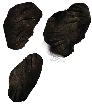
Here are some close-ups of the focal points. That scaly texture you see on the fore-arm and neck came from a brush based on a fish skeleton. It’s basically a bunch of curved lines, with angle jitter set to pen pressure for some randomness.

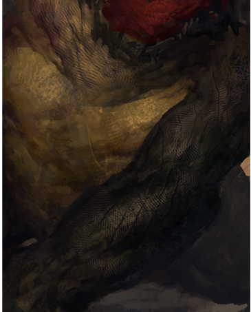
I further refined the texture by painting in some shadows between the scales, and highlights on the edges, to give them some depth and make them feel like armor plating. To keep these texture consistent, and for the sake of speed, I only really drew in the textures on the arm. The texture on this shoulders was just grabbed and transformed from what I had already drawn on his arm.
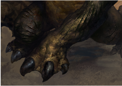
I made a layer called armor pieces, which consisted of a few shapes that I used to build up his scales throughout the rest of the piece.
I just duplicated these, then free transformed them and painted on top.
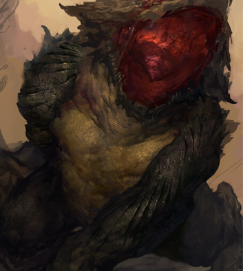
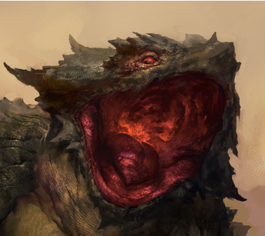
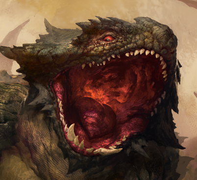
I detailed the rest of his face and mouth after looking at some reference. I had no clue how the inside of a lizards mouth was structured, so I needed to look up good reference for it. I also looked at images of horned lizards, referred to the design of the scales around the head and eyes.
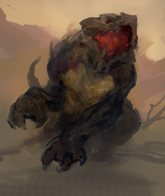
I’m still using color dodge layers here and there to punch up values and texture where I need it. Still using that fish skeleton brush too, on different layer types, such as overlay, multiply, color dodge and burn. Whichever looks right. I don’t actually get to the teeth until later. It might seem like common sense, but I learned the hard way that’s it’s much easier to finish the mouth and gums without the teeth in the way. Here are those same texture techniques applied further. I only really use texture brushes to sketch in the textures. It’s always good to go back in and paint over them, refining and integrating them more. It’s a good idea too to tone down the textures and erase some. I usually end up over-doing it without realizing.
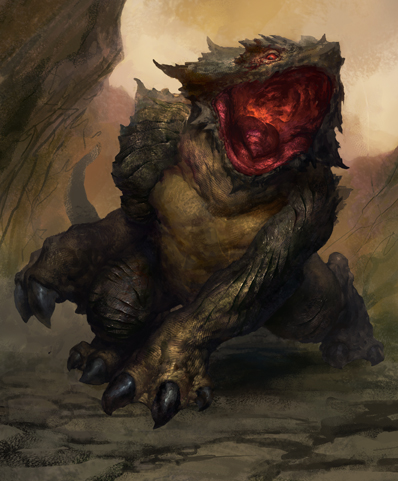
At this point, I’ve made a selection around the monster, trying to stay as tight as possible. The magnetic lasso tool is good for this. Make sure to save your selection, so you don’t lose it. You can find it later in the ‘channels’ window, and control+click it to re-select your selection. It’s very useful for working on the background. I looked up more reference for rocks and volcanic landscapes before I started.
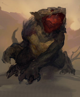
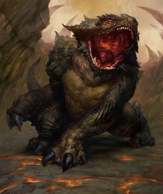
The background is about finished, and I’ve retouched the edges around the monster that were a little weird from the selection.
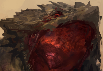
Final details are made around the face. I made a separate selection for each one of his teeth when I painted them, so that I could retain a hard edge. I also sketched in more scaly details around his eyes, following a similar scale pattern of the previously mentioned horned lizard.
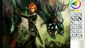
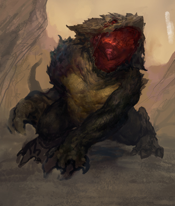
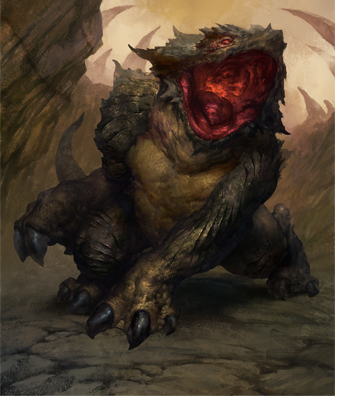
I found some reference for lava glow as well, and with that I’ve finished the illustration. I also added some sharpen to it to punch things out a bit and account for lost detail in downsizing. You can do that a bunch of ways, from the sharpen tool, the unsharp mask, and a paint daubs filter. Hopefully this can help some of you, and you were able to get something out if it. Please ask if you have any questions. Thanks for reading!

About The Author
You might be interested in