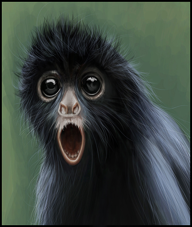
Making of a Monkey
In this tutorial, I will guide you through the whole process, from the initial sketch design to the final presentable painting all using Adobe Photoshop CS5( this process can be applied to all the versions of Photoshop) . The techniques I will use to create this illustration will be fairly simple and I hope it will definitely help you to understand the throughout process. I would like to thank Joel Sartore for the beautiful photography of the subject.
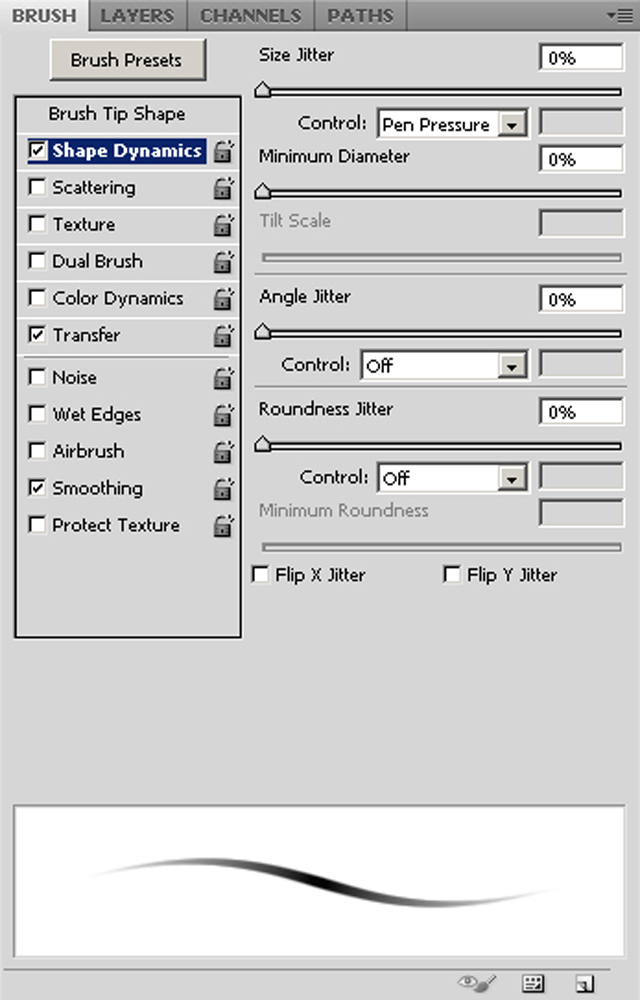
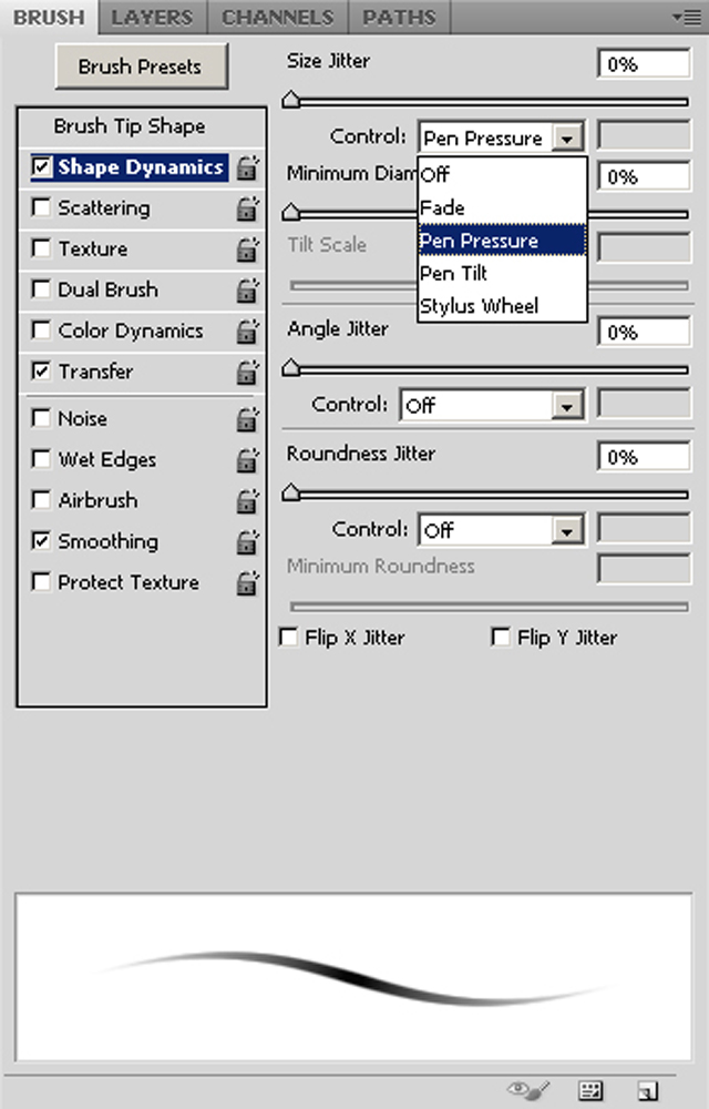
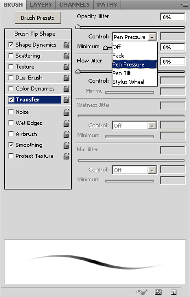
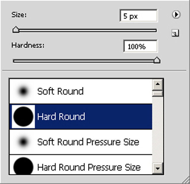
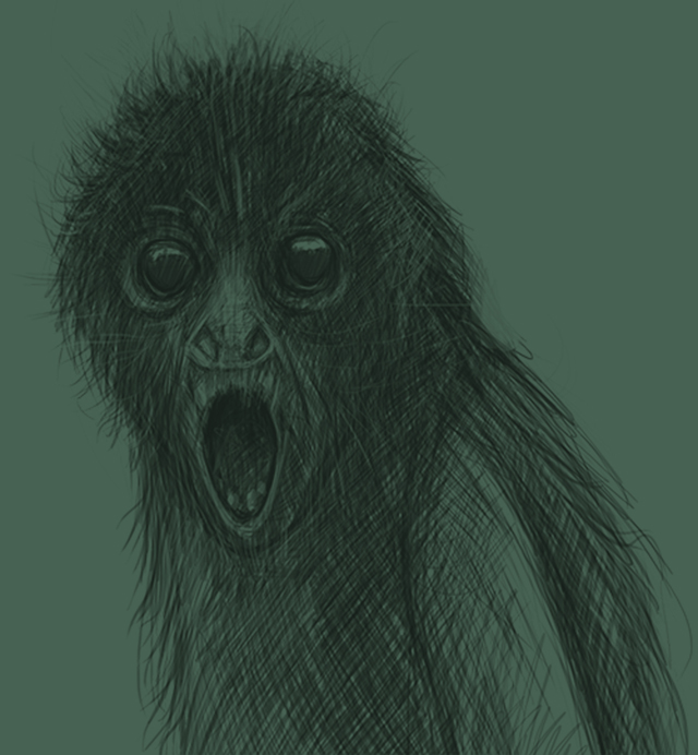
Starting off with the initial sketch design, I prepared my brush palette by selecting a simple “Hard Round brush” tool that comes default with the Photoshop versions. For Brush Settings , I switch “On” the “Shape Dynamics” settings. On the right hand side, I switch the “Control” bar from “Off” to “Pen Pressure”. Then I switch “On” “Transfer” Settings and on the right side, switch the “Control” bar again from “Off” to “Pen Pressure”. Here you will realize you are actually¬¬¬ smoothening out the corners of the brush hence will help you in getting the real brush feel. Now, the harder you press the darker strokes you get and vice versa. I kept my Brush opacity settings set to 100 percent and flow settings to 100 percent and started off with simple block out with basic shapes just to ensure the shape got right there.

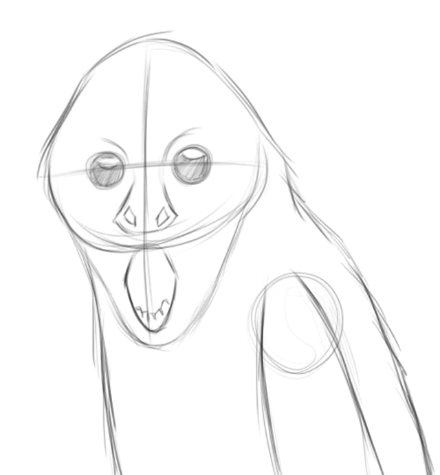
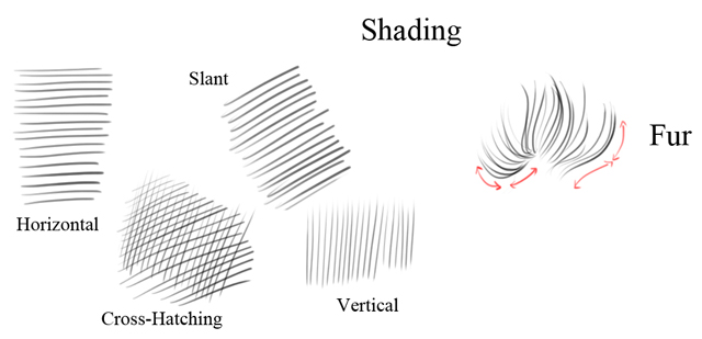
After the basic block out, I started off with the shading part, I used crosshatching techniques and some random strokes wherever I felt necessary keeping in mind the light direction I needed for the final painting.
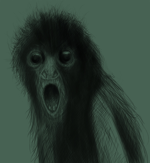
Moving onto coloring part, I laid my final sketch and created a new layer for background and place it below the sketch. Now, I fill the background layer with green color, values I used “R – 47 , G – 65 , B – 55 ” . I set the sketch layer from “Normal” to “Overlay” and set the Opacity to 50 percent. Then I created a new layer, this time over the sketch layer. Now I slightly changed my brush settings. I switch “Off” the Shape Dynamics settings(Transfer Settings Remains “On”) and lower down the Opacity from 100 percent to 80 percent(Flow remains unchanged).


Then I increase my brush size to about 70 – 80 pixels and started blocking out with fairly Black color . I started blocking out the fur as an individual group and used same Fur shading techniques as I did for the sketch. After that I created a new layer and started giving highlights with blue color. The values I used “R – 137, G – 155, B – 179”. While getting through this process I always flip my illustration horizontally(sometimes vertically) to make sure the proportion gets right and the light/shadows affect just the desired area.
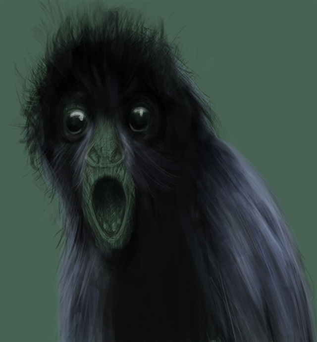
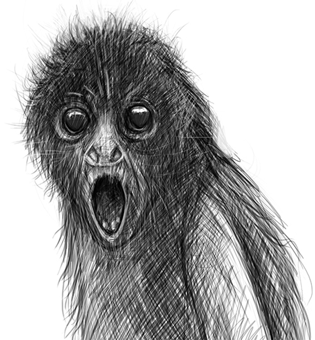
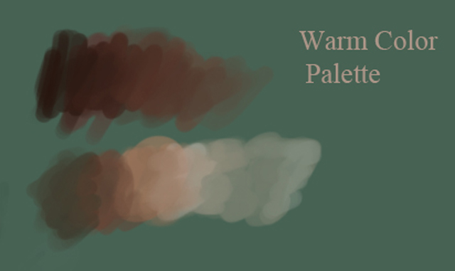
After the basic block out is done, I merged the two layers. Then I made a new layer and there created a Warm Color Tone gradient for skin. Using that skin color gradient I ended up with Nose , Mouth areas and areas around the eyes.
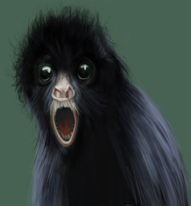
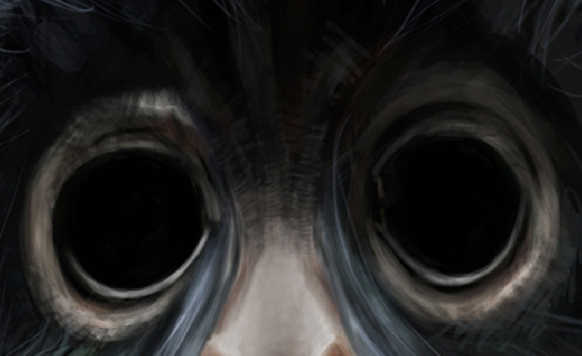
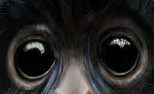
Now I got my main color tones applied on the illustration, I started refining them to make an overall look of the illustration smoother. Now, for eyes I simply fill the black color as base. Created a Highlight of a pattern with white color and a reflection with a dark grey color just to give an appealing look.
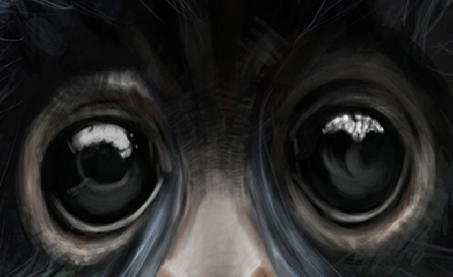
Still the fur needs to be worked out. So I reduce my brush size to almost 4,5 pixels(as per resolution of my painting) and started giving individual hair of blue and black color(just to ensure the hair should not make the illustration monotonous).
Finally, I adjusted Exposure and Gamma Correction(Image

About The Author
You might be interested in