Making Of ‘Closet Monster’
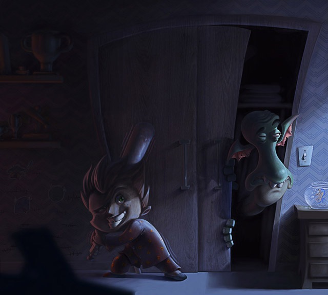
Rafael Nascimento shows how he was making his “Closet Monster”
Introduction
The most important thing I’ve learned with professional work is to search for references when you start a new piece of artwork. So, before I start a new project, I always come up with a general idea of what I’m going to produce. Then I start to search for as many references as possible to refine the idea.
For this particular project the main references were the film and art book of Monster Inc. I want to say too that there isn’t a magical brush which “paints” for you, or a secret plugin that makes you paint like Da Vinci. Everything I’ve learned and applied for this project came from watching Gnomon’s DVDs, talking with other professionals and observing their nature. The important thing is to understand the main concepts and how to apply them.
Step 1
I quickly established a cartoonish style and created a character with the feeling of a child bully. Then I started to think about how it would be if this guy wasn’t afraid of the things that came out of his closet (Fig.01).
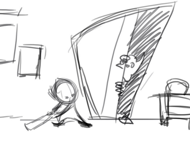
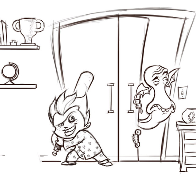
With the general idea set, I started to refine it. I worked a bit more with the design of the characters and the scene itself (Fig.02).
Step 2
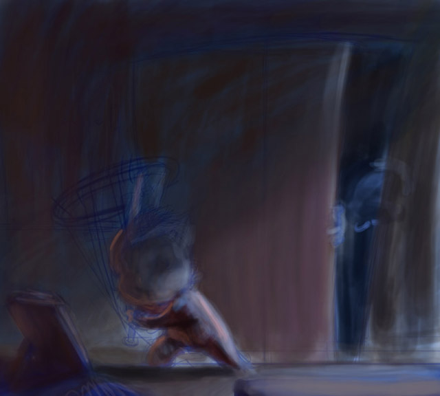
Then I started to think how I would work with the colors and how they would behave in the scene. So I did a preliminary color study, which gave me a clear idea of how I would work to get to the final piece. (Fig.03)
Step 3
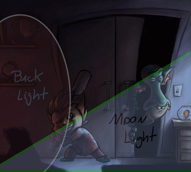
I think this is a great thing to do especially if you are working professionally. During this stage I decided to have my main source of light coming from the window and the back light coming from the door on the opposite side of the scene (Fig.04).
Step 4
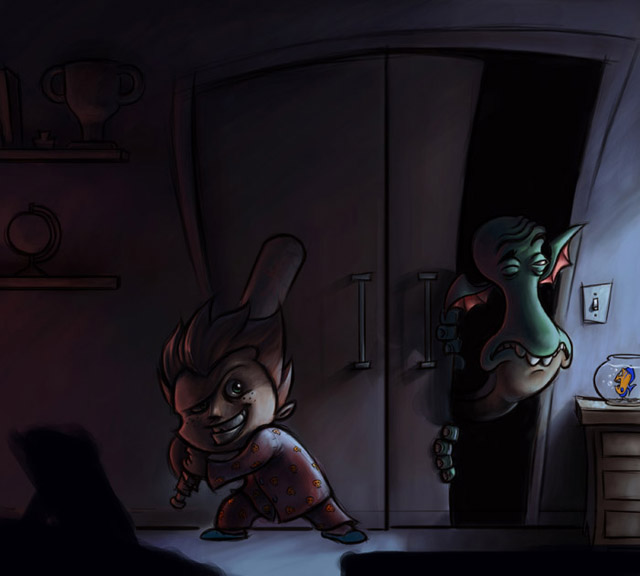
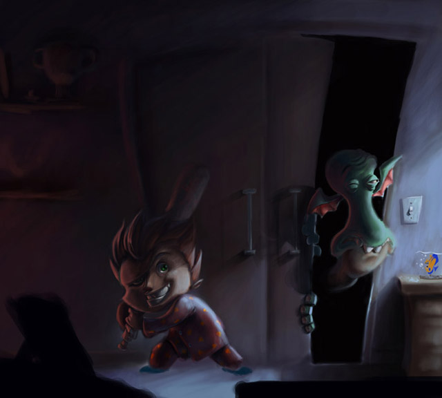
I am used to working with the contours as a guide for the first volumes. After I had most of a piece done, I hid the contour layer and then I started to refine it (Fig.05a – 05b). I confess that when I turned off this layer I had a little panic, because the volumes got a bit confused and I asked myself: “My God, now what?” So I patiently started to work individually on each element. The more I worked on it, the more the elements started to come out.
Step 5
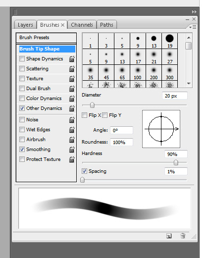
I worked with a Round brush with Shape Dynamics turned off and Other Dynamics turned on with Pen Pressure, Spacing set to 1% and Hardness between 85-90% to block in all of the painting (Fig.06).
I kept in mind that although it was a night scene with a strong blue light, all the colors of the elements still need to be in perceptive but also influenced by the light. I had a lot of fun painting the boy and the monster. It was fun to play around with how the light interacted with them and work out which colors I needed to focus on.
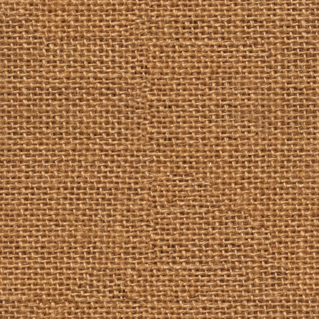
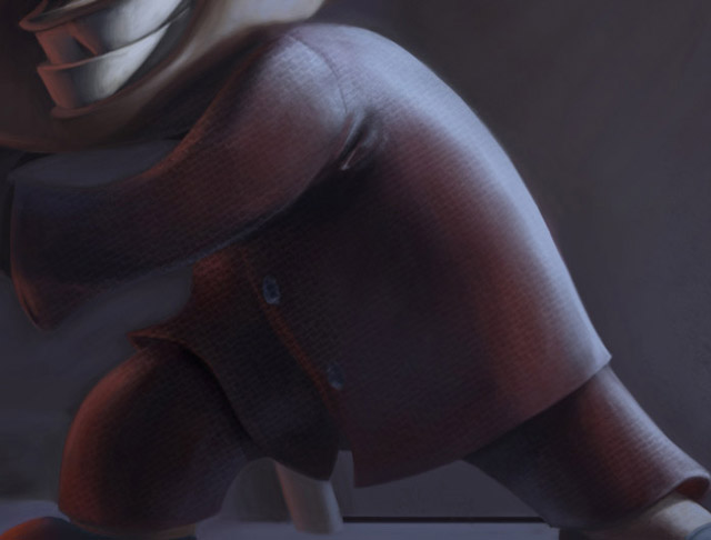
After I had the boy well defined, I decided to put some texture on his clothes. I searched for a suitable wool texture and applied it. I used the Overlay blending mode and adjusted its Opacity (Fig.07a – 07b).
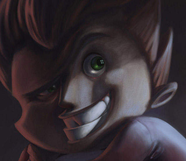
I applied a skin texture on his face too. I didn’t apply it on his hands because they were in the shadows. Again I used the Overlay blending mode and adjusted its Opacity (Fig.08a – 08b).

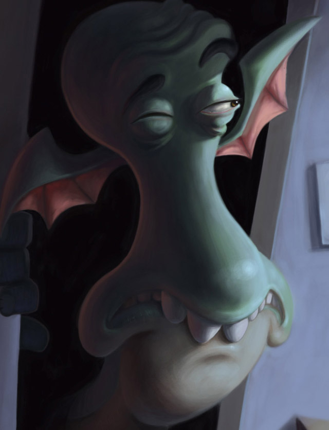
I had the most fun with, and put the most work into, the monster. It was fun because his face is hilarious and during its painting I caught myself laughing. It was hard work because of its volumes, mainly its mouth. It was very frustrating until I found the right volume.
Step 6
I had to do a lot work on the teeth in particular, because I had to think about how the specular, shadow, projected shadow and light influences would behave (Fig.09).
Step 7
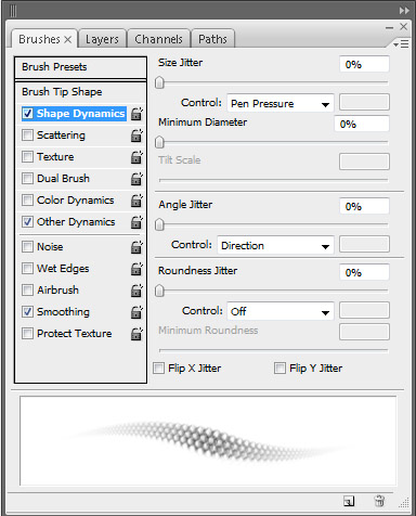
I develop a specific brush to do the scale on the monster’s face. I used this brush with Pen Pressure and Shape Dynamics turned on, with Angle Jitter control set to Direction mode. This brush allowed me to establish the scale while also respecting the volumes of the closet monster (Fig.010a – 10b).

Step 8
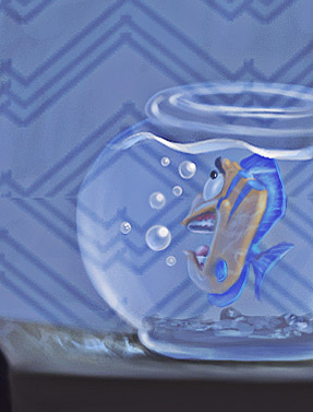
The little fish was easy to deal with. It only took a little work to add the caustic effect of its little aquarium, using an Abstract brush. The water reflection was done randomly, because in nature water doesn’t follow a specific pattern. So I decided to make it believable, but random (Fig.11).
Step 9
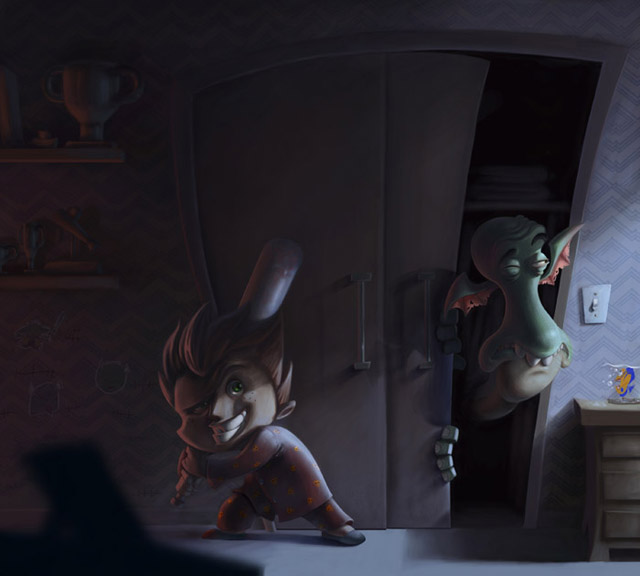
I added some wood texture to the closet door. I then worked on the reflection of the trophies and took away the focus of the furniture on the first plane to give my perspective. I textured the wall and added some drawing of defeated monsters as well as a count to show how many the boy had defeated so far. During the process, I noticed that the closet was empty, so I decided to add some clothes there (Fig.12).
Step 10
To finalize the image, I applied the high pass filter (this filter makes the scene clearer and brings some details alive too) and a blue filter on the whole image to add ambience (Fig.13).

And that is it! I hope you found this Making Of useful and I would like to thank 2DArtist magazine for this amazing opportunity.


