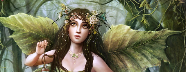
Making of Leaves of Greens
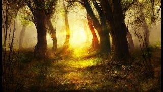
I decided to paint a fairy painting using many variations of greens for my color scheme

Introduction
While driving through a scenic road I was in love with all the different shades of greens of the forest nearby the road. It was Spring after all and all I saw was “green”! I went home and decided to paint a fairy painting using many variations of greens for my color scheme
Brushes:
Aside from the default PS brush preset, I also used my own custom brushes. I called them “flat bristle” and “knife” because they simulate the look of the traditional tools that I use. I use these two throughout the whole process. I use the “knife” brush to add branches and twigs to my trees. I use the small sharp round edge for details and the soft round edge for blending. And the “bristle” I use for large brush strokes to block in large shapes.

STEP 1
I always start my paintings with a sketch, either by pencil scanned into PS or digitally using the stylus and tablet. I used whichever I can grab at the moment. I never clean up my line work since I just painted over it. For this painting I sketched digitally, using a small sharp round brush, set on “pen pressure”.
I sketched the figure first, starting with “stick figure”, adding muscles, and finally drapery. After the figure sketch was finished I started to block in the trees in the background and few small details such as ivy leaves and drooping vines to develop the composition and also to remind me of what I wanted to add later on.
I used the “lasso” tool to select the general shape of the tree, fill the selection with dark brown. Using my “knife” brush I added branches and twigs. Then I made a new layer, set it on “Hard Light”. Using the bristle brush I shaded in the lighter brown to establish the light source on the tree. I also blocked in the dress to help me have a better idea of the form of the figure in the overall layout.
I used a guide to align facial features, such as eyes, nose, and mouth. I made my guide lines red on a separate layer at 50% opacity. This guide is very important when I started painting the face in detail; it helps me keep the facial anatomy in check.

STEP 2
After I was happy with the layout, I started to render. Generally I work “outside in”, rendering the background first and saving the facial details for last. I started on the big tree, adding some barks and moss.
Working at 100%, I redefined the facial features and gave some lighting direction to the figure. To keep the edges clean, I used the pen tool and saved my selections as “left arm”, “right arm”, “torso”, etc. These saved selections are very useful for later stages when I started blending and adding shadow to the figure. To make selections from the pen tool, close your path, right click and choose “make selection”, then go to Select > Save Selection, name your selection and click “Save”.

STEP 3
Here I started to add texture, such as moss, ivy, vines, and fallen leaves into the background.
For the moss, I created a hand-painted custom brush. Using the small sharp round edge brush, I painted individual little dots and moss. The dots represented the small tiny daisies from afar. Once I am satisfied with the shape I select the moss go to Edit > Define Brush Preset. In Brush Dynamics, set the brush to scattering and pen pressure.
In this small example I added moss on a rock. Using my moss brush I painted the green moss on a separate layer. Create a Layer > Clipping mask for the active layer so that the moss fits cleanly on the rock. Set the Layer Style to Bevel and Emboss at a very slight depth, just enough to give the moss its own dimension on top of the rock. I used this same method for the moss on the tree.
I’ve also lengthened her hair, giving the character a more romantic look. I sketched in the dragonfly wings and a few hummingbirds to see if I’d like to add these elements. I decided not to go with these since they were used before in other paintings… I thought of leaves and thought that they would make a more interesting design for wings. The dragonfly design ended up on her dress :)

STEP 4
Here I started on the bird feeder… taking a break from the ivy leaves! I used a ref photo that I took of the bird feeder from a garden. When using refs I use them for two things: lighting and structure. When sketching out the feeder I’ve sketch a line down the middle first; this is the axis of rotation for this object. Then I sketched the overall shape and added the flowers last. Once I’ve captured the basic form and lighting of the feeder, I started to design my own feeder… adding flowers, leaves, ornaments, etc. The key point was to study how the bird feeder looked realistically and also what components make up this feeder, so that next time I want to paint another feeder I could do it without reference.

STEP 5
In this step I’ve added the log, and then the few small flowers on top of the log to add more character to the scene. I also blocked in the snails and rendered them according to the light source of the painting. I also spent a long time sharpening the ivy leaves, painted and cleaning up the edges stroke by stroke. The whole purpose of doing this is to avoid “cookie cutter” leaves that will make the painting look boring and static. Sounds simple, but it took days!!

STEP 6
I started to render folds of the dress and added leafy wings. The design and colors for the wings were inspired by the young sprouting leaves that I took a picture of. I am never without my cheap Lumix camera. It doesn’t yield professional quality photos (and have been dropped many, many times!), but for what I do it does the job. Beauty is often found in unexpected places, and I don’t want to miss capturing it!! The folding of the leaves were one of those rare “happy accidents” that happened while I was blocking in the leaves.
For the dress, I used my own ref. Once again I only needed the structure and the lighting of the dress; I didn’t care that it were pink. I aimed to capture the main folds of the drapery to give my green dress a realistic look, not every fold visible in the photo. What I was looking for was “how does this fabric drape over the anatomy underneath?”
Once I’ve achieved realistic folds, I added my own design to the dress. I really enjoyed this part. I added dragonfly wing as part of the top, and overlapping that I added an ivy-like pattern that echoed the ivy on the tree. Some flowers and leaves are also added to the head-piece, with ivy leaves to unify the overall design.

STEP 7
Once again I came back to the vines and leaves! I added small curly vines to give the vines more character and also achieve a more artistic look. I painted the berries to add variation of the shapes and some white flowers to give a focus among all those greens. Then I added the birds. I painted each of the birds on separate layers, moving them around until I was happy with where they were. One particular bird I wanted him to direct the eyes back into the painting (the one she is looking at), since the viewers will follow her eyes and look right out of the painting! But he was not enough; I later on added a flower to give more “weight” to this redirection of the eye-path.

STEP 8
In this step I will show how I created a textured brush or “stamp” from a photo. I took my photo of fallen brown leaves into PS, desaturated it, and pumped up the contrast using the Levels sliders.
Remember that when making these “stamps”, the black shapes are the shape of the stamp. Because the leaves were light on a darker background, they looked white. If I selected this pattern I’ll end up with the ground as texture, not the leaves. So I needed to invert this image to get the leaves as black shapes. Go to Image > Adjustments> Invert. This will give a nice dark pattern that will be the leaves. I selected the portion that I wanted and “defined brush preset“. Here you can see the “stamp” in green.

STEP 9
Adding more details!
I painted the thin webs on the separate layer. Being lazy I just duplicate the layer and added the web to other parts of the painting. I also painted glittering webs drooping from the flowers and on the lace of her green dress. I also finally rendered the foot!! It was too large and I had to resize it. Then I added more spider webs on the ground where it touched her dress to show that she dragged and stretched the webs as she walked across the forest path.
The beads were then added to the lace. I painted “water drops” to the end of the beads, making them look dewy. I also added the swirly designs to the bottom of the dress on another layer. This layer was set in mode “Overlay”, I used a small round brush 5px to add details. I also used the fallen leaves stamp on the bottom of her dress as well to give it more texture.
Now I sprinkled “glitter” to the dress and ribbon as well by simply use the small round edge brush and stippled in the sparkles. Then I painted the earrings and the ivy necklace, just having fun adding more details at this point.

STEP 10
Finally I came back to her face. I modified and added more flowers and details to her head-piece. The hardest challenge about painting the face for me is not rendering her lashes, but keeping the eyes aligned with each other and other parts of the face. The guide (which I mentioned before) was really helpful; this way I can render her soft features and detailing away while keeping the facial anatomy correct. Flipping the image horizontally also helped to spot mistakes.
For final detailing of the artwork, I painted the finger nails and the wrinkling of the knuckles to achieve a more realistic look. Finally, I added freckles by painting random brown dots on a separate layer that is set to “Overlay” at 25% opacity.
In the final image, after I’ve saved my painting as a new file (file 27 at this point), I flattened the whole image. I checked the consistency of the light source, making sure that everything was lit from left to right. For the ivy leaves on the tree, the light doesn’t spread uniformly among each leaf, but shone on the clump as a whole, with areas of lights and dark. To achieve this look I added a new overlay layer, added “light” to the ivy leaves in the middle of the tree, added some darks were the wings were casting a diffused shadow, and added light to the snails to direct the eyes to notice this detail.
For the very last step I flattened the image again, duplicate it, and set the duplicate layer on “Soft light” to sharpen the painting. But doing this would increase the saturation of my artwork, so I go to Image>Adjustments>Hue/Saturation and slide the Saturation slider to -60 (negative 60) to keep my colors consistent. I flattened the image for the last time and saved file. All done!
Thank you for reading this walk-through. I hope it gave you an insight of my work process and that you found it useful.


