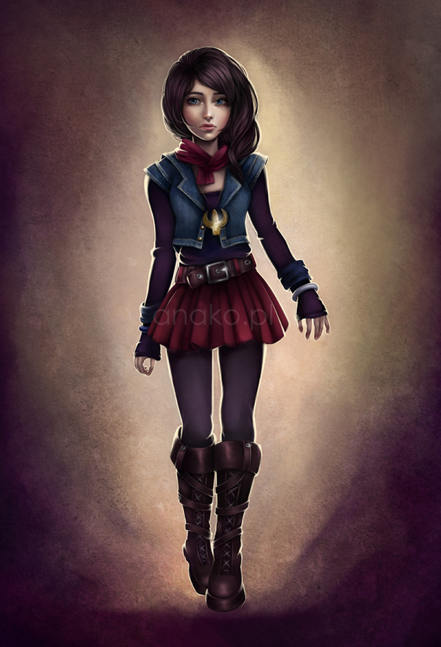
Making of “Natalie”
In this tutorial I will take you through the process of creating my “Character 01” concept illustration. This is the first picture from my “8 characters project”, where I introduce main protagonists from my future-written-story. When painting digitally, I always use Photoshop (my version is CS5, but I guess anything above 7 will do) and Wacom tablet (Intuos3, to be exact).
Step1:SKETCHING
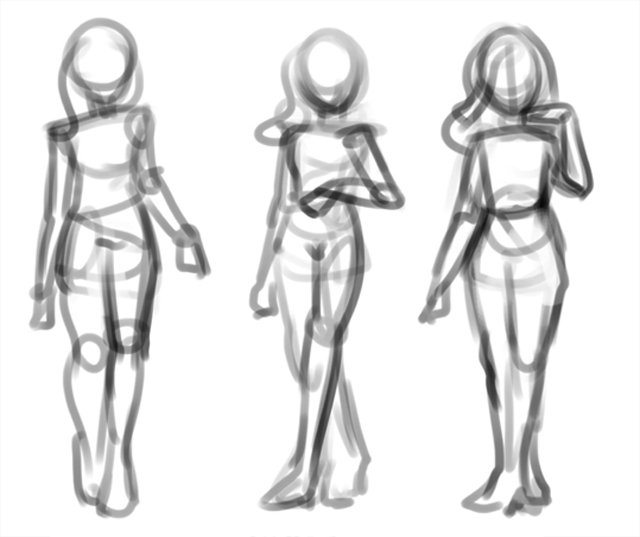
The girl presented here is a 16-year-old main female character named Natalie, who despite being involved in extraordinary events, is a typical non-experienced, naive & rebellious teenager. That is why the first phase consisted of thinking about how to show these two sides of her – normal, but with a slight of mystery. I opened my Photoshop, created a new file, picked a random brush with an Opacity Jitter set to Pen Pressure, and started sketching some quick silhouettes, not focusing on any details yet, just to catch the overall idea about the pose and how the character moves. (01.jpg)
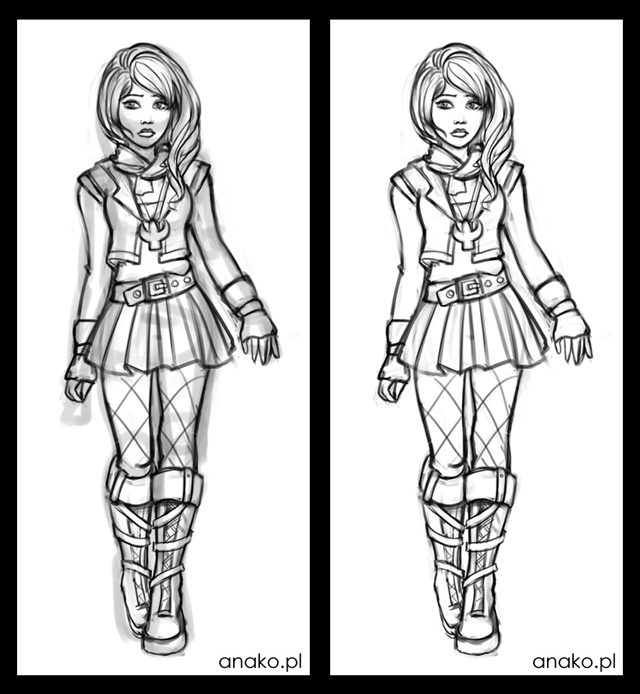
Once I chose the concept that suited me the most, I moved it onto a new file (I usually start from normal A4 300dpi and crop/resize it later), set the layer Opacity to about 20%, created a new one above it and started defining the final sketch. My Natalie is a bit emo-styled, so I did a little research to know how her clothes should look like. (02.jpg)
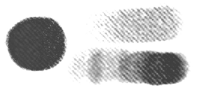
I generally use the same brush for both sketching and painting, a rounded blob jagged on the edges (Spacing 10%, Opacity Jitter to Pen Pressure & Smoothing on), which I found some time ago on the Internet. But anything rugged and rounded will do the job, believe me. (brush.jpg)

Step 2:CHOOSING COLOURS
When I have a sketch finished, I usually take a one-day break from it, to keep my mind fresh. After that time some new ideas may show up to make the picture more interesting. And then the colouring phase starts. I keep my sketch layer locked on the top for now, to make sure I won’t paint over it by accident. (lock.jpg)
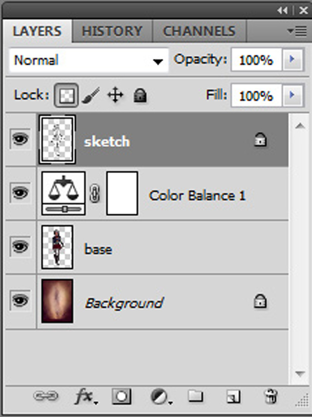
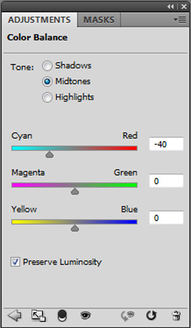
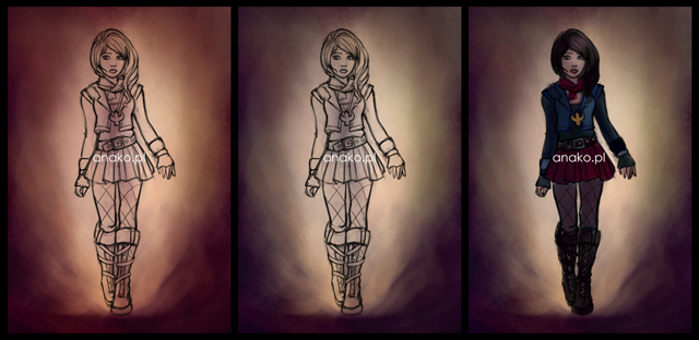
I created a new layer below and started playing with different textures & brushes to create a visually absorbing background. It’s just having pure fun with colours and shapes until I receive the fine effect. Something went wrong with the colour palette, it was far too saturated, so I went to Layer > New Adjustment Layer > Color Balance and did some magic with the zippers. (color_balance.jpg) Now I was happy.
Then I made a new layer, still below the sketch, and chose the base colours for my character. When I wasn’t sure about the colour, I painted it on a separate layer, so that later I cloud easily change it using Color Balance or Hue/Saturation Tools and match it with others. As you see, they’re usually desaturated and rather dark, because I lighten the picture later while painting. (03.jpg)
Step 3:PAINTING FACE & HAIR
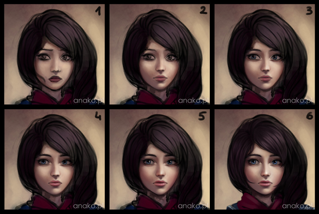
When I was happy with the colour palette, I moved on by creating a new layer, this time *above* the sketch, to paint the face. Just like many other artists that I know, I can’t go any further with the picture unless the face looks good enough. :) Still using the very same brush, I picked a slightly brighter and more saturated skin tone and slowly defined the shape of the face. I have my tablet Tip Feel set to *very* firm during that stage, so that the strokes I paint are very smooth, delicate and blend with each other well. (tablet.jpg)

You can gain the same effect by reducing the Flow value in the Photoshop brush settings. (flow.jpg)

Sporadically I create new layers to keep what I’ve done untouched. Sometimes, when I don’t like the way my painting goes, I delete some of them and come back to earlier stages. Eventually I add other colours. Keep in mind that middle parts of a face (nose, cheeks, ears & space around eyes) usually have more red/pink colour than others. Also remember that even if you’re not aiming for full realism, you still have to obey the rules of anatomy to make things believable. Natalie’s eyes are much bigger than they would be in reality, but still they’re two balls covered by eyelids. Don’t be afraid of using various photo references, they’re extremely helpful when you start painting digitally. Also, be consistent when it comes to the light source. Here I set it on the upper right front, and reminded myself of that while forming the face shapes. When everything seemed to look right, I created a new layer with an Overlay mode and with a light turquoise I gently painted over the face – this action broke its overall redness. (04.jpg)
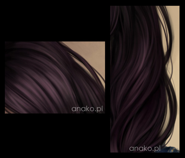
Being happy with the face, I moved to the hair. Painting hair is always a tricky part, because there are many various effects you can gain and each need different methods. Since my character is semi-realistic, I didn’t need to worry about single hairs; I had to focus on the curls and wisps instead, firstly making their shapes, and then slowly lightening them up. I started with a big brush, and gradually decreased its size as I painted thinner and thinner. The gleam on hair should highly contrast with the darker parts, although it shouldn’t be brighter than the main source of light. (05.jpg)
Step 4:RENDERING MATERIALS
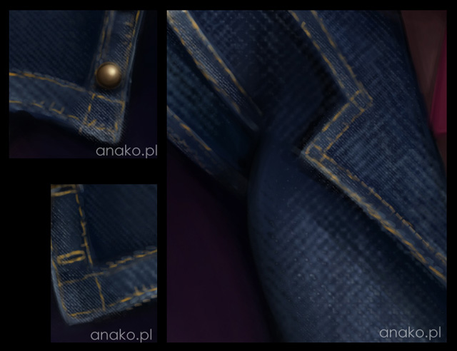
It was time to work on Natalie’s body. She’s wearing a jeans jacket, so it would be nice to reflect the material’s structure well. I decided to create a special custom brush for this occasion. Firstly, I searched for some jeans textures in the internet (there’s plenty of them!) and chose the best one. I opened it in Photoshop and clicked Edit > Define Pattern. Then I picked a random rounded brush and went to the brush settings where I set Hardness to 15%, Spacing to 1%, Opacity Jitter to Pen Pressure and turned Wet Edges on. Now the most important step – I checked the Texture setting and from the patterns I chose the one I had just created. Some regulations with it’s scale and voila – the jeans brush was ready! (jeans_brush.jpg)
With a bright blue I painted carefully with it over the dark material. Then I shaded it with a normal brush and added little details such as buttons and threads. (06.jpg)
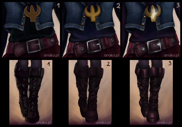
Using the same method as with the face and hair, I was painting now the whole character, and moving from one object to another to keep the cohesion of everything. Rendering the right surfaces of materials is extremely crucial. For instance: metal elements (here: medallion and buckle) reflect light almost absolutely – the shadows & highlights are sharp and greatly contrastive. Smooth leather objects (here: belt and boots) are less reflective, but still shine, blending softly lights with shadows. On the contrary, fabrics like in Natalie’s cotton blouse absorb light so much that they hardly reflect anything at all. Look at as many references as you can to make sure you paint the surfaces correctly! (07.jpg)
It’s also important to mention that I flip my pictures horizontally very often (Image > Image Rotation > Flip Canvas Horizontal). This helps you look at your work with a fresh view, pointing out all the mistakes immediately.
Step 5:FINAL TOUCHES
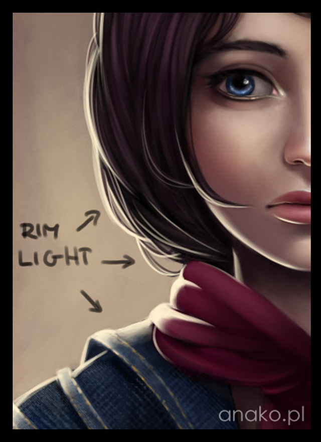
The picture was almost finished. At this stage I usually add some rim light. Different sources of lights always bring more life to pictures and rim light does most amazing effects in my opinion. Let’s say something’s shining right behind her back. On a separate layer with a tiny brush I painted over the edges of my character, keeping in mind how light would spread over the shapes. Rim light should always be brighter than most elements on the picture to look believable. (08.jpg)
I also decided to change the blouse’s colour from dark blue to dark violet, so I made another Overlay layer and used some magenta to achieve this effect. (overlay.jpg)

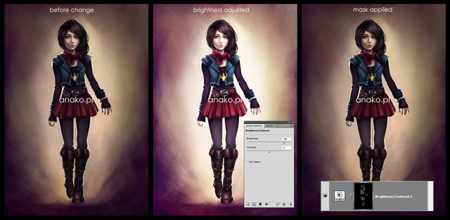
It looked OK, but a bit too dark. I went to Layer > New Adjustment Layer > Brightness/Contrast and brightened the picture. It still didn’t look good enough, so I checked this layer’s mask and filled it with black. Then with an Eraser I painted over the elements I wanted to have brighter – now everything looked just as I wanted. (09.jpg)
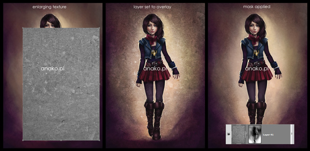
Also, on a new layer set to Linear Dodge I painted a few gleams of metal etc. Time for the finishing touches. I picked a dirty looking texture from my textures library (I truly recommend you to collect as many free textures as you can) and put it over my work. Using Free Transform Tool (Ctrl + T) I enlarged it so that it covered the whole canvas. I played with it some time, checking different layer modes, desaturating it and creating a mask, where I erased parts I didn’t want to have texture. (10.jpg)
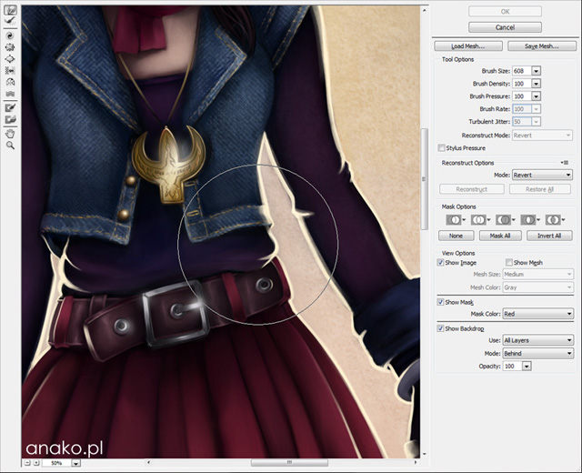
Lastly, I noticed that Natalie is far too slim, even for a semi-realistic character. The picture is already finished, so what shall we do? This is when the Liquify Tool comes in handy! I selected, copied and then merged all the layers of my picture. Then I picked Filter > Liquify and with a few moves of tablet my character virtually put on weight. (liquify.jpg)
The picture was considered finished! (natalie.jpg)

That’s how I create my digital paintings nowadays. I hope you enjoyed this tutorial and that you’ll find my tips and explanations helpful when creating your own pictures. Good luck!


