Making of “Prince of Persia”
Prince of Persia is one of the biggest game franchises and doing the marketing art for the HD remakes of all three parts at the same time was a big honor for me.
Introduction
The great thing was that all the artworks that I had to make was going to be released as 3 separate themes and additional animated one, for which one is the tutorial about (Fig01, the image on the top left).
All of the themes are available for free download on the PS3 Network.

Fig01
Main Goals
The most important thing before you start any new project, commission, illustration, etc. is to have your goals and task perfectly clear. For this project the main goals were to create a theme for PS3 that represents the Prince of Persia franchise although without the Prince himself (he is a bit different in all three installments and there are already a lot of wallpapers, cover variations, etc. for the whole franchise), in HD Resolution with enough details and some basic mood animations (which is not very easy to be made on the console).
Considering the animations that have to be done and the timeframe we had, the obvious choice for me was to make something with some distinct foreground and background elements and to put some casual effects, like smoke, minor particles and other stuff to get more depth into the scene…
Thumbnails
First thing to do was to make some very rough thumbnails – to get the ideas in my head cleared (Fig02). I usually make between 10 and 12 more detailed thumbs, but this time I spent only about an hour to do them and almost the rest of the day to do a full research in internet about textures, and stuff that could be useful for my goals and for the brushes that I would like to create for all the paintings. For example stuff like rock textures, falling leafs, etc.

Fig02
Brushes
When you have to create a HD image, especially within tight deadlines, you have to be very careful how are you going to proceed with it, because there is no time for mistakes.
I personally think that the best way is to use brushes or images from your personal library (images that you have created, or such that you know you can use freely). Because this way you will still have full creativity on your image and enough time to polish it on the end.
For such images with caves and underground caverns I knew that I was going to need a lot of rock details, and a lot of overlayed small details in terms of stone shaped noise. This is something that will make the image more convincing. At the end I ended with two brushes: the detail brush and the rock brush. They are nothing special or complicated but they give me a lot of starting details to paint on.
“The detail brush”: it is fairly easy to create such one – the only thing you need is a high resolution grayscale texture, which tiles perfectly and fits for the goals you have. If it does not tile correctly, you can always use the Filter->Other->Offset option and to do it yourself. After you are done, you have to save it as a pattern (Photoshop: Edit-> Define Pattern). Then you go to the brushes palette (Hit F5) and choose any soft brush you like and check the options bellow (as on Fig03). Leave all settings by default and only from the Texture Palette choose your newly created pattern, set the Mode on Color Burn. Scale it depending on the desired quality. Hit the save new brush button to save it as a stand-alone brush and you are done.
From here you can download two example brushes that I have made on the same principle (working with Photoshop CS): NICK Stone Detail Brushes

Fig03
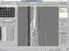
“The rock brush”: this is a bit more tricky, because the shape if very important – first you need to find some textures that will fit fully your purposes, after that you need to create a pattern (as the “Detailed Brush”) and one brush which you will use as a mask (use it instead of the soft brush). You have to set the mode to Multiply in order to get more fill in the brush. Also from Brush Tip Shape you can adjust the spacing of the Brush as desired (Fig04). After you are satisfied with the result hit the save new brush button to save it as a stand-alone brush and you are done.

Fig04
Painting Process
The painting process was a bit rudimentary – I`ve divided the picture composition in a few layers in my head and I began to recreate them one after the other.
First thing is always to create the mood, to see and get the basic color gamma of the artwork so you can see where you are heading to. I take the thumbnail, that I`ve already made for the painting and I put a layer or even two on top of all other ones, filled with solid color. The main point is that on this layer I am able to paint whenever I want with different colors and to have more color variation and full control over the mood of the painting. The layer is always put on „Overlay” mode or in some rare cases on „Soft Light”. There is only one thing to remember – if you use this type of technique you will actually have to paint under this layer with very desaturaded colors.
(See comparison Fig05/Fig06)


Fig05 (Color Layer, Set on Overlay Mode)
Fig06 (Original Painting, without the Overlayed layer)
After that I usually began with the main part – in this case the rock bridge with the Prince of Persia game logo. I`ve repainted it over the thumbnail with a hard brush, blocking properly all the main volumes and then I made selection of the painted part. Here I`ve used with bit darker or lighter color (depending if you are painting in the shadow or on light parts) the rock brush in order to create some kind of a texture on it. After that I usually pick the hard brush and paint all the small details, light, etc. by hand on a new layer, using only the eraser to blend them properly.
You can see on Fig07 the painted part of the foreground with the sketch still visible on some places underneath it.
I have the initial composition from the thumb, but after I finish the first step, I always make a composition check and change everything that may need to be altered (the Liquify tool or just the usual Distort tool always come in handy at that point). For this image I decided the use the Rule of the Thirds, which is most commonly used in photography, instead the Golden Ratio composition.
You can always refer to wikipedia for some basic info if you feel a bit unsure:
Rule of Thirds: http://en.wikipedia.org/wiki/Rule_of_thirds
Golden Ratio: http://en.wikipedia.org/wiki/Golden_ratio
Composition: http://en.wikipedia.org/wiki/Composition_%28visual_arts%29

Fig07
Fig08 (Rule of the Thirds)
One of the things that I had to keep on my mind is that all the effects and particles in this image had to be animated. So I always did a careful check if all layer blend smoothly with each other.

Fig09 (Focal Point Layer, separated)
After I was done with the Focal layer, I`ve began to work on the foreground. It is always good to have some stuff near the camera. It does not matter if you going to use Depth of Filed or not. This is something that always gives much more depth to the whole scene.

Fig10 (Foreground Layer, separated)
After I am satisfied with the overall result I always do a small pass of particles, smokes, etc. on top of the whole image. This is something that will add a lot of atmosphere to the scene. And of`course color corrections… this is the most important step, giving precise colors correction over the whole image can lead to amazing results or to even scrap you artwork totally.

Fig11
Final Tips and Thoughts
1. Always spent some time to make thumbnails or basic sketches, BEFORE you start! There are tons of artist who start directly painting (for example me sometimes ;P) and from time to time this does not lead to particularly good results. It could be 30min or 1hour of thumbnail sketching, but take your time and do it.
2. Check you composition at least a couple of times. Flip the image if you feel unsure – flipping the image will help you see mistakes and you painting from different angle.
3. Avoid having a lot of edges, or points at one spot, this leads to a small composition mess
4. Have a distinct foreground/background separation, you can always made it less visible on the end, but the other is more tricky
5. Check your light sources, spent some time to look at as much references as possible.
6. Details are essential
7. Have a grayscale layer, put on Color mode, on top of all layers. Turn it on from time to time and check your picture depth and balance in grayscale.
8. Never be afraid of changes

About The Author
You might be interested in