WITCH TUTORIAL
Hi! I will explain how I made the Witch Empress illustration.
I’m not a professional illustrator, so follow the guide at your own risk :) I will try to explain the techniques I used from the beginning to the end.
The only software used was Adobe Photoshop with the default brushes.


This is the first step: I open a new document in photoshop with white background and a large size ( in this case, 2500×3800 pixels ) and start drawing with a blue color on a new layer. I try to get the figure overall shape in this case. Is not important to get a detailed drawing, but rather get the right proportions, and an interesting flow in the figure.
The strokes are fast and loose. I’m using a hard circular brush.

These lines represent the motion of the image and how the eye is drawn to the head according to the position and shape of the elements.
The idea is to do an iconic illustration, with the character posing and I will take special care on the character features and clothes. I’m not good enough yet to do a dynamic piece, so I thought about this kind of illustration to work on my basic skills [ lighting, texturing, design, proportions… ]
The strokes are fast and loose. I’m using a hard circular brush.

After drawing the basic figure in blue and when I’m happy with the basic forms, then I create another layer and using black I draw cleaner lines with the same type of brush that I used before (hard edge, circular). I check the shapes to find any proportion errors and get a little into details, like cloth wrinkles or accesories.
A great trick to find proportion problems is to turn the image in the X axis, so you can see it inverted. You will be amazed how fast you can pick the problems doing this. I flip the image several times in different stages of the drawing and painting process.
In this case I was not sure about the lower part, so I drawed two different versions. Although the flow on the right one is nicer, the other one seemed less “artificial”.
At that moment I don’t know which one to pick.
 |
After the lines of the image are drawn is the moment to do a color blocking test. Most of the people would wait until having a finished line art, with all the details there, but I’m not patient enough. Probably my method is not good and I should try to get everything done before starting the coloring phase. Let’s see if I can do it next time :) In this rough coloring step, what I try to achieve is to pick the right colors. I don’t care that much about shadows; I basically set the black layer as multiply and put it on the top, over a new layer I create where I will place all the colors. That way, the line art will be there always over the colored layer and I don’t need to take care of going over it and deleting something. To get an interesting color variation I also paint in an aditional layer over the color one and below the line art with random colors and then change the opacity to something very subtle, like 5% and use it as soft light or Overlay so I get some random color variation that can produce some interesting shades.
|
 |
I tried different color variations and decided to go with a dark background that hilighted the figure. I experimented changing the pose and adding new elements. Sometimes I also copy and paste elements to re-position them in the composition, so everything matches properly, like moving the hips a little to the right or something like that. All this won’t necessary with a finished line art. Here is a zoom of the image in this stage, reduced to 50% of the original size:
|


Once I’m happy with the colors selected and the composition, I start to paint the details. The best way is to fill the parts of the image with the correspondent color, flat, and then work on the shadows and finally on the hilights. It’s very important to left the hilights for the end and not abuse so the volumes are defined mostly by the shadows. Unfortunately I don’t have much time to paint and want to rush to get the final version, so I tend to play with them sooner than I should.
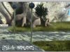
Here you can see that everything is already there, just the lower part is very rough and the cloth and cape are starting to get detailed. You can see how I used a red light from the right and a white/blue from the right to define the shape and make it stand very clearly from the background.
It’s also visible how the technique of painting blobs of random colors worked nicely on the cloth, which has a lot of diferent tones.

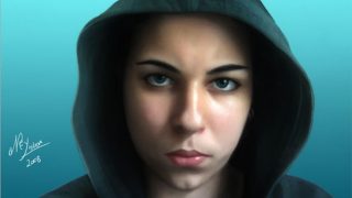
And this is the final image. I could go further and make things better, but I got a little tired and there is a moment when you have to decide not to continue.
You can see that some parts have changed a lot from the previous version. One of the most noticiable is the head that was a lot more interesting before, because of the eyes, that were narrower and the hair that wasn’t hanging but totally pulled back. I thought it was more interesting to have a less scary look, but probably I was wrong :)
I also think that the face could have more volume. I tried to make it flat, so it looked more surreal, but I went too far.
Next time I will try not to do the same mistakes :)
If you chcek the full size details below, you will notice that some parts are more detailed while others are still rough. The idea is not to loose a lot of time with everything, and only work more the needed parts
Close ups [ 100% ]:


About The Author
You might be interested in