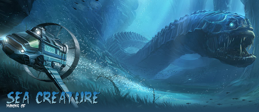
Making of Sea Creature
This image was created specifically for the January 2008 Image Challenge over at the Gnomon Workshop. The theme was, unsurprisingly, “Sea Creature”.
|
Work title: Sea Creature Software used: Adobe Photohop CS2 This image was created specifically for the January 2008 Image Challenge over at the Gnomon Workshop. The theme was, unsurprisingly, “Sea Creature”. I try to participate in such contests whenever I can, as they help you get started by providing you with a subject or theme, and most importantly, a deadline. As these things go, regardless of how tight that deadline is, one always tends postpone the work until it’s almost too late… and this painting was no exception. Read on for details… Before I paint anything, I roughly decide what I want to paint and consider colours and composition. In this case, that came down to ‘a blue/greenish underwater scene, with a big monster chasing a submarine of some sorts’. While I sometimes start in black and white, here I began with a rough colour scheme right away. I feel that for natural environments especially, it makes for easier achieving of some slight natural variation of hues. I start with a simple gradient, lighter at the top to suggest the surface somewhere above the canvas, and a darker greenish blue for the bottom. Next thing to do is to quickly suggest some landscape. After every few brushstrokes I adjust the hue of my foreground colour a little, to achieve subtle natural colour variation.
|
|
Good enough for now. It’s important to get the original idea I had on the canvas as soon as possible, to see if it’s actually going to work or not. So the next thing to do is to get the sea creature itself and the sub in there. I’m not at all bothered with their individual designs at this point; first I need to be able to see if my compositional idea is any good.
I’m pretty satisfied with the motion suggested here: the sub seems to be going from left to right in a curve, and the creature is following it. What I’m trying to depict is to have them follow the same path of motion, even though the monster is oriented with its head to the left and the sub to the right. What I don’t like is that the sub’s side is nearly perpendicular to the camera. Another thing that bothers me is the fact the the creature just ‘floats’ out there; it needs some sort of connection with the landscape to provide some sense of scale and proportions. Also, its design is starting to bother me. I’m messing around a bit with the general shape of the monster. This is really a process of experimenting, but it’s not going the way I want it to, and it’s not at all very brushstroke-efficient. After I waste time going nowhere, I decide it’s time for a different approach. I grab a pic from my collection of reference pictures, change its transparency to about 20%, and slap it on the monster’s head. |
|
That new monster head works for me. It’s not perfect but it’s good enough for now, besides, at this point I have about two days left before the competition deadline, of which I can spend about another 6 hours on this pic. So no more time for redesigning the monster! Aside from the monster I’ve also changed the sub orientation a little; it’s more facing towards the camera now, and that is better. However, aside from the angle the sub’s shape has gotten a lot worse, rather than better. For the sub, I go through pretty much the same process as with the monster: mess around, make more (pointless) brushstrokes, and achieve nothing. Frustrated, I start up Maya and begin working on a sub design in 3D. After two more hours, I have a design that I think is OK-ish. I render it, and slap it on the pic:
I am fighting the panic now, only a few hours to work left, and this looks horrible. I render some more perspectives of the sub and tweak the lighting in Maya, but nothing works. I realise I am not going to be able to get this sub in the painting and have it look good before the deadline. I decide to forget about the 3D model and go back to a 2D sketch. So right now I’m back where I left off, only with a lot more pressure as I’ve wasted a lot of time. After a little while however, I come up with something that I actually like:
Not only have I tweaked the design, I’ve also scaled it down considerably, and cropped the bottom of my canvas to get wider view. However, currently it looks a little static. In the lower left corner is a lot of useless space. I decide to rotate the entire canvas about 10 degrees counterclockwise, and re-crop it:
Good. Now for the lights. What I want is several god rays coming from the water surface far above. Basically, I do this by creating a new layer, making some random scribbles in a whitish colour on the layer, then I transform it in perspective and scale it up, like this:
I am going to use a few of these layers. First I start off with layer behind and on top of the monster, to pull the viewer’s eye towards it: |
|
I keep repeating the process. I make sure not all of the lightbeams have the exact same vanishing point. Also, for natural colour variation, I consciously use different blending modes for my lightbeam layers: Normal, Screen, and Colour dodge. This requires some tweaks of the layer’s colour (for example, the Screen and Color dodge layer have to be a lot darker than the Normal layer). Lastly, I flatten everything, set my Brush mode to "Color dodge" and paint some light spots on the ocean floor, as well as on the creature’s back. It’s easy to lose your focus here and dodge the whole thing to hell, so be cautious.
|
|
|
At this point, my image is basically done. Any further effort I spend on it will only be detailing and special fx, but at this stage it has to look good enough, otherwise it’s never going to work. I’m happy with it so far, which is a good thing, since I have only two hours left before I have to submit my image. Right, let’s finish it. Once again I flip my image horizontally (something which I do continually during painting), and I resize my sub again. I want it to be a little bigger after all. Also, I tighten up its design. The creature needs some more work; I adjust the curvature of its body somewhat to suggest bigger mass and more momentum. Segmentation of its body helps a lot to provide a further sense of scale and distance. I slap a rock texture onto the background in overlay mode at a very low opacity. Further work on the environment at this point comes down to deleting detail. You don’t want a large amount of brushstrokes in an unimportant area of your painting to attract too much attention, so all I’m really doing is simplyfying things.
Again, I keep simplifying as much as I can (the fact that I drew those pillars in the back makes that last statement a lie. I thought they would be cool at the time, but I should have stuck with ‘less is more’. In retrospect, I think the repetitive pillars are completely unneccessary in the final drawing).
|
|
|
There’s very little left to do now. Some bubbles are added (by drawing a single bubble and creating a brush out of that), fish (same technique as the bubbles), and a layer with bubbles that I apply a radial blur filter on (lower left corner); this provides a sense of speed. Next up is a dodge pass where I flatten everything and just very slightly dodge the highlights with a soft brush. This can very easily destroy your work, so use it with care. The *very* last thing I do is apply sharpen filters. To do this properly I create two versions of the painting: a high res version with the Unsharp Mask filter, and a lowres version (always <1600 px wide) that I simply use the 'sharpen' filter on. In the end, I finished this image literally just a few minutes before the deadline passed in my timezone. The image ended up winning first prize, nice! |
About me:
My background is in industrial design, but for the past four years I’ve been doing concept art professionally, and I’ve enjoyed every day of it. You can check out more of my works over at: www.jessevandijk.net Profile: http://jessevandijk.3dm3.com |


 My name is Jesse van Dijk. I’m a concept artist and production designer over at


