The Making of Peugeot 907
 |
||||
 |
September 13, 2005 | Stryker
At the start of July Peugeot design department comissioned me to do a series of illustrations depicting their new concept car for the 2004 Paris Motor Show, the 907 v12. I flew over to Paris to meet the designers for a full run down on the car including design approach, materials and finishes. They wanted something that expresses the attitude of the car and the design approach. In this article I will be demonstrating the workflow I used to create these illustrations. More information about this car can be obtained from the Peugeot Website, www.peugeot.com . Click here to view the images.
The concept is based on the idea of power (the engine) and its’ ability to distort and change the world around it. This is realized by the creation of a shockwave emanating from the center of the engine and radiating outwards to warp and distort the environment around the car. The incorporation of the bars suggests a cage and their destruction and distortion created by the shockwave creates a sense of escape. Visual references cam from doppler waves to Dali paintings to Tubular Bells cover art. Visually I wanted to do something integral with mood and style that tells a story, not just a studio shot (or white plane shot) that was all about the car.
|
 |
  |
 |
 |
 |
||||
 |
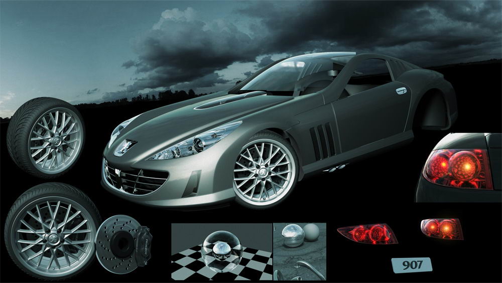
While the concept was being approved I started on the data conversion. The master model was created using ICEM Surf and was exported to IGES format. The mast file consisted of 22 separate files for various parts of the car and weighed in at over 100MB. The model was assembled in Maya and missing parts and problems were identified. The files were then individually imported in to Maya to complete the refinement modeling and culling of invisible parts. As this was a prototype many of the finer details were not included in the CAD files as they were to be finished by hand in the workshop. This meant that a whole lot of filleting and gap filling had to be done. In addition standard off-the-shelf parts such as brake assemblies, wipers, lamps and tires had to be modeled from source material. The filleting of all the sharp edges was a fairly timely process as almost every edge had to have microfilleting. This process took about 3-4 days alone to complete. The additional modeling, filleting and rebuilt parts are shown in the following images. In order for the car to have a more dynamic look and stance the wheels were enlarged and the tire profile reduced from the production size. This is a common practice among car designers in sketching and initial design. The final model was then assembled in Maya. |
 |
 |
 |
||||
 |
The texturing side of this project was fairly straight forward and came mostly from samples supplied by Peugeot. The interior had leather and alcantara which were scanned and applied as projections. As all or most surfaces were nurbs the textures were applied as triplanar projections. The ground texture I shot on the road outside my studio (this texture is available in the download section for free at 1024×1024) and combined with another cracked ground map as a layered texture. The cracks appear only around the car while the asphalt repeats to the edge of the ground plane. All textures were 2048×2048 pixels. I initially explored the option of using mental ray shaders for the car paint and actually compiled some new phenomena to get the desired look. But blurred reflections were increasing render time too much so I decided to simplify and use Maya shaders. The Paint shader is a simple Blinn with reflection falloff (using sampler info: facing ratio) and a procedural rock for specular colour (metallic flakes effect). All interior shaders were also standard Blinn. The Chrome parts all use a simple Blinn (diffuse: black, Specular: 95%white, eccentricity: 0, rolloff: 0.95). The glossy metals use more or less the same chrome but with Reflection utility generating the blurred reflection. This is used on the surrounding bars and the interior metal parts. The wheel material is a variation on this material with a brighter diffuse colour. The Glass shader is also a blinn shader with thin wall refraction so the glass surfaces could remain one surface. The original glass parts consisted of only the outer surface. It also meant that I could reduce the raytrace depth for the overall rendering to save some render time.
The lighting setup is also very simple and is based on the classic 3 point system. The lighting layout can be seen in the diagram below. The main light comes from the warm key light which casts MR area shadows. An additional cool light was added for more definition on the shaders. A final Dome light completes the environment. The dome is used to add diffuse sky light to the scene and also act as a rim light to define the far edges of the car. Attached to the dome is a surface shader with the Ray Type shader connected to out color. The Ray Type has a HDRI spherical reflection map for eye, reflection and refraction and smaller and very blurred version of the same map for final gather rays. The shader is set to be invisible in the render and alpha channel. This is a very typical outdoor lighting setup that I use quite often.
|
 |
 |
 |
||
 |
I used Mental Ray (as always) to render this project but was worried about render times due to the tight deadline for deliver. The actual time for completion was 10 days so render time was a real issue. As it was I had to double my ram (to 2GB) just to deal with the model comfortably. Anyway Mental ray really excelled and the average render time for each image was about 4-6 hours for all passes at a resolution of 3500×2000 pixels. Tessellation was always going to be a big hurdle due to the high order surfaces and microfilleting of the model. I initially tried to single out only those surfaces that needed special treatment but quickly discovered that the render time saved wasn’t worth the effort so applied an approximation override in the MR render global, using spatial fine distance dependant (1 or 0.5 pixel length) settings. This worked really well. It was at this point that the model started to fall apart. Suddenly surfaces that had been fine disappeared in test rendering and appear to be solid blue (same as line colour) in the viewport. I rebuilt some of the surfaces but nothing seemed to work. After losing nearly a day on the problem I final tracked down the problem to some sort of naming problem. Data conversion from CAD sometimes throws up these errors. The error was resolved by exporting all the geometry and reimporting but resolving all the surfaces with a new name. Simple but frustrating. I rendered out quite a few passes per images for speed and controllability in photoshop. The passes were: 2 Main Beauty Pass (ground, car), 3 Reflection Passes (car paint, windows, lights), 2 Ambient Occlusion using Dirtmap (ground, car), Shadow (for car to ground) and some minor features like masks etc. The beauty passes were done with FG with very loose settings as the AO pass was going to fill in any detail later. I normally use large radii for FG to speed up render time. In this case the settings were FG rays: 500, Min Rad: 20, Max Rad: 200. This fills in the diffuse light with no noise and fast render times. Sampling was an average 0,2 samples and supersampling of 0.05,0.05,0.05,0.05 with Mitchell filter. Above are some early progress renderings and experimentation. At this stage I also determined the final look and feel for the final image including the eventual background image. The Sky image came from www.1000skies.com and really created a great mood. I have hundreds of skies which I myself have photographed but where I live you just don’t see this kind of moody stormy sky.
|
 |
 |
|||||||||||||
 |
Once all the rendering was completed the images were compiled and finished in photoshop (I have Photoshop CS). The image really came together here and the final look began to emerge. The compositing of the various layers gave a lot of control over the final image especially with reflections and AO passes. Usually with the ambient occlusion passes I colorize various sections to correspond with the under lying colour. Multiplying just the standard black on top of a red surface (like the interior leather in this case) makes it look dirty and kills the image. It was at this point that the car paint metallic effect was added along with glow effect, hole filling and window reflections. There was also a dust cloud effect added to the two main images for added atmosphere. This was painted in 2D in Photoshop. The last day of the project I received word that the final colour of the car had changed and I had a few nervous minutes to wait for the final colour choice. Luckily the colour was metallic black (originally metallic dark grey) so I could easily make this change in photoshop (using an adjustment layer) and still meet the delivery deadline. The final step was to add an overall colour adjustment which was determined from the earlier tests and a little photo noise (very slight) to add texture to the image. Click on the image below to see the layer palette of main back shot. The following quicktime move shows the build up of the Photoshop file layer by layer. The file size is less than 2MB.
That’s All Thanks for taking the time to read this article and I hope it was enjoyable.
Client : Peugeot Additional Credits : Design by Peugeot. Model supplied by Peugeot CAD dept. Best Regards 3DM models creation |
 |
The following images are show small sections of the images at real size. Click on the thumbnails for the full view.
|
 |


