Tutorial: How to render with Keyshot
Before I begin the tutorial, let me say a few words about KeyShot. KeyShot is a very user friendly 3D rendering application that allows you to create photorealistic visuals in a very short time. It’s the solution for many designers who don’t want to waste time with complicated rendering software.
When I first imported a model to KeyShot, my jaw dropped. “WOW, real time reflections of the HDR image on the model.”, I thought to myself. For those who create hundreds of test renderings just to achieve the right angle for reflections, you’ll understand how much time you can save with that feature alone. Many designers have great models but bad renderings–a loss of quality in their portfolio that can affect job prospects or landing a project. KeyShot changes that completely, putting the ability to create stunning imagery in the hands of every designer.
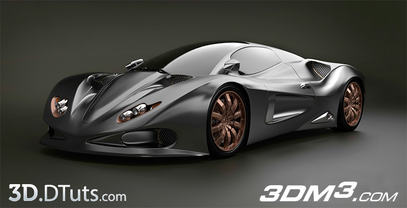
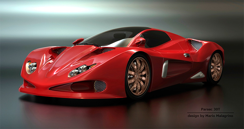
You may wonder what the key is to create great renderings. I will tell you. The key to a great rendering is the quality of light and use of material. That is exactly where we see the power of KeyShot. It offers preset environments (HDRI’s) as well as physical lighting, hundreds of scientifically accurate materials and settings that are simple to adjust. All of the changes and adjustments to the scene happen right in front of your eyes. This tutorial covers these features along with the settings used for the rendering of the car you see in the image above.
Let’s begin
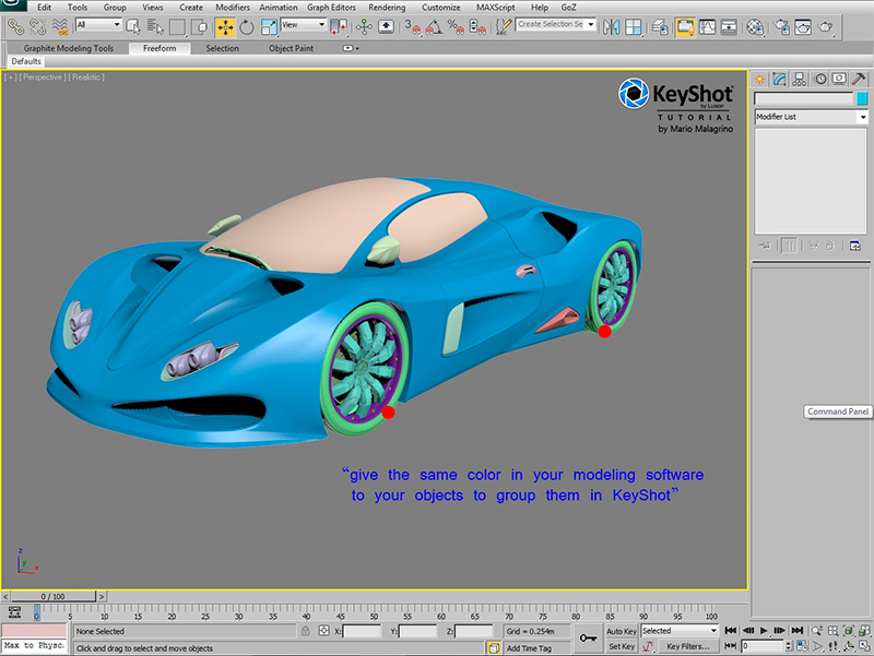
In your modelling software you have to give the same color to those objects that in Keyshot should have the same material. In this way you GROUP the objects for Keyshot. Attention, in older versions of Keyshot it’s the color that you must choose, in the new version it works trough materials !
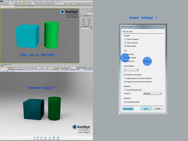
After this step EXPORT the model (I use OBJ files…but there many other choices). Ones you are in Keyshot “IMPORT” the model. You will see a nice real-time rendering in your view. This will allow you to understand what you should change. Remember that in your modelling software you have to set-up the units. For example METERS! This will guarantee you to be able to import in a second moment other objects with correct scale/rotation/size compared to the already existing project.
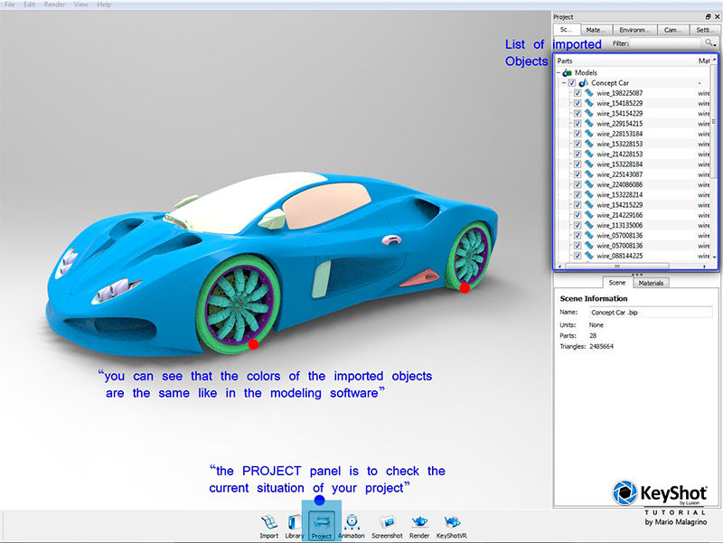
The two most important panels (buttons) are the “PROJECT” panel and the “LIBRARY” panel. The project Panel shows you what you have in your scene. The Library panel shows you what you can add to the scene ( for example an other material on your car, or simply an other HDR image etc…).
Let’s give a quick look to the Library. You have this sections: Materials, colours, environments, backplates, textures, renderings.
Materials
Here you can find a list of materials to apply (trough drag&drop on you model).
Environments
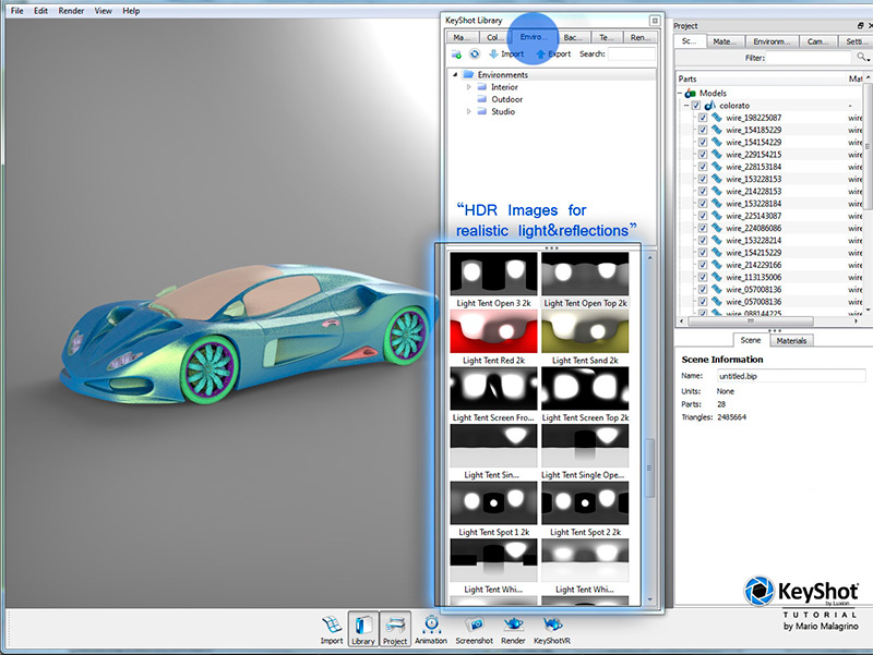
Here you can find many great set-ups of HDR images to use as background and light source (you can also import your own HDRI).
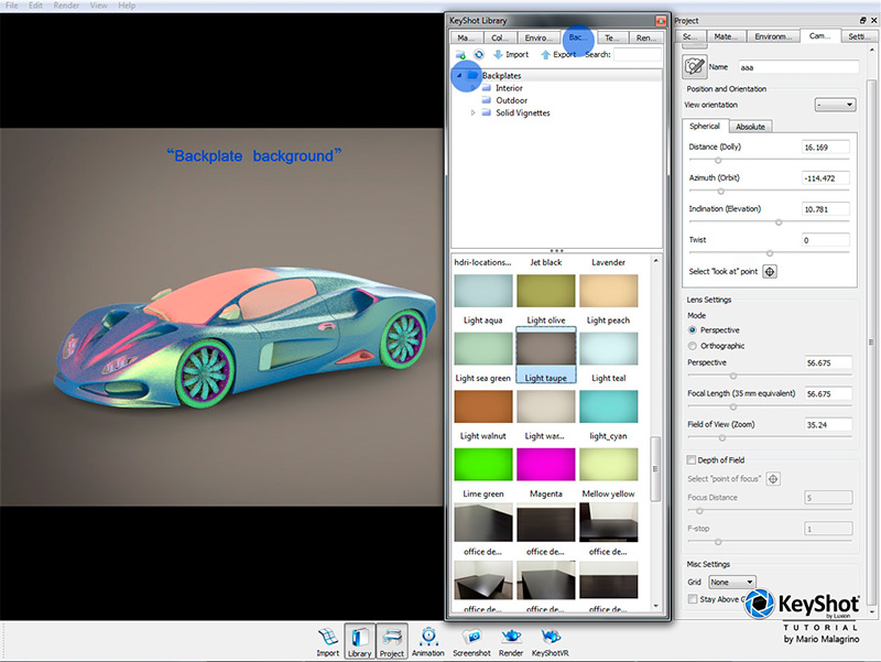
Backtemplates
This are backgrounds with different choices of colours or images (you can create your own in Photoshop).
Textures
If you apply them on your model you can choose between: it’s colour, bump map, opacity or label (it is a kind of material editor). This for are sections that we use in this tutorial.
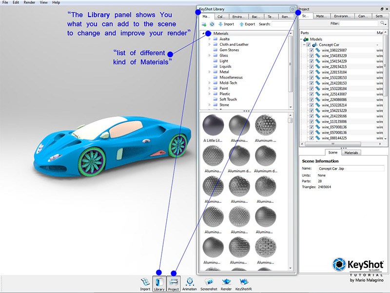
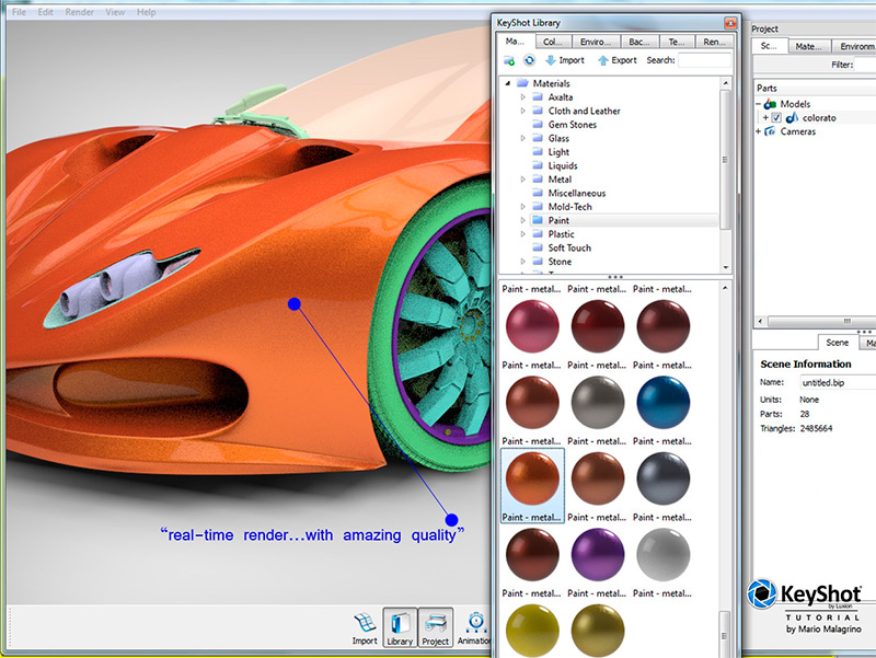
In the Material panel you have different sections. In our case I need a car paint material, so I search in the PAINT section a nice material.
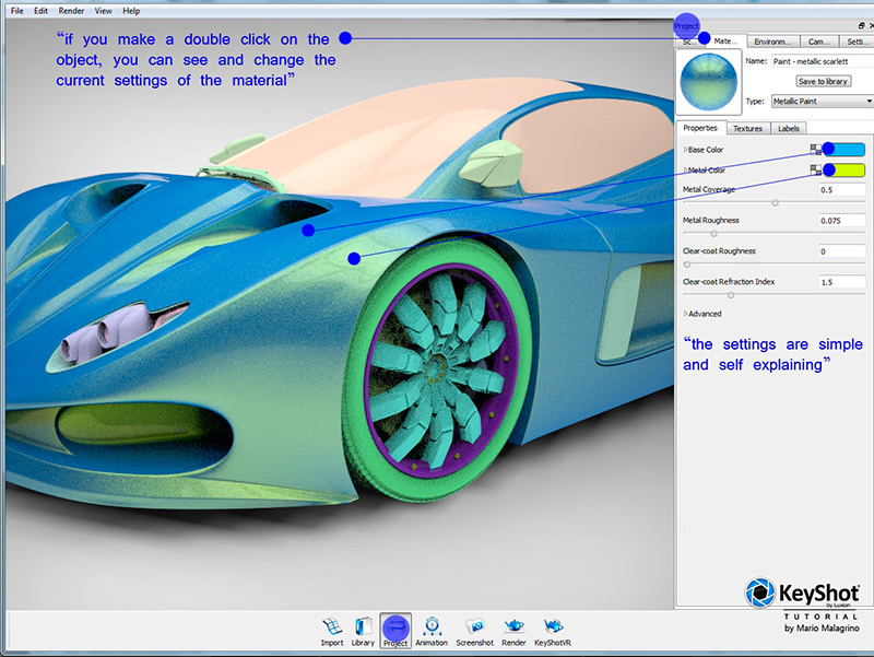
As soon you have applied (drag&drop) the material you can of course change the settings of the material to get other effects that you need. Make a double click on the object and you will see in the Project panel the material with several settings. They have very self explaining names. After changing it you can SAVE it to the library and use it again in other projects.
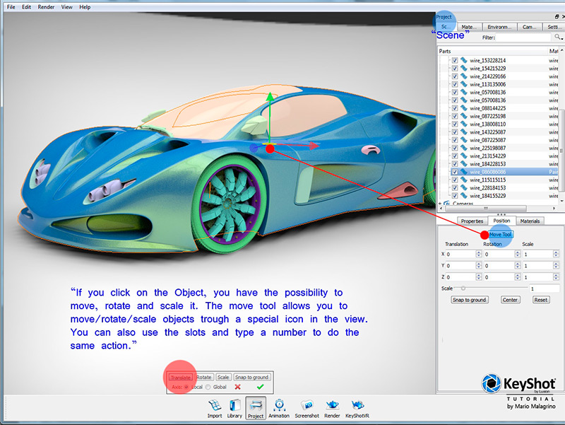
You can change the location, resize and rotate all objects in the PROJECT panel under position. Just click on the “parts” and use the slots writing down a number or use the move tool.
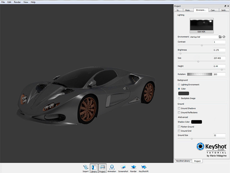
The HDR images are really very different from each other. There is one for every taste or need. Under environment you have the possibility to get light and reflection from the HDR and have a very realistic result.
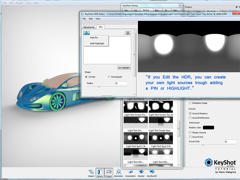
If you click on EDIT HDR you have the possibility to add your own highlights or light sources. It is really simple and effective. In bright renderings I would avoid to much of those extra lights. It looks amazing if you have an dark rendering and if you need an interesting atmosphere. If you make a “photo-studio” rendering remember that on your HDR reflections that are visible on your model there should be no threes or other outdoor elements visible. Should you choose a outdoor image you can “blur” the HDR in the HDR-EDITOR. This makes disappear a bit the disturbing elements in your reflections. If you have a too blue sky, just DESATURATE it in the editor, maybe not totally, since a light blue can have a nice effect.
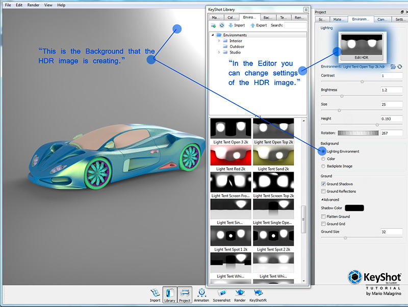
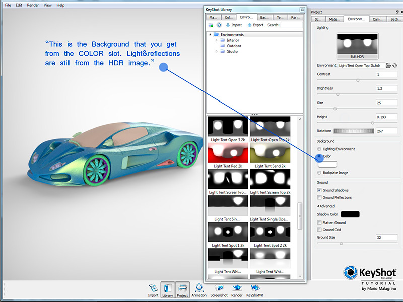
Should you Not like a gradient background or the image that your HDRI is creating in the background in your render, you can check the COLOR slot and choose the color that you like as background. This will not change light or reflections, only the background. Remember that the colour will NOT be reflected on you model.
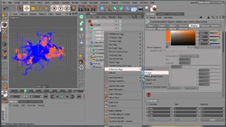
The HDR Edit mode allows you to create light sources in a few clicks. The results are very good, and sometimes necessary. Especially if you have dark scenes and your HDRI is not illuminating the part that you like have a bit brighter. In this case it will really help to add a Highlight or Pin.
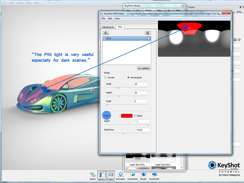
The Pin can have a colour of your choice. This makes the scene for sure more interesting. I suggest a very soft bright orange for WARM atmospheres, and a bright BLUE for cold atmospheres. Do not colourize all the scene with strong colours,…just a little touch of colour (in my sample there is a strong RED, but just to show you the setting).
Backplates are background images that you can choose to make your render looking more interesting. You can create your own in Photoshop, or just use a photography to simulate a outdoor scene. It is so simple to create amazing compositings of cars on street with Keyshot.
Here you have a blurred, de-saturated HDR as light and reflection source. The background is just grey. How can we improve significantly this scene? There is a small trick that I recommend to use, especially to simulate a photo-studio.
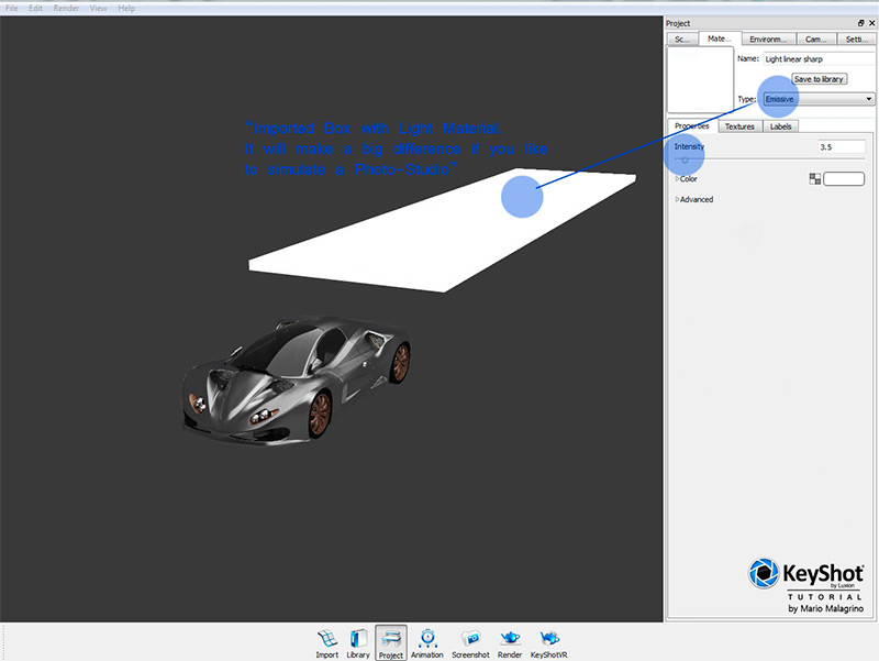
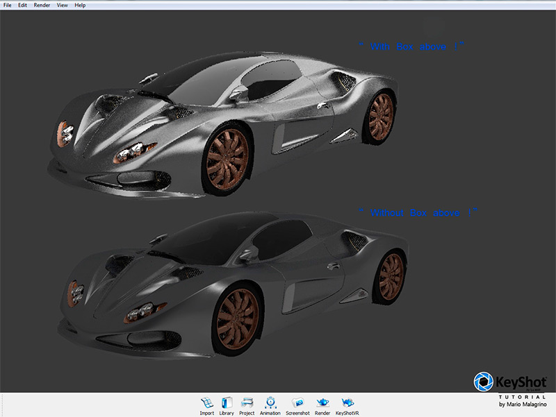
Create a Box, or any other shape (but the Box is the most used one in this kind of effects), place it above the car (or in a position that fits better to your project), and apply a LIGHT material. The difference is clearly visible.
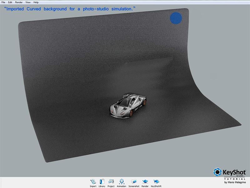
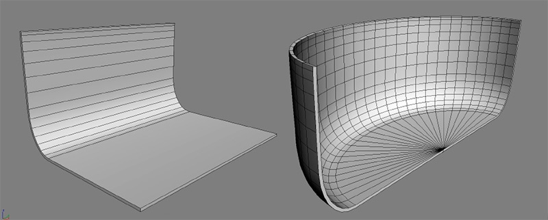
The last tip for this tutorial is to create a curved background, and import it as “wall-ground” for your project. I suggest to make the curvature veeeery soft and big, this will guarantee a very soft gradient in the background of your render. Why should we import this object ? If you go to use a backplate or color, it will not be reflected on your materials/objects. But as soon you apply now a colour on this special object, it’s colour will be reflected on your project :)
This are the most used shapes that you can use as photo-studio background, should you choose to use objects instead of backplates or the HDRI in the background.
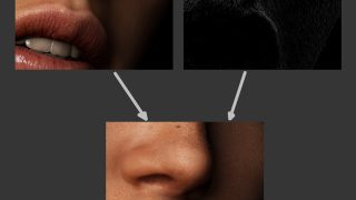
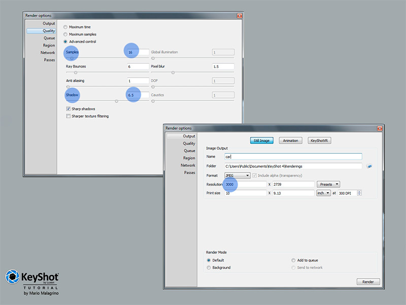
The Render settings are quite simple, and they do not really need to be explained. What I recommend is to keep the samples around 16, and the shadow around 6-7 (this is a good project/portfolio quality). Higher numbers will increase the render time really a lot. In PASSES there is the CLOWN pass which basicly is an alpha mask, but with different colours for each group. Very useful in Photoshop :).
Samples of other HDRI
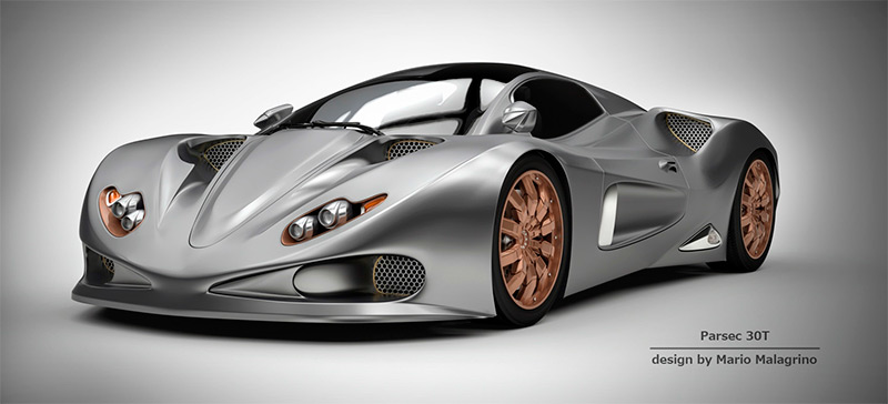
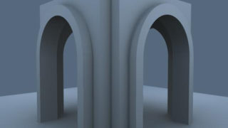
Samples of Real-time View renderings
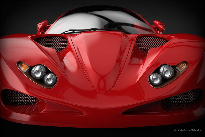
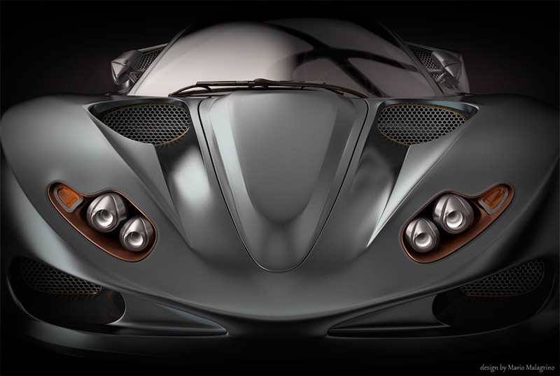
I hope you liked this tutorial. I would thank Luxion for making this useful software for designers.


