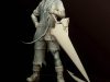
Making of Swamp Thing
This tutorial is of my version of Swamp Thing, and I will be walking you through to the finished piece.
Introduction
Hello my name is Joshua Otero and my digital illustrations and fan art take a turn to the real as I use the theories of light and color along with certain compositions and tones.
This tutorial is of my version of Swamp Thing, and I will be walking you through to the finished piece.
Concept
Conception of the idea usually takes a lot of personal exploration in your tastes. This piece being a part of a art challenge. The subject matter and feelings with the subject has been laid out for me. However, if you are making a piece on your own it’s best to start off with thumbnails. Ideas don’t form in a vacuum they come out through milling through bad ideas or you might end up stumbling on a few good ones. Be sure to start off with simple sketches. Don’t go overboard with detail because you’d end up wasting time (if your limited by time.) Also be sure to do your research on your drawings either by taking pictures of your poses or getting animal reference for creatures, trust me it helps. Once you have chosen the pose and setting then it’s time to either clean up the sketch or if you’re like me just scan in the rough sketch in at 300 dpi (dots per inch) in either color, black and white, or grayscale (grayscale preferred by me.)
STEP 1:
Once scanned in you need to prepare the scan for painting.
[Note: For Mac- Command/Apple/Cmd or with PC users- Ctrl]
To start off you take your image into Photoshop by either dragging it onto the PS icon or click on File> Open> select file in the location scanned.
Now if you scanned the line art in color, you need to change the mode to grayscale. However if your sketch is too light then you need to saturate or darken your colored version slightly to allow the grayscale to show by going to Image>Adjustments>Brightness and Contrast. Play with it till your line work is dark enough.

To change modes you go to Image>Mode> Grayscale.
After that we darken the lines using either Levels or Curves. I tend to use curves because I like sliders over graphs. Take your pick because both do the job well. To access either of those You go to Image> Adjustments>Levels (or Curves) Adjust the sliders (or curve) to the darkest (but not too dark) of line work and Hit okay. To use the Levels the first slider on the left is your Black, sliding it will make the darks darker. The Center slider is your grays. Anything remotely gray will be affected by this. The last slider on the Right is for the whites, it makes everything go white. Play with it and you’ll understand. The point of this set up is to make your background it’s whitest while your line art dark.
Once that is done it’s time to lift up your line art and separate it from the white background onto it’s own transparent layer while having a nice descent line art to work with (And paint behind.)
First off. Open your Channels channel either clicking on the button-menu or go to Window>Channels from here you select the dotted circle also called Load Channel Selection When you click on it “marching ants will be around your line art. So far everything but the line art has been chosen. Next is to reverse it by using Command (Ctrl) + Shift+ the letter I (at the same time) or your can just go to the menu and go to Select>Inverse. Now just your line art is selected. Next thing is to go to your layers menu (it should be out as a default. If not you can find it under Window>Layers.


Create a new layer while the selection on your line art is still active. Select your new layer, then go to Edit>Fill>the drop down menu will appear. Select Black 100% and hit okay.
Your selection will now be filled in your new layer. Now deselect your new layer by going to Select>Deselect or Command (Ctrl) D.
With your new transparent line art layer still selected. Go to Select>All or Command (Ctrl) A which should select everything in the transparent line art.
If you would like to save the sketch’s state save first. Copy the layer with Command (Ctrl) C or go to Edit> Copy
Now to start fresh with a new document, with the new document it will automatically take the sketch’s dimensions and transfers them to then new document dimensions.
If you’re fine with that then either name it or just hit okay.

STEP 2
Now if you are more of a traditional painter and are total fine with painting over the sketch then you can skip the entire first step. But if you are like me who needs a guide for painting, do the first step. Now for painting, first we need to put a base color down for the piece. Usually from here you would do some color tests by taking copies of your sketch and do quick color schemes on each one I would paste the image using Command (Ctrl) V or go to Edit> Paste (or Paste Special if your wanting the previous location it was at.) [Reminder: Be sure to save often. Nothing is worse than going through a process or painting and losing it all because of a digital malfunction.]
Be sure that before you begin to change your Mode from Grayscale to RGB for your screen’s sake. If you plan to print off the bat be sure to switch to CMYK for better printing quality. Also if you want to paint in CMYK using sliders- the top-right of your Colors pallete a drop menu is there. Click it and choose CMYK to color in that mode for better color control. (In my opinion anyway.


Once you have selected your palette of choice choose your main color that will be throughout your piece. This is your base layer, usually it’s very dark but that’s how light works. Form comes from light hitting the surface and describing the texture and illuminating factors. Keep in mind that I use reflection refraction and light behavior to my advantage. Colors tend to intermingle when light bounces off of other objects or from its source. For example Blue Sky + Yellow Sun = Grayish (de-saturated) Green clouds. Odd but it’s all around you if you are observant enough.
Be sure to build up your light slowly. Work on your darks ergo shadows and mid-tones.
After that work on your Light source and taper off slowly. Light tends to have crisp edges while as the form falls off the light it slowly blurs and blends into the background. Finding an losing edges help a form stay in an environment as well. Be sure to work local colors in as well as the light source color as well. Keep in mind your color wheel. Colors that are opposite of each other tend to help the other color pop. Also keep in mind what is the focus and where do you want your audience to focus their attention at using color and brightness to grab the reins. All other information can be de-saturated and be less than vivid of your focus. Be sure to block in the major shapes before you start detailing. If you get the need to start detailing detail major areas or areas in need of extra attention.


STEP 3
Now that you have some information down now you must further bring attention to your subjects using the color wheel shows that my background is of cool colors while parts of my characters have warmer colors even if they aren’t bright they still pop out of the cool background. Be sure to have your reference ready because it will help you make accurate decisions on the details for color later.

STEP 4
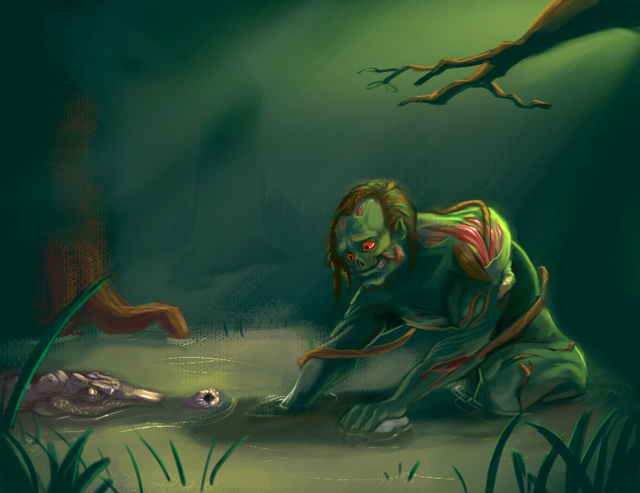
Here I have addressed the background a bit more. No sense in having our subject lost in a colored abyss. Now that he is in his element, it should help to have him grounded (even if he is in muddy water.)
Also I have brought out more of his reddish pink muscles and made his eyes bigger for more of an empathetic look while making his eyes red to combat the loads of green in the image.
I used swamp grass, trees and a tree branch to frame the composition, I could have added much more but it would have over crowded the image and to keep it loose I kept it fairly open.
Paying close attention to the water and the ripples in it, I tend to obey what natures physics does naturally.

STEP 5
Further refining my painting by making sure I paint both inside and outside of the lines to be sure I get fantastic colorful lines that behave with the light.
After some additional detail to the eyes and face, I brighten the whole piece to be sure that my image is not dark or unclear using Brightness and contrast. You could also use Selective Color under Image>Adjustments> Selective Color to control how much or how little your piece has of CYMK or Cyan, Yellow, Magenta, Black. My color sliders are set to CYMK mode so If I wanted to print it. It’s already ready to print.


About The Author
You might be interested in