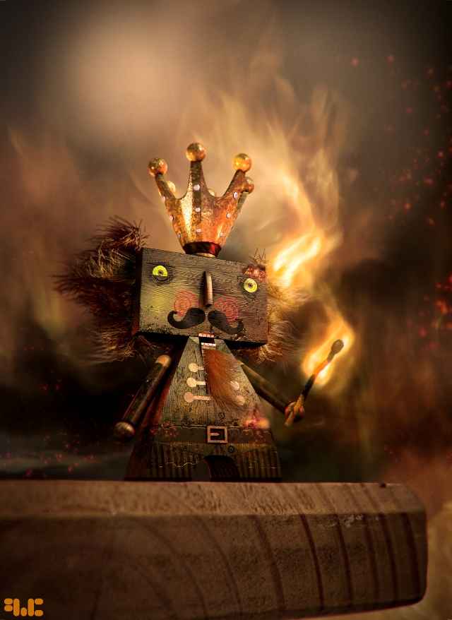
Making of Nutcracker
Making of Nutcracker by Francois Conradie
Introduction:
Hey my name is Francois Conradie and I have been working in the CG industry for almost 6 years, specialising in 3D modelling and texturing.
References:
I have gathered together a couple of references (fig01) and put together some of my favourite influences and inspirations to create this image.
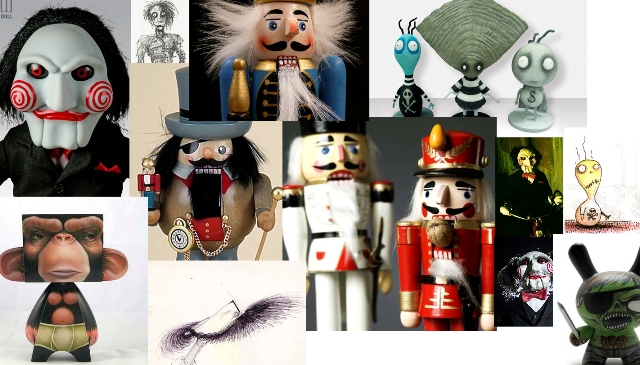
fig01
Concept:
This image first started off as just a doodle in my sketch pad (fig02) and after looking at the black and white sketch, I wanted to see how I could make it work in 3d with rendered hair and dynamic lighting. I have always found nutcrackers to be very interesting but I wanted to do a twisted and comedic take on the traditional character.
With the Tim Burton vinyl toys on my desk as inspiration, I wanted to create a toy-like character with a very simplistic shape, the character of the toy primarily coming from the paint work.
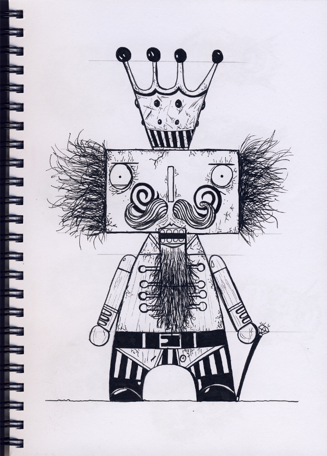
fig02
Modeling:
The modelling was pretty straightforward, the model consisting only of basic shapes (fig03) and some hair generated from the geometry for the character’s hair and beard. UV unwrapping was very straightforward as well. After finishing up the UV layout and basic lighting, I then quickly moved on to the texturing, as this is always the most important and fun part of the job for me, and I wanted to focus as much time as I could allow on it. Modeling and unwrapping was done in Softimage XSI.
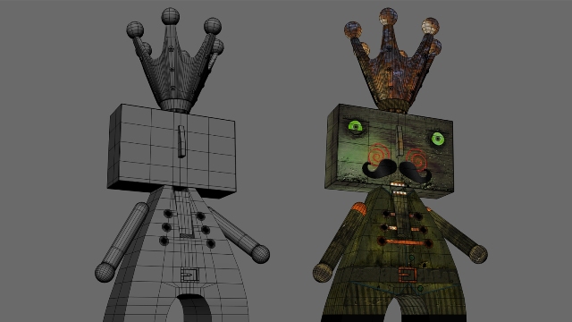
fig03
Lighting:
The materials I used for the different parts of wood were mostly basic Phongs with some specular detailing, with the textures also playing an important part in the resulting spec, reflectivity and bump of the materials. For the lighting, I used a fake FG setup with soft spotlights facing in various directions, with low values to get a overall ambience. I added a spotlight facing the model at an angle for interest and then placed numerous orange and red point lights around and behind the nutcracker to get that rim lighting from the fire background of the scene. (fig04)
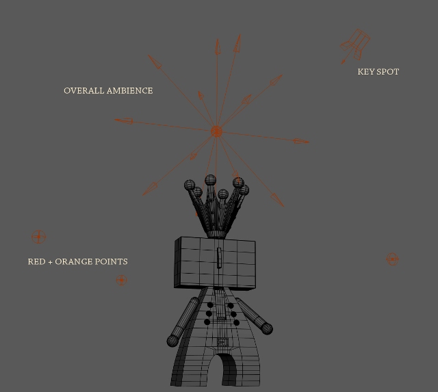
fig04
Texturing:
I had a lot of fun (and frustration) trying to figure out what the best colour choice would be for the look of this nutcracker. I think I went through about 3 different colour palettes before finally sticking with the final one. Texturing wise it was very important for me that the wood “skin” of the old nutcracker looked aged, stressed, a little bit crazy and not new at all. I find this gave it a lot more character and makes the image what it is.
For the bump/displacement I just adjusted the levels and inverted some layers of a greyscale copy of the colour map, saved that out and took it into Mudbox, made some minor tweaks and saved it out to be used in XSI for displacement. (fig05)

fig05
Rendering:
Because I wasn’t sure where I wanted to go with the final look of the image, I thought it best to render out a couple of passes so I could composite it all in Photoshop and play around with various ideas and colours. Passes included Col, Hair as a separate layer, AO, Hair AO (fig06) and the crown gems as a separate to add some glow/reflectivity to them.
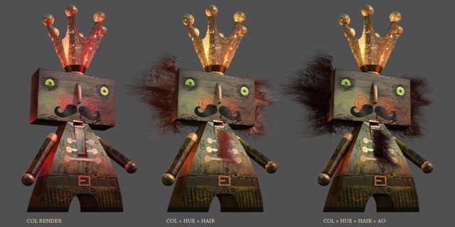
fig06
Background:
The wood-like texture of the character made me wonder if a fire-y background could make it look more interesting, adding to the destruction of not only the character’s mind but the surrounding environment as well. I wanted to convey the idea that he is a menace. That he wanted to be the last nutcracker :) Also getting decent back-lighting on the model would give the dark character sharp contrast in the image and make him pop out more. Plus it’s fun to paint with fire! To get the overall look I used a combination of long exposed photos I took with my SLR nikon d3000 and some paint blending in Adobe Photoshop. (fig07) I then added additional smoke passes, also painted in Photoshop, and I added flying embers, sparks and charred burn marks on the character himself. (fig08)
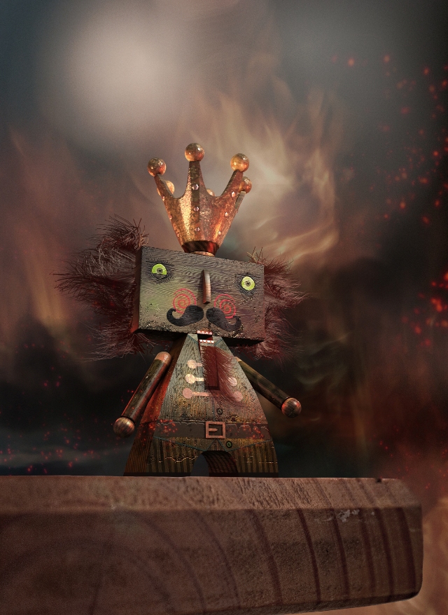
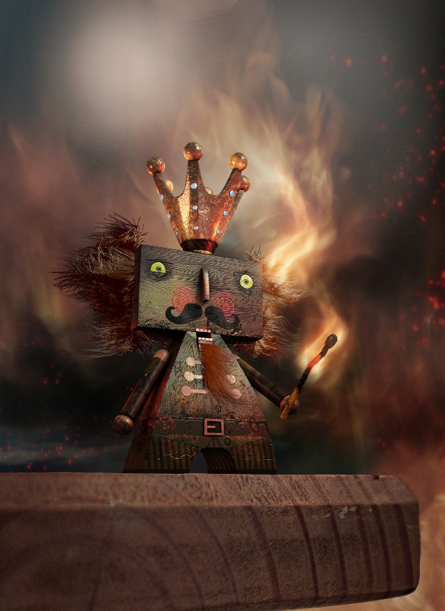
fig07.jpg and fig08.jpg
Compositing:
For the matchstick I used a rough photo as a base to start with, a rough model would also have worked well, and did a lot of painting over and bending to make it fit the scene. For the flames on the matchstick and hair of the nutcracker I also used a combination of the photos I took and painting in to get the final result. Screening a couple of the fire layers over each other gave it that intense glowing look I wanted. Again adding contrast to the overall dark scene.
I then did a lens correction, added a vignette to darken the edges of the image and make the character pop, and finished off the image with adjusting the levels, adding some photo filters and an overall hue and saturation tweak in Photoshop. (fig09) And that’s it.

fig09
I hope you have found this making of informative. Thank you for the support and thanks for the opportunity, it was a fun experience making this image as well as writing about the process.


