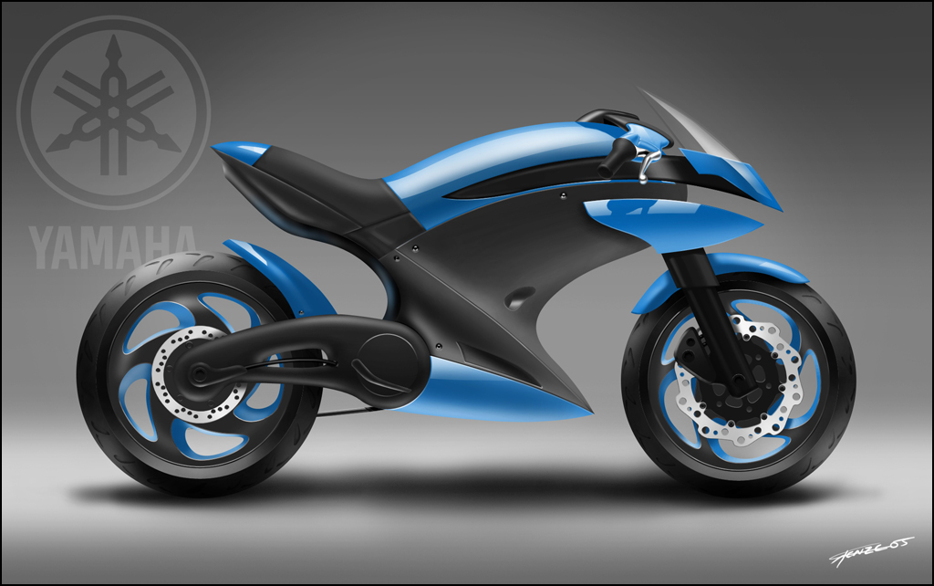
Motorcycle Rendering Tutorial for Photoshop, creating a ‘photoreal’ 2D motorcycle
Hi there and welcome to my second tutorial. Perhaps weird to do so, but I would like to open with a word of advice. My mind can be quite chaotic at times, during this tutorial it certainly was. I made a number of silly mistakes and I’ll show them to you in the course of the tutorial. So please read through the whole tutorial first.. you’ll notice some things that I would change from the start if I were to make this image over again.
If you don’t quite understand what happened in a certain step of the tutorial, just read on, there’s a chance that I will explain in a later step to prevent having too much text with some images.
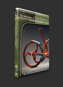
If you’re familiar with the field of concept design, you’ll probably have heard of a guy named Scott Robertson (website drawthrough.com). He has produced an excellent set of tutorial dvd’s for The Gnomon Workshop, one of which shows the process of rendering a futuristic bicycle.
My tutorial uses the same techniques, though perhaps my approach will differ here and there. Anyways, Scott gave me his permission to publish this tutorial, for which I’m grateful.
Right, lets get this thing on the road.
In the Photoshop screenshot below you can see I have started out with a background and an enlarged rough sketch that I prefered to render out. Between the really messy sketchlines you’ll probably see some cleaner lines that I imported from Rhino. They were traced from a Yamaha R1 motorcycle sideview. I used these to make sure my proportions wouldn’t be too far off.
Put the sketch that you want to render out on a seperate layer and set the layer to Multiply and turn down the layer opacity so that it is just visible enough to be usable for tracing.
The background you see is very typical for studio photographs of cars and other vehicles. In the renders I made below you can see the effect I tried to accomplish.
Making this background is really easy, you could do the whole thing with a simple gradient, I simply used some big soft airbrushes from the default Photoshop palette. Try to avoid using the opacity of 100%, if you turn it down you can achieve much softer effects if you make a couple of passes with the brush (think of it as using a tissue with chalk powder).

I put down a simple drop shadow here, it will make a big difference in a few more steps.. Simply use a soft and small airbrush to create the shadows.
Now I will probably modify the shadow later on when the bike render is done, but for now it’s good to just have an indication there of an object that is shown in this studio setup. You don’t want to render a bike that seems to be hovering over the ground. A shadow gives an immediate effect of mass.
Notice the basic layer setup:
sketch guide: the initial sketch + rhino proportions drawing; layer set to multiply (so it will display over all the objects below. I set the layer to an opacity of about 40%, just enough to keep it useful for throwing down some Photoshop Paths later on.
Layer 2: still empty, but imagine in this place all the layers needed to create the actual bike rendering later on.
ground castshadow: I think this one is pretty obvious. Don’t merge it with the background though, if you want to move your bike later on you don’t have to create a new background and shadow if you keep things seperated.
background: the background shot that we created earlier on.

Ok, important step here, you can chose to do it later, but I prefer to lay down some guides as soon as possible.
Activate the rulers with Ctrl+R, click on the left ruler and drag till you see the guide on your image. You’ll need two vertical guides, once for each wheel. Locate them to where you want to have the center of each wheel (axle position).
Now from the top ruler click/drag three guides on your image. Position one of them where your wheels will touch the ground and the other two on your wheel axles. I dropped my rear axle slightly higher than the front one, I want to have a bigger rear than front wheel.

Time to start the tedious stuff Paths!!
Lets start of with the wheels. Click the Ellipse Tool ![]() (U) and before you draw some ellipses, make sure that in the Options bar below the Taskbar this icon in pressed
(U) and before you draw some ellipses, make sure that in the Options bar below the Taskbar this icon in pressed ![]() . This will make sure that the ellipses you’re about to make will be made as paths and not shapes.
. This will make sure that the ellipses you’re about to make will be made as paths and not shapes.
Draw an ellipse with the Shift key pressed. This will force the ellipse to become a circle.
Now your circle is probably too small or too big and not positioned where you want it. We’ll solve this First you have to make sure you have snap turned on ( Shift+Ctrl+; ).
Press the Path Selection Tool ![]() , select the circle you just made and drag it onto the intersection of your guides. With some dragging left/right and up/down you’ll soon enough see your new circular path snapped to the guides.
, select the circle you just made and drag it onto the intersection of your guides. With some dragging left/right and up/down you’ll soon enough see your new circular path snapped to the guides.
With the Path Selection Tool, we’ll now scale your path so that it drops right onto the guide you made for the floor. Chose Edit > Transform Path > Scale. With the handles around your path you now can scale your path. Make sure you keep Shift pressed so that you won’t stretch it back to an ellipse
Again, it might take some effort for the handles of the transform box to snap to your guide, but with some persistance it should work just fine. Press Enter to approve your scale and that’s one circle done
Now we need a couple of these circles.. I created one for the outer edge of each tire as well as inner edge where the rim will start. A fifth circle was made for the shape where the rear wheel suspension will hinge.

First thing you’ll probably notice here is I flipped the image horizontally. Why? Well I prefer to sketch motorcycles with their front wheel to the left. The reference photo I used showed the other side of the motorcycle, with the front wheel to the right. So my sketch had parts on one side that would be on the other side on a real motorcycle (at least, on Yamaha motorcycles in that range). I found this out around this step in the process… so I simply flipped my image horizontally (notice, if you flip your layers individually, their orientation in respect to eachother might be lost, because the layers are flipped around their own pivot points. You won’t have this problem when you flip your whole image in one go.. which would be faster anyways, but it’s good to know ).
Now it is time to make the rest of the paths for our rendering. Paths are vector shapes that are stored inside your drawing as invisible objects, meaning, when you save your image as a .jpg or some other format than .psd, it will not show those paths in your image.
Paths can be used for all kinds of things, but in our image we will use them to create very smooth linework and selections. You can create as many paths as you want and you can always select or deselect them and even modify them.
We will create paths for pretty much all our coloured areas. You can create a path using the Pen Tool ![]() (P). Just make sure you have this
(P). Just make sure you have this ![]() Paths button selected in your tool bar or else you will be drawing shapes instead of paths.
Paths button selected in your tool bar or else you will be drawing shapes instead of paths.
Draw your paths around the area that you want to colour. Maybe you are wondering ‘how do I create two exactly the same bits of linework on the borders of two areas? Do I need to neatly trace the whole border of each coloured area?’. Well, don’t worry because you can most likely overlap the paths in those areas, as long as we pay attention to the layer order. This means you can use the border of the one area and have the neighbouring area just overlap because it will be below it anyways.
This can be quite a puzzle, so be carefull where you think you can overlap paths and where it will be harder.
When you create the path, a single mouseclick for each new control point wil create a sharp corner.. if you click and drag you will create a smooth control point.

The![]() Path Selection Tool (A) can be used to select a whole path. With the path selected you can then transform or scale the path, but not with the Path Selection Tool itself (use the Edit menu in the Photoshop Taskbar).
Path Selection Tool (A) can be used to select a whole path. With the path selected you can then transform or scale the path, but not with the Path Selection Tool itself (use the Edit menu in the Photoshop Taskbar).

Together with the Pen Tool (P), the ![]() Direct Selection Tool (A) is the tool that you will use a lot when creating the paths. This tool is used to control each individual control point of each path.
Direct Selection Tool (A) is the tool that you will use a lot when creating the paths. This tool is used to control each individual control point of each path.
Click on a path with this tool and you will probably see the control points show up as well as 2 handles. With this tool, click on a piece of path between two control points, and the handles of those points controlling that piece of path will show up. If you click on a control point, both handles of this control point will show up.
This tool can be used to modify the control handles of each point, as well as the position of each point. So this is a very powerful tool that you can use to really create the shape that you want.
A good approach to creating paths is to quickly and roughly create a path with the Pen Tool and then after you have created this path, get it to fit properly with this ![]() Direct Selection Tool (A).
Direct Selection Tool (A).

Here you can see that I made the steering arms using a combination of sharp control points (just clicking) and smooth control points (clicking + dragging).
Now you will probably encounter the situation that you have accidentally created a smooth point where you want a sharp corner or vice versa. No problem, use the ![]() Convert Point Tool (press and hold the Pen Tool button to find it) to change the point after you have finished creating your shape. Using this tool you can click on a point to convert it to a sharp control point and click + drag to convert it back to a smooth control point.
Convert Point Tool (press and hold the Pen Tool button to find it) to change the point after you have finished creating your shape. Using this tool you can click on a point to convert it to a sharp control point and click + drag to convert it back to a smooth control point.
Last thing that I want to point out in this screenshot is the Paths dialog that is shown. Sometime during the creation of all your paths it will be likely that you deselect your ‘Work Path’. This will promptly hide all the paths and you will most likely panic Don’t worry, you can simply re-select the ‘Work Path’ and all your paths will be shown again.. I wish Adobe would simply use a hide/unhide button as they do with the Layers… this would be far more consistent and less confusing.

Well it appears I have created all the paths that I need now (most likely you’ll find out later that you need to create even more.. no problem, but tedious, yes ).
Use the ![]() Path Selection Tool (A) to select a path and make sure you have created a new layer for this bit you’re about to colour. Click the right mouse button and chose ‘Make Selection…’. Leave the settins as they are in the popup dialog you’re shown next and press OK. You will see you now have a selection that you can fill with the colour of your choise.
Path Selection Tool (A) to select a path and make sure you have created a new layer for this bit you’re about to colour. Click the right mouse button and chose ‘Make Selection…’. Leave the settins as they are in the popup dialog you’re shown next and press OK. You will see you now have a selection that you can fill with the colour of your choise.
Repeat this procedure with your other paths and try to keep track of the layer order at the same time. Make sure you create layers with proper names, because you’ll likely end up with over 30 layers and you don’t want to spend 10 minutes finding the right layer..
In this screenshot you can see that I have 2 black objects overlapping eachother, namely the foot support and the circular shape behind it. I created two seperate layers for this to make it easier later to add highlights.. prevent using objects on the same layer as much as possible if you’re really lazy and don’t like puzzles (re-ordering layers all the time).

Before starting the shading of each surface, which means adding the highlights and core shadows, we have a nice opportunity to play with the colours of our bike. Make sure you decide on a colour before we commence with the shading. Of course you can modify the colours when you are finished (because we keep our layers seperate), but it will make life easier if you chose a colour that isn’t too hard to shade.
I liked this yellow but then remembered that it is usually a bit of a pain to make shadow areas in yellow look good and not dirty, so I switched to something easier.

From this point on you will be shading mostly, so you can hide your sketch guide layer that you have on top of your image.
Select the layer of the area that you want to shade (for example the fuel tank) and make sure you have ‘Lock transparant pixels’ turned on (it’s the checkerboard icon next to the ‘Lock:’ text in your layers dialog). This will allow you to paint all you want without worrying that you paint outside of your coloured area. Because you locked transparant pixels you cannot paint on empty areas, meaning you can paint only in areas where you already have colour.
Paint the highlight and core shadow of each area on the same layer as the object is located. If you mess up, you can simply paint over the area again with the colour it used to be and all is restored. Don’t use the eraser, it will simply fill the area that you erase with the background colour that you have set in your Toolbox. Simply use your airbrushes to paint until you are happy with the result. Remember, the bits of the bike that are near the top have a pretty strong highlight on top, the bits of the bike near the floor have a weaker highlight on top, but probably also a highlight from light reflected from the floor. Don’t forget to add this effect, it will add a huge amount of realism in your image (you can see this clearly on the plastic bit below the blue fuel tank area).
Again, looking at reference pictures of all kinds of products, bikes and cars in studio setups will teach you a lot on where you can find highlights (don’t confuse highlights with reflections though) and shadows. Having good reference around makes life a lot easier.

Now if you’ll excuse me I’m going to be very lazy here
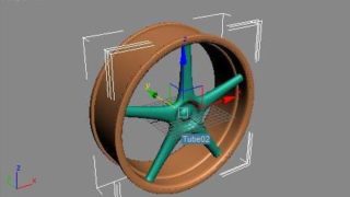
Doing complex shapes like this in a vector drawing program like Illustrator (I used Rhino here because it’s great with curve matching and arrays) can really make the experimenting with shapes a lot easier.
You can do these shapes in Photoshop but it would be really time consuming and the end result is only visible after investing quite a bit of time. In Rhino it was just a matter of cutting up a circle in as much parts as I needed, drawing some curves to replace those parts and polar arraying them. I also matched their curvature and joined them to create a single nice flowing curve object.
It would seem this is a lot of work, but when you are a little familiar with Rhino you will know this is actually really easy and a matter of just a few minutes before you can have a set of different versions to play with.
In the end I used Rhino to create the discbrake assembly, the rims of the wheels and the tire profile. You’ll see those in later steps of this tutorial.

Scale down the imported curves (keep Shift pressed to make a nice uniform scale) and snap them to the wheel centers. Make sure you keep track of the layer order, or these will end up on the wrong end of the steering arms
You’ll notice that these imported curves have quite thick black lines. This might seem bad, but we can actually turn this into a plus because when we turn on ‘lock transparant pixels’ we can draw highlights and shadows on these curves.
Before we do this though we need to colour our shapes. Go to the layer where these shapes are on and use the magic wand to select the insides where you want your colour. Create a new layer while keeping your selection and fill that with the colour of your choice. Just make sure you keep each colour on a seperate layer so that you can easily make changes if you’re not happy with the result.

We’re now going to try to simulate a brushed steel look that you usually see on brake discs like this. All the painting is done on the layer used for colouring the front disc, so no seperate layers for reflections of shadows are used.. this is a simple object to colour so no need to make things overly complex.
You could use a noise filter here and use a radial motion blur as in reality this shading effect is used by tiny radial scratches, but if I’m being honest I don’t think that’s a very realistic look. The radially blurred noise would be good for bumpmaps in 3d software, but not for photoshop, because we’re rendering the actual highlights of those scratches, not the scratches themselves. They are just too small to show up on shots like we’re trying to mimic. So that only leaves the anisotropic effect, which is easily achieved by using a soft airbrush and streaking across the disc a couple of times. Try to achieve a nice and subtle effect.
One nice side effect with glossy surfaces is that they blur reflections. The reflection of the front fork for instance is easily made by using another soft airbrush and going over the area behind the fork. Again, just go for a subtle effect, just don’t make the edges of the reflection too sharp. Notice that I call it a reflection, but you can just as well call it a shadow. In reality it would be a mix of both of course.

For the wheels (rims) we will use exactly the same process. I have imported the curves from Rhino and created a couple of layers for the black areas as well as the blue areas.
For complex assemblies like the rims and disc brakes, it is wise to create not just new layers, but also a new layer group. You can then put all the layers associated with each assembly in their own group. When you select a layer group you can scale/move every layer in that group at the same time. Very convenient!
Now we’ll scale the group I created for this front wheel and put it into place using the uniform scale and snap approach I outlined earlier on.

Ok, now that we have these panels coloured we need to give the edges some nice highlights. Since we have paths for most of these surfaces this is really easy.
Select the path of the surface that you want to edit with the Path Selection Tool (A) and click the ‘Load path as a selection’ button at the bottom of the Paths display (you can chose multiple paths if they’re not overlapping or anything, you might as well do a couple of those at the same time).
Make sure that you’re on the correct layer (I just paint those panel highlights on the colour layers, no need really for a seperate layer for highlights) and also make sure that the layer is still set to ‘Lock transparant pixels’ as we don’t want to paint the highlight outside of the panel area.
Now we’re going to adjust our selection; Select > Modify > Contract… I chose to make the selection contract by 2 pixels. Now inverse your selection (Shift + Ctrl + i) and we’re ready to go. Since we’re only allowed to paint between the selection border and the outer edges of our panels (because of the pixel transparancy lock) we can chose any brush size we want to paint the highlights. Just make sure your brush isn’t too big for the areas where you want to end the highlights, say near the corners of your panel.
Panels that are located high above the ground we’re going to give a strong highlight at their top edges, panels that are located just above the ground we’re going to give highlights on the lower edges as well because of the light bouncing off the floor.

Here’s the result of that highlight work we did. Notice how the main panel in this screenshot has a highlight on its top edge that seems to suddenly stop. The reason for this is that there are parts above that panel that stop it from catching the light there.
A stupid mistake I noticed here is that I completely forgot about the core shadows on this thing. Without them the image looks really artificial and flat.. never do the highlights without forgetting about the core shadows.

You can see a variety of things in this close-up. First of all, the tire profile. Again this was made with 2 simple Rhino curves (inner and outer shapes) that I polar arrayed and imported in Photoshop. The colouring of these profiles are actually pretty simple. Use the magic wand tool to select the inside bits of these shapes (make sure you are on the layer of your profile curves you imported) and with a small black airbrush drop in the shadows and with a white one the highlights. Having selected the insides of these shapes makes sure that you don’t colour outside the lines
Something else you’ll notice is that there’s a big difference in the darkness between the steering arms and the black bits of the brake disc assembly. I corrected this in the brake disc parts by playing with the brightness/contrast sliders.

Now it is time to reflect on all our hard work so far.. we have finished the rendering for a large part. All our surfaces are coloured and all our details are in there. The only thing is that it we still need to add the reflections.
All the body panels still look as if they’re made from a dull plastic. We need to add a clear coat on top of it to make it shine!
To keep things clear and non-confusing we’ll create a new set of paths in the paths window as you can see in the image below. We’ll use this new set to create our reflections.

As you can see I have skipped the part where I create the paths, we have covered that already. I created these reflections on areas that will be highly reflective, the black plastic bits won’t need them.
Create a new layer called Reflections and convert your reflection paths to a selection. Fill the selection with white.

First thing to do is to turn down the opacity of the reflections layer. Having some reference photos nearby helps to chose a realistic value for this. I chose an opacity of 34%, be careful not to make the reflections overpower your whole image and taking too much attention away from the subtle shading we have created underneath.
To finish the reflections I slightly erased the corners and edges of each reflection. This simulates lightboxes used in photography that have their main light strenght in the center of the box.
Very simple, use a big airbrush with just a little bit of opacity so you don’t erase the whole edge in one go.

Now you probably noticed this much earlier than I did, but I was about to wrap this baby up when I discovered I actually completely forgot to make the handlebars and brake handles. Ah yes, nothing better than suddenly discovering you actually have quite a bit of work to do when you think you’re done.
What I did here (sorry for the missing process images..) is basically repeat the whole process of making a quick sketch, new paths, new layers, flat shade fills, highlights and reflections. Since these steps are all familiar by now I hope it shouldn’t be too much of a problem if I leave these out.

Here’s the end result.. notice the missing mirrors. After I made the handlebars it became obvious the mirrors were in an impossible position. Rather than repositioning them I left them out. The bike is a rendering study and not an exercise in design, besides, the lights are missing as well, so sue me
I hope you enjoyed the tutorial and maybe picked something up in the process… I know I did. One last change I made after finishing this piece and entering it in my folio is adjusting the ground shadow a bit more as well as the floor area. I made it a little bit flatter to match the side view ‘camera position’ a bit more.

If you feel you need more help creating images like this, please consider getting Scott’s dvd.. there’s nothing like watching someone perform the whole process right in front of you:
Of course, if you have any questions, let me know and I will try to answer them as well as possible.
Copyright © Renze Rispens
Edit by Stryker
Homepage: http://www.renzerispens.com
Source: http://www.productdesignforums.com

About The Author
You might be interested in