Making of “One Eyed Monster Thing”
This digital painting tutorial takes us back into the realms of strange retro sci fi futurism where we’ll make a weird one eyed monster!
Digital Painting Tutorial – Overview…
So I think after the last digital painting tutorial I’m going to follow suit and have all my progress shots compiled into an animated gif but talk about the main principles and hurdles I experienced along the way.
I don’t think that technique and painting tips is quite as valuable as principles and problem solving. The more I paint, the more I realise how much of a game of psychology illustration is.
You have the “it’s good enough, move on” voice doing war with the “better! it HAS to be better!” voice. I think the thing that takes you out of the bottom end of being a beginner and moves you into the upper end of being a beginner and maybe up to the lower end of intermediate is following the latter voice. Don’t settle – you know it isn’t good enough so get out the eraser tool.
With that said, let’s move on.
Reference and research
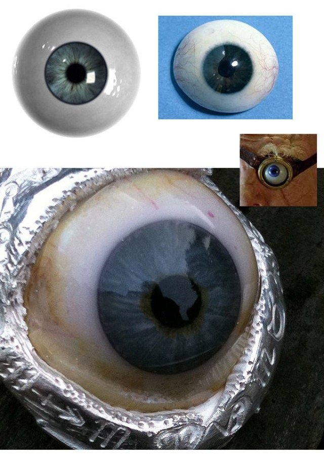
These are just some of the images I used for research. having referene is so important. You have no idea what you can paint until you know what it really looks like. Even though this piece is sort of comic-book style, it still needs to look somewhat real. But… it’s worth noting that this painting took on a life of its own and wasn’t supposed to be this detailed. So reference was gathered after I started, not before. More about that below.
The initial scan/concept
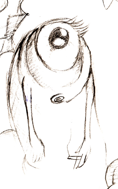
Here’s the initial sketch which I scanned in. I tried to clean this sketch up by drawing him again, more detailed, but I could never fully capture his shocked expression as well as in this drawing. So I decided to just scan the original – which was quite a quick scribble.
It always amazes me how the starting point can evolve and refine so much by the end!
So I cleaned up the scan and started to block in. The document I used was 3500px high.
Major turning points and hurdles
Note: as usual, the full animated gif process will be at the end.
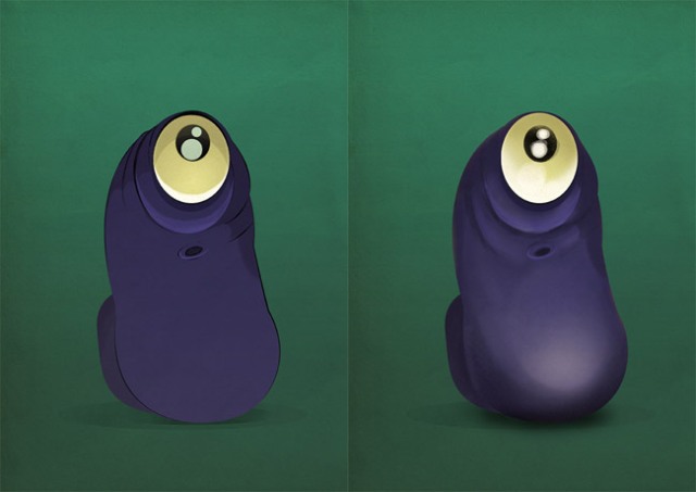
So here’s what I meant. I started out intending to make this a very flat, cartoony image. Thing is, I just wasn’t happy with the style and wanted to get into the detail. So I threw down some values and felt a tiny bit better.
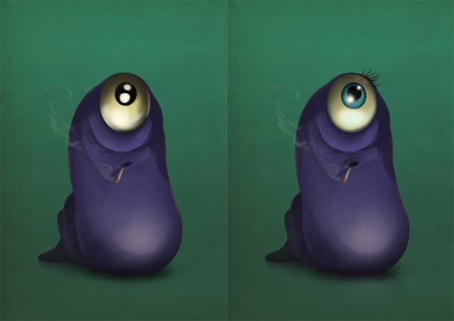
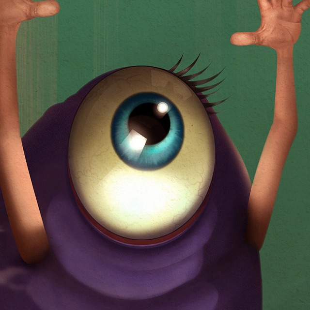
The next turning point was deciding to go uber-detailed on the eye. The before shot shows how I thought the eye was going to look and it was at this point that I started studying the reference. The after shot being the result. Here’s a close-up of the finished eye:
The next turning point were the hands…
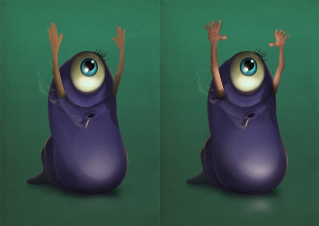
I sort of knew I wanted them to look a bit realistic but then I decided to have them a lot less cartoony to add an extra weirdness to the image – why does this weird blob have human hands? kinda thing.
Here’s the hand reference I used:
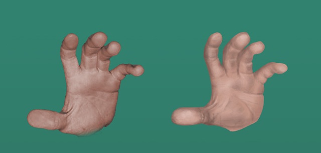
I had them side-by-side and painted at 200% scale because even though the document was 3500px high, it still wasn’t big enough to go into fine detail of those hands. So I then grabbed the hand the scaled it down 50% to fit on his arm.
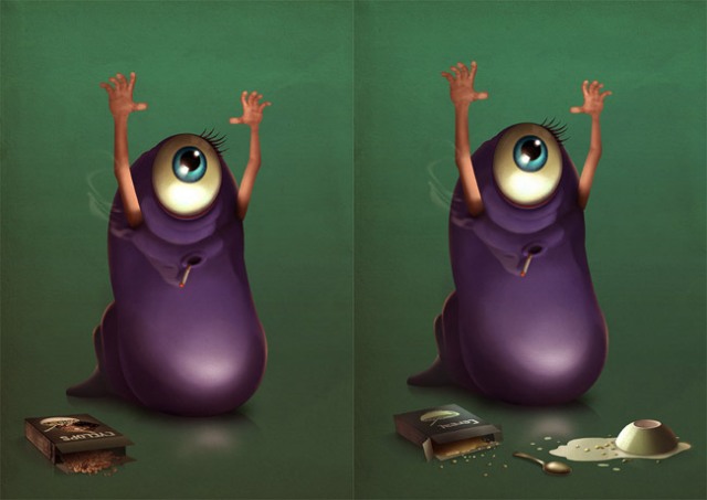
This was one of those battles I mentioned earlier where I just knew it wasn’t good enough. I made my own cereal box cover design and got a side panel from an actual photo/scan of a cereal box plus some photo of spilled cereal. I put all this together and got the image on the left. It just looked too photographic compared to the blob dude. It had to go and if I’m honest, it was a bit rushed.
Here’s a close-up:
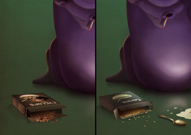
The more painterly shot looks better I think. Even the bits of cereal look nicer than the photograph.
It takes a while before you get to the stage in your paintings/illustrations where you’re prepared to scrap work, that you invested precious time in, because it just doesn’t cut it. I’m just about there but have more growing to do.
I think the true artist is regularly prepared to delete hard work that isn’t their best work.
The final process animated gif!

There was one more step I was glad I made. Watch the change in the lighting of his arms. I spent a while messing with the shadows and trying to figure out just how the low light would affect the whole length of his arms and hands.
It took a few tries and with lighting, you know it’s right when it looks right and you feel pleased with yourself. If you don’t – delete. But always keep asking yourself where light would hit and keep puzzling it out spatially until you come up with a decent guess – that’s all lighting can be really unless you’re painting an exact replica of a photograph/painting.
So, I hope you enjoyed that and learned one or two things.

About The Author
You might be interested in