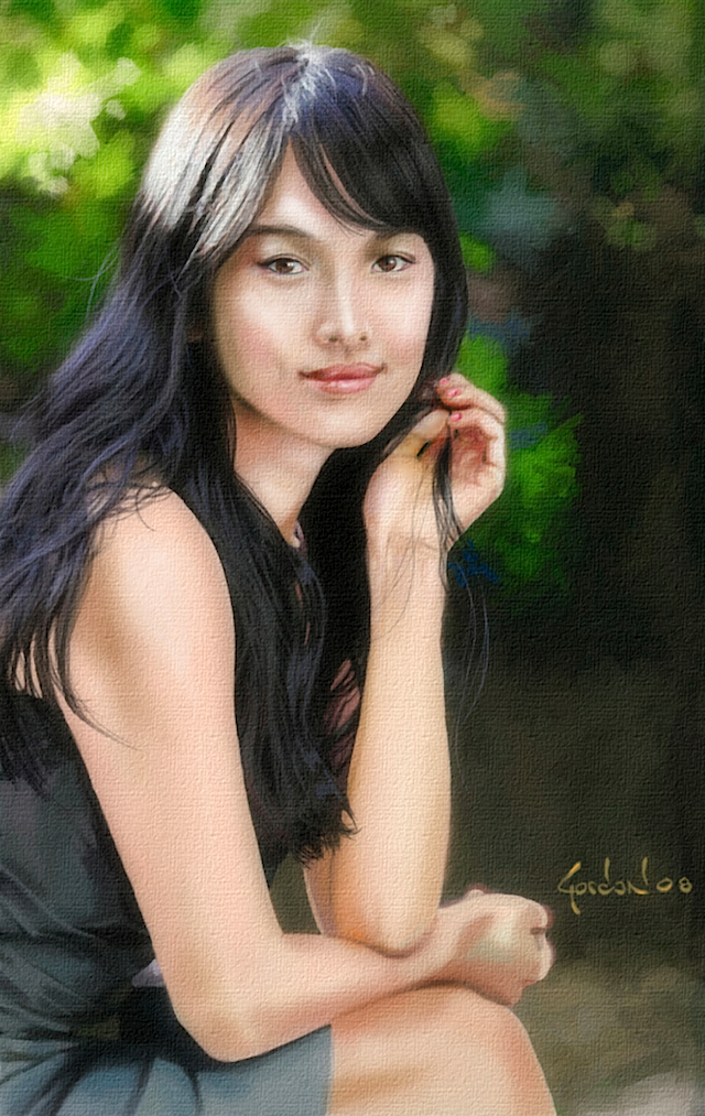
Making of Song Hye Kyo
This is the typical step-by-step process I use when painting a portrait using Adobe Photoshop and Corel Painter.
STEP 1: Sketch
I use a blue pencil to sketch out the basic shapes of the image. At this stage, I do not worry about how perfect the drawing is. I just want to quickly sketch out the subject with a light touch. The last thing I do at this stage is block in the areas of shadow. This step in the process shouldn’t take more than 5-10 minutes. If it does, it is possible that you are trying to finish the painting before you even begin. Keep your strokes fluid and free. You can always paint over any stray lines later.

STEP 2: Defining Shapes
I prefer to go really dark when first applying color to the subject. In conventional painting, flesh color is typically comprised of a combination of brick red, ochre, and lots of white. However, in Photoshop digital painting, you select the flesh color and “add white” to it by adjusting the Brush’s Opacity and Flow options settings. Remember that skin is very reflective. It also varies between the races. Asian skin has a beautiful porcelain, very slight yellowish tint to it. This is considerably different from the skin of Caucasians, who have a ruddier complexion. Latino and black skin is just as reflective as white, but earthier colors are required to make darker skin, so experiment. Since my Korean model is going to be surrounded by lots of green trees, I need to reflect this in her skin. Here I used a warm green. Always remember that skin consists of warm colors. Even the cool tones are “warm”.

STEP 3: The “UGLY STAGE”
Listen, every painting an artist creates goes through the “ugly stage”. Beginners tend to become discouraged at this point, but keep at it. It is a normal – and important – transitional phase of a good painting. I applied various reds to the cheeks, chin, and neck, and made indications for her eyes and mouth. Although the subject has very dark brown eyes, I use a dark green as the base eye color. This helps later on when adding color to the eyes to create the browns. Also notice how the upper lip is typically darker than the lower lip because the lower lip is in the shade of the upper mouth and nose. The sketch still shows up through the painting, which is very useful to me as I want to maintain the shapes during the application of paint. Don’t worry about the sketch lines, as these will all be covered by paint later on.

STEP 4: Lighten up!
Wow, doesn’t this look a lot better than the previous step? You can start to see why I am not afraid to start out really dark because I can always lighten it up by painting over it. Although Photoshop uses “layers” to permit a digital artist to apply various stages of paint, I treat the Photoshop canvas just like a conventional cloth canvas painting. Aside from a “sketch layer” I apply all my paint on just one layer. If you’re starting out as a new digital painter, and you want to paint in layers, this is fine; perhaps you’ll want additional layers for the eye details, one for the hair, one for the clothes, and one for the background… A common trick many painters use to create light is to be sure they have lots of dark. I’ve begun to “flesh out” the facial high and low points. I want her brow, nose and lips to “come out” from the painting, and I want the eyes to slightly recede into their sockets. I never make the “whites” of the eyes – “white”. No one has purely white eyes. Eyes and teeth, like skin, are very smooth and reflective. Here, I’ve added a gray-blue to the shadow area of the eyes, and I’ve added a touch of very pale pink to the corners. I’ve also added some medium mauve color to her mouth. Notice how I am not concerned about keeping my colors within the sketch lines. This is because I want to quickly lay in color, and I don’t want to be distracted about perfection – not yet. Besides, all the color outside the lines will be covered up later…

STEP 5: Defining the light tones
When using Photoshop, use the Opaque and Flow options of your Brush tool to adjust the amount of paint you use. I typically use a standard airbrush and leave my Flow setting at 68-75. I rarely raise my Opaque setting higher than 35, using the lowest settings, and then painting over and over the areas I want more color added. I never use the Eraser or Effects Tools (i.e. Blur, Clone Stamp, Burn, Dodge, etc.). I paint with a Wacom Intuit 3 tablet using a stylus, which is like painting with a paintbrush. I have added a touch of the dark hair color around her face because I need to see if I can go lighter, or if I need to add in some darker tones. I added some light reds and blues (never white) to her neck to get a feel for this, and as you can see, I can safely and confidently add more light color to her face. I’ve also added a little more detail to her eyes, nose, lips, and open hand. Even though the painting is far from being finished, I like to define the eyes early on. I want to see someone looking back at me so we can go through the painting together. At this point in the painting process, I should start to see a soul coming to life behind the eyes…

STEP 6: Coming to Life
Notice the features of this subject, such as her face and arms, are beginning to take shape and form. The blue sketch lines begin to disappear! This is exactly what I want to happen. I don’t need to worry about eventually erasing the sketch, because I’m simply going to cover it up with paint. I have added more light color to her face – not just pink, and yellow, but also the greens and blues (keep in mind that the skin is very reflective). If you look closely enough, you will see the greens and blues in her skin. I’ve also made indications for her cute dimples and painted in more detail into her eyes and mouth. So far, the only thing I do not like about this painting is what she is doing with her open hand… It looks like she’s nervously picking at her nails. I need to think about what I’m going to do about this, but I will leave this problem to the end. For now, I just put it away in some sub-compartment of my mind so that I can be free to get everything else just right.

STEP 7: The Background
Depending on the subject matter of my digital paintings, I may paint a “ground” layer first, add a sketch layer, and then add a final third layer to hold all of my paint. However, for most of my digital portraits, I prefer to sketch out my subject directly onto a new, white canvas, and paint in my “ground” at the very end. Unorthodox, I know, but it works for me because it permits me control, and for a digital artist, control is everything. At this point in the painting, I switch to Corel Painter. I love Corel Painter for painting only certain things, such as landscapes and backgrounds to my portrait paintings. Here, I have very loosely (almost haphazardly) splashed in the primary colors of the background. I have decided to make my light source appear in the top left area of the painting. I had decided this early on, but now I need to make sure that every facet of the composition, such as the skin, hair, leaves, dress, etc., aligns with the light source. This is especially true of the eyes. If I do not observe the light source when painting the reflections of the eyes later on, I could end up with an aesthetically pleasing painting of a beautiful woman, but with crossed eyes, and so this must be avoided. Also remember that when painting a background, objects further away tend to be lighter in shade and somewhat softened in focus.

STEP 8: The details
I define the background with indications of foliage – keeping in mind the entire time where my light source is. I painted the entire dress with a plain gray-blue color at a medium opaque setting. I painted in the folds of the dress with a dark blue-red-brown color (this is also the color I use for my blackest blacks). I switched to a lighter variant of this same color to paint the highlights of her dress’s creases and folds. The hair looks so real that you could almost comb it. However, painting it is a cinch. I used my dark blue-red-brown color for black (never use “black” for anything) and painted the body of her hair with it. I used a much lighter variant of this color to give the hair its shadow color, such as you see in the blue/violets I painted the shades with. I used a light brown color to paint the highlights in her hair. Going even lighter with this color provides a nice highlight to her hair as it shines in the late afternoon sun. Remember that even black hair is reflective! Notice how I used a darker mixture of the blue/violet and the light brown on her hair in the shade. I used a very thin airbrush tool to paint in the hair strands. This takes the longest amount of time to complete, as I need to paint in the strands one by one. Oh yes, about the open hand problem: I added playfulness to the subject matter by painting in a tuft of hair between her fingers. For a “professional touch” I used the Canvas filter to make my digital painting look like it was painted on a cloth canvas. If you end up printing your artwork as a Giclee on canvas paper, you will be able to sell you artwork in the $100’s because 1) it is an original and a limited edition, 2) it will last 200 years, and 3) long after you are dead, people will be fighting over your artwork (sad, but true). Lastly, don’t forget your signature, and come up with something original and interesting so that it is recognizable .


