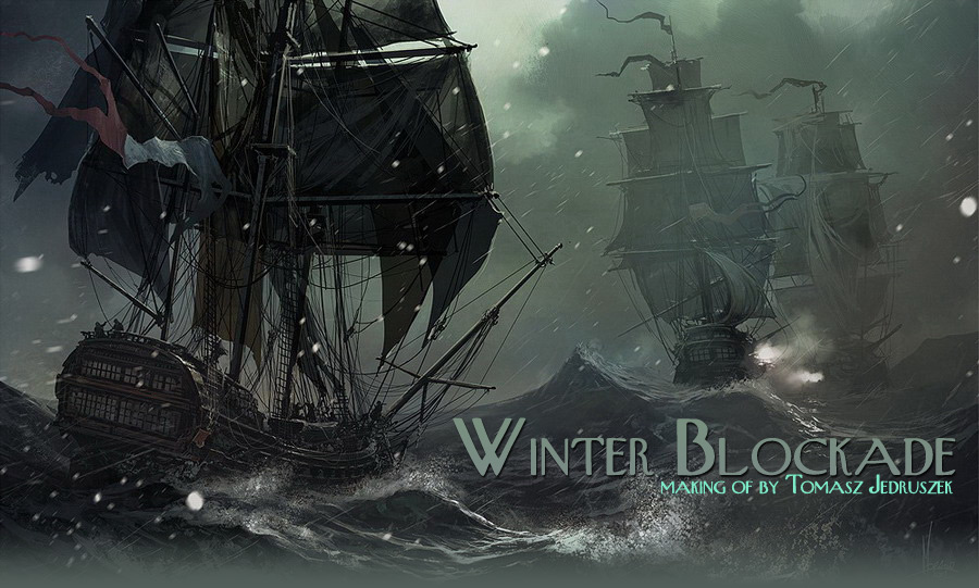
Making of Winter Blockade
It is always tricky task for me because usually I don’t printscreen or record my process, except situations when client ask for that from start like ImagineFX or CGSociety challenges.
IntroductionI’ve been asked to write a “making of” my last work “Winter blockade”. It is always tricky task for me because usually I don’t printscreen or record my process, except situations when client ask for that from start like ImagineFX or CGSociety challenges. Even then is not easy because once I get into work it is hard to stop and make printscreen, write a note and go back to work – sometimes it kills all fun I have with painting.
SketchesI started with simple speedpainting made for new TW fans(been one myself) calendar. Few days later I decided to get deeper in that scene. I’ve looked back to one of C.S.Forester’s novels and build up background mood for my work. I don’t write this all just to tell you how boring my life is, but to show you how important to have a reason to start a work. How good you will perform your task as an artist it is very much depending on what story is behind and how deep you’ve sank in it.
On this new illustration I wanted quite new composition and wider view, so let just leave first image as reference. Here is new composition ,as you can see I already set basic colors ,distance fog and lighting –try to deal with those at the very begining of your work .My goal was to show a very unpleasent envirorment and people struggling both with nature and human against. Try to figure out the overal color pallete ,lights, atmospheric effects and mood at this stage and create them as separate layers . The image still has less details ,all changes requires small amount of work, don’t be afraid to experiment with different color palletes and tones ,it would be much harder to change something later when lot of new objects will apear . When your scetch will be ready then just turn all effects off and work on detailing and finishing the image. Basic process of this work is to pant with simple flat round brushes, then smaller its sizes and adding more textures in dual mode to get an effect or illusion of details as we would go farther in the process. Lets just take a closer look how this work on few examples. |


WaterWe begin with flat round brush as I mentioned, just to shape main mass of water (in that case). Try to imagine 12 meters waves, shape them as creazy as you can imagine -it would do lot of difference in overall feeling of this image . Then turning on dual mode we use some custom textures to add details, we are not going to paint each drop of the water – becaus eit would be simply insane and stupidy. We just mark few recognizable and characteristic issues for water and its behavior like wet (ofcourse ) ,splashy, green-blue color (if ocean or sea) ,waveing, transparent ,reflecting , transculent etc – the task here is to make it look as a water so viewer can obviously tell it this is a water not gelly or concrete. Then we add some participles but again just suggest them with custom brush not paint each drop separately, and finally you can use smudge tool to blend some areas to get smoother color tones
How to make real water with few brush strokes? There is no simple answer for that but the key is light the world as we see it is only because of light, so colors, so highlights and shadows . Of course there is also mass or gravity but since we paint 2D artwork we just have to use visual effects. you can only observe nature or use photo reference in case you aint living on sea shore. SkySince You know how to paint ocean, what would be a dificulty to paint sky? Again You have to read the nature as it is, how clouds interact with light, how wind effects on its shape etc. And again custom brushes might be very helpfull just to pin down the main aspects of the sky, no reason to spend days on painting each cloud .At the end human eye won’t tell the difference because it is very easy to fool it. Our brain just read those very main aspects of the object like color, light absorbing etc. That’s why we have some troubles to define if we are still looking on distanced mountains or they are low (above horizon) clouds already, when takeing a walk in moutains on a misty and cloudy day. Try on your self.
FrigateWe know already some important things about nature and its behave. How about objects created by human? Just the same way- the wood, metal ,stone, fabric they are all has specific way to react with light ,produces diferent color tones and shadows. How the ships was painted: I used commont technique to paint base color shapes and “sculpt” them with eraser
|


|
As you can see, each new color has its own layer so you can work with eraser not touching background. Itis very safe and effective method.here is our glass layer which will be used to create windows of the back gallery of the ship.
|

Make a selection of this new layer (ctrl+lmb) then add some texture to painted glass layer . this will represent different tones on glass surface reflecting a light bounced from water surface which obviously isnt constant- again it is all about abserveing nature. |
|
Now lets sculpt our “glass” plate to window tiles. Taping with eraser on one end of the line and then pressing shift and taping LMB on the other end we get stragiht line and sharp as a knife. This way we get sharp eges of the window tiles ,even better quality than we used a photo and paint over it.
|
|


|
Using the same method we can not just eraseing but paint too. Then erasing then paint again and so on. We getting more complicated image each step, with nice illusion of multipile details just like XIX ships has, lot of small details, rich decoration and our shape starts looking as a frigate.
Another method to get more detailed look is to use siple brush with dual texture and paint it on a flat color in multiple mode, then switch mode to dodge use same brush (or more detailed), choose lighther color and doge it to get illustion of highlights on that flat surface.
The same methods were used on entire ship. Here is just simple template how i did painted side hull with cannons etc. Each new color were painted on separated layer then sculped with eraser. To finish the job I did some highlights with method from picture at the top of this page and paint 2-3 pixel objects with thin brush. SailsNext few screens shows the process of creating sails. As You can see I paint flat color areas in lightcolors and placed them in “multiple” mode ,so they are transparent ,then at the end i created last one layer in “normal” mode to add some back light and few more details in shadowed areas.
|


FinishingLast moments to add more details, using very small brush, sometimes with dual option on, i paint more ropes just to make the total mess of storm feeling more. And some crew on the deck in rainnig coats trying to hold this ship in one piece.
Post EffectsDurring whole process we have to work on clear base image, to make it easier–for example we don’t have to pay much attention to blending colors because of distance fog etc–we simply turn on all “effects” layers at the end of work when all painting were done. The best is to have those layers prepared on sketch stage, but we can create them or add few new at the very end. Makeing all post processing at the beginning helps us to keep sketch atmosphere and mood the same as final but adding them at the and is same good just if we keep sketch image as a reference open.
As You can see on the concept sketch two ships in the distance almost vanish in the fog, but when i work on them their colors get little to much brigt so they pop up in front. That’s why I add additional FOG and smoke layer and cover second ship with little more smoke too.
|


|
Postprocess effects as switchable layers is a plus when you would like to add some more details or objects in your work. Just turn them all off, finish your job and turn them back again – Your image will change but the overal feeling ,color pallete and mood remains the same. Overlay color and light might be just few areas painted with smooth airbrush and placed on image in “hard light” or “overlay” mode.
Few more screens showing how snow was made:
|


|
Basicaly they are some spots or snow flakes created with custom brushes and blured in motion, erased in some places not to cover too much of the image itself – unless we are painting blizzard, but it wasn’t our subject this time. The snow is just to show the speed ,wind and cold so few flakes makeing oon one direction and few more blured on foreground would be just enough.
Final image see below:
|

About MeMy name is Tomasz Jedruszek, using alias Morano as easier for those haveing troubles to spell my orginal names. Im doing art in generall since i was 6 and to publish my own comic book series like Thorgal was always my greatest dream. Following great master like Rosinsky but learning a lot from such legends and Giger, Brom, Gimenez, Frazetta or Manara too, I sold my soul to the Art Devil and have never regred that decision . Graduaded as M.Sc.Eng. of Architecture in 2006 but 6 years before started freelance work as an artist and illustrator. Was my pleasure to tell you a little about my work and hope it would be helpfull in anyway. Web-site: www.morano.pl Portfolio: http://morano.cgsociety.org |


About The Author
You might be interested in