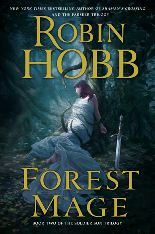
The Making of “Forest Mage”
In this tutorial Christophe Vacher shows us how he was creating “Forest Mage”, the cover for the book of the same name written by Robin Hobb and published by Harper Collins
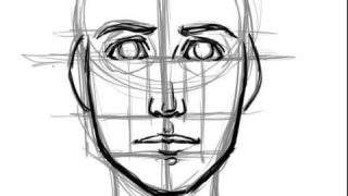
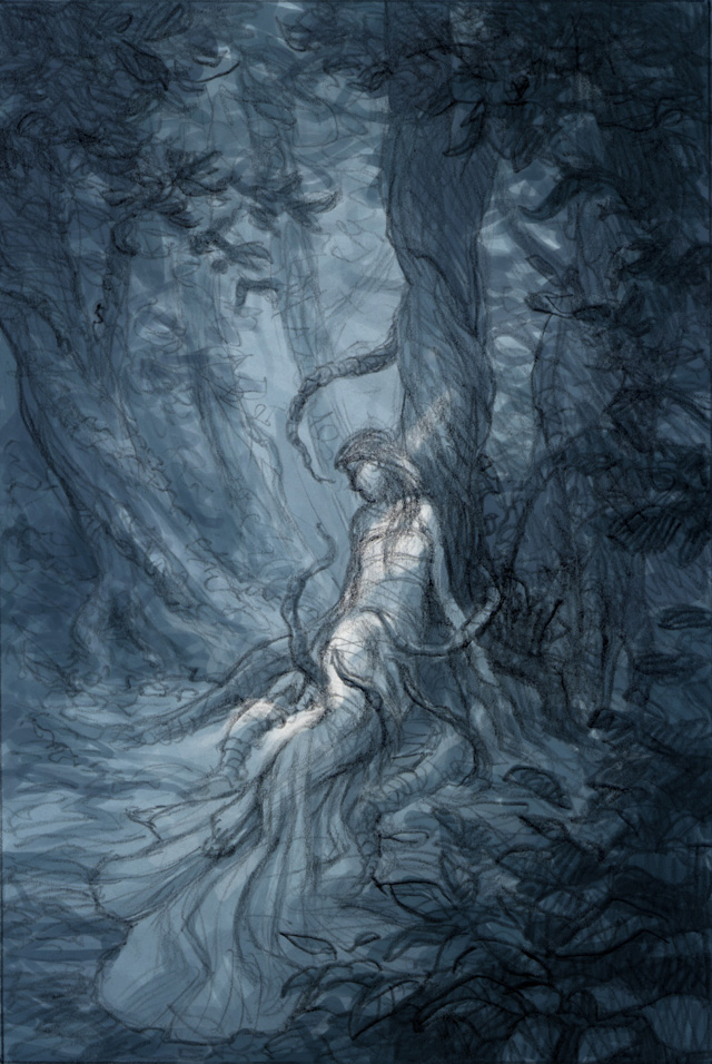
PHASE 1: Concept sketches
(photos 1 & 2)
First, I get information from the Art Director on the project to start dфesigning rough sketches based on the ideas he has discussed with the editor and the director of production.
I do two on paper and toned in Photoshop (I actually did more than that, but the other idea was completely abandoned, so, I will only show what was relevant to this idea).
In those 2 sketches, I worry more about composition and lighting than anything else.
The scene is supposed to take place in daytime, but it’s in a forest, and the lighting must reflect a strange and slightly dark mood.
Sketch 2 is chosen. Later on, the vines taking life around the sleeping woman are added to give an even more eerie atmosphere.
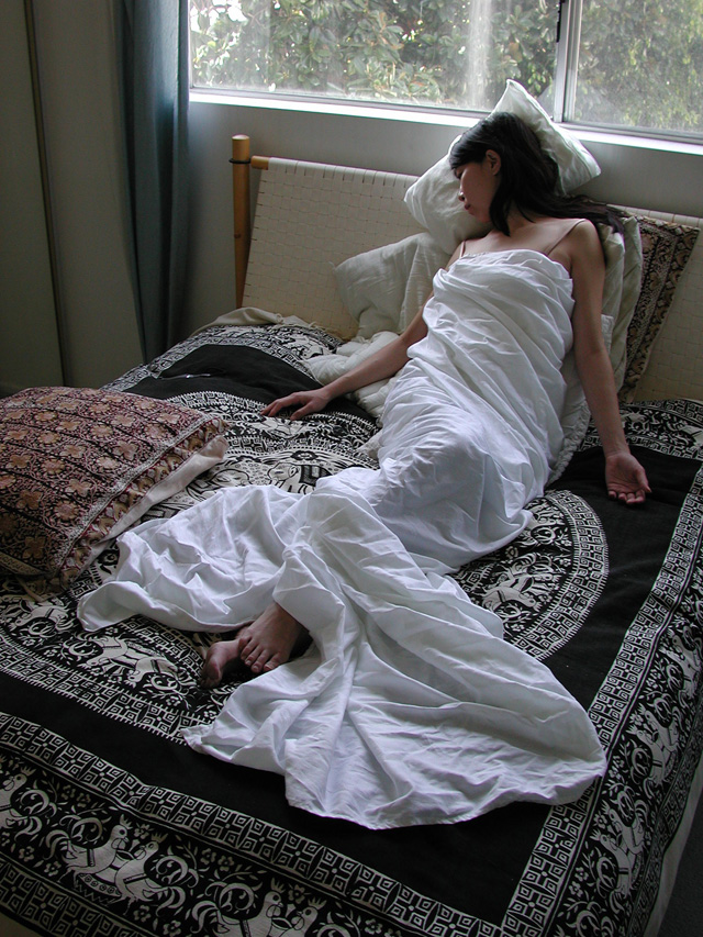
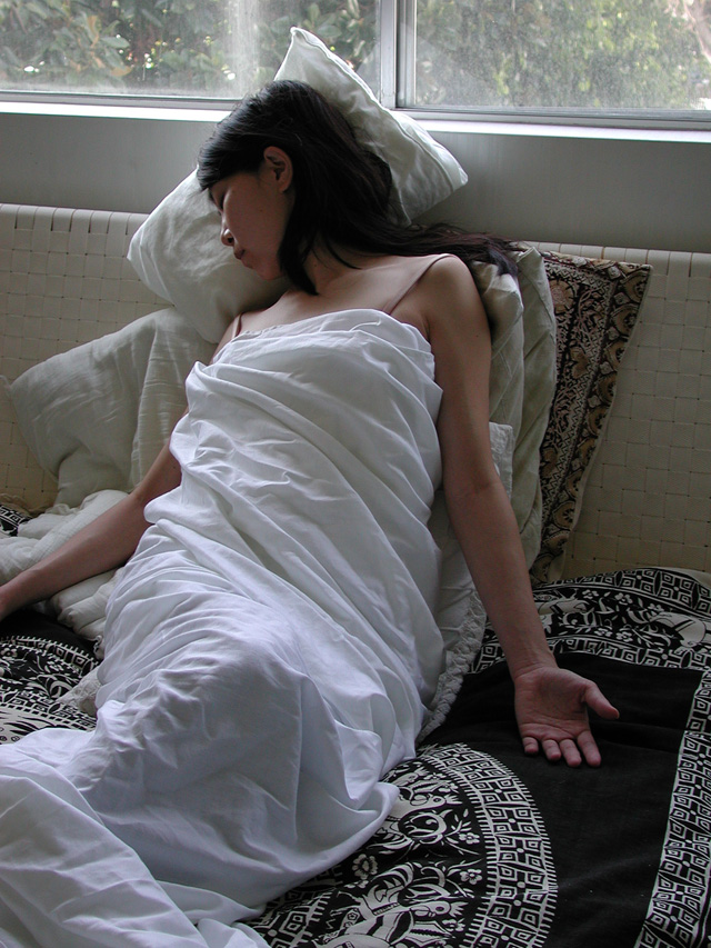
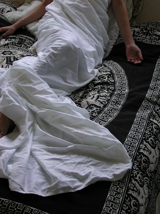
PHASE 2: Gathering reference and preparing a Mock up of the cover
Once the Art Director has picked the right sketch, I start gathering reference pictures. In this case,
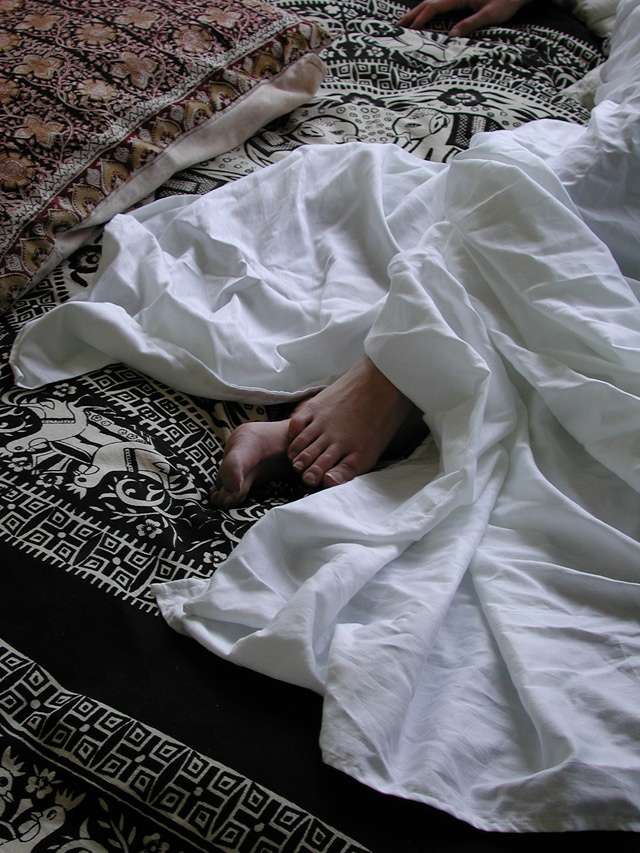
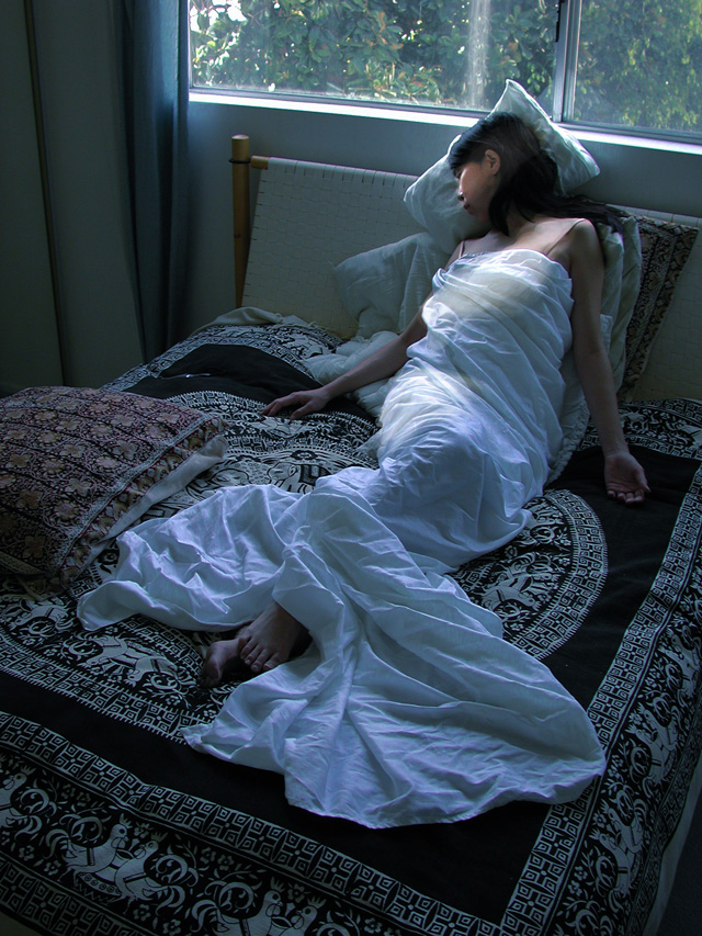
I ask a friend to pose for me and arrange drapes on her. I take a general picture and close ups for details (photos 3,4,5,6).
At this point, I also start to build the lighting a little more accurately by doing a quick pass in Photoshop on the picture that will be my main reference (photo 7).
Then, with that picture and the initial sketch, I do a quick digital mockup of the full picture as a cover, trying to match the mood I had in the original sketch, and adding basic fonts to check for title placement options (photo 8).
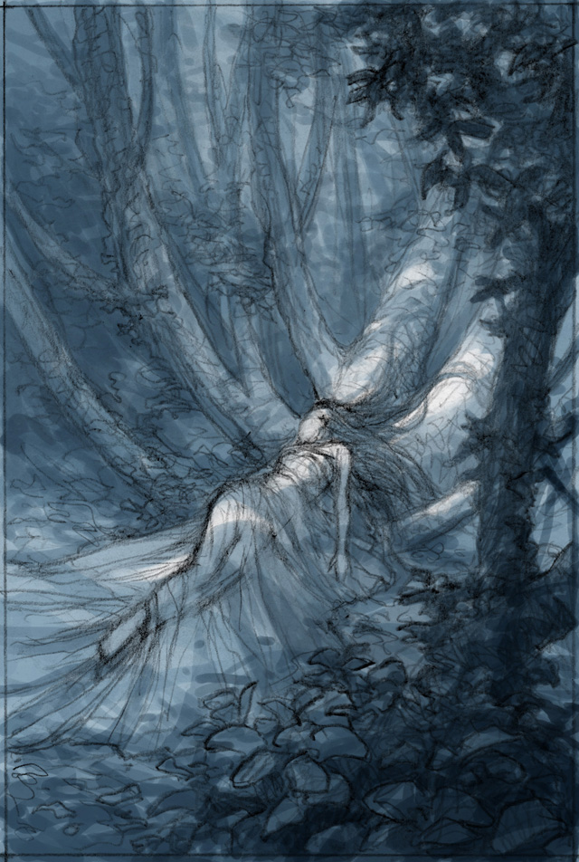
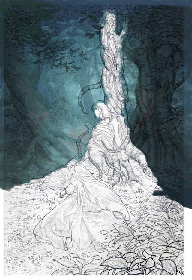
At the end of this phase, I draw a final sketch on paper that will serve as the line foundation for the painting (photo 9).
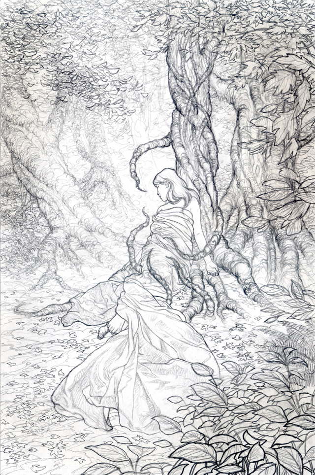
I scan the line sketch into Photoshop and make it a separate layer. I push contrast and brightness on it, so the whites go whiter and the greys go blacker. Then I turn the layer on multiply mode to make it transparent and I create another one underneath.
PHASE 3: The painting
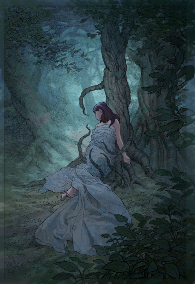
I start painting underneath the sketch, blocking out roughly the very background and trees (photo 10).
Separating as many paint layers as possible according to the composition is necessary, to keep control of future individual adjustments. I finish all the layering with a basic neutral lighting and turn off the line layer (photo 11 & 12).
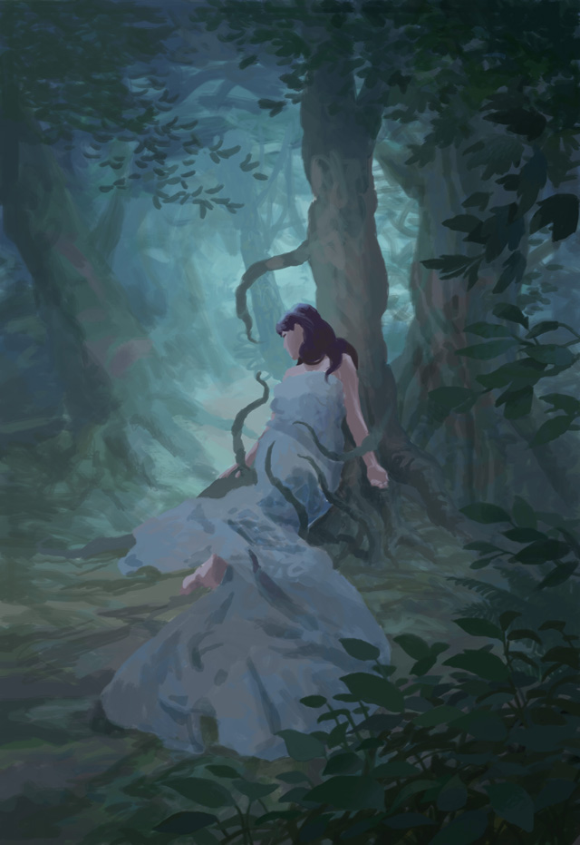
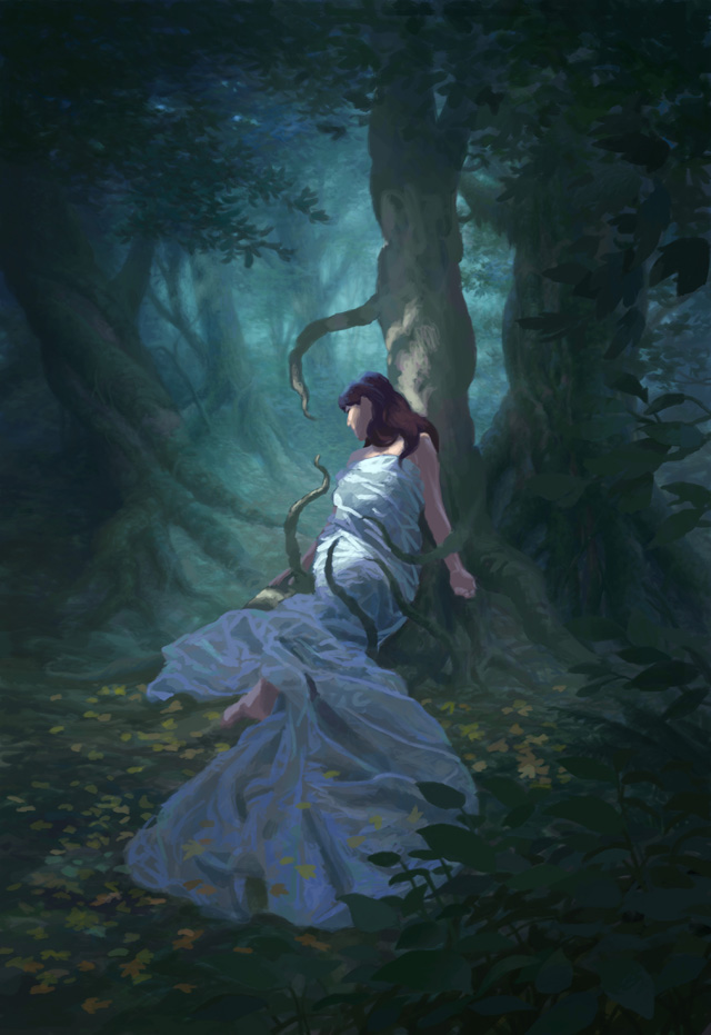
I then begin refining the folds on the dress, the lighting on the woman and tree, and add leaves on the ground (photo 13).
At this point, it becomes important to readjust the general darkness and color saturation on all the
layers, and I continue developing the details and light on the dress. I am starting to have a better idea of what the final image will look like, but there is still a long way and many adjustments to go (photo 14).
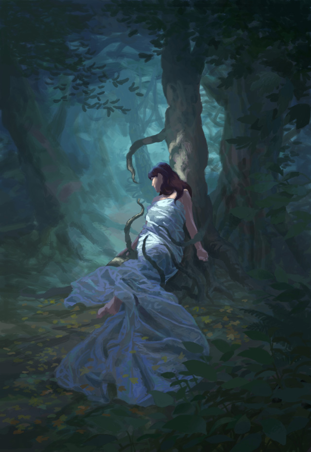
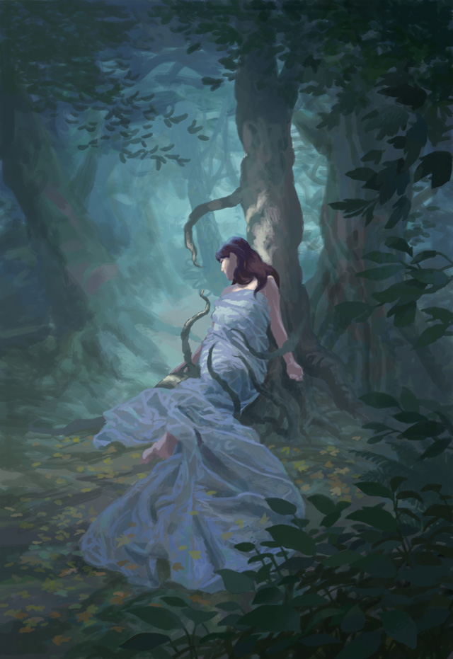
It is now time to finish the forest in the back, as I keep pushing definition on all layers. I try to keep the soft aspect of the misty atmosphere by adding just the right amount of details, and I readjust darkness and saturation again (photo 15).
Layer after layer, from the background to the foreground, I refine all the texture details and lighting. On the trees, the ground, the leafs, the dress, the woman, etc… The key here is to avoid putting too much detail and still keep a clear overall vision of what the image needs and where.
It can be very easy to overwork the details and brushstrokes. You have to remember that everything that’s in shadow doesn’t necessarily need too much detail, just the suggestion of it.
The same goes for the elements that are further away. The further the object, the more you can simplify the textures, still keeping a general sense of volume. More detailing applies to whatever is in full light. For that reason, I further push the darks and lights in the image, and the saturation one more time (photo 16).
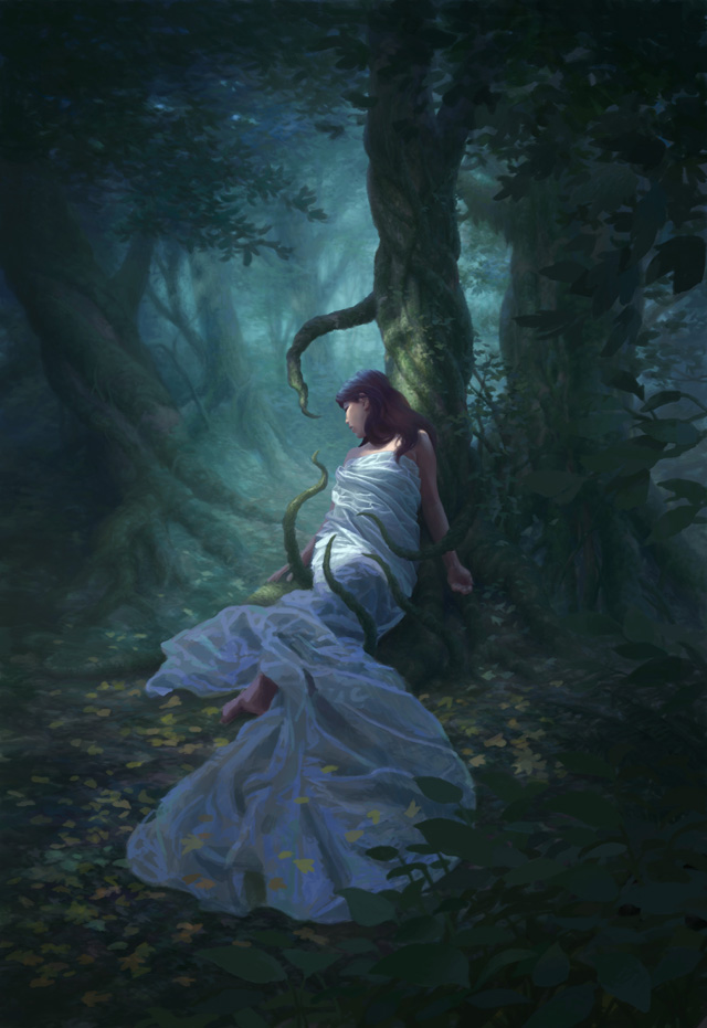
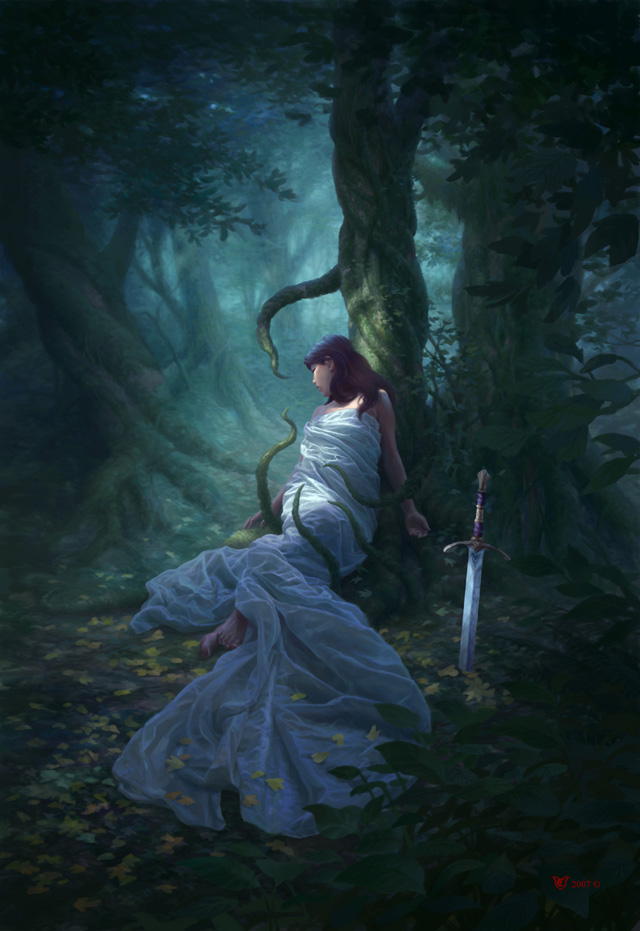
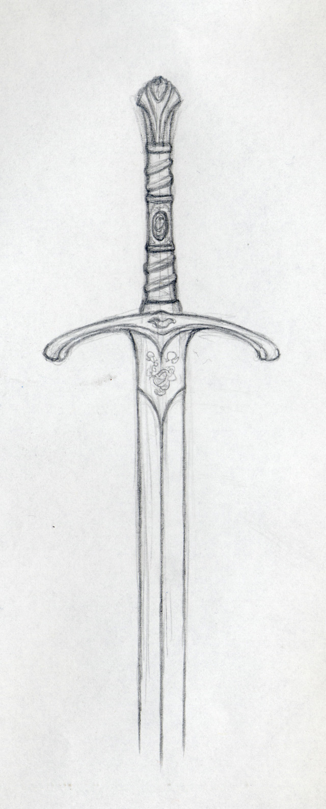
After the picture is complete, the Art director –based on the editor and publisher’s request- asks to add a sword planted in the ground. I then design a sword and add it next to the sleeping woman (photo 17 & 17b).
Notice how the subtle mix of warm and cool tones in the dress helps to give it a slightly translucent appearance, especially in the shade (photo 17a).
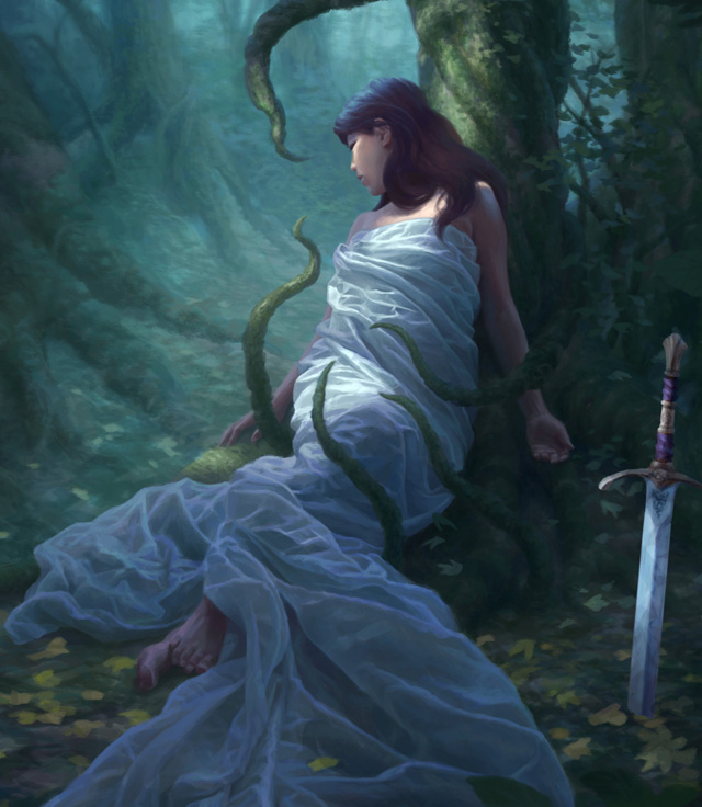
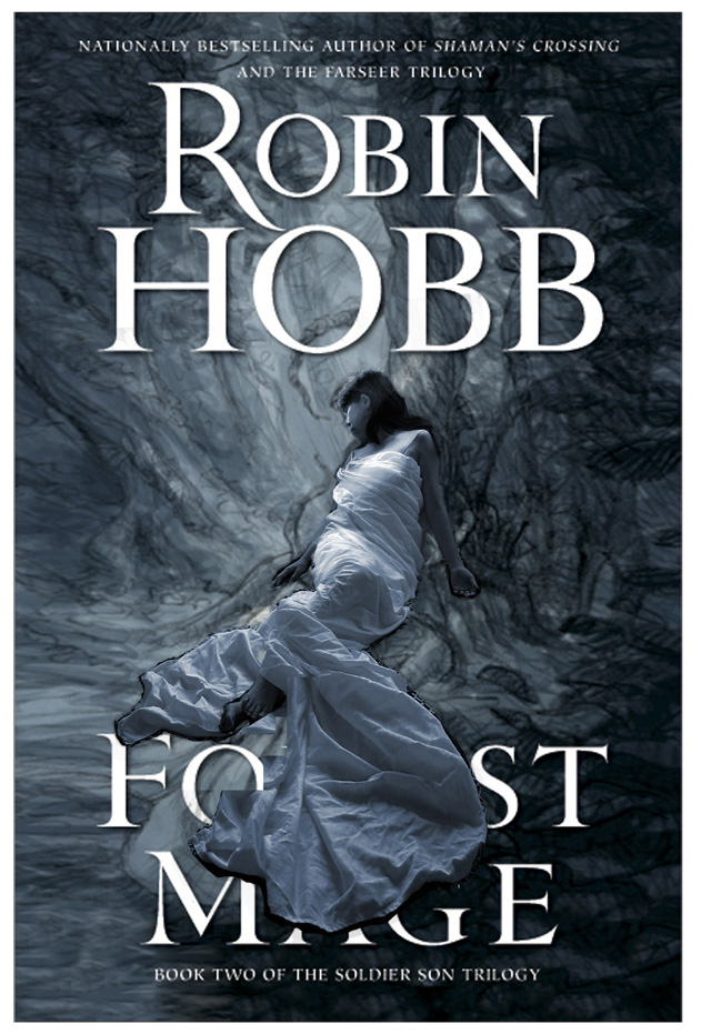
Finally, the image is ready for cover printing (photo 18).


About The Author
You might be interested in