Making of Balance’s spirit
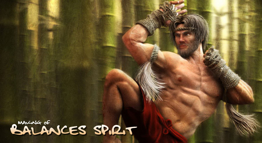
“Balance’s spirit” is an illustration which I carried out for my training to carry out a realistic character. Indeed, at the beginning there was no concept design on this project.
InfoHello all and welcome to the making of “Balance’s spirit”. “Balance’s spirit” is an illustration which I carried out for my training to carry out a realistic character. Indeed, at the beginning there was no concept design on this project. You will see the transformation of the character at the time when the idea will appear to create the final illustration. To make this project I’ve used 3DSMax for modelling, texturing, Vray for render, Ornatrix for hair and After Effect for compositing. ModellingLike many other modeller, I’ve beging to create a simple plane and extrude the edges to begin the head. When you have the first shape of the eyelid, you can had a sphere has eye to help you to place well the vertex. In EditablePoly, you can now extrude the edge by pressing Shift+move, it’s very fast. The topology of the head is very important if you want to create an animable shape, respecting the muscles of the head. Like this:
You can consider the red lines as the basic shape (low poly):
The interesing part begin after you create the simple mesh. At this step you split the faces to create the mass.
I have seen someone with the hand like that, open and downwards. It’s a good idea to skin later.
|
|
I’ve used my body as reference for the legs and foots, that’s why he had flat foot!
Ok, the boring part now (for me in any case). I advise you to work in mirror mode during the modeling, for my part I work with a reference mesh with a turbosmooth, like that I can see what my model will looks like at the end.
So before collapse the meshs, create the UV coordonates. I use cylinder projection for the head and body, the legs and arms, and planar for my flat foot! Now you can collapse two meshs, and finish to create the UVs, the goal is to have no overlapped faces:
Tips: In face select mode, go to select rollup and overllaped face to see your errors. |
|
Like that you texture your model and don’t have symetric texture, the second advantage is for zbrush, because it don’t like overlapped faces, like that you’ll have a nice displacement map
Hair SetupThe better way to create the hair is to select and detach the mesh of the head where you want to put the hair. Detach in a second time this mesh in other to create the different kind of styles. In this case I used 4 meshs. Ornatrix is a very powerful and simple to use plugin to create hair. You have just to push button named : Add Hair to selection to have this three firts modifiers.
Ox Guides from surface : lenght and guide points number (like of segment like a cylinder) Hair curling for destructure hair (buckles); render settind for the shape of hair for the mesh (like a cylinder) and UV coordonates; mesh from strand: convert your guide into mesh! With this last modifier you can render the hair like any other mesh. Because in my case I use Vray Render. |
Concept DesignIt was time for me to find a concept art ! I hesitated a long time between a surfer, angel from Xmen comics and a muai thai warrior. Finaly I’ve choosed the two last!In this “Making of”, we’ll speak about the warrior (Balance’s spirit), but you can see the second choise:
It symbolizes the fall of an angel towards the darknessness of humanity,only that! :) Balance’s spiritReference: This man is Tony Jaa, famous movie actor.I’ve found the left picture amazing, and that inspirate me the title.
So the next step is to remodelling the character to give him mush muscular and slim like this kind of warriors.
|
SkinningOh!Great the second the most boring part! Here, I’ve used Character Studio and Physique, you can see example below:
Once done, I’ve placed the character like I want, I break the skin, because it wasn’t animated,and finally I done somes improves directly in the mesh to have control. Test render : HDRI, one Vraylight, and GI.
BackgroundReference background image: This was simple, just create differents kinds of shape and texture and duplicate…
|
|
Put the character:
Little turn to Zbrush, I’m not a specialist in Zbrush so just accentuate some details:
Render SetupVery Simple too,HDRI and GI, somes lights:
CompositingWe approach to finish! Simple again, render and Zdeph:
|
|
Result:
Photoshop Retouch: This part is difficult to explain, because photoshop postprocessing depends on your feelings. I’ve had correct some details on the character, color and hair correction etc..And a texture overlay all.
That’s all. Thanks for reading, I’m hope this "making of " will be helpful for you. About me
Portfolio: http://pascal.ackermann.free.fr/ |


 My name is Pascal ACKERMANN, I’m french, and I have 28 years old. I currently work for Actiplay at Montpellier as main CG 3D for games and precalculed. I’m work on modelling, lighting, texturing, rigging and rendering, with max, mental ray/Vray,character studio, photoshop and zbrush recently. We create games playable online for brands, that’s very fun, every month we work on other projet, me and my programmer : Martial Barbera. I’m looking for any good experience to learn and improve my skill.


