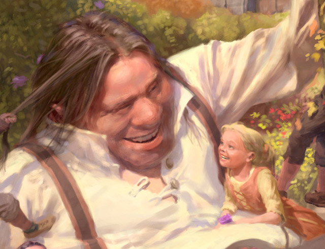
Making of The Selfish Giant
It is one of the most challenging illustrations for the book, featuring a lot of figures, all interacting with one another
Introduction
As soon as I read a story like The Selfish Giant my mind floods with imagery of the characters, places, and scenes depicted in the text. It’s important for me to get this early raw imagery down as quickly as I can, while it’s still fresh and clear, which is why I always carry a pocket sized sketch book with me wherever I go.
For the character of the giant I didn’t have to explore a lot of different treatments – I knew exactly what he looked like! But I did need to clarify how he would appear as he underwent his various transformations, both physically, as he grew older, and in terms of personality, as he changed from grumpy to cheerful, even loving, over time. Making sure a character is always clearly recognizable as “the same guy” while also showing the full range of emotions and poses, and being able to depict him from all different angles are critical factors if the character is to be as real to the audience as he is to me. Working this stuff out is what sketch books are for…
After getting the main character down, one of the first spreads I tackled was the scene that appears later in the story of the giant playing with the children – something that had become a regular and familiar event to him by this time. I knew it was going to be one of the more challenging illustrations for the book, featuring a lot of figures, all interacting with one another (well, all with the giant).

STEP 1:THUMBNAILS
All illustrations start with a “thumbnail”, and this was no exception. I explored two different approaches – the giant walking along with kids hanging from him, and the giant half sitting on the ground, being somewhat overwhelmed by kids (and joy). I chose the latter because it was something I personally could identify with, having spent much more than my fair share of time on the ground being tackled by my daughter’s friends and the neighborhood kids! Also I felt the walking idea made it look a bit like they were “going somewhere”, while I wanted them to be clearly quite content rolling around in that magical garden.
The top left thumbnail is the one I felt captured the right gesture, movement and weight of the giant and kids together, the giant sort of struggling to keep himself upright while not inadvertently squashing any of the little tykes! Still, in the other thumbnails you can see individual snippets that were taken and transplanted, for example, the boy throwing the ball, the child hanging by his two hands, etc.

STEP 2:Sketch
Often I go directly from very rough thumbnail to paint, but with a complex scene like this, it’s better for me to work out some things in pencil first – basic poses and costumes, for example. Often my best sketch work comes spontaneously and unexpectedly when I find myself with a spare moment to jot down some ideas waiting in line to pick up my daughter from school, at the dentist’s office, whatever. So again, I always keep my miniature sketchbook at the ready. I also download some of the sketches from the internet, but they were in PDF format, which could not be as clear as JPG format for drawing or sketching. Thus thanks to the technology, I found the way of how to convert pdf to jpg for print them out in image format for sketching.


STEP 3: PUTTING IT ALL TOGETHER
After exploring some rough ideas with the figures, it’s time to lay these separate drawing on top of the (blown up) thumbnail, with a lot of twisting, flipping and resizing to pull it all together. The goal, as always, is to move the picture to the next level without losing that precious, elusive power that the little thumbnail magically delivers. The result is the rough sketch – you can see the thumbnail as a very rough and somewhat blurry pencil drawing behind the more detailed drawing.
I don’t want to go too far with the pencil drawings, though, because when I start painting I don’t want to feel constrained and have to “paint to the line” so to speak. I want my paint marks to be fresh, alive and new, as if the picture is starting then (which in some ways it is, because these paint marks, and not the pencil marks, are all the viewer will see). So the pencil drawing, for me, is more of a rough map, a skeleton to get me started. There are still lots and lots of explorations to be made, and questions to be answered, and fun to be had, in the (digital) “paint.”

STEP 4 : ROUGH PAINTING
Since the change of seasons plays such a specific role in other parts of the story, I chose to use weather and seasonal differences throughout the illustrations to underscore the various changes going on in the giant’s life and outlook, and with the kids’ situation as well. I chose to set this scene in the autumn, in part because that specific season is not used elsewhere in the book, but also because at this point the giant had entered his “autumn years.” He’s getting older, and before long (in Wilde’s brief text), he’s going to be too old to do much but sit in his armchair watching the kids play.
I started by laying in some really loose colors, in Corel Painter, staying on the cool side, and working the picture as a whole. I don’t really plan out the palette, I just “think autumn” and some hidden part of my brain seems to deliver the goods. I use really big, soft brushes at this point, so I can cover a lot of area quickly. I don’t need to be caught up with any details at this point – that’d be counterproductive. I use the color picker (the eyedropper) to grab colors from all over the painting and mix and blend them to make new colors, which helps to give the palette some internal consistency as it forms up.
The trick here, as always, is to capture that same gesture that the thumbnail exhibited, which becomes increasingly difficult to as the picture develops, and less and less is necessarily left to the viewer’s imagination. But in this the rough painting stage is critical, because not only the shapes and forms, but the actual colors must also contribute to this, and as new, more detailed elements are clarified, they, too, need to have their own little “gesture” and palette.

STEP 5: SETTING UP THE IMAGE
Once I have the rough painting in place I decide on how to structure the layers in my image. I don’t use a lot of layers, for example, to create effects, but I do prefer to have certain things on separate layers to facilitate more loose and fluid painting of elements that are behind other elements, and to allow me to moves things around without having to constantly retouch. For example, I typically put the sky on its own layer, on the very bottom, so that I can paint it using very large brushes and bold strokes, without having to simultaneously worry about painting around the figures and other foreground elements.
Usually I have two to four layers: sky, background, mid ground, and foreground. Sometimes I have a sort of auxiliary layer on the very top for small details like animal whiskers and such because they, too, can be unnecessarily challenging to paint around if you find you need to alter something that is, visually speaking, behind them.
Once my image is properly structured, I start working on… whatever I feel like at the time! Really – each stage of a painting has its own challenges, and the challenge here is to start to make the scene more and more real and palpable, when in fact there is nothing really there yet for me to see. This is where I have to start pulling reality out of nothingness. Once I get a foothold, something solid and convincing, it’s comparatively easy to build on that. So I look for what’s working, and push it along a bit. Sometimes it’s an important focal point, other times it’s a minor background element. Here I started developing the girls’ faces and costumes.


STEP 6: COMPOSITION
At this point I felt something wasn’t quite working in the visual space behind the giant and the boy on the left. This is one of those things that, for me, could not really be resolved in the pencil drawing. Once I had some color and value laid in, I realized it would be much stronger if this area were dark, rather than light, as this would contrast the giant’s white shirt, thus creating a a strong diagonal from his raised arm, across his shoulders to his other arm. The altered bushes now form a dark, triangular wedge that showcases the giant and also cuts him off from the castle, which, like his shirt, is also light. But, this created a problem whereby the dark haired boy on the left was no longer strongly silhouetted against the (now dark) background, so I placed a lighter bush just behind him. I also at this point felt the blonde haired girl’s cool blue dress was drawing too much attention and not fitting in well with the rest of the piece, so I changed it to orange and yellow.
Some artists maintain that these things should be worked out in advance, before any real color is applied, but with digital painting that’s really not the case – you can work things out in full color, as you go, without hampering the image or the process. Compared to a strictly traditional approach it may look like “two steps forward and one step back”, but really there is simply no strict line between the rough stage, the composition stage, and the final painting stage, and the overall process is very quick. With digital media you can make big compositional changes after doing detailed painting, for example (more on that later), and sometimes in fact it’s the painting that prompts the idea for the compositional change.


STEP 7: PAINTING!
With the image firmly established now, it’s time to paint, paint, paint. I use Corel Painter for all the mark making in my paintings, periodically dropping into Photoshop to make large scale adjustments to color and levels, or to move and resize areas of the painting. For me this is a constant and integral part of the process. For example, I tilted the red haired boy’s head up a bit, changed the blonde haired girl’s pose, and corrected the scale of the staircase.
But at this stage most of my time is spent just painting! I move from area to area, staying zoomed out to the point where the whole picture fits on the screen, always working on whatever area is the most far behind (least developed). Finding the proper zoom level when painting digitally can be quite a challenge – some digital brush strokes look great when you’re zoomed out, but terrible when you’re zoomed in (and that often translates to the printed image). But working zoomed in means you lose sight of what is going on with the picture as a whole. As usual the challenge is to make the image more and more real, without killing it…
I don’t want my pictures to “look like they were painted with oils”, that is, I’m not trying to fool anyone, but it is critical to me that my hand, my marks, are clearly visible in the finished work. For me, one side of the viewer’s brain must feels s/he is looking at a “real thing” or a “real person”, while at the same time the other side must also know for a fact that s/he’s just looking at a bunch of individually meaningless marks made by a human. That abstract non-sequitur is something a photograph cannot deliver, it’s what lights up my brain, and that’s what I’m trying to give my audience as well.


STEP 8: FINAL TOUCHES
Continuing to work the whole picture, I add more and more details such as the leaves on the ground, the giant’s hair, the flowers – even one in the blonde haired girl’s hand. But even at this stage I will also make relatively drastic changes if necessary, such as shifting the upper part of the castle back so it is less imposing, less dominating over the giant and the central area of the picture in general.
Working digitally is great because you can change colors, move things around, etc., at any stage of the picture – but this can often create a trap where you find yourself endlessly experimenting with different ideas, never really committing to anything. It’s a fine line to walk – you want to always be open to new possibilities for the picture, and “happy accidents”, but at the same time if the picture does not move forward with some degree of purposeful, focused momentum then it will almost certainly flounder or even collapse.
Once you learn how to draw and paint well enough, the challenge in picture making becomes being able to simultaneously direct the outcome while also sitting back and just letting it happen. Anyone who knows a formula for that, please give me a call.


