Making of Drilling Core
Hello everyone and welcome to the making of Drilling Core. In this walkthrough I’m going to talk about the key things that made up not only this image but give an insight in how I make most digital speed paintings. We’ll start off with the sketching phase, choosing the appropriate color palette, maximizing brush texture and finally using textures to finish the scene.
Setup:
I get a lot of questions how I start my paintings, while its a simple question it has a fairly complicated to explain answer. A painting for me shapes itself around random fields of color that appear on my screen, the only thing I know for sure is the colors and the mood the colors can give. I start off by making a color palette, or picking one from my library. I have various sets of color palettes that I made and expanded on over the years. A very quick and easy way to get a nice color palette from a reference image (photographs are great for this) is to load the image in photoshop, go to Image > Mode > Index color, in this popup window select the amount of colors you want (try to keep it low, somewhere between 16 and 32 should do nicely) now this will heavily modify the plate, thats ok. Next go to Image > Mode > Color Table and voila (fig.01). Save out the swatches and you’re on your way. Make sure you tweak your palette to truly make it your own. What I frequently do is make an image with one of my old palettes, color balance it and create a new palette. Just to keep things fresh.

The Basics:
Since these paintings always happen fairly quick it’s good to keep in mind why these images can be made so fast. One major aspect of it is the ability to see tons of different things in what are essentially just blobs of color (fig.02) Having a broad library in your mind of how compositions work and how camera’s can be positioned around the subject matter helps a lot. It pushes things out of just sideviews (even though this one is haha) and challenges you to also use more extreme angles, so really these blobs of color can become anything you want from any angle! The trick is to start to learn how to see them, don’t worry if the first few tries don’t work out as you want them to. Take your time, be patient and remember that its a learning process. Repetition is a key!

The next thing is to familiarize yourself with the shapes you will be using. Drilling Core was the second out of a series of 3 paintings so I already had made 1 painting which helped me grasp the mood and the shapes I would be using. (fig.03) Each shape lends itself for a particular rendering technique, even when going for a really rough and painterly shape there are a few things to keep in mind about surface quality. Shiny hard surfaces should generally not be painted with rough brushes because it’s surface quality’s are more smooth, the way light bounces off things can help sell realism. Now, this is of course just a suggestion, the more you understand how surfaces work the more you can bend the rules.

Tips and Tricks:
1) Make sure you know where your light comes from and only apply highlights in the right places, but don’t go overboard! A nice soft lighting in contrast with just a few super bright highlights can go a long way.
2) Polygonal Lasso tool is very much your friend. Create super crisp edges with it to really make surfaces pop.
3) Histogram. Learn it well, it will help you a lot to balance the overall painting. I personally use the levels layer a lot to keep my painting in check and to make sure I have a nice color distribution
4) Iterate, also with colors. Don’t be shy or reluctant to paint the same bit over and over again until it fits the scene, same goes for colors. I use tons and tons of color balance layers with various masks to really get the colors I want, mixing in complementary colors in the shadows.
5) Detail Aspect Ratio – a word I use to describe high detail vs low detail areas, this draws the eye in and also ensures you don’t have to detail every last bit of the painting. In my opinion this is what gives a piece it’s flavor, the artists touch if you will.
6) Textures. Theres are tons of different stock texture libraries on the web, and also a lot of really good DVD’s you can buy which provide you with textures you can use to really liven your scene. You can choose to paint surfaces, but I like to throw in quick metal or pipe textures and put them on a blending layer to get that sense or realism across.
On with the Painting:
Now on with my scene. (fig.04) A few hours in and I have the basics done and a few textures applied, I still need to work out some details but the painting is pretty much set. Very early on I already have an idea what I wanted the blobs of color to be so the rest becomes a matter of filling in the gaps.

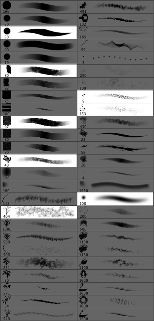
These are the brushes that helped me do it (fig.05)
One of the main focal points is the beam and the platform in the middle. I wanted to have that as a centre piece and the entire painting around it had to make sure it was connected and had a nice flow. I spent quite a bit of time reworking the middle platform, each time adding a bit more detail and new shapes, always looking for a nice rhythm. The entire middle platform really lend itself for some nice extreme lights, dark at the top – bright highlight – mid tones – dark – highlights and finally the lower gradient. Using the lasso tool and rectangular brushes with a lot of texture helped me block it in.
Now it’s time to do the final balancing. Like I said before I use a lot of tweaking layers including Levels, Hue/Saturation, Color Balance and Brightness / Contrast. All of them to reach a maximum dramatic effect. I’m a sucker for super cinematic dramatic! For this painting I think I used about 20 of those tweaking layers in total, I can get a little crazy!
Lastly I used the round brush with only the size on pen pressure to create some solid highlights and of course my trusty scatter brush to add some flavor.
Composition:
A little composition tech stuff like explanation of this image might be in order, so I’ve broken it down for you guys. For this I used a slanted cross composition (fig.06) which uses dark / light sources to draw it in. (fig07)
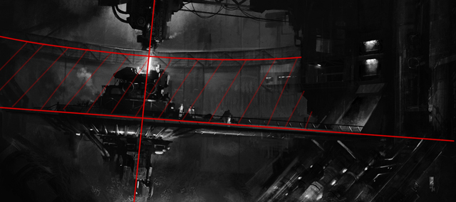

The highlights outside of the green lines are there to balance it out, on the left side this is not necessary because of the image edge but on the right there was such a large space that it needed highlights to keep it balanced. The light coming from below is almost the same intensity as that from above but due to the gradient and the green color it’s not as dominant, giving it that ominous atmosphere. I tried to create a strong composition by using light and dark and a little bit of visual guidance with structures. I think this works quite well if you want to go for really dramatic scenes but for high detail it’s not as clear as it could be.
Conclusion:
I love making these paintings, the only tricky bit is explaining how I did it! I hope this gives some insight in how I approach these paintings and I’m always available for questions if you guys have any. Remember that practice makes perfect and making tons of paintings (in moderation, don’t overwork yourself!) also ensures you get your own unique style.

Thanks for reading and I’ll see you around the web!


About The Author
You might be interested in