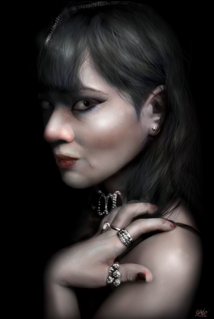
Making of “Deadly Mistress”
This is my first serious picture using a tablet and started out as a mere practice session to help me get a feel for my new pen. I feel like I handled a mouse pretty well all these years, but I now realise how much I’ve been holding myself back. The Graphire 4 is a low end tablet, but is a major step up from using a mouse. It took me some getting used to and I wanted to throw it out of the window to begin with, but after just a few days it feels so natural and makes digital painting so much easier and more fun.
Because this was intended to be a practice session to polish up on my technique, I decided to refer to a stock photo for my sketch. There are many people out there who condemn artists using any kind of reference, but there are way too many “doodlers” out there already, with great ideas and sloppy painting skills. My advice: put your ambitious motifs on hold until you have developed some core skills. Just be careful not to infringe on copyrights when using commercial references.
So then, the first step in this piece was to create a rough sketch. As the image is going to be created on a dark background, I decided to sketch with a light grey on a dark background with a small hard brush. I highly suggest sketching in a separate layer to the background here.
Some artists like to add a lot of detail and sketch in all the shadows and highlights, but I prefer to do that during the painting process, so I just wanted a basic outline. In previous tutorials I’ve demonstrated the grid method, which will help your proportion if this is something you struggle with. However, for this image I decided to work with the basic ruler guide instead.

Next, I created a new layer in between the sketch and the background. On this layer I began “blocking in” the basic greyscale tones with a hard brush. At this stage it’s important to let yourself go and just form a rough impression of the image. Don’t worry about perfect strokes, smooth shading or going over the lines of your sketch. It can be tidied up later.
Years ago I used to take the opposite approach and try to get everything clean and perfect right from the start. I would work on an eye for example, paint it in detail, then move on to the next eye and build the image piece by piece. Unfortunately I found these pieces didn’t always fit together. Either the colours or tones were inconsistent or my proportion was wrong. As a result, I had to repaint the whole thing again, or (most often) delete it from my drive!
By using the blocking method, you can be sure that all the tones are consistent, that everything is in the right place and get an impression of the entire image. If you need to make changes, it’s much easier to do at this stage without ruining any hard work.
In my opinion, the hardest part of any image is getting started, but when using this technique you just go for it!
While it’s sometimes good to get the colours down from the outset, I find they can cause distraction at this stage and I much prefer working in grayscale until I have the basic shading complete.

Working with the blocked in tones, I started using some smaller brushes to refine some of the shading. This basically involves going over the image and painting in the midtones, whilst tidying up some of the rough edges.
I continued to use my sketch as a guide, but lowered the opacity as I started painting in some of the details.
I also decided to apply a paint daubs filter (low sharpness, low brush size) just to smooth out some of the rough strokes. I don’t advocate using many filters in your digital paintings as they tend to look too generic, but I find this creates a nice base to work over. It will leave the picture looking quite blurred and undefined, but we will define everything as we go along.
I began defining the eyes, hand and lips with small brushes and added some lines to the face for guidance.
I decided to put all reference photos aside now and let the piece develop freely. I started looking at my face in the mirror, my own hands and observed people around me throughout the day – the tone and colour of their skin, the way light interacts with their features, how and where wrinkles form, how their hair falls, and the shape and form of their eyes, for example.
Spending all this time gazing in the mirror or staring at people might earn you a reputation as a poser and a pervert, but it’s actually a great day-to-day habit to get into. Some details you can’t truly grasp from photographs.

Using a fairly large soft brush, I started painting in some of the highlights in the hair. This will form the underlying base of the hair, which we will start to work over as we progress.
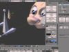
I also started smoothing out some of the strokes and working towards an even airbrushed look. I achieved this by using the smudge tool with the fingerpaint box checked. I used the colour picker continuously to pick up the midtones, before going over the hard edges (see screenshot below).
I try to keep the smudge strength low (between 10%-30%) and paint very lightly. I also make sure I have a soft brush selected, just large enough to cover the light and dark step I’m blending together.


I decided to use the brightness and contrast sliders here to lighten the image, then continued refining and blending.
Before I smoothed out all the strokes, however, I decided to add in some pale colour and hues. I created a new layer and set the overlay mode to colour (soft light or overlay might work too, so play around with these settings). On this layer, I painted over the flesh areas using a pale pink tone.
For this portrait I knew I wanted to portray the subject as some kind of vampire or witch figure and wanted to create a contrast between her dark hair and pale skin. I set the layer opacity high enough to give a hint of colour, yet low enough to appear quite desaturated.
I then created another layer and set this to overlay mode. In this layer, I started adding in some blues, greens and reds. I can’t tell you exactly where to paint these colours, but I’ll give a basic indication:
* Blue is a cooling colour, so I use this in shadowed areas. I also used it extensively around the eyes to simulate eye shadow.
* Red is generally a warm colour and should be used where the skin appears flushed. In this instance, I used it on the bridge of the ear, the tip of the nose and the cheeks.
* Green can be used where veins are close to the skin’s surface, such as the hands and forehead. Used correctly (and subtly), this can create a strong impact, especially when creating pale skin tones.
I often try to apply colours with a scattered brush so it’s not all mushed together, so to speak. I also like to merge these colour layers into my main image so any shading, blending or highlighting will affect the overall image.

I decided to turn my attention to the hair. This is where the tablet really shows its worth! In my previous (mouse-based) tutorials, I advise creating hair by forming highlights and using the smudge tool to fine these out. This is very time consuming and frustrating, and can often end up looking very smudged (a criticism I received for my Beginner Tutorial).
When working with a tablet, however, you can work directly with a small brush and paint in the strands individually. You will need to start with a underlying base, so I recommend blocking in some highlights with a large brush or scatter brush before proceeding. Hair is naturally built up of layers, so you need to paint it layer by layer, getting finer and finer as you get to the surface.
Pick a hard brush (I used a size 5 but it depends on your image size) and make sure your brush settings look something like the screenshot, with size, opacity and flow jitter all set to pen pressure. You can lock these to affect all brushes if you wish.

Having done this, use the colour picker to pick out some of the tones in the hair and use the brush to start painting in some finer strands. Try to work lightly here, and follow the general flow of the hair. At this point, try to imagine that the hair has been combed, so all strands follow the same path. It will look a bit too even, but we will roughen it up as we go along.
A common mistake here is when artists want the detail of the hair to jump out, and so they start painting with strong highlights and shadows. As a result, you can see every individual stroke and it looks like wire or straw. The key to soft and natural looking hair is to keep the tones very subtle and work with low contrasts. So subtle, in fact, that you may need to zoom in just to see what you are doing. Always remember that individual hairs rarely catch strong highlights or create strong shadows – only where hair is clumped together will it really reflect the light.
Once you have refined the hair, you can use the dodge tool on midtones to start adding in the highlights. For this, I recommend using a large feathered brush and low opacity so that the highlights and shadows blend smoothly. You don’t want to highlight individual strands here; you want to give the hair an overall sheen and depth, kinda like waves. You can also use the burn tool on midtones to add in any extra shadows you need…just keep them subtle!
From here we need to start refining even further and roughening up the flow of hair. Pick a small hard brush (I used a size 3), and start painting some finer strands over the top of your highlighted and shadowed areas, sometimes straying from the general flow. Keep in mind that the hair strands closest to the surface will generally be lighter and finer than those underneath.


At this point I continued refining and blending, trying to harden up any edges and even out any brush strokes by returning to the smudge tool in fingerpainting mode.
A lot of digital artist prefer leaving brush strokes in their work and keeping a level of roughness to give it an authentic hand-painted look. In many instances this works nicely, but I’ve always prefered the smooth look when painting portraits, then texturing and dithering by hand (a habit from my pixelling days on the Amiga).
This, however, causes a lot of artists problems and the shading becomes too blurry, smudged or plastic looking. The trick to avoiding this is subtlety. Paint lightly, and use the colour picker frequently to select the midtones. Try to keep everything pale and low contrast and avoid adding in any strong shadows or highlights for now. We will deal with those once we have smoothed out all of the steps and brush strokes.
Providing you merged your colour layers into your main portrait layer, you will also find that this smoothing out process helps to disperse your colours in an even and natural way. This helps to avoid that colourized look that can often happen when painting over grayscale images.
At this stage, I started using a small hard brush to sketch some detail into the jewellery, and add some creases to the hand and wrist.
As an extra touch, I applied a few light green strokes on the hand to look like veins. This is very subtle, but gives an effective overall impression. When painting flesh tones, it is a good idea to really look at people’s skin. One thing you will notice is that pale skin tends to be more transparent and shows the colour of veins where they are most prominent.

With the blending complete, I began adding in some stronger shadows and highlights. I achieved this with the dodge and burn tools on midtones, low strength and with a large feathered brush. I simply dabbed over the areas that needed darkening or highlighting. This helped to create more facial definition in areas such as the cheekbone and chin.
I also applied a basic overpainting technique here, similar to those I use in the Venice 2020 tutorial and describe throughout the Tricks of the Trade program. I created a new layer, filled it with a grey and set it on multiply. I then rubbed through it with the eraser tool and a large feathered brush to create a more universal lighting effect.
At this point I decided that the jewellery needed more work, so I created a new layer, laid down a single blob which I then enhanced using the layer styles to create a diamond.
Having created my diamond, I held down the
By the time I had finished, however, the diamonds looked too sharp and stole attention from the reset of the image so I decided to smudge and brush over them slightly just to soften them up.

Painting eyes is a detailed process and requires good observation skills. There are a few things to consider – the first is that eyes are not pure oval shapes nor are they filled entirely by the eyeball; they have an inner corner and a tear duct. The next thing to keep in mind is that lashes don’t sprout directly from the eyeball, but from the upper and lower lids. You can see the rims of these lids between the eyeball and the eye lashes.
The detail of the eye lashes and eye brows was achieved by first painting in the basic lashes with a brush and then using the smudge tool (fingerpainting off) to refine them. I added a single highlight to the eye a hint of red to the eye ball.
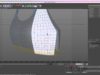
I also began the process of dithering/stippling here by simply dabbing faint dots between the dark and light areas of the image (as demonstrated in the enlarged screenshot). You can do this with the burn and dodge tools or with the basic brush and colour picker.
This is how I give my images their texture, and it also adds a porous and speckled effect to the skin, which is another way of avoiding the blurred/plastic look. If you look at the finished picture, you will see that I applied this stippling effect over many areas of the image. It takes a long time, but I find it one of the more enjoyable aspects of painting.
Unlike magazine models and airbrushed celebrity photos, real people have wrinkles, creases and freckles and this is an effective element to include in your portraits. Simply paint them in using the basic brushes on low opacity.
I felt that the subject for this portrait had something dark and alluring about her, and with the pale skin and dark eyes I’d given her, I was getting a strong vampire vibe. Vampires aren’t the most original motif, I know, and I didn’t want a caricature or to revert to stereotypes. In my opinion, the sardonic and seductive expression on her face says far more than fangs and props so I decided for some very subtle touches of blood…just enough to get the imagination going.
The blood droplets were created using the layer styles. Those of you who have followed the Tricks of the Trade DVD will know how powerful the layer styles feature can be when used right and will find this painting style in the Interface Tutorial.
As an extra touch, I added some faint stains around the mouth and fingers using a hard brush on color mode.


To finalise the image, I just added some more shadows and highlights with the burn and dodge tools and added in a bit of extra detail and stippling.
My original idea was to work at a large image size, then scale it down. This is a popular technique that allows artists to work quite loosely without the magnify tool, and usually ends with a smaller, sharper image.
However, I was very disappointed how the image looked when scaled down as it loses all of its finer detail and texture. Fortunately, because I’d worked in detail at full scale and smoothed out most of the rough areas, the image doesn’t really need scaling down.
But that’s it, image complete! Quite a basic portrait and motif, but hopefully you have picked up a few painting techniques that will help with your own work. Good luck!


About The Author
You might be interested in