Making of “Man Eating Plant”
In this Making Of I‘d like to show my working process and hope this could be some help for others.
INTRODUCTION
Man Eating Plant has been created for a Drawing Jam and was my personal interpretation of this sort of plants. In this Making Of I‘d like to show my working process and hope this could be some help for others.
TOOLS
In most of my images I just use one or two main brushes and some customized brushes, but this always depends on their speci?c need.
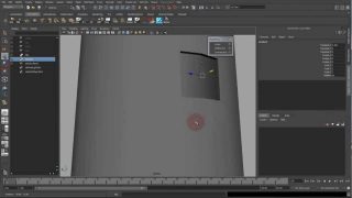
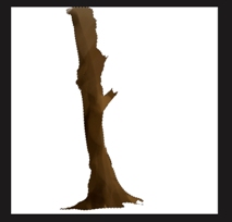
I really like to combine those brushes with the selection tool – this gives me the opportunity to get crisp edges and to paint just certain areas in my images (Fig. A).


WORKFLOW
I don’t know why – but I’m a big fan of layers. I always try to keep my layers until I’m happy with the look and feel. After that I reduce the layer to one and start working on a newly created layer.
Well – to describe my work?ow is much better to show you how I work instead of telling it to you. But I’ll give it a shot. I usually start with drawing a selection on a new layer for the shape I’d like to paint. Happy with the shape I start to block in the main color. Normally I hide the selection but I kept it for a better visualization. My next step is to create another new layer and to roughly paint in the shadow areas. After the shadows are painted in I start erasing not needed parts of the shadow. This process is going forth and back. Also for the midtone areas and highlights, too. For the highlights I usually draw in smaller areas and paint/erase them on a separate layer. I’m still using the same brush for painting and erasing.
Blocking in
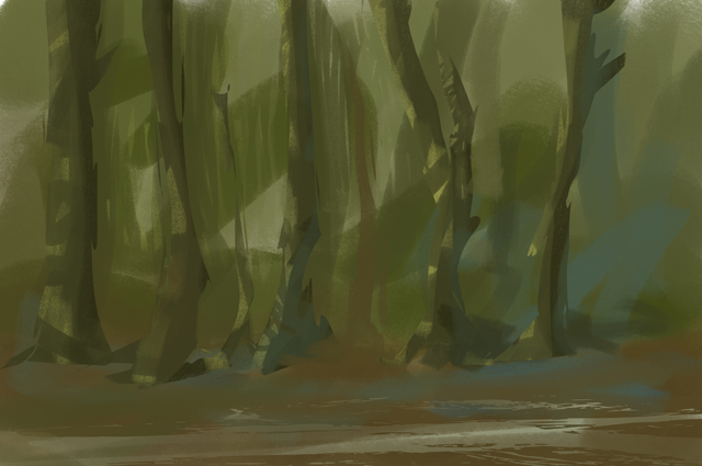
While many other artist starting with a rough sketch or a line drawing, I start mostly with blocking in some colors and pretty rough shapes (Fig.
01). It takes some time to see “something” in this chaotic brush mess, but I use this time to let my brain juice and my imagination flow.
FIRST SHAPES
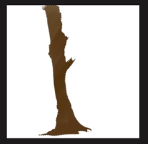
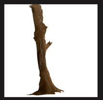
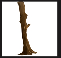
After a certain time I started to see some tree shapes and decided to go with a “clearing” for the overall mood and direction. The next step was to draw in some tree shapes by using the selection tool. Happy with the shapes I painted in some color values with my main brush (see Fig.
A). I also used the eraser tool for some softer and more blending values. (Fig. 02).
DEFINING SHAPES AND MOOD
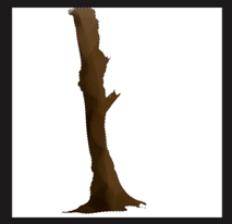
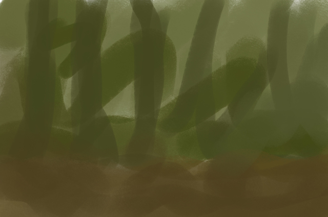
I kept working on the trees by using the same technique. The trees in the background are simple brush strokes. This is an easy way to give your image depth and a better sense of scale. For the ground I used a technique that was developed by Sparth, called customized shapes. It’s quiet similar to customized brushes – but just working with shapes/paths. After dropping in the shapes I used the eraser tool to get rid of the crisp edges. The leafs are made by a customized brush. Color gradients on soft light layer are used to set the overall color temperature and mood (Fig. 03)
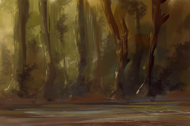
DETAILING
Happy with the mood and colors (for now) I started to add more details and some foreground and middground elements by using the custom-ized shape and brushes technique again. For the highlights on the trees I used again the selection tool – simply select certain areas, hide the selection and start painting.(Fig. 04)
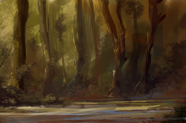
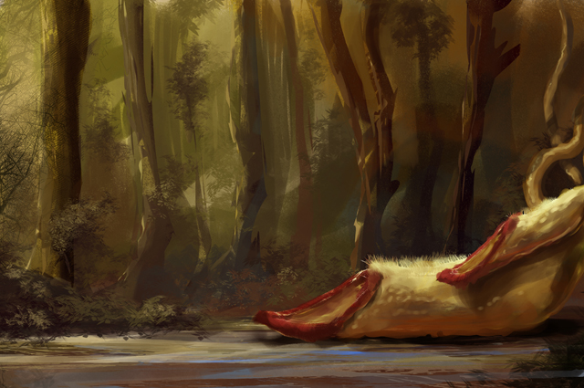
Blocking in the plant
Having a lot of fun painting the forest, I totally forgot the topic – Men Eatin Plant. After a “quick” web research (great source of inspiration and a time killer as well) I was really inspired by the beautiful shapes and colors from that sort of plant. With using my main brush again, I blocked in the initial plant shape and added some lights and shadows as well. (Fig. 05)
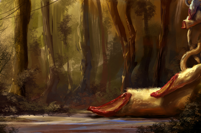
SECOND PLANT, DETAILS AND COLOR TEMPERATURE
While working further on the plant by adding details and de?ning the light direction, I decided to add another “calyx”. Also I duplicated the plant layer and set it to soft light. This is a pretty good way to increase contrast and to intensify the colors. I’m using the number pad for playing with the amount of transparency. At this stage I kept all my layers separate – one for the background, one for the background details and one for the plant and the leafs as well. (Fig. 06)
COLOR TEMPERATURE AND DETAILS
I duplicated all layers and reduced them to one. Now it was time to add more details to the background and foreground as well. I used my customized leaf brush again to get more volume to the bushes. The colors are always picked from anywhere in the image to keep the color theme consistant. On top of that I added some leafs on the trees with the same brush, too. You should always try to repeat elements from your image. Flipping the canvas from time to time refreshes your eye and will give you a different point of view. I also duplicated the plants, scaled down and moved them to the upper right corner. The newly formed shape of the plant will lead the eye to the center of interest. (Fig. 07)
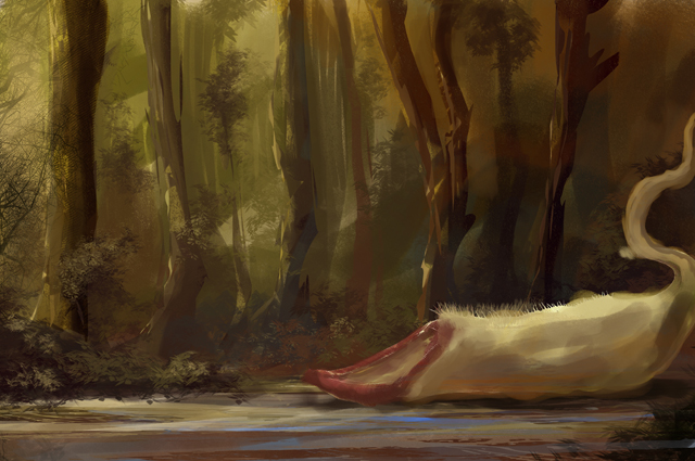
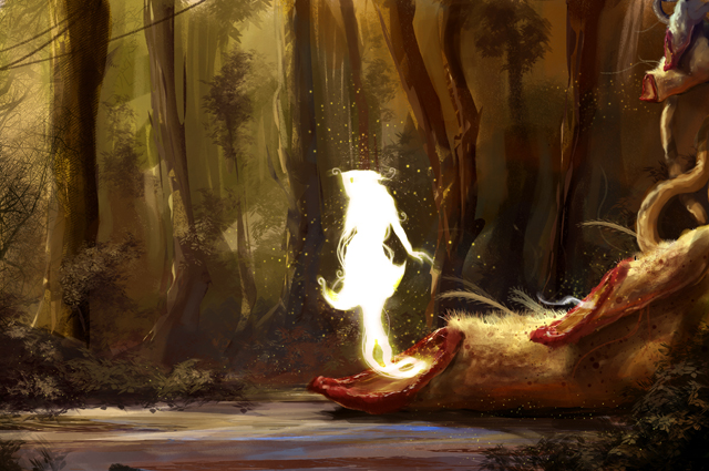
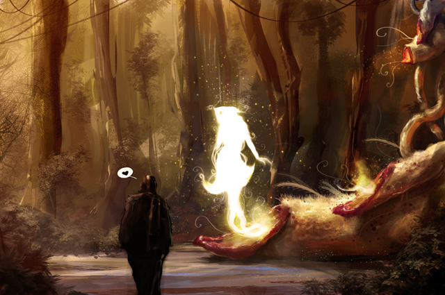
CENTER OF INTEREST – THE LADY PISTIL
After a while I was happy with the plant, but I missed something. Something that attract a man to get closer, something inviting…
And what attracts a man more than a beautiful woman, a perfect body shape, etc (yeah – sometimes men are simply constructed ;) ) The idea was set and I started to block in the female body shape, again by using my main brush. Keeping the shape simple and using only white contributes to a more mystical style and feeling. Glowing sparks around the female body are also a good way to add some “magic”. The sparks are made by a round brush (with modi?ed settings for shape, jittering and spacing) (Fig. 08)
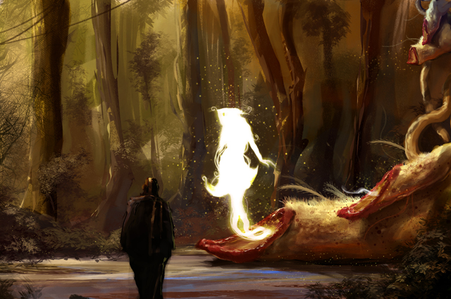
THE POOR DUDE
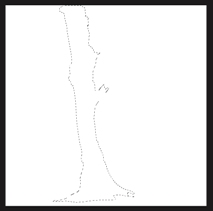
OK – I’ve got all things set – the environment, the plant, the magic feeling. It was time to work on the poor dude that was supposed to be eaten by the plant. I used again my main brush (set to opacity mode) for the silhouette and the selection tool for details. I used the same technique as described in my work?ow (Fig. B) and started painting my main color. For the details I always use a new layer. I tend to erase parts of the main color to get the shadows and only paint in the highlights. This process has gone forth and back until I was happy. (Fig. 09)
ATMOSPHERE
I added a new layer for the atmosphere. The fog is painted with a customized “cloud” brush set to a big size (up to 1000 pixels). By using the same brush for erasing certain areas on the cloud you’ll get a better cloudy / foggy result. The thought bubble with the heart was just for the fun of it, but I decided to keep it. (Fig. 10)
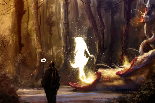
WARM / COLD CONTRAST
I took a short break from painting on that image. This is, by the way, another good approach to get a fresh view on your image. After a cup of coffee I found that the overall color mood was to warm / to brownish. I really like a high cold / warm contrast in my images. I created a new layer and added a blue radial gradient (top right corner to the middle of the image). The layer was than set to soft light and the opacity was set to 40%. I duplicated and ?ipped the layer. By using the color/saturation ?lter I changed the blue to a warm orange. (Fig. 11)
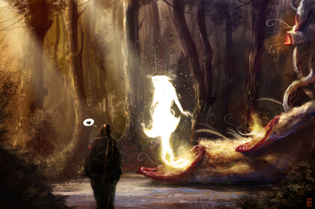
FINAL DETAILS
Once again I duplicated all layer and reduced it to my ?nal layer. A new layer was created for the last ?nal details. I added some more leafs to the foreground (customized brush) and on the tress in the background as well. For the light rays I created again a new layer (20% opacity) and painted in some bold yellowish brush strokes and applied the motion blur ?lter. I duplicated the layer, set it to “add” and adjusted the opacity.
I ?attened the whole layer an made a copy of it. For the glow effect on the sparks and the lady pistil I used the burn/dodge tool with a soft round brush (set to opacity mode). (Fig. 12)

About The Author
You might be interested in