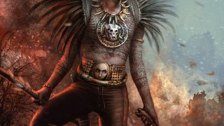
Making of “What Are They Staring At”
What are they staring at has been created to improve my skills at environmental design and ended up as a personal piece I really like.
Introduction
On the far end I decided to add a bit of story into the image and add the glowing eyes to the background. In this Making Of I‘d like to show my working process and hope this could be some help for others.
Tools
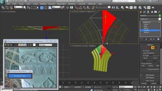
In most of my images I just use one or two main brushes and some customized brushes, but this always depends on their specific need.
I really like to combine those brushes with the selection tool – this gives me the opportunity to get crisp edges and to paint just certain areas in my images (Fig. A).


Workflow
I don’t know why – but I’m a big fan of layers. I always try to keep my layers until I’m happy with the look and feel. After that I reduce the layer to one and start working on a newly created layer.
On top of that I really love to work with the selection tool. I use this tool many, many times in my work. It is a simple and easy way to create different shapes, etc. Is the selection drawn, I start to paint in my main color. I always create a new layer for shadow and lights. This will give me the freedom to go forth and back and also to erase certain areas in the actual selection – without affecting the colors “below” or “above”. Happy with the result, I merge the layers.
Blocking in / first shapes
I have no typical start such as line drawings or thumbs. Mostly I start blocking in some rough colors and/or shapes. For this image I did a bit of research on the web and after a while I had a clear idea in mind. By using the selection tool and my main brush I dumpt in the basic shapes (Fig. 01).Using a perspective grid is really helpull for environments and can be easily drawn using the line tool. I started with a brown and grayish color palette to get a first feeling for the overall mood.
First details an use of textures
After a while I started to see how the hall could look like and started to add the first textures on the left wall. A good thing to create your own library of textures. Just go out and shot what ever you like or use online libraries such as CGTextures, etc. I used some corrugated iron for the window and painted over with my main brushes (described in Fig. A). I really like the combination of both – real textures and painted brush strokes. (Fig. 02)
Mood and more textures
I kept working on the window and duplicated the corrugated metal and set it to soft light. Working with soft light is a easy way to intense the colors and to increase the contrast. I set the duplicated layer to 40% and started to paint over again. Also I erased some areas from the corrugated metal to get a softer look. I used the same textures as a repeating element for the wall in the back and for the left wall as well. Not happy with the brownish / greenish mood, I used the color balance filter to get more in to some cold and blueish color temperature.(Fig. 03)
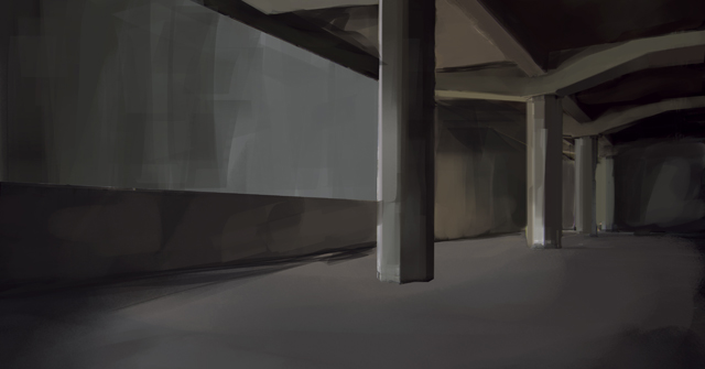
Flipping the canvas and additional textures
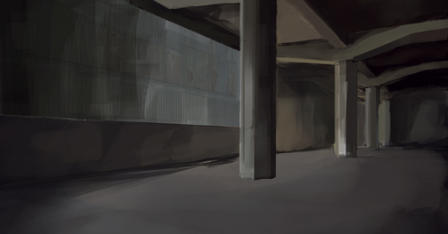
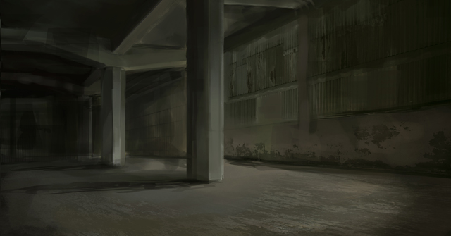
Flipping the canvas from time to time is a really good way to refresh your eyes and to get a new feeling for your image. I created a short cut for this action and use it really often while painting my images. For the floor and the wall I used some concrete textures that I had in my library to get a more decayed look. The texture layer was set to round about 20% in soft light.(Fig. 04)
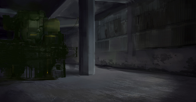
Dоn’t be afraid
Once I was quiet happy with the look I received from adding the textures into my images, I started to block in some Mech shape. I’m not really used to Mechs and this was more of an attempt to get better at it. Absolutely unhappy in what this turned out, I get rid of the Mech and the technical shapes around and worked forther on the empty hall.(Fig. 05)
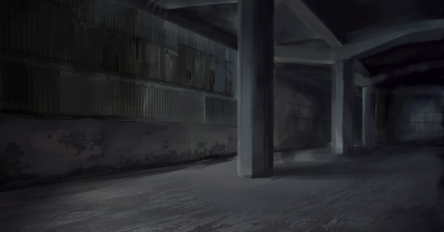
Mood and light directions
While working (again) on the empty hall, I used another time the color balance. The blueish hall was more of a night situation but I had some day light situation in my mind. I painted in some rough shadows with a squeezed round brush to get a better feeling from where the light should come later. By using the transformation tool I changed the perspective a bit.(Fig. 06)
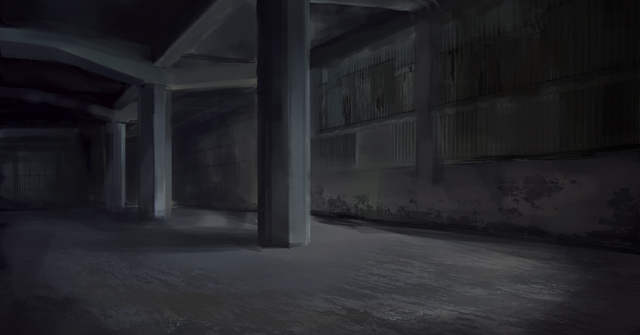
More details
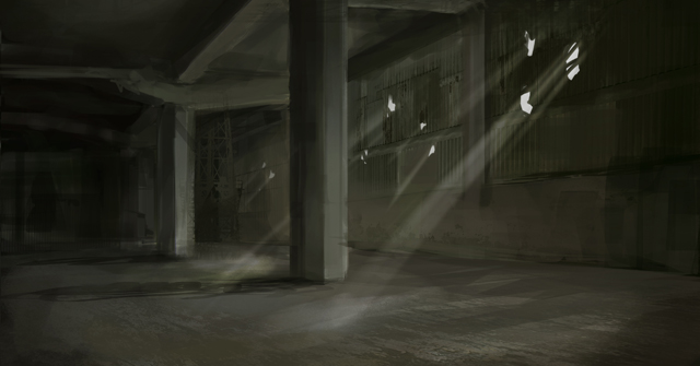
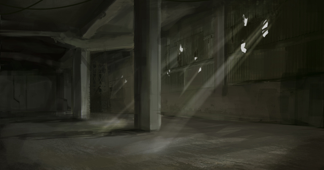
I duplicated all layers and reduced those to one. Now it was time to add more details to the background and foreground as well. I used some customized brushes for the technical shapes in the background. Also I selected the shape and started to paint some highlights to that area. I used the paint and erase technique (described in workflow). At the point I painted in the shadows I had already the source of light in mind – some holes in the corrugated iron. Those could be bullet holes or what ever. (Fig. 07)

Light rays
For the rays of light I just duplicated the holes and added the motion blur filter to it. You have to play around with the angle and the amount to get a proper result. I erased the overlapping rays (upper right side from the holes) with my main brush which is also my main “eraser” brush.
(Fig. 08)
Light intensity and background details
I duplicated the rays and set the layer to add. While this was way to bright I adjusted the setting for the opacity. Whith using my customized cloud brush I painted in some soft fog on the floor (where the light hits the floor) and reduced the oppacity to 10 – 15%. For the rough details on the back wall I used again the selection tool and my paint/erase technique. (Fig. 09)
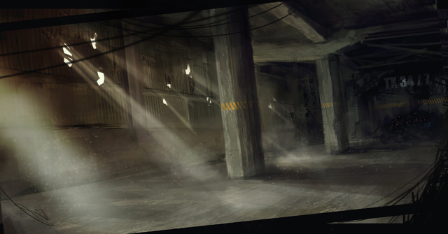
Atmosphere and warm/cold contrast
I added a new layer for the atmosphere. The fog is painted with a customized “cloud” brush set to a big size (up to 1000 pixels). By using the same brush for erasing certain areas on the cloud you’ll get a better cloudy / foggy result. The sparks/ dust particles are painted in with a small round brush (modified setting for spacing, jitter, transperency). I really like a big warm and cold contrast in my images. I added again a new layer and applied a soft radial gradient in blue – set to soft light.This layer was duplicated and flipped. I changed the color by using the color/ saturation filter and adjusted the transperency. On top of it I added some rough foreground elements and changed the “camera” angle to a more dynamic perspective.
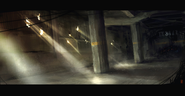
Final details and textures
I took a short break from painting on that image. This is, by the way, another good approach to get a fresh view on your image. Back with fresh eyes I added more textures to the columns and ceiling. The orange stripes are painted in with a customized brush and erased on the side to get a more dimensional feeling. To get a small story into that image I added some dark areas on the back wall and painted in some red glowing eyes – just pretty rough (it keeps the imagaination flow). This I a good way to lead the attention through the entire image. I’m a really big fan of a more cinematographic format – like 21:9. To get this I simply added some black bars on the top and on the bottom on the canvas. My final step for this image was that I used the burn/dodge tool to increase the contrast and the brightness of the lightrays by using a soft round brush. (Fig. 11)
Conclusion
I hope this tutorial will give you a small insight how I work on most of my images. I still believe that the technique should always depend on the image you like to paint. But I really think that a good understanding of light and shadow and color theory is key to create good art. Also I hope this tutorial will be helpful and useful. If you have any more detailed questions – don’t hesitate to drop me a mail.


About The Author
You might be interested in