Tutorial “Photo-real Stone Ruins”
Achieve a photo-real effect in your digital paintings with this stone ruins digital painting tutorial…
Introduction
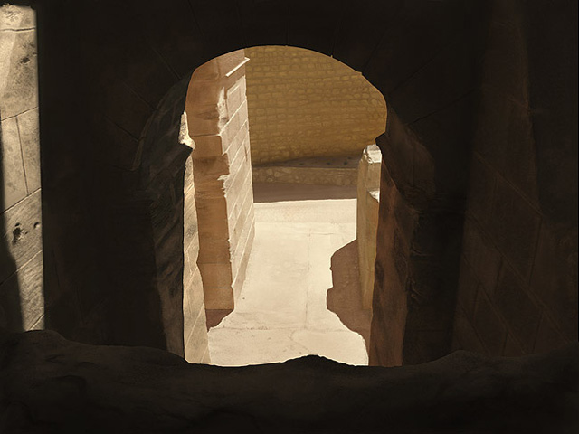
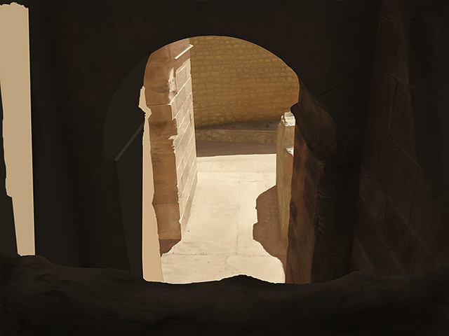
Creating digital paintings and developing skill while you’re at it, is a challenging path. One of the bread and butter aspects to developing that skill are you regular painting studies where it is considered useful practice to paint from photographs. This is one such study based on the following photograph:
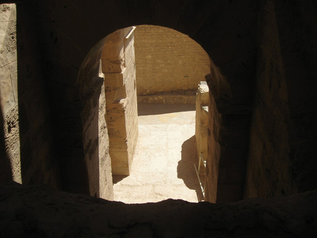
This photo is called ‘ruins stock 10’ by EveBlackwoodStock from deviant art. Click here to view original image from within deviantart.com where you may also browse her other stock photos.
I chose this photo very deliberately because I wanted to study hard light and shadows. This kind of lighting is perfect for studying such things and will enhance your digital paintings greatly.
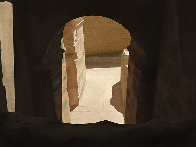
My aim was at first to create a speed painting and stay loose, but it turned into a full-blown painting study which took around 3 days to complete (about average for the more in-depth painting studies). As such I feel we’re then going for a more photo-real effect, which can be very rewarding when you pull it off!
For this tutorial you will need Photoshop (obviously) and a graphics tablet.
It is also useful to use the provided Photshop chalk brushes which are the default ones but tweaked to give a nicer, more stoney effect. It may also be useful to download my Free Rock Brushes and use those for such a piece.
Step 1
First, I wanted to not mess around with guessing perspective.
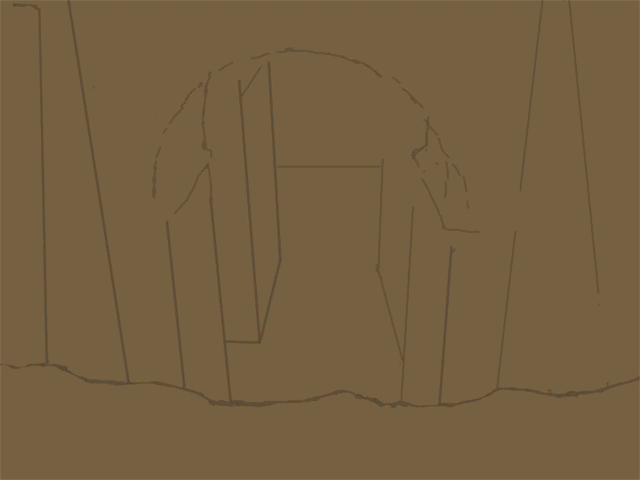
Sometimes when one embarks on a digital painting study there is a focus. My focus here was on texture, lighting and realism. As such I decided to roughly trace the perspective of the source photo which you can see here:
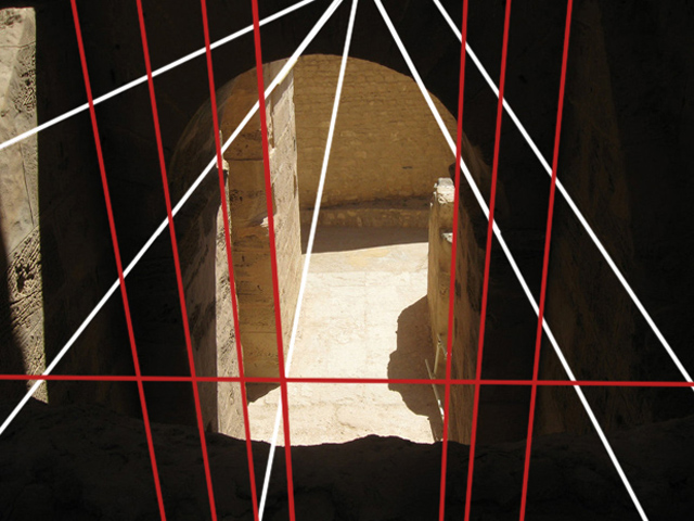
There is a vanishing point almost within the frame at the top and another way down off the frame at the bottom. We can use the top (perpendicular to us) vanishing point as it’s quite near but the vertical vanishing point takes a bit of guess work. The lines were made by clicking once, holding SHIFT and clicking somewhere else (make sure there are no opacity or size settings for your brush or this doesn’t work).
Step 2
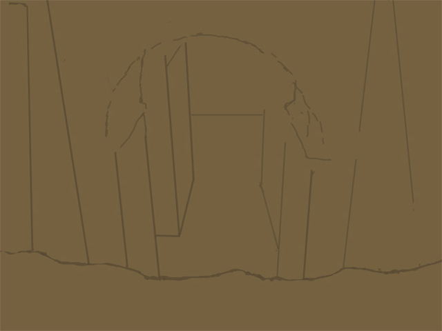
I dragged the guides into my document, filled it with a mid-tone brown and started to draw in the lines based on my perspective grid.
My canvas was 2500px wide but I would recommend a higher canvas size of around 4000px.
Step 3
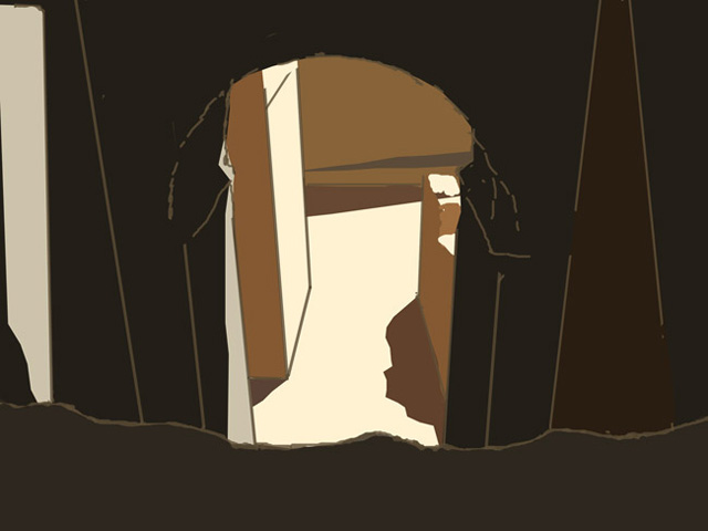
Next I simply filled in the colors with a close approximation. Or at least a representative color.
Step 4
I then hid the guide lines and refined the colors a little more closely. As you can see, if you squint your eyes at this stage, we have at least achieved a somewhat photo-real light set up – kind of like an untextured render in 3d with some default lights.
Step 5
Now for the tricky part – texture and detail.
It’s at this stage in the painting where one’s confidence is riding on whether a decent level of realism is pulled off. I combat this by working one area tightly so I can a) feel more confident that the rest of the painting will work and b) so I can take what I’ve learned and apply it to the rest of the painting e.g. light values, shade values and texture. By now I know which brushes are working well too.
Color Picking: It’s never advisable to color pick from your photo. Firstly because your photo can be misleading in terms of pixel-by-pixel color shade and secondly because it hinders the development of your artistic ‘eye’.
What I did was to guess a color, then paint into the photograph. If my color seemed to disappear then I guessed right! If I were out in terms of shade or saturation then I would tweak and start again until I got it right. This really helps develop your eye for color!
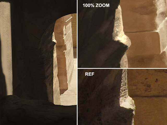
As you can see from the above example, close-up the painting is quite simple yet zoomed out it looks pretty accurate.
The area just where light and shadow touch is very crucial to get right.
I tended to paint using no opacity sensitivity but instead to drop the opacity to about 30-40% and build up. If you’re at 100% opacity you lay down your brush stroke and it’s too harsh/solid. Better to build it up through several strokes of a low percent.
Let’s also pay attention to light direction. Notice that the light is coming from high above and to the right. This helps define shape and form so again notice that the tops of my bricks have a very light lip or edge. This helps define the perspective as well as light direction.
Step 6
Ok, let’s get subtle and paint the ground.
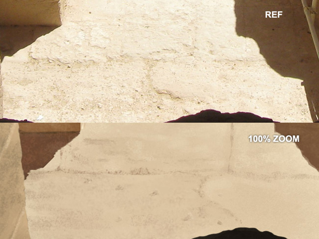
As you can see if you compare the two pictures, a very subtle effect was used to paint the ground. The ground is pretty much in direct sunlight and is quite flat too. But still there is some direction of light worth acknowledging. So paying attention to the subtle light direction I painted in some very slightly raised bumps and cracks, even some tiny stone chips with a basic shadow.
Zoomed out you can see how it works just fine.
Step 7
Now onto our biggest cast shadow. As I mentioned before, getting shadows correct is key to selling the realism of your images. Shadows aren’t always dark, aren’t solid in color/tone and certainly are big black areas, which is something our untrained mind will often assume.
Because of bounced light and ambient light, even within our shadows we’ll have soft shadows. So first lay down your darks then paint in some lighter values over the top and watch your shadows come to life. See the below close-up and notice the lighter tones and textures within the shade.
Step 8
This was the most difficult step because of all the stone work!
I worked on the base first – putting in those flat stones and worked on the shadow (see 1 & 2 below). Fairly easy stuff. Then I tried to get the occluded area (the dark corner) to look nice and shaded. After a few failed attempts I cut out the bottom ‘wedge’ bit and stuck it on a new layer so I could get underneath it.
I then painted using a soft round brush behindit to give a gradual soft shadow – the chalk brushes weren’t helping me in that instance.
I also couldn’t quite figure out what those little dark things were so I went back to deviant art to download the full high res version of the ref pic so I could actually see! Thus far I had been working off a smaller image.
This helped a bunch.
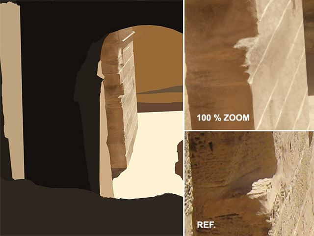
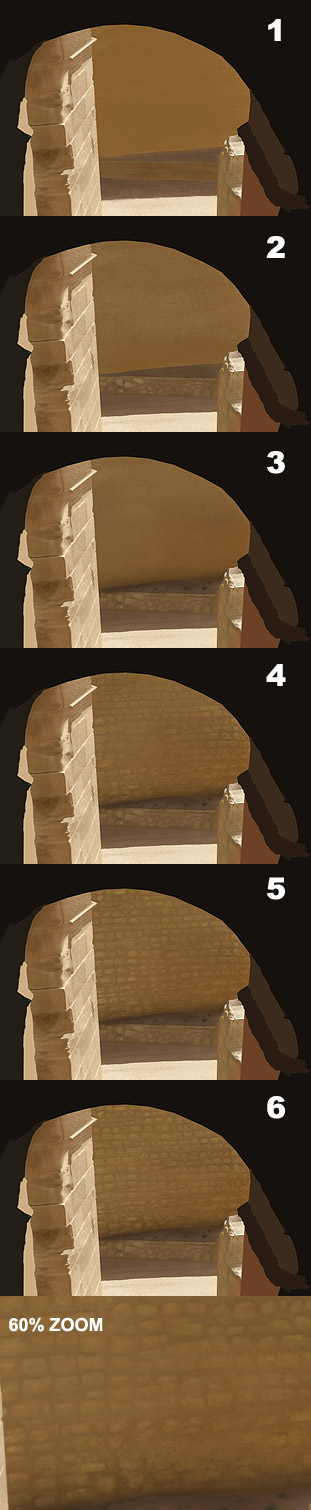
Time to get my hands dirty and start making individual stone bricks (sob). This time, the ref pic almost went out of the window as copying brick by brick would have resulted in death/insanity. The key to pulling this kind of thing off is in desperately finding a shadow somewhere. Something that shows form and definition.
I found my answer in the shadow above each brick. It’s very subtle but look at the 60% zoom and you’ll see.
There is much gradient and subtle shades in the wall, so I used many layers in front and behind the bricks to get it just right – knocking them back here, bringing them out there.
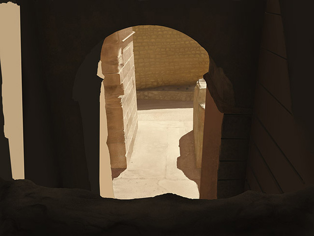
Step 9
Now for the interior shaded parts.
Throughout this whole process, it’s worth mentioning that I had to often tweak my perspective. When I got to this stage I realized that I needed to rework and more accurately define the perspective lines of the stone work. As you can see below, I had to make more guide lines to show where the structure was and how it moved throughout the photo/painting, where did that line connect to this line etc.
The sandy shelf-looking thing in the foreground required little definition as it’s not an essential component of our piece. It isn’t a focal point. It’s again worth pointing out that even in such a shaded area, there’s still shadow to pay attention to. I made sure there was some defined shape through shaded areas and also used my rock brushes to give it a sandstone effect.
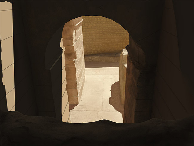
Step 10
This stone work was tricky because there’s much less definition in the lines than on our sunlit pillar. Like I said before, the perspective lines were key. I at first started to guess the direction but my guess was way out, so I went back to my perspective grid and paid close attention. You have to trust perspective!
So here I sort of cheated a little bit and starting defining lines that weren’t necessarily there just to define the form better. When trying to paint such vague things as old, scruffy stone in semi-darkness, you really have to ‘represent’ what’s there rather than copy it crumb by crumb!
Step 11
The interior darkness was also less important to define than the lighter parts or the focal parts such as the lit pillar out in the open. Your focus will draw your attention to the more contrasted areas (the middle in this case) and so we’re allowed to be more vague in the peripheral areas. Besides, it’s too dark to warrant a ton of detail as people won’t even see it.
Step 12
The darkest parts of the interior shadows would be the two vertical corners as they recede away from the light. So here I actually used a large soft-edge brush to create a soft shadow rather than go for the chalky effect. This is noticeable in the right hand corner below. I did this once all the texturing had been done and on a separate layer. Because the two planes of each corner are lit differently, I masked out one wall using the lasso tool and airbrushed the shadow in and then inverted the selected area to airbrush in the other (due to bounced light, the right hand wall is lighter than the part of the pillar which faces us).
Looking at that pillar on the right, see how warm the color of the mortar is? The light is so vivid and stark on the ground that we can be sure it would bounce up and hit that pillar. Seeing as the overall color of the scene is peachy then we can be sure that pillar would have elements of peach on it. Always remember bounced light and the saturation/value it brings to the surface it’s hitting.

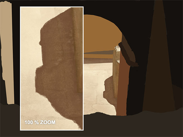
Step 13
The left hand pillar is quite an important aspect to our study as there is a face quite close to us which contains both light and shade.
It’s also worth mentioning here that by the time I had gotten to this pillar I had noticed a few perspective issues I really didn’t want to have to correct. If this situation comes up, you just have to bite the bullet. Around this stage I had to rework the arch and some of the stone work to make everything slot together nicely. It’s almost like building a house!
Again, we have very subtle definition in our source photo but using the perspective grid and showing line direction helps sell it.
Pay close attention to the subtle differences between this stage and the next. Perhaps some people would have stopped at this stage but the little extra detail goes a long way. Knowing when you’re done is crucial. Over doing it is not a huge problem but under doing it is!
Step 14
The color dodge feature in photoshop is awesome for creating hot areas in your digital paintings. Simply take a regular brush, choose a light color or just plain white, then from the ‘mode’ drop down at the top choose ‘color dodge’, and finally make your brush around 10-20% opacity so it’s not too ‘hot’.
Note that for this to work you have to work on solid pixels, so you may need to flatten the layers of the area you’re working on.
You can see the below painting, even at 100% zoom looks fairly realistic.
I also refined the edge of the pillar slightly. Notice the tiny indent down below where the edge of a brick meets a corner and makes a kind of lip. This is useful in selling the 3d form of the bricks/stones.
The image below shows the effect of the color dodge, notice how it has a slightly over-exposed or sun-bleached look, adding to the realism.
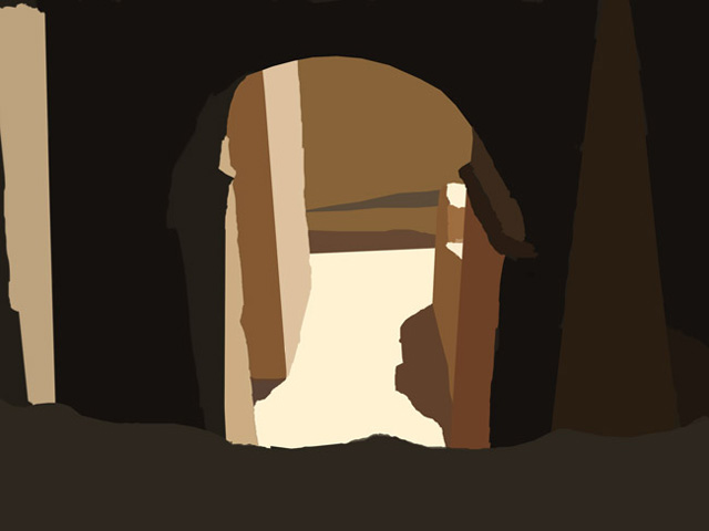
Final Result
Finally there’s the area of light on the far left. This was a tricky choice between acknowledging that it is something of a focal point and worthy of detail but also realizing that the source photo has some very difficult stone detailing/wear that is hard to pull off and could actually harm the believability.
Paying attention to the light direction, you can again see the light hitting the tops of the stones and also picking out subtle variations in the bumps. In the little holes we have darkness near the top and, where the light is catching it, a little lip of light on the bottom of the indents. Follow the light source and over and over again you’ll see your paintings come to life.
Even by cutting a few corners, I hope you can see how it’s possible to achieve a near photo-real result from your painting/photo studies.
The main factors that influenced such a result here were: perspective accuracy, consistent light direction, brush choice and texture (note that no photo textures were used at all here) and finally, not being satisfied until a certain level of realism was reached!

Here’s a step-by-step animated gif showing the progression of the whole painting.

About The Author
You might be interested in