Making of God of War
This image was my entry for a Drawing Jam called God of War.
INTRODUCTION:
While browsing the web for some information and inspiration as well, I realized that most of the images just focusing on a effigy of the God himself. So I decided to not to go that route. I wanted something bigger, something more powerful – why not showing a God of War in his destiny? The idea was set and my next step was to spend some time on choosing how to present my image.
I’m a big fan of super wide cinematic shots. So why not giving it a shot in this epic direction? Now everything was set – time to fire up Photoshop!
THE TOOLS AND PAINTING PROCESS
I’m a big fan of customized brushes and shapes, but for this image I worked mostly with my “standard” brush set.
I used some customized brushed for the clouds and for the arrow – but the rest was done with a hard round brush and my main brush (not named it yet). Figure A show what brushes I used for the entire image. A big help for de- fining shapes is the lasso tool. It’s an easy going to draw in some random shapes and work with the brush and the eraser over an over until you’re happy.


BLOCKING IN:
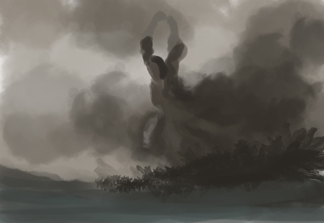
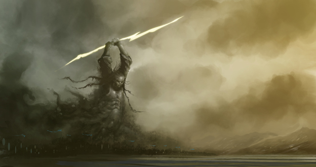
As I said before, I was heading for something huge, something epic for that image. That in mind I started to block in some rough color values and shapes. My goal for this step was to set the main colors and the composition. The God should be something huge, followed by his fellow army. I painted in the initial shape for the God and set his pose as you see in figure 01.
FIRST DETAILS:
I kept working on the God and started to paint in more details and the God’s face as well. For a better feel for the scale I started to paint in the God’s army by using just the round brush. For the shields I used the round selection tool, added a new layer and used my normal “paint/erase” technique. (Fig. 02)
REWORKING THE GOD:
Not really happy with the pose of the God I started to do draw in some lines for a better understanding how the pose could look more impressive and strong. The extended lines on the right side of images are mostly done for finding a good blending with the clouds and atmosphere. (Fig. 03)
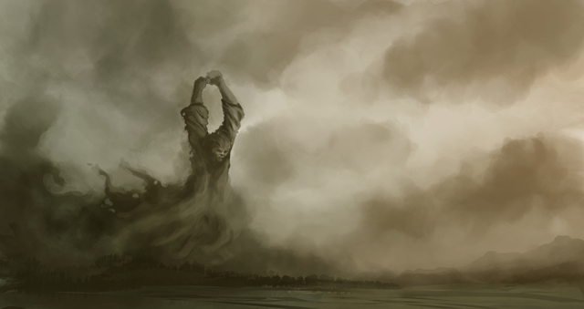
REWORKING THE COMPOSITION:
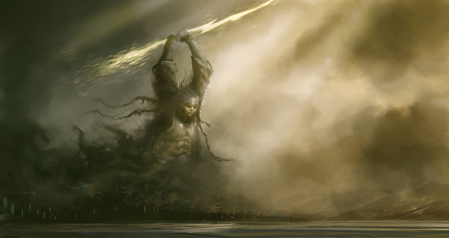
Taking a break from an image is always a good way to refresh your eyes and view. After a delicious cup of cof- fee I started to rework the entire image/composition. My first step was to extend the canvas to the right side and adding some warm tones to the upper right side as well. I also repainted the entire army by using a customized brush. The brush is a simple shape of standing person and was set to opacity and jitter. By painting the army way smaller the immense size of the God are shown way better. (Fig. 04)
MORE DETAILS:
Pretty happy with the actual look, I started to paint in some random details to the army below the God. For the Shield and flags I created a new layer and worked with the lasso tool and the round selection. Again by using the same paint and erase technique. I always create a new layer when I’m working with this technique – it gives me
the opportunity to as long as it needs without affecting the rest of the image. On top of that I started to rough in the first look of the God’s armor by using just the round hard edges brushes. A big flash as a weapon do the justice for a God. (Fig. 05)
MOOD AND COLOR:
I flipped the canvas a couple of times and realized that I needed a more dramatic lighting and mood. By using my customized cloud brush I painted in a lot of fog and smoke. This was also a good way to show how the God was manifested from smoke and clouds. For the light rays I used the lasso tool ( holding the alt key give you the option to draw straight lines). The selection was filled with a bright tone on a newly created layer, which was set to add. Using layer effects are a pretty effective way to add lights or shadows to your image. Further on I created again a new layer and added a blueish soft round gradient on the lower left side – set to soft light. I really like to work with
a high warm/cold contrast in my images. (Fig. 06)
MORE DETAILS AND THE EVIL ARMY:
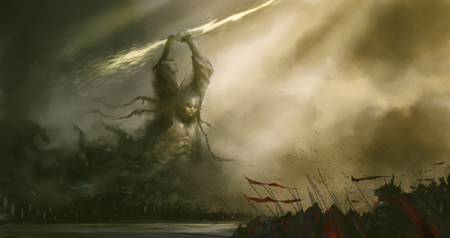
With a better feeling for the mood and the lightning, I pushed the details on the God and the foggy blending way further. Again with just the round brush and the smudge tool. The smudge tool is a great and effective tool for blending hard edges. The left side of the images was pretty much set at the moment. For me a good point to start to add “something” to the empty right side. What will be a battle without enemies? The hostile line was blocked in the same way as I did for the God’s army (customized brush). For a better visual difference I gave the “bad boys” the color red, while the “good boys” are in blue. I know this is a bit of cliche – but why changing already learned things? Its always good to use elements which people are used to.(Fig. 07)
CLOUDS AND DETAILS:
Oh – stupid me;) I realized that the flags are going in different directions – what will never happen. I repainted the blue flags by using again the lasso tool and my standard brush. Now, at all flags going in the right direction you’ll get the where the wind / storm is coming from. Not really happy with the God’s head I set my complete focus on it. Changing his helmet to rising hairs also shows way better his rage. On top of the hairs I started to add a lot of
details to his armor. All details are painted with the hard round brush – set to opacity mode. For the soft blending I
used a lot the smudge tool and for the hard edges I work a lot with the lasso tool as well. (Fig. 08)
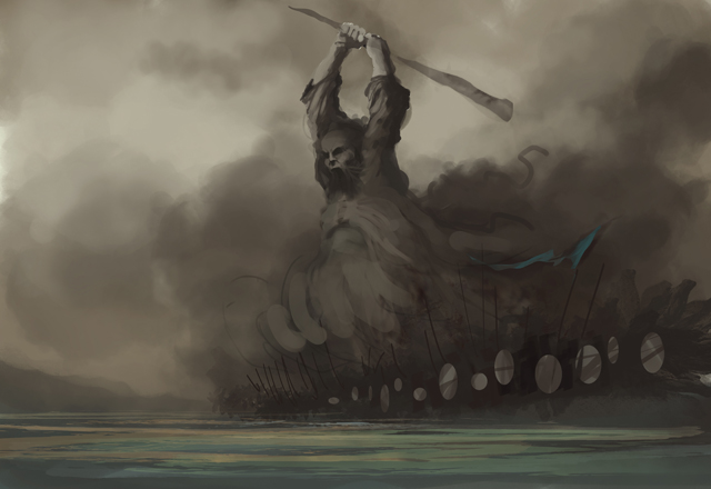
ARMOR AND COLORS:
Spending a bit more time on the armor helped to make the God more pop out. I created a new layer, set to soft light and painting in some bright yellow tones on top of the armor to make it more goldish. Another new layer with a purple soft round gradient on the upper right side, shifted the color away from the too greenish look. Working with extra layer is a pretty comfortable way to change moods, colors and values.
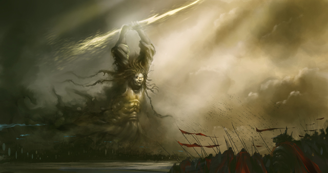
OK – back to the God. I moved his arms downwards, because I had the feeling that his proportions are off. I also added some patterns to his armor for a more ancient and mystical feeling. Some bluesih tones are painted into the fog/cloud. Some simple touches to match him with the army below.(Fig. 09)
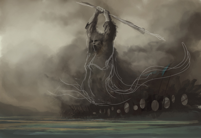
FINAL DETAILS:
Time for the last details. By using the lasso tool I selected the lightning and duplicated it to a new layer (ctrl+J).
Using a motion blur and a radial blur filter as well, while the layer is set to add, gives some nice glowing touches.
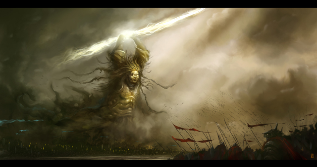
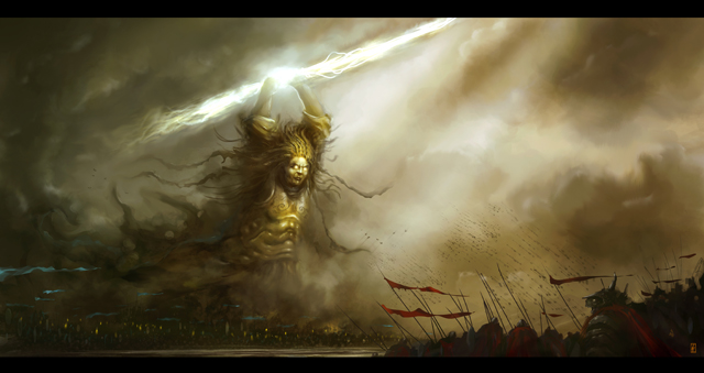
I moved his head a bit upwards and repainting his facial expressions to a more aggressive one. Mostly done with the hard round brush and the smudge tool. For the final color correction I’m really used to the color balance layer effect. A simple but effective way to change the color for depth, midds and highs. By using this layer effect you’re easily able to change the highs to a blue while the depths are more reddish. I merged all the layer to one and du- plicated it. The final “light” touches on the God and his lightning are made with the burn tool by using a soft round brush. I think I call it done. (Fig. 10)
CONCLUSION
I hope this tutorial will give you a glance on how I work mostly. But I still believe that every image needs his “own way” to be painted. One of the important lessons I’ve learned is that you need a good understanding of what are you doing. If you just paint, maybe the image will look good but didn’t will get the depth and the soul which will received if you do know what you’re doing.
Thanks for watching this Making Of and I really hope that it will be a bit of help.
Take care

About The Author
You might be interested in