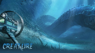
Making of “KEEP THE STREET EMPTY”
A new making of by Markus Lovadina
INTRODUCTION:
Music has been and is still a great source of inspiration for me. There is nothing better than the right song for the right image. Music have – at least for me – the ability to intensify emotions. No matter in which way. Sometime I’m browsing trough my tunes library and get stuck to one of them. While listening to the sound again and again, an image starts to pop into my mind. This happened while I was listening to the song “Keep the streets empty” from the band Fever Ray. The song is pretty intensive and have this kind of dark mood to it. The idea to paint my own interpretation of the “why” was set.
I already had some images in mind how the final illustration could look like and I know it should have a more illustrational feeling compared to my other works. Normally I use a lot of customized brushes and shapes to speed up the process. For this image I decided that this “special” look dosen’t ?t to the mood and the theme as well. It’s also a good approach to learn some new techniques. For the whole image I just used three main brushes (Fig_A) for painting and a specieal brush for smudging.


THE TOOLS AND PAINTING PROCESS
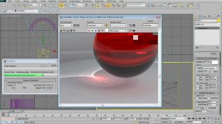
The smudge tool is a pretty great tool for blending hard edges together. But you have to play with the right settings, because this depends on what kind of brush you use. When I’m using the smudge tool the strength is set to 20% and the “brush” itself is set to pressure sensitive. The scale is 100% with no effect.
If I work with the smudge tool, I’m still using my layer technique. This mean I have my base color on one layer, my shadows and highlight on separate layer as well. By using the smudge tool on the highlight, you’ll get some pretty nice happy color accidents. The only downside is that this will slow down your computer a bit (but this happen only when using with separate layers). When I’m happy with the look I merge the layers together and create a new one for the next steps (Fig_B)


BLOCKING IN:
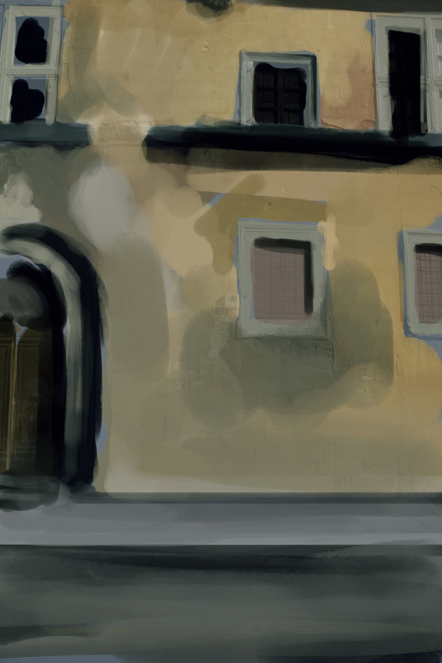
As I mentioned before, I already had an image in mind how it should look like. In such a case I’m starting directly with blocking in my rough shapes and colors without any thumbnails or sketches. I know I’d like to have a street scene where the “camera” is pretty close to my main building. The whole seen is set into some dark mood, with an old worn-out building facade. For the blocking in I used mainly a round hard brush (set to opacity) and a square brush(set to opacity, too) as well. I used some textures for the wooden door and the concrete, all from my own library of textures.(FIG_01)
FIRST DETAILS:
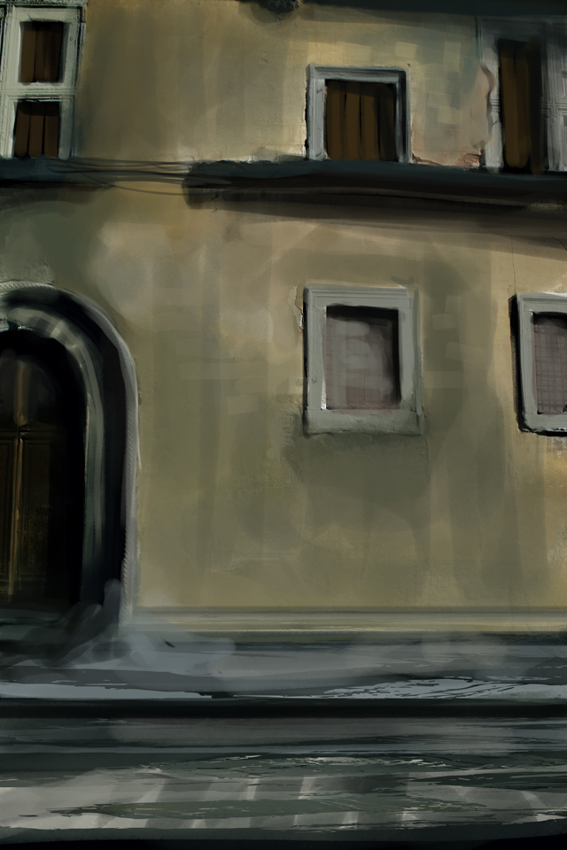
I added some additional colors to the wall, mostly grey values and started to paint in the ?rst window details. The windows are barricaded with some wooden planks, what adds a more eerie feeling to the whole mood. Until now everything was painted again with the round and square brush. The square brush was also used to implicate the ?rst rough bricks. (Fig. 02)
MORE DETAILS AND FIRST COLOR CORRECTION:
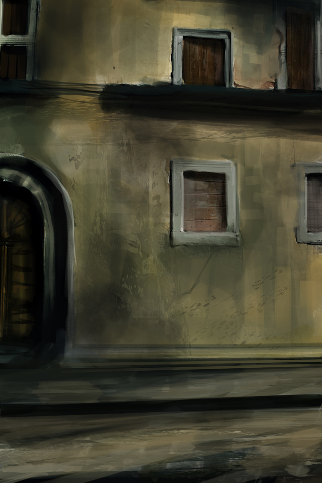
The next step was to get a bit more texture to the wall. I used my customized shapes and erased unnecessary part. Customized shapes or simply normal shapes automatically create a new layer, what will give you the option to play with the layers opacity setting or just to erase certain areas without affecting the background. Shapes could be easily made from most images- Just convert to image top a black and white image (no grayscale). Select the black areas, make a clipping path and add it to your shapes (main menu, below brushes). On top of that, I started to add the ?rst details and elements top the door. (Fig. 03)
MORE DETAILS AND TEXTURES:
My next step was to create a new layer for more color variations. This layer was set to soft light – a pretty easy and comfortable way to adjust and add colors. Depending on your speci?c needs, you could paint in the colors with some brush strokes or using the a soft gradient. I used mostly some purple or blue tones for the additional color. For the structure on the wall I used some texture shot I did quiet a while ago. It is pretty useful to collect your own texture ref library. Jut go out with a camera and shot what ever you want – you’ de?nitely will need it some days. (Fig. 04)

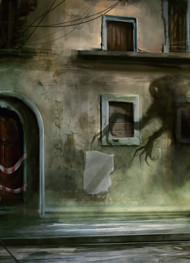
BLOCKING IN THE CREATURE:
Pretty happy with the actual mood and look I started to block in some more details and the ?rst initial shape for the creature as well. The creature shape was mainly painted in with the hard round brush and the paint brush as you can see in Fig_A on the beginning of this tutorial. Normally I use a mid sized round hard brush for the base shape and than I start to erase certain areas for smaller details (e.g. Claws, etc.). This procedure goes forth and back until I’m happy with the overall shape. I also added some details as you can see on the door, on the top of the image and I added a poster onto the wall – not sure this will be in the ?nal image though. Again a new lyer with soft light settings was created and ?lled with a soft greenish gradient on the lower right side.(Fig. 05)
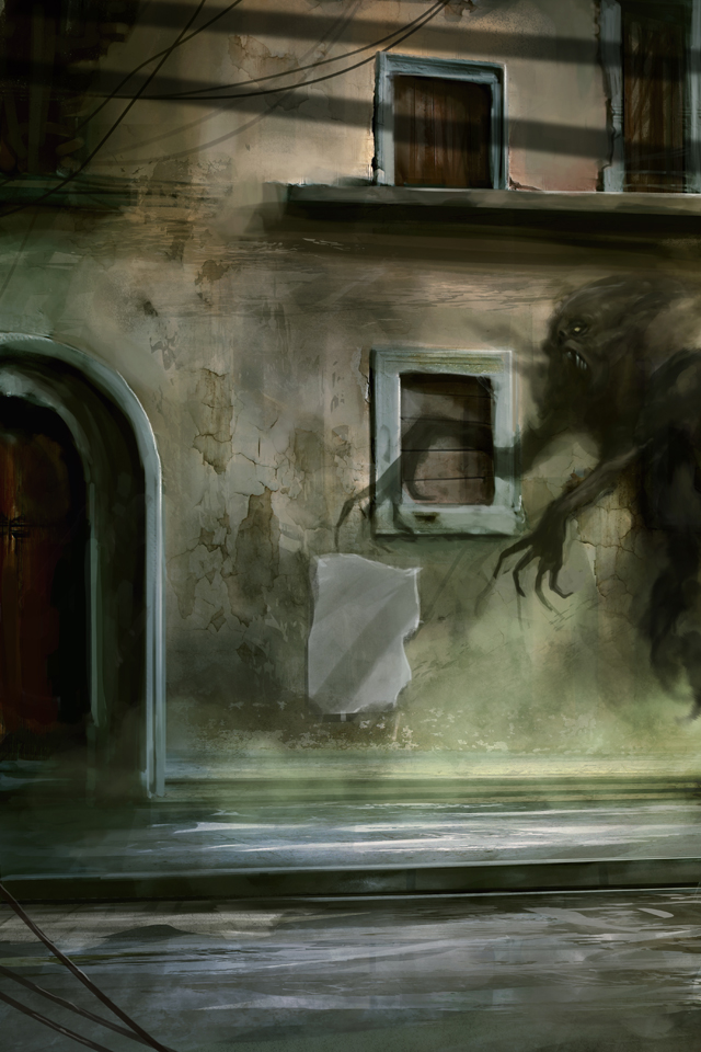
CREATURE DETAILS:
When I paint in the details for a creature, a character or what ever, I really like to work on separate layers for mid tones and the highlights as well. The technique I used here is described at the beginning of this tutorial (Fig_B). For the details I used a lot the smudge tool with the special smudge brush (Fig_A). You’ll get some pretty soft tone blending and while working on separate layer, some happy color accidents as well. If I like the ?rst look I merge the layers and create an new one for painting/smudging more details and brighter highlights(Fig. 06)
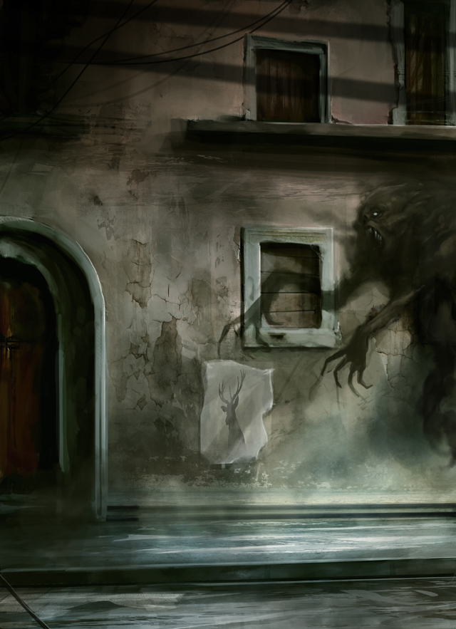
COLOR CORRECTION AND LIGHT SOURCE:
Not really happy with the barrier band on the door and the poster, I decided to paint over those two disturbing elements. The whole scene should be happen in a more night orientated scene – so I shaded the whole image by using the Level Correction tool. To imply that the scene is light by some pole lights I added the two big diagonal shadow on top of the images. I created a new layer, draw in the shapes with the selection tool and ?lled the selection with a dark and brownish tone. The layer was than set to multiply and the opacity was set to roundabout 45 – 50%. For a more 3 dimensional feeling I selected the shadow area on the inner side of the window and moved it a bit downwards. A simple way to apply some depth. I used the color balance adjustment to shift the greenish tones to blue. (Fig. 07)
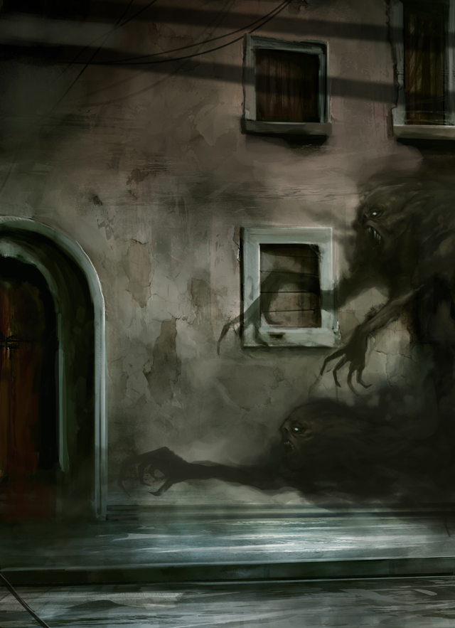
SECOND CREATURE AND REFINING:
After a short break from this image I decided to add a second creature, which – in my opinion – added a lot to the eerie feeling. I duplicated the ?rst creature (another good reason to keep some elements on a separate layer) and moved it to the lower area of the image. In order that the second creature looks not like copy and pasted, I use the liquefy tool and the transformation tool to receive a new “body” shape. By using the eraser tool I get rid of not necessary elements and painted in some new shapes as the arm and the smoky body. Again with the round hard and paint brush. On top of that I painted over the concrete nose on the upper part of the image. This element took way too much attention. (Fig. 08)
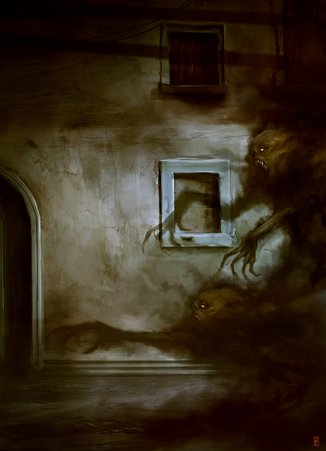
FINALS DETAILS AND COLOR GRADING:
Now – the image was close to final. Just a few small steps ahead. Again I created a new layer and started to paint in some bright highlights on the creatures. For the Eyes I created a second layer which was set to add. I used a soft round brush – just twice the size of the eyes – with a pretty bright value and painted in the glow of the eyes.
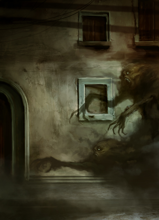
To get the right look you could play around with the opacity of the layer. Still in mind that the creatures should be half “manifested” and half shadow/smoke I used a customized cloud brush to paint in the foggy bodies. For adding more atmosphere to the painting I created again a new layer an painted in some fog by using the cloud brush as well. Last but not least I used the color balance tool for a more subtle color shifting. And ?nally a soft light layer with some reddish and greenish tones for the warm / cold contrast. I think I call it done..(Fig. 09)

About The Author
You might be interested in