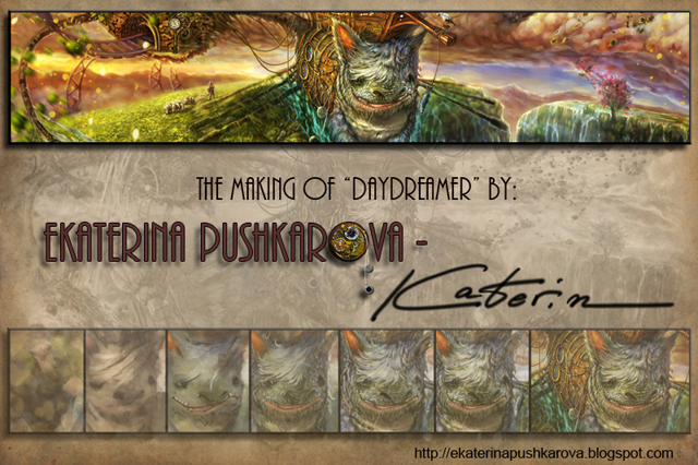
The making of “Daydreamer”
In this tutorial Ekaterina Pushkarova describes how she was making her work “Daydreamer”.
Introduction
First of all, I’d like to thank “Netrinomedia Network” for the invitation to present a tutorial about the creation of my work Daydreamer!
I have used Photoshop CS4 and Wacom Sintiq
Very often the creation of a work of art begins with a sketch or a drawing. With me, most of the times it would begin as a chaos evolving from scattered spots, based on the principle of a colorful overlay in the classic drawing.
Just like the children stare in the clouds in a hot summer day, so do I discover, in the chaos, fanciful creatures and vast lands.
THE IDEA
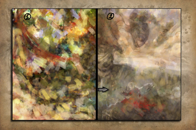
While looking at the colourful spots you will see that your fantasy is gradually going to create images, which otherwise you would find hard to produce and the idea is going to take shape step by step. Once the basic idea has already taken form in your mind, then comes the time for the first main steps:
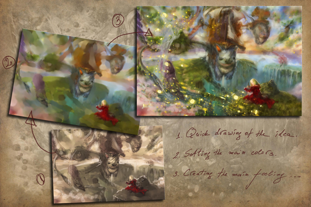
1. A quick sketch of your work.
2. The basic silhouette and range of colours.
3. And last but not least, creating the specific sense or effect by which you recreate the kind of mood that you would like to fill up your picture.
THE MAIN FEELING OF THE PICTURE
This could be, as it is in this case, flying splashes of light and pieces of green land, could be a strong foreshortening, a particular source of light or something else, which could grab the audience attention, because as we know the first impressions are the most important. They win the audience.
COMPOSITION

Composition could be divided into triangular, pyramidal and circular. The objects in the picture are situated in such a way, so that the main sought after effect could be achieved. In my particular case I have used circular composition, which follows the movement of the flying splashes of light, and I have later on intensified this feeling through one of the creatures’ tail, which also follows the circular movement. This way or other, the composition centre remains the most important to me. The point, which is noticed first by any human eye. Or this is the centre of the picture. Most often, if you draw two lines between the picture angles, the point where they cross is the picture centre. There is the object, which will be noticed firstly by the viewer – a main character or an impressive detail, or a colour spot. It happens often that the composition centre has been pushed further away and does not coincide with the format centre. But in order to be perceived easily by the human eye, the picture centre in this case should be peaceful and clear.
LIGHT AND ATMOSPHERE
The light is what draws the black and white picture. It fills up with a different colour the atmosphere between the viewer and the mountains in the distance. When you have well expressed cast shadows or more dramatic lighting, the picture effect of perception on the viewer is always better. Here, the light comes from the setting behind the mountains sun. In the background I have put quite a lot of layers with different degrees of opacity, so that they could tint the backgrounds and the clouds into warm shades.

I have experimented with various layers when doing the shadows. For example Layer – Soft Light – Opacity – 43.… , so that I could keep the shadow main color, but to tone it towards a darker shade. Apart from that, I have darkened the ends a little bit and lightened the centre of the composition.
The generalization of some parts of the picture, for example as it is in the case with the rock and the girl in a cool shade, gives and air of depth, peace and summarize some of the unnecessary details.
DETAILS
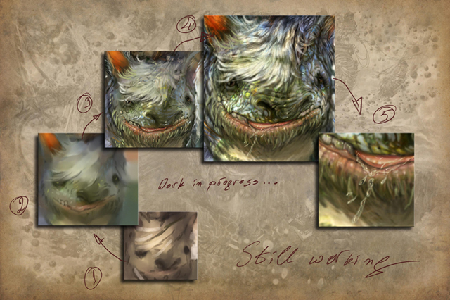

Practically these are several pictures in the picture. If you look carefully you will notice them. Here the difficulty was not only in the recreation of the sense of chaos in the picture – as if in a dream – but also the preservation of the harmony between the different components. That’s why some of the details have been blurred , so that the background could look more peaceful.

This way or other, if you wish to create a work with super realistic details, I would repeat the basic principles of drawing in one sphere. Every separate part, if you perceive it in the way you do the sphere, then everything would be all right. Everything is volume, volume and again volume!!! From the drop to the grass – always think about the volume! And if you don’t know the qualities of the matter you are drawing, look up on the Internet for reference and think the things over! For example, what does a drop of water do? Really just a drop? First, it’s transparent and reflects the colour of the surface, which means that there should be a light spot, but as the light has passed through some matter (i.e. water), the light spot should be at the bottom of the drop and it will have a different colour from that of the surface. And last but not least is the volume…Think about the drop as if it has volume. Do not just draw its contour.

BRUSHES
Because all the things mentioned above are the basic principles of drawing and painting, this is perhaps the most important part for those who are making their first steps in the digital art. The brushes in Photoshop – experiment with the settings of every brush. They offer thousands of possibilities. I personally have not more than 10 brushes and change their settings all the time. The more brushes I have, the less I use them. I choose a few main brushes, basic to Photoshop and a few more, which effects I like and they could recreate texture, close to that of the painting.

Experiment with the layers . For example, the main green shade of the grass is on 1 layer, above it is a layer with a brush, which has texture, so that it could recreate the slight chaos and grainy look and on top I draw separate blades of grass, which shape up the basic mass. Hold the different thing separate, so that you would be able to take them away at every moment in case you decide you don’t like them anymore.

The other important setting to me is Color Dodge. I choose a round brush with white colour. From Mode I set it to Color Dodge and turn down the Opacity . I paint with it the places, which I want to make lighter or strongly light contours. This is the light-making brush, but you have to be very careful about her strength, because it is possible to spoil the colour and turn it into pure white.

The third important “brush” is Smudge Tool. When you go through its settings Shape Dynamics and Scattering, you can get a result pretty close to the mixing of paint in the classing painting. Choosing a brush with an interesting shape is something I very much prefer.
IF YOU DON’T LIKE ANYTHING … DO NOT HESITATE, DELETE IT!
Take a look at your work from a distance. There is something you don’t quite like? DO not hesitate, delete it and try something else in its place. After all you have layers. If your try isn’t successful, you can always show the old layer.

In my case the balloon in the left part of the picture has been constantly was rather irritating to me…so I took it off, waiting to see what I’ll replace it with. Then it occurred to me that as a child I used to flow little paper boats in a bucket of water. And there they are…the painted pieces of paper, flowing towards the fairytale world. And after that I didn’t want to change anything. Take the old away, so that the new could come in its place…And do not hesitate, when you don’t like something in that corner at the bottom…Change it!

The same has happened with the town. It seemed to me rather fragmented and scattered. I’ve tried to make it up, but it wouldn’t work out. Then I remembered – the best inspiration is the reality! My home town…with its thousands winding narrow streets, little houses situated on rocks, one above another as if perching on the hill. In order to concentrate on it only, I chose Crop and drew it as a separate picture. So that the feeling of my town could be full blooded, I decided to add some little lights like layer with “Lighter Color“.
CONCLUSION

And so I could have missed many things which I would like to tell you or such, which you would have wanted to ask me. But the most important thing I would repeat is that a picture is painted with heart and soul, not with brain!
Do train your logic before you start painting. Have a look at the works of many artists, not just one, so that you won’t turn into someone’s imitator!!!….Be yourself….find yourself! While looking at an artist’s works, ask yourself how exactly has this happened, how has he done it? Learn him or her, draw a lot of sketches until the moment comes when your brain would have remembered the main principles of the construction of objects. Just then he or she would stop interfering with you and your heart and only by the stroke of the brush your hand would place the spot exactly where its place is. And your picture will be sealed with the magic of your soul. Every one of you can do it only if you have faith in yourself!
Here it is the “Daydreamer“…
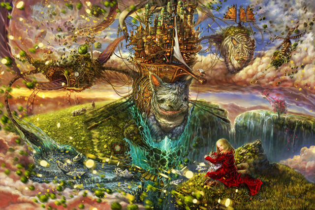
Daydreamer
What I am going to tell you about is part of my life.
It took place a long time ago…
There was a girl in a red dress, sitting on a rock.
Each of her thoughts materialized and flew away into space,
creating a dream world… piece by piece…just like a jigsaw puzzle…
It was a dream…
Ten years later I was sitting on the same rock,
writing about and painting enchanted far-away places…
My dream had come true, and I had turned into Creator of worlds…
as have you all… daydreamers…
I dedicate this picture to all creative artists.
Perhaps there is a place somewhere, beyond the limit of this world,
where they call you the CREATOR… looking at the sky…
as the girl in the red dress is…
Keep on creating!


About The Author
You might be interested in